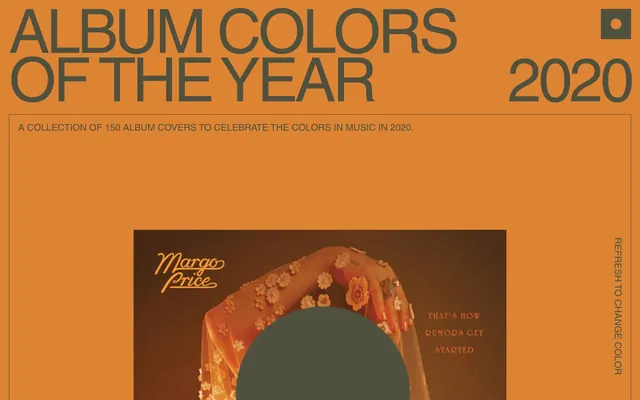
Preview image. Unlock full-res
Shifting monochrome poster
Color palette
Dominant background color that dynamically shifts, setting the overall mood of the page
One of several dynamic occasional background colors for the canvas
One of several dynamic occasional background colors for the canvas
One of several dynamic occasional background colors for the canvas, and for occasional links
One of several dynamic occasional background colors for the canvas, and for occasional links
Primary text color for headings, body, and all interactive elements. Controls the visual weight against the dynamic canvas
Used for occasional backgrounds contrasting with the vibrant canvas
Used for subtle backgrounds and in contrast to white backgrounds
Used for occasional overlay backgrounds
Typography
- Weights
- 400
- Sizes
- 16px, 21px, 75px, 137px
- Line height
- 0.79, 0.8, 0.9, 1, 1.6
- Letter spacing
- -0.05em
- Fallback
- Helvetica Neue
Primary typeface for all headings and body text, providing a geometric, condensed feel. The tight letter-spacing contributes to its poster-like appearance, especially at larger sizes.
- Weights
- 400
- Sizes
- 21px
- Line height
- 1.2
- Letter spacing
- normal
- Fallback
- Helvetica Neue
Used for ghost buttons, maintaining readability even without explicit letter-spacing.
Spacing & shape
Components
Text is Slate Text (#4f503e), 21px Helvetica weight 400. Has a 0px border-radius, with 0px padding. Defined by a 1px solid Slate Text (#4f503e) border.
No specific background color; inherits the dynamic Canvas background. Contains varying individual album details.
Slate Text (#4f503e), 137px Helvetica LT Pro weight 400, line-height 0.79, letter-spacing -0.05em.
Slate Text (#4f503e), 75px Helvetica LT Pro weight 400, line-height 0.80, letter-spacing -0.05em.
Slate Text (#4f503e), 16px Helvetica LT Pro weight 400, line-height 1.6, letter-spacing -0.05em.
Guidelines
- Use Slate Text (#4f503e) for all text and ghost button borders against the dynamic canvas.
- Apply 0px border-radius consistently for all interactive elements and containers.
- Utilize Helvetica LT Pro (or Helvetica Neue) with a letter-spacing of -0.05em for headlines and body text to maintain the condensed, poster-like aesthetic.
- Implement the dynamic page background using any of the brand-colored hexes (#e4822, #b13225, #c97f40, #99aa91, #feccc0) as the primary Canvas.
- Maintain a comfortable density with 20px of padding consistently around content blocks.
- Employ the ghost button style (text color + border color, no fill) for all primary interactive elements.
- Prioritize stark visual contrast between text and background, typically Slate Text (#4f503e) on a vivid brand color or White Contrast (#ffffff) on Dark Overlay (#081618).
- Avoid using filled buttons; all actions should be ghosted with borders.
- Do not introduce rounded corners; maintain sharp, rectilinear shapes for all elements.
- Do not deviate from the defined Helvetica font families or their specified letter-spacing.
- Refrain from using shadow effects for elevation; elevation is achieved through color contrast and direct placement.
- Do not use generic system fonts unless specified for a component; prioritize Helvetica LT Pro for brand consistency.
- Avoid adding extraneous decorations or complex gradients on surfaces.
- Do not use subtle variations of neutrals if a clear contrast is available; keep the palette stark.
About this system
ShowHide
Album Colors functions as a dynamically colored digital poster, where the entire canvas shifts hue to celebrate album art. Its visual language relies on bold, all-caps typography set against a monochrome but interchangeable background. Interaction elements are ghosted, defined by stark borders rather than fills, reinforcing a sense of understated presence. The structure prioritizes a clear, grid-like presentation of content within a constantly re-colored frame.
The page primarily uses a full-bleed layout, where the dynamically colored Canvas extends edge-to-edge. Content appears to be centered within this broad frame. The hero section features a large, stacked headline and subheading against the colored background. Below this, album covers are presented in a grid-like fashion, often accompanied by artist and title in a secondary typeface. Vertical spacing between sections is consistent, employing a simple stacked arrangement. There is no visible complex grid, sidebars, or mega-menus; navigation is minimal, characterized by ghosted textual links.
The site's primary imagery consists of prominent album cover art, dynamically displayed within a clean editorial context. These are treated as contained, rectangular elements without rounded corners or complex masking. There are no lifestyle photos or abstract illustrations; the visual focus remains on the album art itself, presented directly to showcase its colors and design. Icons, if present, are minimal and functional, depicted with sharp, clean lines and inheriting the main text color. The density is image-heavy, with large album covers dominating sections, balanced by concise, impactful typography.
Reminiscent of Spotify Wrapped, Are.na, AIGA Eye on Design, Google Arts & Culture.
# 2020 — Style Reference
> Shifting monochrome poster

**Theme:** light

**Site:** https://albumcolors.com

Album Colors functions as a dynamically colored digital poster, where the entire canvas shifts hue to celebrate album art. Its visual language relies on bold, all-caps typography set against a monochrome but interchangeable background. Interaction elements are ghosted, defined by stark borders rather than fills, reinforcing a sense of understated presence. The structure prioritizes a clear, grid-like presentation of content within a constantly re-colored frame.

## Tokens — Colors

| Name | Value | Token | Role |
|------|------|------|------|
| Canvas | `#e4822e` | `--color-canvas` | Dominant background color that dynamically shifts, setting the overall mood of the page |
| Deep Red | `#b13225` | `--color-deep-red` | One of several dynamic occasional background colors for the canvas |
| Deep Orange | `#c97f40` | `--color-deep-orange` | One of several dynamic occasional background colors for the canvas |
| Pale Green | `#99aa91` | `--color-pale-green` | One of several dynamic occasional background colors for the canvas, and for occasional links |
| Pale Pink | `#feccc0` | `--color-pale-pink` | One of several dynamic occasional background colors for the canvas, and for occasional links |
| Slate Text | `#4f503e` | `--color-slate-text` | Primary text color for headings, body, and all interactive elements. Controls the visual weight against the dynamic canvas |
| White Contrast | `#ffffff` | `--color-white-contrast` | Used for occasional backgrounds contrasting with the vibrant canvas |
| Black Accent | `#000000` | `--color-black-accent` | Used for subtle backgrounds and in contrast to white backgrounds |
| Dark Overlay | `#081618` | `--color-dark-overlay` | Used for occasional overlay backgrounds |

## Tokens — Typography

### Helvetica LT Pro
- **Substitute:** Helvetica Neue
- **Weights:** 400
- **Sizes:** 16px, 21px, 75px, 137px
- **Line height:** 0.79, 0.8, 0.9, 1, 1.6
- **Letter spacing:** -0.05em
- **Role:** Primary typeface for all headings and body text, providing a geometric, condensed feel. The tight letter-spacing contributes to its poster-like appearance, especially at larger sizes.

### Helvetica
- **Substitute:** Helvetica Neue
- **Weights:** 400
- **Sizes:** 21px
- **Line height:** 1.2
- **Letter spacing:** normal
- **Role:** Used for ghost buttons, maintaining readability even without explicit letter-spacing.

## Tokens — Type Scale

| Role | Size | Line height | Letter spacing |
|------|------|------|------|
| body | 16px | 1.6 | -0.8px |
| subheading | 21px | 1.2 | -1.05px |
| heading | 75px | 0.8 | -3.75px |
| display | 137px | 0.79 | -6.85px |

## Tokens — Spacing

- **Section gap:** 40px
- **Card padding:** 20px
- **Element gap:** 20px

## Tokens — Radius

- **Default:** 0px

## Layout

The page primarily uses a full-bleed layout, where the dynamically colored Canvas extends edge-to-edge. Content appears to be centered within this broad frame. The hero section features a large, stacked headline and subheading against the colored background. Below this, album covers are presented in a grid-like fashion, often accompanied by artist and title in a secondary typeface. Vertical spacing between sections is consistent, employing a simple stacked arrangement. There is no visible complex grid, sidebars, or mega-menus; navigation is minimal, characterized by ghosted textual links.

## Imagery

The site's primary imagery consists of prominent album cover art, dynamically displayed within a clean editorial context. These are treated as contained, rectangular elements without rounded corners or complex masking. There are no lifestyle photos or abstract illustrations; the visual focus remains on the album art itself, presented directly to showcase its colors and design. Icons, if present, are minimal and functional, depicted with sharp, clean lines and inheriting the main text color. The density is image-heavy, with large album covers dominating sections, balanced by concise, impactful typography.

## Components

### Ghost Button
*Interactive element for navigation or actions*

Text is Slate Text (#4f503e), 21px Helvetica weight 400. Has a 0px border-radius, with 0px padding. Defined by a 1px solid Slate Text (#4f503e) border.

### Content Wrapper
*Container for album art and related text*

No specific background color; inherits the dynamic Canvas background. Contains varying individual album details.

### Main Heading
*Primary page title*

Slate Text (#4f503e), 137px Helvetica LT Pro weight 400, line-height 0.79, letter-spacing -0.05em.

### Subheading
*Secondary page title or description*

Slate Text (#4f503e), 75px Helvetica LT Pro weight 400, line-height 0.80, letter-spacing -0.05em.

### Body Text
*Descriptive text*

Slate Text (#4f503e), 16px Helvetica LT Pro weight 400, line-height 1.6, letter-spacing -0.05em.

## Guidelines

### Do

- Use Slate Text (#4f503e) for all text and ghost button borders against the dynamic canvas.
- Apply 0px border-radius consistently for all interactive elements and containers.
- Utilize Helvetica LT Pro (or Helvetica Neue) with a letter-spacing of -0.05em for headlines and body text to maintain the condensed, poster-like aesthetic.
- Implement the dynamic page background using any of the brand-colored hexes (#e4822, #b13225, #c97f40, #99aa91, #feccc0) as the primary Canvas.
- Maintain a comfortable density with 20px of padding consistently around content blocks.
- Employ the ghost button style (text color + border color, no fill) for all primary interactive elements.
- Prioritize stark visual contrast between text and background, typically Slate Text (#4f503e) on a vivid brand color or White Contrast (#ffffff) on Dark Overlay (#081618).

### Don't

- Avoid using filled buttons; all actions should be ghosted with borders.
- Do not introduce rounded corners; maintain sharp, rectilinear shapes for all elements.
- Do not deviate from the defined Helvetica font families or their specified letter-spacing.
- Refrain from using shadow effects for elevation; elevation is achieved through color contrast and direct placement.
- Do not use generic system fonts unless specified for a component; prioritize Helvetica LT Pro for brand consistency.
- Avoid adding extraneous decorations or complex gradients on surfaces.
- Do not use subtle variations of neutrals if a clear contrast is available; keep the palette stark.

## Agent Prompt Guide

Quick Color Reference:
text: #4f503e
background: #e4822e
border: #4f503e
accent: #e4822e
primary action: no distinct CTA color

Example Component Prompts:
1. Create a Hero section: Canvas background #e4822e. Headline 'ALBUM COLORS' in Slate Text (#4f503e), 137px Helvetica LT Pro weight 400, line-height 0.79, letter-spacing -6.85px. Subheading 'OF THE YEAR' in Slate Text (#4f503e), 75px Helvetica LT Pro weight 400, line-height 0.80, letter-spacing -3.75px. Body text 'A COLLECTION OF 150 ALBUM COVERS...' in Slate Text (#4f503e), 16px Helvetica LT Pro weight 400, line-height 1.6, letter-spacing -0.8px.
2. Create a Ghost Button: Has text 'REFRESH TO CHANGE COLOR' in Slate Text (#4f503e), 21px Helvetica weight 400, normal letter-spacing, with a 1px solid Slate Text (#4f503e) border and 0px border-radius.
3. Create an Album Art Container: Place a 0px border-radius image of an album cover, scale to fill available space, against the active Canvas background color. Text 'Margo Price' and 'THAT'S HOW RUMORS GET STARTED' appearing as annotations, in Slate Text (#4f503e), using 16px Helvetica LT Pro weight 400, letter-spacing -0.8px.
More like this






Keep what you find
A free account saves references to boards and can send you a weekly email of picks based on what you save.
To see every result, go Pro.