Preview image. Unlock full-res
Deconstructed Collage Zine
Color palette
Orange wash for highlight backgrounds, decorative bands, and soft emphasis behind content. Use as a supporting accent, not as a status color
Primary text, borders for textual elements, outlines for cutout components, strong graphic accents. Provides stark contrast against all backgrounds
Hairline borders, dividers, input outlines, and card edges on light surfaces. Do not promote it to the primary CTA color
Dominant page background, providing a subtle, warm, aged paper texture that serves as the visual base for the collage
Background for utilitarian buttons, creating a subtle lift from the main background without introducing strong color
Typography
- Weights
- 300, 400
- Sizes
- 26px, 32px
- Line height
- 1, 1.3
- Letter spacing
- normal
- Fallback
- Playfair Display
Primary display and heading font. Its weight variations (300, 400) allow for a subtle range in emphasis, contributing to the distinct, somewhat artisanal feel of the brand. Used for prominent text blocks.
- Weights
- 400
- Sizes
- 13px
- Line height
- 1.2
- Letter spacing
- normal
- Fallback
- Times New Roman
Secondary text for informational details and captions, grounding the design in a familiar, readable serif style.
Spacing & shape
Components
Background: Button Gray (#efefef), Text: Ink Black (#000000), Border: 1px solid Ink Black (#000000), Padding: 1px top/bottom, 6px left/right. Square corners (0px radius).
Background: transparent (rgba(0,0,0,0)). No border, no shadow, 0px border-radius. Padding: 0px. Often used for imagery that forms part of the collage.
Background: almost transparent (rgba(0,0,0,0.004)). No border, no shadow, 0px border-radius. Padding: 0px. Used for content blocks that need a minimal visual separation without appearing as distinct cards.
Text: Ink Black (#000000) using Recife (300-400), background transparent. Underlined with a 1px solid Ink Black border on hover/active. Each item typically includes 3px bottom padding.
Guidelines
- Use Found Paper (#eee2d4) as the primary page background color to establish the warm, aged base.
- Employ Ink Black (#000000) for all primary text and critical UI borders for maximum contrast and graphic impact.
- Set all `border-radius` values to 0px to maintain the sharp, cut-out aesthetic; avoid rounded corners entirely.
- Utilize Recife font for headlines and prominent text, varying between 300 and 400 weights for subtle hierarchy at 26px or 32px size and 1.0-1.3 line height.
- Apply a 1px solid Ink Black (#000000) border to interactive elements and text blocks when a distinct visual separation or highlight is needed.
- Treat content sections less as structured blocks and more as overlapping or adjacent cutout elements, allowing for varied bottom padding values.
- Keep utilitarian buttons visually understated with Button Gray (#efefef) background and Ink Black (#000000) text and border.
- Do not use any shadows for elevation; rely on overlaps, borders, and position for visual hierarchy.
- Avoid gradients anywhere in the UI; the system is built on solid color blocks and photographic textures.
- Do not introduce additional background or accent colors that deviate from the established neutral and single semantic red palette.
- Refrain from using consistent grid structures or even spacing across major content sections; embrace a deliberately 'unaligned' feel.
- Do not use letter-spacing other than 'normal' except where explicitly specified by type data.
- Avoid any visually 'smooth' or 'modern' components (e.g., pill buttons, soft shadows, subtle color ramps); prioritize a raw, artisanal feel.
- Do not use system fonts for prominent display text; adhere strictly to Recife for its distinct character.
About this system
ShowHide
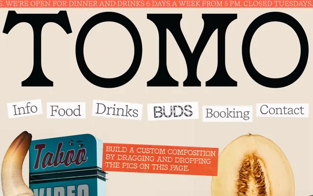
TOMO's design system is a collage-like, intentionally raw aesthetic, reminiscent of a zine or found-art compilation. It layers unconstrained imagery with stark, high-contrast typography and a simple, limited color palette focused on black, white, and a distinctive background tint. Visual elements often break traditional layout norms, appearing as cut-outs or overlapping pieces, eschewing typical component styling like consistent borders or backgrounds for a more deconstructed feel. The system prioritizes texture and visual surprise over smooth predictability, with text blocks often treated as separate, unaligned artifacts.
The page embraces a full-bleed, unconstrained layout, eschewing a fixed `pageMaxWidth` to allow visuals to extend to the edges. The hero section prominently features a very large, loosely centered typographic mark over the main background, with navigation items appearing as separate, displaced 'cut-out' text strips. Subsequent sections continue the collage pattern, with imagery and text blocks overlapping and appearing in an organic, non-grid-aligned fashion. There are no clear horizontal section dividers; vertical rhythm is established through varied bottom padding on content blocks, creating a dynamic, unpredictable flow. Navigation is presented as a series of distinct, rectangular text labels that float over content rather than a fixed bar.
The site utilizes a dense, maximalist collage approach, combining a wide array of high-quality, cut-out product photography (shrimp, strawberries, melons, rice cookers, crabs), street photography, and miscellaneous found objects (clamshells, bottle). Images are often irregularly shaped 'cut-outs' with raw edges, rather than contained frames. They aggressively overlap and layer to create a rich, chaotic texture. There is no consistent photographic style; product shots are crisp and isolated, while environmental shots are more contextual. The imagery serves as both decorative atmosphere and direct content, dominating visual space and creating an immersive, busy composition.
Reminiscent of Momofuku, The Infatuation, Superior Merchandise Company, Rough Trade NYC.
# TOMO — Style Reference
> Deconstructed Collage Zine

**Theme:** light

**Site:** https://tomoseattle.com

TOMO's design system is a collage-like, intentionally raw aesthetic, reminiscent of a zine or found-art compilation. It layers unconstrained imagery with stark, high-contrast typography and a simple, limited color palette focused on black, white, and a distinctive background tint. Visual elements often break traditional layout norms, appearing as cut-outs or overlapping pieces, eschewing typical component styling like consistent borders or backgrounds for a more deconstructed feel. The system prioritizes texture and visual surprise over smooth predictability, with text blocks often treated as separate, unaligned artifacts.

## Tokens — Colors

| Name | Value | Token | Role |
|------|------|------|------|
| Warning Red | `#ff6347` | `--color-warning-red` | Orange wash for highlight backgrounds, decorative bands, and soft emphasis behind content. Use as a supporting accent, not as a status color |
| Ink Black | `#000000` | `--color-ink-black` | Primary text, borders for textual elements, outlines for cutout components, strong graphic accents. Provides stark contrast against all backgrounds |
| Canvas White | `#ffffff` | `--color-canvas-white` | Hairline borders, dividers, input outlines, and card edges on light surfaces. Do not promote it to the primary CTA color |
| Found Paper | `#eee2d4` | `--color-found-paper` | Dominant page background, providing a subtle, warm, aged paper texture that serves as the visual base for the collage |
| Button Gray | `#efefef` | `--color-button-gray` | Background for utilitarian buttons, creating a subtle lift from the main background without introducing strong color |

## Tokens — Typography

### Recife
- **Substitute:** Playfair Display
- **Weights:** 300, 400
- **Sizes:** 26px, 32px
- **Line height:** 1, 1.3
- **Letter spacing:** normal
- **Role:** Primary display and heading font. Its weight variations (300, 400) allow for a subtle range in emphasis, contributing to the distinct, somewhat artisanal feel of the brand. Used for prominent text blocks.

### Times
- **Substitute:** Times New Roman
- **Weights:** 400
- **Sizes:** 13px
- **Line height:** 1.2
- **Letter spacing:** normal
- **Role:** Secondary text for informational details and captions, grounding the design in a familiar, readable serif style.

## Tokens — Spacing

- **Section gap:** 75px
- **Card padding:** 0px
- **Element gap:** 13px

## Tokens — Radius

- **none:** 0px

## Layout

The page embraces a full-bleed, unconstrained layout, eschewing a fixed `pageMaxWidth` to allow visuals to extend to the edges. The hero section prominently features a very large, loosely centered typographic mark over the main background, with navigation items appearing as separate, displaced 'cut-out' text strips. Subsequent sections continue the collage pattern, with imagery and text blocks overlapping and appearing in an organic, non-grid-aligned fashion. There are no clear horizontal section dividers; vertical rhythm is established through varied bottom padding on content blocks, creating a dynamic, unpredictable flow. Navigation is presented as a series of distinct, rectangular text labels that float over content rather than a fixed bar.

## Imagery

The site utilizes a dense, maximalist collage approach, combining a wide array of high-quality, cut-out product photography (shrimp, strawberries, melons, rice cookers, crabs), street photography, and miscellaneous found objects (clamshells, bottle). Images are often irregularly shaped 'cut-outs' with raw edges, rather than contained frames. They aggressively overlap and layer to create a rich, chaotic texture. There is no consistent photographic style; product shots are crisp and isolated, while environmental shots are more contextual. The imagery serves as both decorative atmosphere and direct content, dominating visual space and creating an immersive, busy composition.

## Components

### Standard Button
*Default interactive button style.*

Background: Button Gray (#efefef), Text: Ink Black (#000000), Border: 1px solid Ink Black (#000000), Padding: 1px top/bottom, 6px left/right. Square corners (0px radius).

### Transparent Card
*Container for content, often layered directly on the background.*

Background: transparent (rgba(0,0,0,0)). No border, no shadow, 0px border-radius. Padding: 0px. Often used for imagery that forms part of the collage.

### Subtle Transparent Card
*Used for slightly more pronounced content blocks that still maintain a lightweight feel.*

Background: almost transparent (rgba(0,0,0,0.004)). No border, no shadow, 0px border-radius. Padding: 0px. Used for content blocks that need a minimal visual separation without appearing as distinct cards.

### Navigation Link Strip
*Interactive text links for navigation or content categories.*

Text: Ink Black (#000000) using Recife (300-400), background transparent. Underlined with a 1px solid Ink Black border on hover/active. Each item typically includes 3px bottom padding.

## Guidelines

### Do

- Use Found Paper (#eee2d4) as the primary page background color to establish the warm, aged base.
- Employ Ink Black (#000000) for all primary text and critical UI borders for maximum contrast and graphic impact.
- Set all `border-radius` values to 0px to maintain the sharp, cut-out aesthetic; avoid rounded corners entirely.
- Utilize Recife font for headlines and prominent text, varying between 300 and 400 weights for subtle hierarchy at 26px or 32px size and 1.0-1.3 line height.
- Apply a 1px solid Ink Black (#000000) border to interactive elements and text blocks when a distinct visual separation or highlight is needed.
- Treat content sections less as structured blocks and more as overlapping or adjacent cutout elements, allowing for varied bottom padding values.
- Keep utilitarian buttons visually understated with Button Gray (#efefef) background and Ink Black (#000000) text and border.

### Don't

- Do not use any shadows for elevation; rely on overlaps, borders, and position for visual hierarchy.
- Avoid gradients anywhere in the UI; the system is built on solid color blocks and photographic textures.
- Do not introduce additional background or accent colors that deviate from the established neutral and single semantic red palette.
- Refrain from using consistent grid structures or even spacing across major content sections; embrace a deliberately 'unaligned' feel.
- Do not use letter-spacing other than 'normal' except where explicitly specified by type data.
- Avoid any visually 'smooth' or 'modern' components (e.g., pill buttons, soft shadows, subtle color ramps); prioritize a raw, artisanal feel.
- Do not use system fonts for prominent display text; adhere strictly to Recife for its distinct character.

## Agent Prompt Guide

Quick Color Reference:
text: #000000
background: #eee2d4
border: #000000
accent: no distinct accent color
primary action: no distinct CTA color

Example Component Prompts:
1. Create a primary headline: Text 'TOMO' in Recife, weight 400, size 32px, line height 1.0, color Ink Black (#000000).
2. Create a navigation link: Text 'Info' in Recife, weight 300, size 26px, line height 1.3, color Ink Black (#000000). Apply 3px bottom padding. On hover, add a 1px solid Ink Black (#000000) border bottom.
3. Create a utilitarian button: Background Button Gray (#efefef), text 'Close button' in Times, weight 400, size 13px, line height 1.2, color Ink Black (#000000). Border 1px solid Ink Black (#000000). Padding 1px top/bottom, 6px left/right. Radius 0px.
More like this






Keep what you find
A free account saves references to boards and can send you a weekly email of picks based on what you save.
To see every result, go Pro.