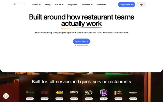
Preview image. Unlock full-res
Crisp Utility, Rounded Edges
Color palette
Primary Call-to-Action buttons, active states, decorative accents — a vivid, energetic blue that highlights key actions
Outlined button borders (e.g. navigation tabs), occasional decorative fills, text underlines – a secondary accent for subtle emphasis
Green text accent for links, tags, and emphasized short phrases
Decorative background of some cards, subtle highlight for secondary content blocks
Decorative background of some cards, subtle highlight for secondary content blocks
Dark card backgrounds (usually paired with light text)
Dark card backgrounds (usually paired with light text)
Dark card backgrounds (usually paired with light text)
Page backgrounds, card surfaces, dominant interactive elements text against blues
Primary text, prominent headlines, dark section backgrounds, card backgrounds
Hairline borders, subtle separators, inactive elements
Subtle background for secondary sections, card backgrounds within white areas
Secondary body text, helper text, captions — provides contrast without competing with main headlines
Typography
- Weights
- 400
- Sizes
- 11px, 12px, 14px, 16px, 18px, 36px, 64px
- Line height
- 1, 1.11, 1.14, 1.2, 1.3, 1.33, 1.38, 1.4, 1.5, 1.56
- Letter spacing
- -0.0500em at 64px, -0.0300em at 36px, -0.0250em at 18px, -0.0220em at 16px, -0.0200em at 14px
- Fallback
- Inter
Body text, navigation items, descriptive content, and primary headlines — a versatile, compact sans-serif that balances readability with a contemporary feel across all textual elements.
- Weights
- 500
- Sizes
- 11px, 12px, 14px, 16px, 18px, 24px, 28px, 36px, 40px, 48px, 64px, 120px, 150px
- Line height
- 0.75, 0.9, 0.93, 1, 1.1, 1.11, 1.33, 1.4, 1.43, 1.5
- Letter spacing
- -0.0300em at 150px, -0.0200em at 48px, -0.0180em at 24px, -0.0120em at 18px
- Fallback
- Inter
Call-to-action text, sub-headings, and emphasized content — providing subtle weight distinction for prominence without heavy boldness.
- Weights
- 400, 500
- Sizes
- 28px, 30px
- Line height
- 1, 1.5
- Letter spacing
- -0.0300em at 30px
- Fallback
- Kalam
Decorative headlines and accent text — a handwritten script that adds a personal, informal touch to selected titles.
- Weights
- 700
- Sizes
- 14px
- Line height
- 1.14
- Letter spacing
- 0.0250em at 14px
- Fallback
- Inter
Strong emphasis on small-form headings or labels — used sparingly for high impact within compact UI elements.
Spacing & shape
Components
Filled with Blueprint Blue (#4570ff), Canvas White (#ffffff) text, and a 9999px (pill-shaped) border-radius. Padding of 0px vertical and 16px horizontal. Uses 'Medium' font, 500 weight.
Transparent background (rgba(0,0,0,0)), Ink Black (#000000) text, 20px border-radius, no vertical/horizontal padding for text-only appearance. Uses 'Regular' font.
Canvas White (#ffffff) background, Ink Black (#000000) text, Divider Gray (#e5e7eb) border, 9999px border-radius. Padding 4px vertical, 10px horizontal. Uses 'Regular' font.
Whisper White (#f1f0ec) background, Ink Black (#000000) text, Divider Gray (#e5e7eb) border, 9999px border-radius. Padding 0px vertical, 16px horizontal. Uses 'Regular' font.
Canvas White (#ffffff) background, 20px border-radius, no shadow. Padding 28px on all sides. Content is self-contained.
Ink Black (#000000) background, 20px border-radius (rounded bottom and left corners on some variants), no shadow. Padding 40px on all sides. Used often for featured content or comparisons.
Ink Black (#000000) background, 40px border-radius (bottom corners only on some variants), no shadow. Top padding 60px; horizontal and bottom padding 0px to allow content to bleed. Often full-width background.
Semitransparent black (rgba(0,0,0,0.5)) background, 20px border-radius, no shadow. Padding 40px. Used for content that sits visually on top of imagery, allowing background to show through.
Guidelines
- Prioritize Blueprint Blue (#4570ff) for all primary calls-to-action to establish a consistent interactive focal point.
- Apply 9999px border-radius to all buttons for a friendly, pill-shaped aesthetic.
- Use Ink Black (#000000) for primary headlines and Canvas White (#ffffff) for card backgrounds, maintaining high contrast.
- Employ Divider Gray (#e5e7eb) for all hairline borders and subtle visual separations within components and between sections.
- Maintain a clear visual hierarchy with 'Regular' for body copy and 'Medium' for button text and subheadings.
- Utilize 20px border-radius for all standard cards to reinforce the consistent soft-edged design language.
- Implement the fixed vertical element gap of 8px when arranging discrete UI elements within components or sections.
- Avoid using multiple vivid accent colors simultaneously; limit to Blueprint Blue for primary actions and occasional Soft Orange Highlight (#ff6808) for secondary emphasis.
- Do not introduce hard, sharp corners; use the established radii of 20px, 40px, or 9999px where appropriate.
- Refrain from using strong box-shadows or drop shadows; the system relies on flat surfaces and minimal elevation.
- Do not deviate from the 'Regular' and 'Medium' font families for core UI text; 'Nanum Pen Script' is reserved for highly decorative titles.
- Avoid using primary text in any color other than Ink Black (#000000) on light backgrounds or Canvas White (#ffffff) on dark backgrounds.
- Do not use overly complex gradients; the system favors solid colors and subtle accent washes.
- Avoid dense, information-heavy blocks; ensure generous padding (28px minimum for cards) and vertical spacing between elements.
About this system
ShowHide
7shifts employs a functional and approachable design system, combining a crisp white and dark gray achromatic base with a singular vivid blue accent for key interactions. Typography provides clear hierarchy, with a custom `Regular` font family for all content up to large headlines. Components are lightweight and often borderless, emphasizing content over chrome, while subtle rounding creates a friendly, modern feel across cards and buttons. The system balances directness with a degree of visual softness.
The page primarily uses a contained layout model, with content centered within a maximum width (implied, not explicitly stated as it's null, but visually constrained). The hero section typically features a large, centered headline over a white background, occasionally transitioning to a full-bleed dark feature panel at the bottom of the hero area. Section rhythm is driven by alternating background colors, moving between Canvas White (#ffffff) and Whisper White (#f1f0ec), punctuated by occasional full-bleed dark sections (Ink Black #000000) or colorful accent sections (e.g. Spring Green or Lavender Mist cards). Content is often arranged in symmetrical stacks or two-column text-left/image-right patterns. Card grids are utilized for features, maintaining consistent spacing. The navigation is a sticky top bar, containing text links, a primary CTA button, and a secondary login button.
The imagery style is a mix of product screenshots, often presented within mock UI frames, and abstract flat graphic illustrations for decorative purposes. Product screenshots are typically sharp, clear, and focused on showing the interface without distracting backgrounds. Illustrations are primarily flat, organic shapes, relying on brand colors (like Spring Green, Lavender Mist, and Sky Blue Light) to add a modern, soft visual texture. Icons are filled, with a consistent stroke weight where outlines exist, and are monochromatic in Ink Black or Canvas White, or tinted with Blueprint Blue for interactive states. Imagery primarily serves to explain or enhance content, acting as visual support and product showcases rather than decorative atmosphere. Density is moderate; imagery is used to break up text-heavy sections or highlight features.
Reminiscent of Calendly, Figma, Asana.
# 7shifts — Style Reference
> Crisp Utility, Rounded Edges

**Theme:** light

**Site:** https://www.7shifts.com

7shifts employs a functional and approachable design system, combining a crisp white and dark gray achromatic base with a singular vivid blue accent for key interactions. Typography provides clear hierarchy, with a custom `Regular` font family for all content up to large headlines. Components are lightweight and often borderless, emphasizing content over chrome, while subtle rounding creates a friendly, modern feel across cards and buttons. The system balances directness with a degree of visual softness.

## Tokens — Colors

| Name | Value | Token | Role |
|------|------|------|------|
| Blueprint Blue | `#4570ff` | `--color-blueprint-blue` | Primary Call-to-Action buttons, active states, decorative accents — a vivid, energetic blue that highlights key actions |
| Soft Orange Highlight | `#ff6808` | `--color-soft-orange-highlight` | Outlined button borders (e.g. navigation tabs), occasional decorative fills, text underlines – a secondary accent for subtle emphasis |
| Spring Green | `#c6ff94` | `--color-spring-green` | Green text accent for links, tags, and emphasized short phrases |
| Lavender Mist | `#ebdcff` | `--color-lavender-mist` | Decorative background of some cards, subtle highlight for secondary content blocks |
| Sky Blue Light | `#d6e0ff` | `--color-sky-blue-light` | Decorative background of some cards, subtle highlight for secondary content blocks |
| Midnight Forest | `#244f47` | `--color-midnight-forest` | Dark card backgrounds (usually paired with light text) |
| Deep Plum | `#c293f1` | `--color-deep-plum` | Dark card backgrounds (usually paired with light text) |
| Rich Indigo | `#193f78` | `--color-rich-indigo` | Dark card backgrounds (usually paired with light text) |
| Canvas White | `#ffffff` | `--color-canvas-white` | Page backgrounds, card surfaces, dominant interactive elements text against blues |
| Ink Black | `#000000` | `--color-ink-black` | Primary text, prominent headlines, dark section backgrounds, card backgrounds |
| Divider Gray | `#e5e7eb` | `--color-divider-gray` | Hairline borders, subtle separators, inactive elements |
| Whisper White | `#f1f0ec` | `--color-whisper-white` | Subtle background for secondary sections, card backgrounds within white areas |
| Muted Text Gray | `#6e6d6c` | `--color-muted-text-gray` | Secondary body text, helper text, captions — provides contrast without competing with main headlines |

## Tokens — Typography

### Regular
- **Substitute:** Inter
- **Weights:** 400
- **Sizes:** 11px, 12px, 14px, 16px, 18px, 36px, 64px
- **Line height:** 1, 1.11, 1.14, 1.2, 1.3, 1.33, 1.38, 1.4, 1.5, 1.56
- **Letter spacing:** -0.0500em at 64px, -0.0300em at 36px, -0.0250em at 18px, -0.0220em at 16px, -0.0200em at 14px
- **Role:** Body text, navigation items, descriptive content, and primary headlines — a versatile, compact sans-serif that balances readability with a contemporary feel across all textual elements.

### Medium
- **Substitute:** Inter
- **Weights:** 500
- **Sizes:** 11px, 12px, 14px, 16px, 18px, 24px, 28px, 36px, 40px, 48px, 64px, 120px, 150px
- **Line height:** 0.75, 0.9, 0.93, 1, 1.1, 1.11, 1.33, 1.4, 1.43, 1.5
- **Letter spacing:** -0.0300em at 150px, -0.0200em at 48px, -0.0180em at 24px, -0.0120em at 18px
- **Role:** Call-to-action text, sub-headings, and emphasized content — providing subtle weight distinction for prominence without heavy boldness.

### Nanum Pen Script
- **Substitute:** Kalam
- **Weights:** 400, 500
- **Sizes:** 28px, 30px
- **Line height:** 1, 1.5
- **Letter spacing:** -0.0300em at 30px
- **Role:** Decorative headlines and accent text — a handwritten script that adds a personal, informal touch to selected titles.

### Bold
- **Substitute:** Inter
- **Weights:** 700
- **Sizes:** 14px
- **Line height:** 1.14
- **Letter spacing:** 0.0250em at 14px
- **Role:** Strong emphasis on small-form headings or labels — used sparingly for high impact within compact UI elements.

## Tokens — Type Scale

Augmented Fourth (1.414) from 14px base.

| Role | Size | Line height | Letter spacing |
|------|------|------|------|
| caption | 11px | 1.5 | — |
| body | 14px | 1.5 | -0.28px |
| heading-sm | 18px | 1.33 | -0.45px |
| heading | 36px | 1.33 | -1.08px |
| heading-lg | 48px | 1.1 | -0.96px |
| display | 64px | 1.11 | -3.2px |

## Tokens — Spacing

- **Section gap:** 24px
- **Card padding:** 28px
- **Element gap:** 8px

## Tokens — Radius

- **General:** 12px
- **Buttons:** 9999px
- **Cards:** 20px
- **emphasizedCard:** 24px
- **headerTabs:** 16px
- **icons:** 8px
- **largeElements:** 40px

## Layout

The page primarily uses a contained layout model, with content centered within a maximum width (implied, not explicitly stated as it's null, but visually constrained). The hero section typically features a large, centered headline over a white background, occasionally transitioning to a full-bleed dark feature panel at the bottom of the hero area. Section rhythm is driven by alternating background colors, moving between Canvas White (#ffffff) and Whisper White (#f1f0ec), punctuated by occasional full-bleed dark sections (Ink Black #000000) or colorful accent sections (e.g. Spring Green or Lavender Mist cards). Content is often arranged in symmetrical stacks or two-column text-left/image-right patterns. Card grids are utilized for features, maintaining consistent spacing. The navigation is a sticky top bar, containing text links, a primary CTA button, and a secondary login button.

## Imagery

The imagery style is a mix of product screenshots, often presented within mock UI frames, and abstract flat graphic illustrations for decorative purposes. Product screenshots are typically sharp, clear, and focused on showing the interface without distracting backgrounds. Illustrations are primarily flat, organic shapes, relying on brand colors (like Spring Green, Lavender Mist, and Sky Blue Light) to add a modern, soft visual texture. Icons are filled, with a consistent stroke weight where outlines exist, and are monochromatic in Ink Black or Canvas White, or tinted with Blueprint Blue for interactive states. Imagery primarily serves to explain or enhance content, acting as visual support and product showcases rather than decorative atmosphere. Density is moderate; imagery is used to break up text-heavy sections or highlight features.

## Components

### Primary Call-to-Action Button
*High-priority action trigger*

Filled with Blueprint Blue (#4570ff), Canvas White (#ffffff) text, and a 9999px (pill-shaped) border-radius. Padding of 0px vertical and 16px horizontal. Uses 'Medium' font, 500 weight.

### Ghost Navigation Button
*Secondary navigation and internal links within headers.*

Transparent background (rgba(0,0,0,0)), Ink Black (#000000) text, 20px border-radius, no vertical/horizontal padding for text-only appearance. Uses 'Regular' font.

### White Pill Button
*General secondary action or tag.*

Canvas White (#ffffff) background, Ink Black (#000000) text, Divider Gray (#e5e7eb) border, 9999px border-radius. Padding 4px vertical, 10px horizontal. Uses 'Regular' font.

### Whisper White Tag Button
*Informational tags or filter options.*

Whisper White (#f1f0ec) background, Ink Black (#000000) text, Divider Gray (#e5e7eb) border, 9999px border-radius. Padding 0px vertical, 16px horizontal. Uses 'Regular' font.

### Standard Card
*Content grouping, feature display, informational blocks.*

Canvas White (#ffffff) background, 20px border-radius, no shadow. Padding 28px on all sides. Content is self-contained.

### Dark Overlay Card
*Elevated content overlay or feature block on dark backgrounds.*

Ink Black (#000000) background, 20px border-radius (rounded bottom and left corners on some variants), no shadow. Padding 40px on all sides. Used often for featured content or comparisons.

### Full-Width Dark Feature Panel
*Hero section content, prominent feature showcase.*

Ink Black (#000000) background, 40px border-radius (bottom corners only on some variants), no shadow. Top padding 60px; horizontal and bottom padding 0px to allow content to bleed. Often full-width background.

### Frosted Glass Card
*Background for overlaid content, subtle visual interest.*

Semitransparent black (rgba(0,0,0,0.5)) background, 20px border-radius, no shadow. Padding 40px. Used for content that sits visually on top of imagery, allowing background to show through.

## Guidelines

### Do

- Prioritize Blueprint Blue (#4570ff) for all primary calls-to-action to establish a consistent interactive focal point.
- Apply 9999px border-radius to all buttons for a friendly, pill-shaped aesthetic.
- Use Ink Black (#000000) for primary headlines and Canvas White (#ffffff) for card backgrounds, maintaining high contrast.
- Employ Divider Gray (#e5e7eb) for all hairline borders and subtle visual separations within components and between sections.
- Maintain a clear visual hierarchy with 'Regular' for body copy and 'Medium' for button text and subheadings.
- Utilize 20px border-radius for all standard cards to reinforce the consistent soft-edged design language.
- Implement the fixed vertical element gap of 8px when arranging discrete UI elements within components or sections.

### Don't

- Avoid using multiple vivid accent colors simultaneously; limit to Blueprint Blue for primary actions and occasional Soft Orange Highlight (#ff6808) for secondary emphasis.
- Do not introduce hard, sharp corners; use the established radii of 20px, 40px, or 9999px where appropriate.
- Refrain from using strong box-shadows or drop shadows; the system relies on flat surfaces and minimal elevation.
- Do not deviate from the 'Regular' and 'Medium' font families for core UI text; 'Nanum Pen Script' is reserved for highly decorative titles.
- Avoid using primary text in any color other than Ink Black (#000000) on light backgrounds or Canvas White (#ffffff) on dark backgrounds.
- Do not use overly complex gradients; the system favors solid colors and subtle accent washes.
- Avoid dense, information-heavy blocks; ensure generous padding (28px minimum for cards) and vertical spacing between elements.

## Agent Prompt Guide

Quick Color Reference:
text: #000000
background: #ffffff
border: #e5e7eb
accent: #ff6808
primary action: #4570ff (filled action)

Example Component Prompts:
1. Create a primary CTA button: Blueprint Blue background (#4570ff), Canvas White text (#ffffff), 9999px border-radius, 0px vertical and 16px horizontal padding. Text 'Get started now', 16px 'Medium' font, 500 weight.
2. Create a standard content card: Canvas White background (#ffffff), 20px border-radius, 28px padding on all sides. Headline 'Flexible Scheduling', 36px 'Regular' font (#000000), body text 'Easily manage shifts and team availability', 16px 'Regular' font (#000000).
3. Create a dark feature panel (full width): Ink Black background (#000000), 40px border-radius (bottom corners only visually), 60px top padding. Headline 'Unified Platform', 48px 'Medium' font (#ffffff), body text 'Streamline operations from a single dashboard', 18px 'Regular' font (#ffffff).
More like this









Keep what you find
A free account saves references to boards and can send you a weekly email of picks based on what you save.
To see every result, go Pro.