Preview image. Unlock full-res
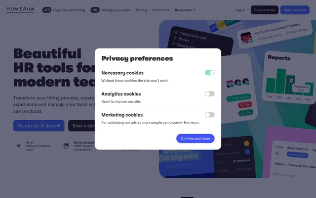
Warm, playful professionalism with soft edges.
Color palette
Primary action buttons, active navigation states, interactive links, brand accents — a vibrant, trustworthy blue
Distinctive card shadow color — a playful, vibrant elevation cue
Secondary action button fill and border
Soft background washes, decorative card elements
Decorative card backgrounds, accent surfaces
Green action color for filled buttons, selected navigation states, and focused conversion moments. Use as a supporting accent, not as a status color
Page backgrounds, card surfaces, ghost button backgrounds, default text color on dark surfaces
Secondary card surfaces, subtle background variations
Tertiary card backgrounds, button borders, subtle surface accents
Muted text, secondary navigation links, subtle borders
Primary text, darker borders, icon fills, placeholder text
Headline text, strong accents, button text on light surfaces
Strongest contrast for headlines and critical information
Typography
- Weights
- 400, 500, 700
- Sizes
- 13px, 14px, 16px, 18px, 20px, 22px, 28px, 50px
- Line height
- 1.11, 1.2, 1.25, 1.3, 1.38, 1.4, 1.43, 1.44, 1.45, 2
- Letter spacing
- normal
- Fallback
- Inter
Primary UI text, body copy, navigation, buttons, and most informational elements. Its clarity and range of weights provide a solid, readable foundation.
- Weights
- 900
- Sizes
- 20px, 22px, 30px, 34px, 48px, 64px, 82px
- Line height
- 1, 1.1, 1.18, 1.2, 1.4
- Letter spacing
- -0.0230em at 82px, -0.0160em at 64px, -0.0150em at 48px, -0.0070em at 34px, -0.0040em at 30px
- Fallback
- Montserrat
Display headlines and hero text. The extra bold weight and subtle, proportional negative letter-spacing give it a confident, modern presence without being overly aggressive.
- Weights
- 400
- Sizes
- 22px
- Line height
- 1.4
- Letter spacing
- normal
- Fallback
- DM Serif Display
Likely used for decorative quotes or specific brand messaging, bringing an artistic, serif touch.
Spacing & shape
Elevation
Components
Text: Charcoal Coffee (#4a3e3e), no background. Border: Charcoal Coffee (#4a3e3e), 0px radius. Padding: 14px vertical, 20-24px horizontal. Appears as a text link with a bottom border on hover.
Background: Royal Blue (#4f75fe), Text: Canvas White (#ffffff). Radius: 12px. Padding: 12px vertical, 16-20px horizontal. Emphasizes urgency and brand identity.
Background: Canvas White (#ffffff), Text: Charcoal Coffee (#4a3e3e). Border: Paper Beige (#edebe7). Radius: 10px. Padding: 12px vertical, 16-20px horizontal.
Background: Transparent. Text: Deep Mocha (#2d2323). Border: Deep Mocha (#2d2323). Radius: 10px. Padding: 0px vertical, 0-12px horizontal. Used for compact actions, often with an arrow icon.
Background: Grape Punch (#f0a8fa). Radius: 20px. Box Shadow: Bubblegum Pink (#d386de) 0px 4px 5px 0px. Padding: 60px vertical, 50px horizontal.
Background: Vanilla Cream (#faf9f7) or Paper Beige (#edebe7). Radius: 20-40px. No shadow. Padding: 40-48px vertical, 48-64px horizontal.
Background: rgba(45, 35, 35, 0.1). Text: Charcoal Coffee (#4a3e3e). Border: Warm Gray (#595d68). Radius: 30px (left side), 0px (right side). Padding: 8px vertical, 12-20px horizontal for a pill-like shape.
Background: Canvas White (#ffffff). Radius: 20px. No shadow. Padding: Not directly specified, but internally uses standard component structure.
Background: Rich Blue (#4353ff). Text: Canvas White (#ffffff). Border: Rich Blue (#4353ff). Radius: 12px. Padding: 12px vertical, 16-20px horizontal.
Background: Spring Green (#00c275). Text: Canvas White (#ffffff). Border radius: 12px. Padding: 12px vertical, 16px horizontal. Signifies HR-related content.
Guidelines
- Prioritize Royal Blue (#4f75fe) for primary actions and active states.
- Use GT Walsheim 900 for all display and large headlines, applying proportional negative letter-spacing for visual punch.
- Apply generous padding (40-60px vertical, 48-64px horizontal) to cards to create a spacious feel.
- Utilize soft, organic border radii: 20px for most cards, up to 40px for larger decorative cards, and 10-12px for buttons.
- Employ the Bubblegum Pink (#d386de) for soft, vibrant card shadows, moving away from conventional grayscale shadows.
- Maintain a clear hierarchy: Deep Mocha (#2d2323) for headlines, Charcoal Coffee (#4a3e3e) for body text, and Warm Gray (#736b6b) for muted or secondary information.
- Leverage Canvas White (#ffffff), Vanilla Cream (#faf9f7), and Paper Beige (#edebe7) for layered background surfaces.
- Avoid harsh, sharp corners; all component corners should have a radius of at least 10px.
- Do not use dark, heavy shadows; opt for the light-hearted Bubblegum Pink (#d386de) shadow or no shadow.
- Do not introduce new saturated hues outside of Royal Blue (#4f75fe) or the accent purples and pinks for UI elements.
- Do not use highly dense layouts; ensure ample negative space around elements and between sections.
- Do not use generic system fonts for any text role; always use GT America or GT Walsheim (or their recommended substitutes).
- Avoid purely black text (#000000) for standard body copy; reserve it for high-contrast headlines or specific bold statements.
- Do not center-align large blocks of body text; left-align for readability.
About this system
ShowHide
Homerun employs a whimsical, modern aesthetic through a muted, earthy color palette punctuated by vibrant, deep blues and a playful use of soft, chunky card shadows. Typography is clean and confident, creating a comfortable information hierarchy. Components feature generous padding, organic rounded corners, and a light-hearted visual rhythm that prioritizes a friendly user experience over stark efficiency.
The page uses a contained layout with some full-bleed hero sections. Max width isn't explicitly defined visually but elements are centrally aligned. Hero sections often feature large, bold headlines centered over backgrounds, with content typically structured in alternating left-text/right-visual or right-text/left-visual blocks. Features are presented in multi-column card grids, emphasizing the soft-edged, spaced-out card components. Vertical rhythm is established through consistent section gaps and generous component padding. The primary navigation is a sticky top bar with clearly delineated sections.
Imagery features a mix of conceptual illustrations and product screenshots, often combined. Illustrations are abstract, feature organic shapes and are rendered in muted, brand-aligned colors. Photography, when present, tends to be tightly cropped on subjects, minimizing busy backgrounds. Icons are generally outlined, with a moderate stroke weight, and monochrome in brand colors or neutrals. Imagery serves both decorative and explanatory roles, adding a friendly and approachable feel.
Reminiscent of Framer, Notion, Linear, Webflow.
# Homerun — Style Reference
> Warm, playful professionalism with soft edges.

**Theme:** light

**Site:** https://www.homerun.co

Homerun employs a whimsical, modern aesthetic through a muted, earthy color palette punctuated by vibrant, deep blues and a playful use of soft, chunky card shadows. Typography is clean and confident, creating a comfortable information hierarchy. Components feature generous padding, organic rounded corners, and a light-hearted visual rhythm that prioritizes a friendly user experience over stark efficiency.

## Tokens — Colors

| Name | Value | Token | Role |
|------|------|------|------|
| Royal Blue | `#4f75fe` | `--color-royal-blue` | Primary action buttons, active navigation states, interactive links, brand accents — a vibrant, trustworthy blue |
| Bubblegum Pink | `#d386de` | `--color-bubblegum-pink` | Distinctive card shadow color — a playful, vibrant elevation cue |
| Rich Blue | `#4353ff` | `--color-rich-blue` | Secondary action button fill and border |
| Oceanic Blue | `#c9d5fd` | `--color-oceanic-blue` | Soft background washes, decorative card elements |
| Grape Punch | `#f0a8fa` | `--color-grape-punch` | Decorative card backgrounds, accent surfaces |
| Spring Green | `#00c275` | `--color-spring-green` | Green action color for filled buttons, selected navigation states, and focused conversion moments. Use as a supporting accent, not as a status color |
| Canvas White | `#ffffff` | `--color-canvas-white` | Page backgrounds, card surfaces, ghost button backgrounds, default text color on dark surfaces |
| Vanilla Cream | `#faf9f7` | `--color-vanilla-cream` | Secondary card surfaces, subtle background variations |
| Paper Beige | `#edebe7` | `--color-paper-beige` | Tertiary card backgrounds, button borders, subtle surface accents |
| Warm Gray | `#736b6b` | `--color-warm-gray` | Muted text, secondary navigation links, subtle borders |
| Charcoal Coffee | `#4a3e3e` | `--color-charcoal-coffee` | Primary text, darker borders, icon fills, placeholder text |
| Deep Mocha | `#2d2323` | `--color-deep-mocha` | Headline text, strong accents, button text on light surfaces |
| True Black | `#000000` | `--color-true-black` | Strongest contrast for headlines and critical information |

## Tokens — Typography

### GT America
- **Substitute:** Inter
- **Weights:** 400, 500, 700
- **Sizes:** 13px, 14px, 16px, 18px, 20px, 22px, 28px, 50px
- **Line height:** 1.11, 1.2, 1.25, 1.3, 1.38, 1.4, 1.43, 1.44, 1.45, 2
- **Letter spacing:** normal
- **Role:** Primary UI text, body copy, navigation, buttons, and most informational elements. Its clarity and range of weights provide a solid, readable foundation.

### GT Walsheim
- **Substitute:** Montserrat
- **Weights:** 900
- **Sizes:** 20px, 22px, 30px, 34px, 48px, 64px, 82px
- **Line height:** 1, 1.1, 1.18, 1.2, 1.4
- **Letter spacing:** -0.0230em at 82px, -0.0160em at 64px, -0.0150em at 48px, -0.0070em at 34px, -0.0040em at 30px
- **Role:** Display headlines and hero text. The extra bold weight and subtle, proportional negative letter-spacing give it a confident, modern presence without being overly aggressive.

### Oliver
- **Substitute:** DM Serif Display
- **Weights:** 400
- **Sizes:** 22px
- **Line height:** 1.4
- **Letter spacing:** normal
- **Role:** Likely used for decorative quotes or specific brand messaging, bringing an artistic, serif touch.

## Tokens — Type Scale

Perfect Fourth (1.333) from 16px base.

| Role | Size | Line height | Letter spacing |
|------|------|------|------|
| caption | 13px | 1.45 | — |
| body | 16px | 1.43 | — |
| subheading | 20px | 1.25 | — |
| heading-sm | 22px | 1.2 | — |
| heading | 30px | 1.2 | -0.12px |
| heading-lg | 48px | 1.18 | -0.72px |
| display | 82px | 1 | -1.89px |

## Tokens — Spacing

- **Section gap:** 43px
- **Card padding:** 12px
- **Element gap:** 8px

## Tokens — Radius

- **Default:** 10px
- **Buttons:** 10-12px
- **Inputs:** 30px
- **Cards:** 20-40px
- **links:** 100px

## Tokens — Elevation

- **Hero Card:** `rgb(211, 134, 222) 0px 4px 5px 0px`
- **Button Focus:** `rgb(227, 225, 221) 0px 2px 0px 0.5px`

## Layout

The page uses a contained layout with some full-bleed hero sections. Max width isn't explicitly defined visually but elements are centrally aligned. Hero sections often feature large, bold headlines centered over backgrounds, with content typically structured in alternating left-text/right-visual or right-text/left-visual blocks. Features are presented in multi-column card grids, emphasizing the soft-edged, spaced-out card components. Vertical rhythm is established through consistent section gaps and generous component padding. The primary navigation is a sticky top bar with clearly delineated sections.

## Imagery

Imagery features a mix of conceptual illustrations and product screenshots, often combined. Illustrations are abstract, feature organic shapes and are rendered in muted, brand-aligned colors. Photography, when present, tends to be tightly cropped on subjects, minimizing busy backgrounds. Icons are generally outlined, with a moderate stroke weight, and monochrome in brand colors or neutrals. Imagery serves both decorative and explanatory roles, adding a friendly and approachable feel.

## Components

### Ghost Navigation Button
*Secondary navigation and utility actions.*

Text: Charcoal Coffee (#4a3e3e), no background. Border: Charcoal Coffee (#4a3e3e), 0px radius. Padding: 14px vertical, 20-24px horizontal. Appears as a text link with a bottom border on hover.

### Primary CTA Button
*Key conversion action.*

Background: Royal Blue (#4f75fe), Text: Canvas White (#ffffff). Radius: 12px. Padding: 12px vertical, 16-20px horizontal. Emphasizes urgency and brand identity.

### Standard Button
*General purpose buttons.*

Background: Canvas White (#ffffff), Text: Charcoal Coffee (#4a3e3e). Border: Paper Beige (#edebe7). Radius: 10px. Padding: 12px vertical, 16-20px horizontal.

### Small Text Button with Icon
*In-line actions or links within denser content.*

Background: Transparent. Text: Deep Mocha (#2d2323). Border: Deep Mocha (#2d2323). Radius: 10px. Padding: 0px vertical, 0-12px horizontal. Used for compact actions, often with an arrow icon.

### Hero Card with Playful Shadow
*Visually appealing content blocks.*

Background: Grape Punch (#f0a8fa). Radius: 20px. Box Shadow: Bubblegum Pink (#d386de) 0px 4px 5px 0px. Padding: 60px vertical, 50px horizontal.

### Neutral Content Card
*Standard content containers, features, testimonials.*

Background: Vanilla Cream (#faf9f7) or Paper Beige (#edebe7). Radius: 20-40px. No shadow. Padding: 40-48px vertical, 48-64px horizontal.

### Outline Input
*User input fields.*

Background: rgba(45, 35, 35, 0.1). Text: Charcoal Coffee (#4a3e3e). Border: Warm Gray (#595d68). Radius: 30px (left side), 0px (right side). Padding: 8px vertical, 12-20px horizontal for a pill-like shape.

### Cookie Consent Modal
*Legal consent UI.*

Background: Canvas White (#ffffff). Radius: 20px. No shadow. Padding: Not directly specified, but internally uses standard component structure.

### Cookie Consent Confirm Button
*Action within cookie consent modal.*

Background: Rich Blue (#4353ff). Text: Canvas White (#ffffff). Border: Rich Blue (#4353ff). Radius: 12px. Padding: 12px vertical, 16-20px horizontal.

### HR Feature Tag
*Categorization or feature highlight.*

Background: Spring Green (#00c275). Text: Canvas White (#ffffff). Border radius: 12px. Padding: 12px vertical, 16px horizontal. Signifies HR-related content.

## Guidelines

### Do

- Prioritize Royal Blue (#4f75fe) for primary actions and active states.
- Use GT Walsheim 900 for all display and large headlines, applying proportional negative letter-spacing for visual punch.
- Apply generous padding (40-60px vertical, 48-64px horizontal) to cards to create a spacious feel.
- Utilize soft, organic border radii: 20px for most cards, up to 40px for larger decorative cards, and 10-12px for buttons.
- Employ the Bubblegum Pink (#d386de) for soft, vibrant card shadows, moving away from conventional grayscale shadows.
- Maintain a clear hierarchy: Deep Mocha (#2d2323) for headlines, Charcoal Coffee (#4a3e3e) for body text, and Warm Gray (#736b6b) for muted or secondary information.
- Leverage Canvas White (#ffffff), Vanilla Cream (#faf9f7), and Paper Beige (#edebe7) for layered background surfaces.

### Don't

- Avoid harsh, sharp corners; all component corners should have a radius of at least 10px.
- Do not use dark, heavy shadows; opt for the light-hearted Bubblegum Pink (#d386de) shadow or no shadow.
- Do not introduce new saturated hues outside of Royal Blue (#4f75fe) or the accent purples and pinks for UI elements.
- Do not use highly dense layouts; ensure ample negative space around elements and between sections.
- Do not use generic system fonts for any text role; always use GT America or GT Walsheim (or their recommended substitutes).
- Avoid purely black text (#000000) for standard body copy; reserve it for high-contrast headlines or specific bold statements.
- Do not center-align large blocks of body text; left-align for readability.

## Agent Prompt Guide

Quick Color Reference:
text: #4a3e3e
background: #ffffff
border: #edebe7
accent: #f0a8fa
primary action: #4f75fe (filled action)

Example Component Prompts:
1. Create a Primary CTA Button: Royal Blue (#4f75fe) background, Canvas White (#ffffff) text, 12px radius, 12px vertical padding, 16px horizontal padding. Text uses GT America 500, 16px.
2. Design a Hero Card: Grape Punch (#f0a8fa) background, 20px radius, Bubblegum Pink (#d386de) 0px 4px 5px 0px box shadow, 60px vertical padding, 50px horizontal padding. Headline uses GT Walsheim 900, 64px, Deep Mocha (#2d2323), letter-spacing -1.02px.
3. Implement a Neutral Content Card: Vanilla Cream (#faf9f7) background, 40px radius, no shadow, 48px vertical padding, 64px horizontal padding. Body text uses GT America 400, 16px, Charcoal Coffee (#4a3e3e).
4. Build an Outline Input Field: rgba(45, 35, 35, 0.1) background, Charcoal Coffee (#4a3e3e) text, Warm Gray (#595d68) border, 30px radius on left, 0px on right, 8px vertical padding, 20px left padding, 12px right padding. Placeholder text in Warm Gray (#736b6b).
5. Create a Ghost Navigation Button: Transparent background, Charcoal Coffee (#4a3e3e) text, no border. Padding 14px vertical, 24px horizontal. Text uses GT America 500, 14px.
More like this









Keep what you find
A free account saves references to boards and can send you a weekly email of picks based on what you save.
To see every result, go Pro.