Preview image. Unlock full-res
Minimalist alpine clean
Color palette
Highlight text, decorative borders, unique element accents (e.g. email input border focus). The sole chromatic accent, used sparingly to draw attention to specific informational elements
Primary text, major headings, borders, button backgrounds (filled), active icons, primary action borders for ghost buttons. Controls the stark contrast against light surfaces
Canvas background, card backgrounds, text on dark buttons, interactive element backgrounds. Provides a clean, bright foundation
Secondary surface background for cards and featured sections, subtle variant from pure white to introduce warmth and depth. Often used for subtle elevation
Footer background, very subtle content section backgrounds. A soft, warm off-white, slightly darker than Greige Canvas, for grounding elements
Muted text, secondary link color, subtle borders, inactive elements. Provides a softer secondary textual element
Typography
- Weights
- 400, 600
- Sizes
- 14px, 16px, 18px, 23px, 25px, 36px, 38px, 88px
- Line height
- 1, 1.05, 1.19, 1.2, 1.4, 1.45
- Letter spacing
- -0.02em, 0.02em, 0.04em, 0.10em
- Fallback
- Inter
Primary and secondary headings, call-to-action text, navigation items, and descriptive body text. Its wide range of weights and letter-spacing options allow it to establish strong hierarchy and impact, from large, tracked-out display text to compact labels.
- Weights
- 300, 400
- Sizes
- 24px, 38px
- Line height
- 1.05, 1.2, 1.33
- Letter spacing
- -0.43em, -0.02em
- Fallback
- Playfair Display
Hero headlines, sometimes used for subheadings. The very tight negative letter-spacing at large sizes creates a distinctive, impactful, almost sculptural text block, while the serif character adds a touch of classic authority.
- Weights
- 400
- Sizes
- 12px
- Line height
- 1.33
- Letter spacing
- -0.02em
- Fallback
- Space Mono
Small functional text like captions, labels, and metadata. Its monospace nature provides a technical, precise feel for auxiliary information.
Spacing & shape
Components
Transparent background with a 1px border of Alabaster White. Text is Alabaster White, practice font at a variable size. No padding directly applied to the button, but often contained within larger elements. Radius is 0px for sharp edges.
Transparent background with a 1px border of Midnight Ink. Text is Midnight Ink, practice font at a variable size. Padding of 0px top/bottom and 12px left/right. Radius is 0px for sharp edges.
Solid Alabaster White background with Midnight Ink text. Practice font, 0px top/bottom padding, 32px left/right padding, and a prominent 32px border radius for a soft, pill-like shape. Has a 1px Midnight Ink border.
Background is Greige Canvas, no shadow, with 12px border radius. Generous 72px padding on all sides, creating substantial negative space around content.
Transparent background with Midnight Ink text. Features a subtle 1px border in a very light gray (rgba(0,0,0,0.12)). Rounded corners with an 8px border radius. Padding of 20px top/bottom and 24px left/right.
Transparent background with Alabaster White text. Uses a 6px border radius. No specific padding defined, relies on content wrapping.
Transparent background with Midnight Ink text. Uses a 0px border radius. No specific padding defined, relies on content wrapping.
Guidelines
- Use Midnight Ink (#000000) for all primary text and major headlines to maintain high contrast and legibility.
- Apply Alabaster White (#ffffff) for primary canvas backgrounds and text on dark elements, supporting the clean aesthetic.
- Introduce warmth and subtle hierarchy on light surfaces by using Greige Canvas (#f7f5ee) for cards and secondary content blocks.
- Prioritize the 'practice' font for all interactive elements, navigation, and most body text, using its variable weights and letter-spacing to control emphasis.
- Reserve the 'plantin' font with aggressive negative letter-spacing for impactful, large display headlines to create a distinctive brand presence.
- Employ the Harvest Gold (#a77a41) accent color extremely sparingly, primarily for functional highlights like input borders or specific, small informational text.
- Maintain generous spacing around elements and within content blocks, using 72px padding for cards and a comfortable 24px element gap to enhance readability and the sense of premium quality.
- Avoid using multiple accent colors; stick to Harvest Gold for all chromatic emphasis.
- Do not introduce heavy shadows or gradients; rely on color temperature and subtle background shifts (e.g., from Alabaster White to Greige Canvas) for depth.
- Do not use generic system fonts; always specify 'practice', 'plantin', or 'lab-mono' to preserve brand identity.
- Refrain from tight, cramped layouts; ensure ample whitespace, especially around components like cards and headings, to support the spacious and natural feel.
- Do not deviate from the specified border radii (e.g., 32px for pill buttons, 12px for cards, 8px for inputs) to maintain design consistency.
- Avoid using Harvest Gold for large text blocks or backgrounds; its impact is derived from its scarcity.
- Do not use highly saturated or neon colors; the palette is deliberately muted and natural, with Harvest Gold being the only chromatic exception.
About this system
ShowHide
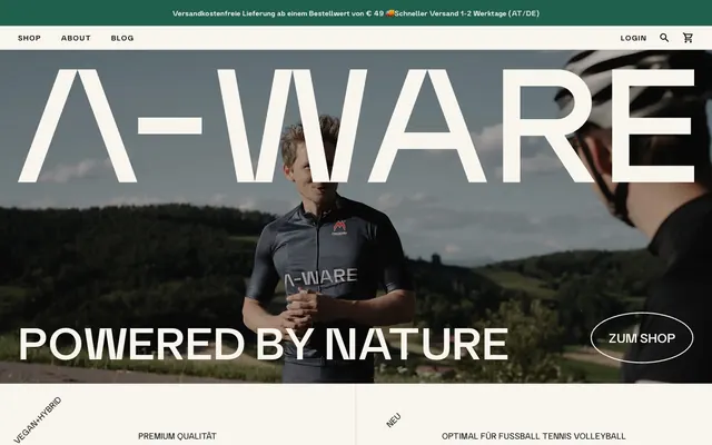
A-WARE cultivates a natural and premium aesthetic through a minimal, high-contrast monochrome palette punctuated by a single warm golden accent. Typography is a deliberate interplay of bold, expanded sans-serifs and a refined serif, creating a distinct brand voice. Surfaces are predominantly light and matte, achieving depth through subtle off-white tones rather than shadows, reinforcing a sense of clean, unadulterated quality. Layouts are spacious and structured, guiding the eye with generous negative space.
The page uses a full-bleed model with content centered within an implied maximum width, creating a spacious and structured feel. The hero section is often full-viewport, featuring a striking photographic background with large, centered, and overlaying typography. Sections maintain a consistent vertical rhythm, often alternating between a clean Alabaster White background and a slightly warmer Greige Canvas for cards and content blocks. Content arrangement frequently uses a centered stack for textual elements and 2-column or 3-column grids for product displays or feature lists, maintaining clear divisions. Navigation is a sticky top bar with minimal links and icons, emphasizing a clean header area.
The visual language predominantly features clean, product-focused photography and lifestyle images of athletes in natural settings. Photography is high-key and bright, often with tight crops on products against light backgrounds or individuals engaged in activities in well-lit natural environments. Product images are typically isolated or presented minimally. There are no heavy illustrations or abstract graphics. Icons are minimal, outlined (e.g., shopping cart, search) or filled, presenting a simple, functional aesthetic primarily in Midnight Ink or Alabaster White. Imagery serves both decorative atmosphere and product showcase roles, with a medium density, balancing visual interest with text-dominant content sections.
Reminiscent of Oura, Aesop, Moment, Vuori.
# A-WARE — Style Reference
> Minimalist alpine clean

**Theme:** light

**Site:** https://a-ware.at

A-WARE cultivates a natural and premium aesthetic through a minimal, high-contrast monochrome palette punctuated by a single warm golden accent. Typography is a deliberate interplay of bold, expanded sans-serifs and a refined serif, creating a distinct brand voice. Surfaces are predominantly light and matte, achieving depth through subtle off-white tones rather than shadows, reinforcing a sense of clean, unadulterated quality. Layouts are spacious and structured, guiding the eye with generous negative space.

## Tokens — Colors

| Name | Value | Token | Role |
|------|------|------|------|
| Harvest Gold | `#a77a41` | `--color-harvest-gold` | Highlight text, decorative borders, unique element accents (e.g. email input border focus). The sole chromatic accent, used sparingly to draw attention to specific informational elements |
| Midnight Ink | `#000000` | `--color-midnight-ink` | Primary text, major headings, borders, button backgrounds (filled), active icons, primary action borders for ghost buttons. Controls the stark contrast against light surfaces |
| Alabaster White | `#ffffff` | `--color-alabaster-white` | Canvas background, card backgrounds, text on dark buttons, interactive element backgrounds. Provides a clean, bright foundation |
| Greige Canvas | `#f7f5ee` | `--color-greige-canvas` | Secondary surface background for cards and featured sections, subtle variant from pure white to introduce warmth and depth. Often used for subtle elevation |
| Stone Whisper | `#ece9df` | `--color-stone-whisper` | Footer background, very subtle content section backgrounds. A soft, warm off-white, slightly darker than Greige Canvas, for grounding elements |
| Subtle Ash | `#888783` | `--color-subtle-ash` | Muted text, secondary link color, subtle borders, inactive elements. Provides a softer secondary textual element |

## Tokens — Typography

### practice
- **Substitute:** Inter
- **Weights:** 400, 600
- **Sizes:** 14px, 16px, 18px, 23px, 25px, 36px, 38px, 88px
- **Line height:** 1, 1.05, 1.19, 1.2, 1.4, 1.45
- **Letter spacing:** -0.02em, 0.02em, 0.04em, 0.10em
- **Role:** Primary and secondary headings, call-to-action text, navigation items, and descriptive body text. Its wide range of weights and letter-spacing options allow it to establish strong hierarchy and impact, from large, tracked-out display text to compact labels.

### plantin
- **Substitute:** Playfair Display
- **Weights:** 300, 400
- **Sizes:** 24px, 38px
- **Line height:** 1.05, 1.2, 1.33
- **Letter spacing:** -0.43em, -0.02em
- **Role:** Hero headlines, sometimes used for subheadings. The very tight negative letter-spacing at large sizes creates a distinctive, impactful, almost sculptural text block, while the serif character adds a touch of classic authority.

### lab-mono
- **Substitute:** Space Mono
- **Weights:** 400
- **Sizes:** 12px
- **Line height:** 1.33
- **Letter spacing:** -0.02em
- **Role:** Small functional text like captions, labels, and metadata. Its monospace nature provides a technical, precise feel for auxiliary information.

## Tokens — Type Scale

Augmented Fourth (1.414) from 16px base.

| Role | Size | Line height | Letter spacing |
|------|------|------|------|
| caption | 12px | 1.33 | -0.24px |
| body-sm | 14px | 1.4 | 0.28px |
| body | 16px | 1.45 | — |
| subheading | 23px | 1.2 | — |
| heading | 36px | 1.05 | — |
| heading-lg | 38px | 1.2 | -7.98px |
| display | 88px | 1 | -17.6px |

## Tokens — Spacing

- **Card padding:** 72px
- **Element gap:** 24px

## Tokens — Radius

- **General:** 6px
- **Buttons:** 32px
- **Inputs:** 8px
- **Cards:** 12px
- **badges:** 6px

## Layout

The page uses a full-bleed model with content centered within an implied maximum width, creating a spacious and structured feel. The hero section is often full-viewport, featuring a striking photographic background with large, centered, and overlaying typography. Sections maintain a consistent vertical rhythm, often alternating between a clean Alabaster White background and a slightly warmer Greige Canvas for cards and content blocks. Content arrangement frequently uses a centered stack for textual elements and 2-column or 3-column grids for product displays or feature lists, maintaining clear divisions. Navigation is a sticky top bar with minimal links and icons, emphasizing a clean header area.

## Imagery

The visual language predominantly features clean, product-focused photography and lifestyle images of athletes in natural settings. Photography is high-key and bright, often with tight crops on products against light backgrounds or individuals engaged in activities in well-lit natural environments. Product images are typically isolated or presented minimally. There are no heavy illustrations or abstract graphics. Icons are minimal, outlined (e.g., shopping cart, search) or filled, presenting a simple, functional aesthetic primarily in Midnight Ink or Alabaster White. Imagery serves both decorative atmosphere and product showcase roles, with a medium density, balancing visual interest with text-dominant content sections.

## Components

### Ghost Outline Button (Light Text)
*Primary Call to Action on dark backgrounds.*

Transparent background with a 1px border of Alabaster White. Text is Alabaster White, practice font at a variable size. No padding directly applied to the button, but often contained within larger elements. Radius is 0px for sharp edges.

### Ghost Outline Button (Dark Text)
*Secondary Call to Action, active state for navigation.*

Transparent background with a 1px border of Midnight Ink. Text is Midnight Ink, practice font at a variable size. Padding of 0px top/bottom and 12px left/right. Radius is 0px for sharp edges.

### Pill Button (Filled)
*Primary Call to Action on light backgrounds.*

Solid Alabaster White background with Midnight Ink text. Practice font, 0px top/bottom padding, 32px left/right padding, and a prominent 32px border radius for a soft, pill-like shape. Has a 1px Midnight Ink border.

### Product Card
*Displaying product information and features.*

Background is Greige Canvas, no shadow, with 12px border radius. Generous 72px padding on all sides, creating substantial negative space around content.

### Text Input Field
*Collecting user input.*

Transparent background with Midnight Ink text. Features a subtle 1px border in a very light gray (rgba(0,0,0,0.12)). Rounded corners with an 8px border radius. Padding of 20px top/bottom and 24px left/right.

### Tag Badge (Light Text)
*Categorization and metadata on dark backgrounds.*

Transparent background with Alabaster White text. Uses a 6px border radius. No specific padding defined, relies on content wrapping.

### Tag Badge (Dark Text)
*Categorization and metadata on light backgrounds.*

Transparent background with Midnight Ink text. Uses a 0px border radius. No specific padding defined, relies on content wrapping.

## Guidelines

### Do

- Use Midnight Ink (#000000) for all primary text and major headlines to maintain high contrast and legibility.
- Apply Alabaster White (#ffffff) for primary canvas backgrounds and text on dark elements, supporting the clean aesthetic.
- Introduce warmth and subtle hierarchy on light surfaces by using Greige Canvas (#f7f5ee) for cards and secondary content blocks.
- Prioritize the 'practice' font for all interactive elements, navigation, and most body text, using its variable weights and letter-spacing to control emphasis.
- Reserve the 'plantin' font with aggressive negative letter-spacing for impactful, large display headlines to create a distinctive brand presence.
- Employ the Harvest Gold (#a77a41) accent color extremely sparingly, primarily for functional highlights like input borders or specific, small informational text.
- Maintain generous spacing around elements and within content blocks, using 72px padding for cards and a comfortable 24px element gap to enhance readability and the sense of premium quality.

### Don't

- Avoid using multiple accent colors; stick to Harvest Gold for all chromatic emphasis.
- Do not introduce heavy shadows or gradients; rely on color temperature and subtle background shifts (e.g., from Alabaster White to Greige Canvas) for depth.
- Do not use generic system fonts; always specify 'practice', 'plantin', or 'lab-mono' to preserve brand identity.
- Refrain from tight, cramped layouts; ensure ample whitespace, especially around components like cards and headings, to support the spacious and natural feel.
- Do not deviate from the specified border radii (e.g., 32px for pill buttons, 12px for cards, 8px for inputs) to maintain design consistency.
- Avoid using Harvest Gold for large text blocks or backgrounds; its impact is derived from its scarcity.
- Do not use highly saturated or neon colors; the palette is deliberately muted and natural, with Harvest Gold being the only chromatic exception.

## Agent Prompt Guide

Quick Color Reference:
text: #000000
background: #ffffff
border: #000000
accent: #a77a41
primary action: no distinct CTA color

Example Component Prompts:
1. Create a hero section: full-viewport image background, overlaying 'plantin' font headline at 88px, Alabaster White text (#ffffff), letter-spacing -17.6px. Below it, a Ghost Outline Button (Light Text) with 'practice' font at 16px, background transparent, 1px #ffffff border, 0px radius, text #ffffff.
2. Create a Product Card: Greige Canvas background (#f7f5ee), 12px radius, 72px padding. Inside, 'practice' font heading at 23px, Midnight Ink text (#000000). Below that, 16px body text in Subtle Ash (#888783).
3. Create a Pill Button (Filled) for an interactive action: Alabaster White background (#ffffff), 32px radius, 1px Midnight Ink border (#000000), 32px horizontal padding, Midnight Ink text (#000000) using 'practice' font at 16px.
4. Create a Text Input Field: Transparent background, 8px radius, 1px border of rgba(0,0,0,0.12). Placeholder text in Subtle Ash (#888783) using 'practice' font at 16px, user input text in Midnight Ink (#000000). 20px vertical, 24px horizontal padding.
More like this









Keep what you find
A free account saves references to boards and can send you a weekly email of picks based on what you save.
To see every result, go Pro.