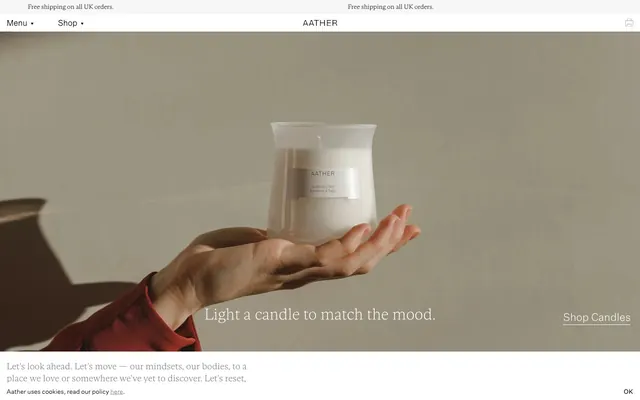
Preview image. Unlock full-res
Whispered luxury on white linen. A visual system that emphasizes premium product through a muted, spacious, high-contrast, text-dominant interface.
Color palette
Primary text, navigation links, button text, subtle borders, and line elements — establishes a stark, high-contrast presence
Page backgrounds, card surfaces, and text fields — provides a clean, expansive canvas
Subtle borders and dividers, indicating soft separation without harsh lines
Muted secondary text, informational tooltips, and ghost button borders — provides a softer alternative to Inkwell
Typography
- Weights
- 100, 200
- Sizes
- 14px, 16px, 20px
- Line height
- 1.22, 1.35, 1.38
Gestura Text Extra Light — detected in extracted data but not described by AI
- Weights
- 100, 200
- Sizes
- 14px, 16px, 20px, 35px
- Line height
- 1.2, 1.22, 1.35, 1.38
- Fallback
- Montserrat, Raleway Thin
Headlines and display text where a delicate and refined presence is desired. The extra light and thin weights signify understated luxury, particularly for titles up to 35px.
- Weights
- 100, 200, 400
- Sizes
- 9px, 11px, 12px, 13px, 14px, 16px, 18px, 20px, 24px
- Line height
- 0.78, 1.17, 1.2, 1.22, 1.35, 1.38, 1.39
- Letter spacing
- 0.0360em, 0.0420em, 0.0560em
- Fallback
- Inter, Lato
Functional text: navigation, body copy, input fields, and smaller headings. The light and regular weights balance readability with a sophisticated, contemporary feel, enhanced by subtle letter-spacing for improved clarity.
- Weights
- 200
- Sizes
- 16px
- Line height
- 1.38
Gestura Text Light — detected in extracted data but not described by AI
Spacing & shape
Components
Textual button with Inkwell for text. No background, no padding or border by default. Active/hover states reveal thin Inkwell underline or Ash Gray border.
Background transparent, border 1px solid Inkwell, text color Inkwell. 2px border radius. Padding varies by context but minimal.
Background transparent, border 1px solid Ash Gray, text color Ash Gray. 2px border radius. Used for 'Subscribe' and similar prompts.
Background Paper White, no border, no shadow, no padding. Product image is dominant. Text (Inkwell) and price (Ash Gray if not Inkwell) are left-aligned below the image. No visible border radius.
Background Paper White, border 1px solid Inkwell when focused (hinted by --color-border-form), default border 1px solid Ghost Gray. 2px border radius, with bottom right being 0px. Text color Inkwell.
Inkwell text using Untitled Sans Light, 14px size, a thin Inkwell underline on hover/active. No background, minimal padding.
Guidelines
- Prioritize product photography as the focal point, ensuring it is clean, well-lit, and isolated, often on neutral backdrops.
- Use Gestura Text Extra Light and Thin for headings and display text, embracing its delicate nature at 35px for prominent statements.
- Apply Untitled Sans for all functional UI text (body, navigation, buttons, forms), varying weights from 100 to 400, for clarity and sophistication.
- Maintain a high-contrast palette with Inkwell (#000000) for text and Paper White (#ffffff) for backgrounds, with Ash Gray (#808080) for secondary information.
- Keep components visually lightweight: prefer ghost buttons, thin borders (1px Inkwell or Ash Gray), and absent shadows to ensure content dominance.
- Use a base unit of 4px for all spacing decisions, particularly for minimal element gaps like 10px and section separators around 25px.
- Employ a subtle 2px border radius specifically for interactive elements like buttons and input fields to offer a soft, modern touch without being overly rounded.
- Avoid using bold or heavy typography for headlines; the Brand's voice relies on lightness and restraint.
- Do not introduce strong accent colors or vivid hues; the palette is strictly achromatic and relies on subtle shifts in gray.
- Steer clear of pronounced shadows or heavy elevation styles; the design emphasizes flatness and a light, airy feel.
- Do not add excessive padding or prominent borders to cards; these should blend into the background as content containers.
- Do not use highly rounded corners (e.g., 8px or more); the maximum radius is 2px for specific interactive elements.
- Avoid busy or dense layouts; spaciousness is key to presenting products and content with an upscale feel.
- Do not use system-default link underlines or colors; all interactive text should follow the Inkwell color and subtle underline pattern.
About this system
ShowHide
AATHER employs a refined, subdued aesthetic, prioritizing high-quality product photography over bold UI. The design uses nearly achromatic colors, with deep charcoal text on pristine white or nuanced off-white backgrounds, creating a sense of understated luxury. Typography leans towards delicate, thin weights, establishing a gentle, sophisticated voice. Components are minimal, often borderless or with subtle hairline outlines, ensuring the UI fades into the background, allowing content to take center stage.
The page adheres to a full-bleed layout for hero sections, showcasing large product photography that spans the viewport width. Content sections below often follow a contained, centered structure with a consistent vertical rhythm of around 25px section gaps. Text and image arrangements vary but frequently present large, singular images followed by centered typographic statements. A flexible grid for product listings (implied by multiple product cards) maintains visual order. Navigation is a minimal top bar with 'Menu' and 'Shop' links, along with a 'Brand Name' (AATHER) centrally placed.
Imagery is almost exclusively high-key, product-focused photography. Products (like candles) are often isolated or tightly cropped, presented on neutral, often light beige or white backgrounds. When hands are present, they are part of a clean, minimalist composition. There are no illustrations or abstract graphics. Icons are minimal, outlined, and monochromatic (Inkwell). The imagery's role is primarily to showcase the physical product as hero, with a very high density relative to the UI, filling large sections of the screen.
Reminiscent of Aesop, Byredo, Le Labo, Frama.
# AATHER — Style Reference
> Whispered luxury on white linen. A visual system that emphasizes premium product through a muted, spacious, high-contrast, text-dominant interface.

**Theme:** light

**Site:** https://aather.com

AATHER employs a refined, subdued aesthetic, prioritizing high-quality product photography over bold UI. The design uses nearly achromatic colors, with deep charcoal text on pristine white or nuanced off-white backgrounds, creating a sense of understated luxury. Typography leans towards delicate, thin weights, establishing a gentle, sophisticated voice. Components are minimal, often borderless or with subtle hairline outlines, ensuring the UI fades into the background, allowing content to take center stage.

## Tokens — Colors

| Name | Value | Token | Role |
|------|------|------|------|
| Inkwell | `#000000` | `--color-inkwell` | Primary text, navigation links, button text, subtle borders, and line elements — establishes a stark, high-contrast presence |
| Paper White | `#ffffff` | `--color-paper-white` | Page backgrounds, card surfaces, and text fields — provides a clean, expansive canvas |
| Ghost Gray | `#e8e8e8` | `--color-ghost-gray` | Subtle borders and dividers, indicating soft separation without harsh lines |
| Ash Gray | `#808080` | `--color-ash-gray` | Muted secondary text, informational tooltips, and ghost button borders — provides a softer alternative to Inkwell |

## Tokens — Typography

### Gestura Text Extra Light
- **Weights:** 100, 200
- **Sizes:** 14px, 16px, 20px
- **Line height:** 1.22, 1.35, 1.38
- **Role:** Gestura Text Extra Light — detected in extracted data but not described by AI

### Gestura Text
- **Substitute:** Montserrat, Raleway Thin
- **Weights:** 100, 200
- **Sizes:** 14px, 16px, 20px, 35px
- **Line height:** 1.2, 1.22, 1.35, 1.38
- **Role:** Headlines and display text where a delicate and refined presence is desired. The extra light and thin weights signify understated luxury, particularly for titles up to 35px.

### Untitled Sans
- **Substitute:** Inter, Lato
- **Weights:** 100, 200, 400
- **Sizes:** 9px, 11px, 12px, 13px, 14px, 16px, 18px, 20px, 24px
- **Line height:** 0.78, 1.17, 1.2, 1.22, 1.35, 1.38, 1.39
- **Letter spacing:** 0.0360em, 0.0420em, 0.0560em
- **Role:** Functional text: navigation, body copy, input fields, and smaller headings. The light and regular weights balance readability with a sophisticated, contemporary feel, enhanced by subtle letter-spacing for improved clarity.

### Gestura Text Light
- **Weights:** 200
- **Sizes:** 16px
- **Line height:** 1.38
- **Role:** Gestura Text Light — detected in extracted data but not described by AI

## Tokens — Type Scale

Minor Third (1.2) from 20px base.

| Role | Size | Line height | Letter spacing |
|------|------|------|------|
| caption | 14px | 1.35 | — |
| body-sm | 16px | 1.35 | — |
| body | 20px | 1.35 | — |

## Tokens — Spacing

- **Section gap:** 25px
- **Card padding:** 0px
- **Element gap:** 10px

## Tokens — Radius

- **Buttons:** 2px
- **Inputs:** 2px

## Layout

The page adheres to a full-bleed layout for hero sections, showcasing large product photography that spans the viewport width. Content sections below often follow a contained, centered structure with a consistent vertical rhythm of around 25px section gaps. Text and image arrangements vary but frequently present large, singular images followed by centered typographic statements. A flexible grid for product listings (implied by multiple product cards) maintains visual order. Navigation is a minimal top bar with 'Menu' and 'Shop' links, along with a 'Brand Name' (AATHER) centrally placed.

## Imagery

Imagery is almost exclusively high-key, product-focused photography. Products (like candles) are often isolated or tightly cropped, presented on neutral, often light beige or white backgrounds. When hands are present, they are part of a clean, minimalist composition. There are no illustrations or abstract graphics. Icons are minimal, outlined, and monochromatic (Inkwell). The imagery's role is primarily to showcase the physical product as hero, with a very high density relative to the UI, filling large sections of the screen.

## Components

### Ghost Button
*Navigation links and secondary actions*

Textual button with Inkwell for text. No background, no padding or border by default. Active/hover states reveal thin Inkwell underline or Ash Gray border.

### Outlined Button
*Call to action with minimal visual weight*

Background transparent, border 1px solid Inkwell, text color Inkwell. 2px border radius. Padding varies by context but minimal.

### Secondary Outlined Button
*Subtle interactive elements*

Background transparent, border 1px solid Ash Gray, text color Ash Gray. 2px border radius. Used for 'Subscribe' and similar prompts.

### Product Card
*Display individual products within a grid*

Background Paper White, no border, no shadow, no padding. Product image is dominant. Text (Inkwell) and price (Ash Gray if not Inkwell) are left-aligned below the image. No visible border radius.

### Text Input Field
*Forms and data entry*

Background Paper White, border 1px solid Inkwell when focused (hinted by --color-border-form), default border 1px solid Ghost Gray. 2px border radius, with bottom right being 0px. Text color Inkwell.

### Top Navigation Link
*Primary site navigation in header*

Inkwell text using Untitled Sans Light, 14px size, a thin Inkwell underline on hover/active. No background, minimal padding.

## Guidelines

### Do

- Prioritize product photography as the focal point, ensuring it is clean, well-lit, and isolated, often on neutral backdrops.
- Use Gestura Text Extra Light and Thin for headings and display text, embracing its delicate nature at 35px for prominent statements.
- Apply Untitled Sans for all functional UI text (body, navigation, buttons, forms), varying weights from 100 to 400, for clarity and sophistication.
- Maintain a high-contrast palette with Inkwell (#000000) for text and Paper White (#ffffff) for backgrounds, with Ash Gray (#808080) for secondary information.
- Keep components visually lightweight: prefer ghost buttons, thin borders (1px Inkwell or Ash Gray), and absent shadows to ensure content dominance.
- Use a base unit of 4px for all spacing decisions, particularly for minimal element gaps like 10px and section separators around 25px.
- Employ a subtle 2px border radius specifically for interactive elements like buttons and input fields to offer a soft, modern touch without being overly rounded.

### Don't

- Avoid using bold or heavy typography for headlines; the Brand's voice relies on lightness and restraint.
- Do not introduce strong accent colors or vivid hues; the palette is strictly achromatic and relies on subtle shifts in gray.
- Steer clear of pronounced shadows or heavy elevation styles; the design emphasizes flatness and a light, airy feel.
- Do not add excessive padding or prominent borders to cards; these should blend into the background as content containers.
- Do not use highly rounded corners (e.g., 8px or more); the maximum radius is 2px for specific interactive elements.
- Avoid busy or dense layouts; spaciousness is key to presenting products and content with an upscale feel.
- Do not use system-default link underlines or colors; all interactive text should follow the Inkwell color and subtle underline pattern.

## Agent Prompt Guide

Quick Color Reference:
  text: #000000
  background: #ffffff
  border: #000000
  accent: no distinct accent color
  primary action: no distinct CTA color

Example Component Prompts:
  Create a primary headline for a hero section: 'Light a candle to match the mood.' using Gestura Text, 35px, weight 200, color #000000.
  Design a full-width image banner with a centered text overlay. The overlay text reads 'Shop Candles', rendered in Untitled Sans Light, 14px, #000000, with a thin #000000 underline when active.
  Build a product card: a large featured image, 0px border radius, no padding, with 'Cabin in the Forest' text underneath, 16px, Untitled Sans Light, #000000.
  Generate a text input field for an email address: 14px Untitled Sans Light, 2px border radius, border 1px solid #000000. Placeholder text 'Your Email'.
More like this









Keep what you find
A free account saves references to boards and can send you a weekly email of picks based on what you save.
To see every result, go Pro.