Preview image. Unlock full-res
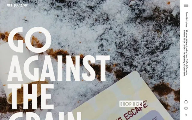
Raw Concrete Canvas — Bold typography and rich textures anchor a tactile, achromatic experience.
Color palette
Primary page background, UI surfaces, muted borders. This near-white ensures content stands out while providing a soft, natural base
Primary text, strong accents, filled button backgrounds. Its deep, near-black tone provides strong contrast for legibility and command
Primary text for specific links, deep shadows, and borders in high-contrast contexts
Subtle background shifts, lighter borders, and ghost button outlines, providing slight visual separation without strong contrast
Muted text, secondary information, and subtle background elements for visual depth
Card backgrounds, modal surfaces, and text on dark backgrounds for maximum contrast
Input borders and subtle UI strokes
Hairline borders and dividers, providing organization without heavy visual weight
Typography
- Weights
- 200, 300, 400, 600, 700
- Sizes
- 11px, 13px, 14px, 16px, 18px, 19px, 22px, 24px, 28px, 50px
- Line height
- 1, 1.05, 1.06, 1.2, 1.35, 1.81
- Letter spacing
- -0.0100em, 0.0340em, 0.0430em, 0.0510em, 0.0530em, 0.0600em, 0.0670em, 0.0730em, 0.0750em
- Fallback
- Inter
Primary typeface for body text, general UI, and many headings. Its wide range of weights and careful letter spacing allows for both compact information and expressive statements.
- Weights
- 300, 700
- Sizes
- 26px, 45px, 75px, 250px
- Line height
- 0.85, 1
- Letter spacing
- -0.0200em, 0.0130em, 0.0210em, 0.0370em
- Fallback
- Oswald
Impactful display typeface used for hero headlines and large promotional text. Its condensed, strong forms capture attention.
- Weights
- 300, 600, 700
- Sizes
- 18px, 22px
- Line height
- 1, 1.2
- Letter spacing
- 0.0440em, 0.0530em
- Fallback
- Bebas Neue
Distinctive secondary display typeface for specific titles, badges, and emphasizes text blocks. Its robust, slab-serif like character provides a grounded, artisanal touch.
- Weights
- 400
- Sizes
- 13px
- Line height
- 1.2
- Letter spacing
- normal
- Fallback
- Arial
System fallback for specific button labels and icons, ensuring broad compatibility.
- Weights
- 300
- Sizes
- 16px
- Line height
- 1.5
- Letter spacing
- 0.0600em
- Fallback
- Space Mono
Unique mono-spaced font for code snippets or technical product details, creating a distinct content block.
Spacing & shape
Components
Solid Graphite Ink background (#151515) with Pure White text (#f5f4f2). Has a 8px border-radius and 18px vertical, 20px horizontal padding. Identifies key calls to action.
Transparent background with Graphite Ink text (#151515) and a 1px Graphite Ink border. No border-radius. Padding is 13.5px vertical, 0px horizontal. Used for secondary actions that require less visual weight.
Transparent background with Pure White text (#f5f4f2) and a 1px Pure White border, 0px radius, 0px vertical padding, 48px horizontal. Used for promotional actions at large scale.
Transparent background, Pure White text (#f5f4f2), Pure White border with 50% border-radius to create a full circle. Used for navigation icons or small, less prominent actions.
Pure White background (#ffffff) with an asymmetric 16px 16px 0px 0px border-radius. Has 16px padding on top, right, and left, and 54px on bottom. Houses product imagery and details.
Pure White background (#ffffff) with a 1px Outline Gray border (#8a8a8a) and 4px border-radius. Padding is 6px vertical, 10px right, 16px left. For general form inputs.
Transparent background with a 1px Canvas White border (#f5f4f2) and 0px border-radius. Has 12px vertical padding. Used for prominent input fields like search or newsletter sign-ups.
Guidelines
- Use Graphite Ink (#151515) for all primary text content to maintain strong contrast against lighter backgrounds.
- Apply Canvas White (#f5f4f2) as the default page background and for subtle UI element borders.
- Prioritize TWK Lausanne for all body copy and standard headings, adjusting weight and letter spacing according to the type scale for functional variation.
- Reserve Molitor for large, impactful headlines (e.g., hero sections) to create significant visual presence.
- Ensure all interactive elements, like buttons, maintain a minimum border-radius of 7px, with product cards using 16px, for subtle softening without appearing overly rounded.
- Utilize 10px as the standard element gap for arranging items within cards or small groupings.
- Employ the Ghost Button variant (transparent background, Graphite Ink border, no radius) for secondary actions or navigation links to maintain a light UI footprint.
- Do not introduce new saturated colors; the palette is strictly achromatic with minimal, functional color accents for specific text states.
- Avoid applying heavy drop shadows; elevation is primarily achieved through background color shifts and subtle borders.
- Do not use Molitor or Garaje for body text; their distinct characteristics are intended for display and emphasis only.
- Refrain from using border-radii smaller than 3px or deviating from the established 7px (buttons), 10px (badges), 16px (cards), and 50% (circular) values.
- Do not use generic padding values; adhere to the 16px card padding and 10px element gap for consistent content density.
- Avoid dense, information-heavy sections; ensure comfortable spacing and visual breaks between content blocks.
About this system
ShowHide
Escape Coffee Company presents a rugged, textural commerce experience. High-contrast typography emphasizes bold statements, while a carefully curated achromatic palette allows rich product photography and content backgrounds to dominate. Interaction elements are minimal and integrated, often appearing as subtle outlines or text against dark neutral backgrounds, preserving a raw, authentic feel.
The site employs a primarily contained layout, utilizing a max-width for content sections, while the hero section breaks this with a full-bleed background image. The hero features a massive, split-word headline ('Go Against The Grain') overlaid directly onto the background, creating immediate impact. Sections generally flow with consistent vertical spacing, often alternating between visual styles (e.g., full-bleed image to white contained section). Content arrangement frequently uses left-aligned text with visual elements on the right, or centered stacks for product listings. There's an underlying grid for product display, likely 3-column, allowing for clear presentation of items. Density varies from image-heavy, spacious heroes to more compact product detail areas. Navigation consists of a sticky top bar and a thin, vertical sidebar on the right for utility links and a hamburger menu.
Imagery on Escape Coffee Company is characterized by raw, sometimes grunge-like, high-quality photography interwoven with product shots. The treatment is often full-bleed for hero sections, showing realistic textures like snow, grain, or misty landscapes, creating a mood. Product photography features tight crops of coffee bags or cups, often on contrasting surfaces. There are also detailed, almost blueprint-like illustrations on product packaging, which are abstract and functional. Icons are minimalist, outlined, and monochromatic, typically in Graphite Ink (#151515) or Pure White (#ffffff). Imagery plays a dual role: setting an atmospheric mood and clearly showcasing product details, dominating visual space in hero and collection sections.
Reminiscent of A-COLD-WALL*, Allbirds, Patagonia, Acne Studios, Aesop.
# Escape Coffee Company — Style Reference
> Raw Concrete Canvas — Bold typography and rich textures anchor a tactile, achromatic experience.

**Theme:** light

**Site:** https://escape.cafe

Escape Coffee Company presents a rugged, textural commerce experience. High-contrast typography emphasizes bold statements, while a carefully curated achromatic palette allows rich product photography and content backgrounds to dominate. Interaction elements are minimal and integrated, often appearing as subtle outlines or text against dark neutral backgrounds, preserving a raw, authentic feel.

## Tokens — Colors

| Name | Value | Token | Role |
|------|------|------|------|
| Canvas White | `#f5f4f2` | `--color-canvas-white` | Primary page background, UI surfaces, muted borders. This near-white ensures content stands out while providing a soft, natural base |
| Graphite Ink | `#151515` | `--color-graphite-ink` | Primary text, strong accents, filled button backgrounds. Its deep, near-black tone provides strong contrast for legibility and command |
| Asphalt Black | `#000000` | `--color-asphalt-black` | Primary text for specific links, deep shadows, and borders in high-contrast contexts |
| Pale Stone | `#ebe9e6` | `--color-pale-stone` | Subtle background shifts, lighter borders, and ghost button outlines, providing slight visual separation without strong contrast |
| Fog Gray | `#929292` | `--color-fog-gray` | Muted text, secondary information, and subtle background elements for visual depth |
| Pure White | `#ffffff` | `--color-pure-white` | Card backgrounds, modal surfaces, and text on dark backgrounds for maximum contrast |
| Outline Gray | `#8a8a8a` | `--color-outline-gray` | Input borders and subtle UI strokes |
| Subtle Border | `#e3e3e3` | `--color-subtle-border` | Hairline borders and dividers, providing organization without heavy visual weight |

## Tokens — Typography

### TWK Lausanne
- **Substitute:** Inter
- **Weights:** 200, 300, 400, 600, 700
- **Sizes:** 11px, 13px, 14px, 16px, 18px, 19px, 22px, 24px, 28px, 50px
- **Line height:** 1, 1.05, 1.06, 1.2, 1.35, 1.81
- **Letter spacing:** -0.0100em, 0.0340em, 0.0430em, 0.0510em, 0.0530em, 0.0600em, 0.0670em, 0.0730em, 0.0750em
- **Role:** Primary typeface for body text, general UI, and many headings. Its wide range of weights and careful letter spacing allows for both compact information and expressive statements.

### Molitor
- **Substitute:** Oswald
- **Weights:** 300, 700
- **Sizes:** 26px, 45px, 75px, 250px
- **Line height:** 0.85, 1
- **Letter spacing:** -0.0200em, 0.0130em, 0.0210em, 0.0370em
- **Role:** Impactful display typeface used for hero headlines and large promotional text. Its condensed, strong forms capture attention.

### Garaje
- **Substitute:** Bebas Neue
- **Weights:** 300, 600, 700
- **Sizes:** 18px, 22px
- **Line height:** 1, 1.2
- **Letter spacing:** 0.0440em, 0.0530em
- **Role:** Distinctive secondary display typeface for specific titles, badges, and emphasizes text blocks. Its robust, slab-serif like character provides a grounded, artisanal touch.

### Arial
- **Substitute:** Arial
- **Weights:** 400
- **Sizes:** 13px
- **Line height:** 1.2
- **Letter spacing:** normal
- **Role:** System fallback for specific button labels and icons, ensuring broad compatibility.

### GTStandard-M
- **Substitute:** Space Mono
- **Weights:** 300
- **Sizes:** 16px
- **Line height:** 1.5
- **Letter spacing:** 0.0600em
- **Role:** Unique mono-spaced font for code snippets or technical product details, creating a distinct content block.

## Tokens — Type Scale

| Role | Size | Line height | Letter spacing |
|------|------|------|------|
| caption | 11px | 1.35 | 0.43px |
| subheading | 18px | 1.2 | 0.44px |
| heading-sm | 22px | 1 | 0.53px |
| heading | 28px | 1.06 | 0.51px |
| heading-lg | 50px | 1 | -0.5px |
| display-sm | 75px | 0.85 | -1.5px |
| display | 250px | 0.85 | -2px |

## Tokens — Spacing

- **Section gap:** 40px
- **Card padding:** 16px
- **Element gap:** 10px

## Tokens — Radius

- **Default:** 3px
- **Buttons:** 7px
- **Inputs:** 7px
- **Cards:** 16px
- **badges:** 10px
- **circular:** 50%

## Layout

The site employs a primarily contained layout, utilizing a max-width for content sections, while the hero section breaks this with a full-bleed background image. The hero features a massive, split-word headline ('Go Against The Grain') overlaid directly onto the background, creating immediate impact. Sections generally flow with consistent vertical spacing, often alternating between visual styles (e.g., full-bleed image to white contained section). Content arrangement frequently uses left-aligned text with visual elements on the right, or centered stacks for product listings. There's an underlying grid for product display, likely 3-column, allowing for clear presentation of items. Density varies from image-heavy, spacious heroes to more compact product detail areas. Navigation consists of a sticky top bar and a thin, vertical sidebar on the right for utility links and a hamburger menu.

## Imagery

Imagery on Escape Coffee Company is characterized by raw, sometimes grunge-like, high-quality photography interwoven with product shots. The treatment is often full-bleed for hero sections, showing realistic textures like snow, grain, or misty landscapes, creating a mood. Product photography features tight crops of coffee bags or cups, often on contrasting surfaces. There are also detailed, almost blueprint-like illustrations on product packaging, which are abstract and functional. Icons are minimalist, outlined, and monochromatic, typically in Graphite Ink (#151515) or Pure White (#ffffff). Imagery plays a dual role: setting an atmospheric mood and clearly showcasing product details, dominating visual space in hero and collection sections.

## Components

### Filled Primary Button
*Interactive element*

Solid Graphite Ink background (#151515) with Pure White text (#f5f4f2). Has a 8px border-radius and 18px vertical, 20px horizontal padding. Identifies key calls to action.

### Ghost Button
*Interactive element*

Transparent background with Graphite Ink text (#151515) and a 1px Graphite Ink border. No border-radius. Padding is 13.5px vertical, 0px horizontal. Used for secondary actions that require less visual weight.

### Text Link Button
*Interactive element*

Transparent background with Pure White text (#f5f4f2) and a 1px Pure White border, 0px radius, 0px vertical padding, 48px horizontal. Used for promotional actions at large scale.

### Circular Ghost Icon Button
*Interactive element*

Transparent background, Pure White text (#f5f4f2), Pure White border with 50% border-radius to create a full circle. Used for navigation icons or small, less prominent actions.

### Product Card
*Display content*

Pure White background (#ffffff) with an asymmetric 16px 16px 0px 0px border-radius. Has 16px padding on top, right, and left, and 54px on bottom. Houses product imagery and details.

### Standard Input Field
*User input*

Pure White background (#ffffff) with a 1px Outline Gray border (#8a8a8a) and 4px border-radius. Padding is 6px vertical, 10px right, 16px left. For general form inputs.

### Full-width Input Field
*User input*

Transparent background with a 1px Canvas White border (#f5f4f2) and 0px border-radius. Has 12px vertical padding. Used for prominent input fields like search or newsletter sign-ups.

## Guidelines

### Do

- Use Graphite Ink (#151515) for all primary text content to maintain strong contrast against lighter backgrounds.
- Apply Canvas White (#f5f4f2) as the default page background and for subtle UI element borders.
- Prioritize TWK Lausanne for all body copy and standard headings, adjusting weight and letter spacing according to the type scale for functional variation.
- Reserve Molitor for large, impactful headlines (e.g., hero sections) to create significant visual presence.
- Ensure all interactive elements, like buttons, maintain a minimum border-radius of 7px, with product cards using 16px, for subtle softening without appearing overly rounded.
- Utilize 10px as the standard element gap for arranging items within cards or small groupings.
- Employ the Ghost Button variant (transparent background, Graphite Ink border, no radius) for secondary actions or navigation links to maintain a light UI footprint.

### Don't

- Do not introduce new saturated colors; the palette is strictly achromatic with minimal, functional color accents for specific text states.
- Avoid applying heavy drop shadows; elevation is primarily achieved through background color shifts and subtle borders.
- Do not use Molitor or Garaje for body text; their distinct characteristics are intended for display and emphasis only.
- Refrain from using border-radii smaller than 3px or deviating from the established 7px (buttons), 10px (badges), 16px (cards), and 50% (circular) values.
- Do not use generic padding values; adhere to the 16px card padding and 10px element gap for consistent content density.
- Avoid dense, information-heavy sections; ensure comfortable spacing and visual breaks between content blocks.

## Agent Prompt Guide

Quick Color Reference:
- text: #151515
- background: #f5f4f2
- border: #f5f4f2
- accent: no distinct accent color
- primary action: #151515 (filled action)

Example Component Prompts:
- Create a hero section with a full-bleed background image. Overlay a 'Molitor' 250px weight 700 headline in pure white (#ffffff) that reads 'GO AGAINST THE GRAIN'. Include a 'Text Link Button' at the bottom right with 'SHOP NOW' in pure white (#ffffff), 0px vertical padding, 48px horizontal padding, and #ffffff border.
- Design a product listing card: Use a Pure White background (#ffffff), 16px 16px 0px 0px border-radius, and 16px padding (top, right, left) with 54px bottom padding. Inside, feature a product image, followed by product name in 'TWK Lausanne' 18px weight 600, price in 'TWK Lausanne' 16px weight 400, and a 'Wrapped Ghost Button' with 'View Details' in Graphite Ink (#151515) and a #151515 border.
- Construct a search input field: Full-width, transparent background, with a 1px Canvas White border (#f5f4f2) and 0px border-radius. Use 'TWK Lausanne' 14px weight 400 for placeholder text in Fog Gray (#929292). Add 12px vertical padding.
More like this









Keep what you find
A free account saves references to boards and can send you a weekly email of picks based on what you save.
To see every result, go Pro.