Preview image. Unlock full-res
Gallery space, stark and bold.
Color palette
Interactive elements like active navigation items, text links, icon fills. This lone chromatic color commands attention and indicates interactivity.
Primary text, headings, prominent UI elements, button text, icon strokes. Creates an authoritative, high-contrast presence.
Main page background, content pane backgrounds. Provides a clean, expansive canvas for high-fashion imagery.
Input field backgrounds. A subtle off-white that creates depth against Background White without adding visual noise.
Less prominent text, utility links. Offers a softer contrast for secondary information.
Typography
- Weights
- 400
- Sizes
- 9px
- Line height
- 1.15
- Letter spacing
- 0.0330em
- Fallback
- Space Mono
This custom monospace font is the signature typographic element, used for all primary text, headings, and UI labels. Its wide letter-spacing and technical precision lend a utilitarian yet high-fashion feel, differentiating the brand from conventional luxury sites.
Spacing & shape
Components
Text Black on Background White, no background, 0px border-radius, 4px top padding, 9px horizontal padding, 18px bottom padding. Uses Helvetica Monospaced Pro, weight 400, letter-spacing 0.0330em. Underlined with Action Violet (0px bottom padding) when active.
Transparent background, Text Black text. 0px border-radius. Padding of 4px top, 9px horizontal, 18px bottom. Helvetica Monospaced Pro, weight 400, letter-spacing 0.0330em.
Transparent background, Action Violet text, underlined with Action Violet. 0px border-radius. Padding of 2px top, 0px horizontal, 0px bottom. Helvetica Monospaced Pro, weight 400, letter-spacing 0.0330em.
Form Surface background, Text Black text. 0px border-radius. Padding of 19px vertical, 10px horizontal. Uses Helvetica Monospaced Pro, weight 400, letter-spacing 0.0330em.
Text Black icon, typically 4px padding around the icon. No background or border. Interactivity often implied by parent container's hover state or Action Violet color if active.
Secondary Text Gray text (can be Text Black). No background or border. Uses Helvetica Monospaced Pro, weight 400, letter-spacing 0.0330em. Often grouped in 4px vertical stacks.
Guidelines
- Use Helvetica Monospaced Pro for all typography, maintaining a consistent weight of 400 and letter-spacing of 0.0330em for brand cohesion.
- Employ a strict black and white palette (#000000 and #FFFFFF) for primary content and backgrounds, reserving #0018a8 for all interactive elements and high-contrast accents.
- Maintain 0px border-radius across all UI elements, including buttons, inputs, and containers, reinforcing the sharp, modern aesthetic.
- Utilize 60px as the primary vertical spacing unit between major content sections to create a spacious, gallery-like layout.
- Ensure all text links are Action Violet (#0018a8) with a 0px bottom padding when active, clearly indicating interactivity while maintaining the minimalist aesthetic.
- Prioritize product imagery over decorative graphics, presenting products as clean, isolated compositions on white or subtly textured backgrounds.
- Do not introduce additional chromatic colors; the single Action Violet (#0018a8) is the only brand accent.
- Avoid rounded corners or soft shadows; the design relies on sharp edges and flat planes to convey sophistication.
- Do not deviate from the specified Helvetica Monospaced Pro font family or its defined letter-spacing and weight; this is a core brand identifier.
- Do not use generic gray values; stick to the defined #6b6b6b for secondary text and #f7f7f7 for subtle surface variations.
- Avoid excessive decoration or complex UI patterns; the minimalist approach places emphasis on content and brand imagery.
- Do not use large, visually dominant background images or patterns that distract from product displays; backgrounds should be understated.
About this system
ShowHide
Acne Studios presents a design system that feels like a stark, minimalist gallery exhibiting cutting-edge fashion. The visual identity is built on a high-contrast black and white foundation, leveraging negative space and a single, vivid violet accent. This bold simplicity ensures that the products themselves are the focal point, while a custom monospace typeface adds a distinctive, technical-luxury edge. The overall impression is one of unapologetic sophistication and brand confidence.
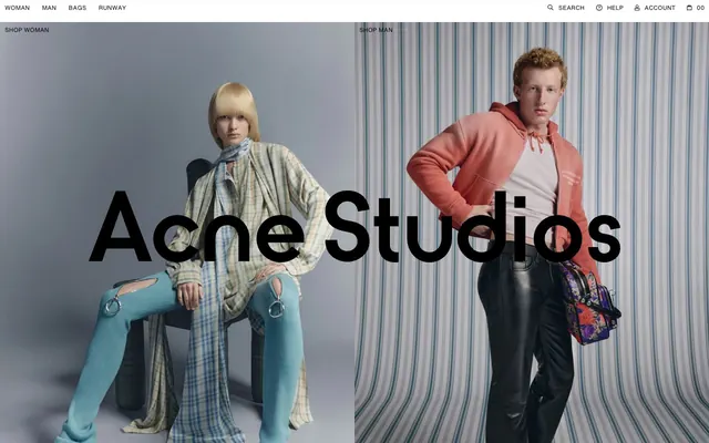
The page uses a full-bleed layout, with content often spanning the entire viewport width, particularly in hero sections with large product imagery. The general structure maintains a centered content flow where text and product grids are present. The hero displays two large, side-by-side product or model images with the brand name 'Acne Studios' overlaid in large, bold typography. The section rhythm is consistent, separated by visible vertical spacing. Content arrangement often features a grid for products and stacked or simple text blocks for informational sections. Navigation is a minimalist sticky top bar, reinforced by the dominant visual of the main content.
Imagery features high-fashion photography primarily showcasing models wearing products or tight product crops. The treatment is stark and editorial, often with models posed against plain, light backgrounds or subtly striped backdrops (like in the hero). Photography is full-bleed in hero sections, otherwise contained within clean, unmasked rectangular frames. The role of imagery is primarily product showcase and brand storytelling, using sophisticated, sometimes avant-garde styling, with a dense, impactful presence in key sections.
Reminiscent of Balenciaga, The Row, COS, SSENSE.
# Acne Studios — Style Reference
> Gallery space, stark and bold.

**Theme:** light

**Site:** https://acnestudios.com

Acne Studios presents a design system that feels like a stark, minimalist gallery exhibiting cutting-edge fashion. The visual identity is built on a high-contrast black and white foundation, leveraging negative space and a single, vivid violet accent. This bold simplicity ensures that the products themselves are the focal point, while a custom monospace typeface adds a distinctive, technical-luxury edge. The overall impression is one of unapologetic sophistication and brand confidence.

## Tokens — Colors

| Name | Value | Token | Role |
|------|------|------|------|
| Action Violet | `#0018a8` | `--color-action-violet` | Interactive elements like active navigation items, text links, icon fills. This lone chromatic color commands attention and indicates interactivity. |
| Text Black | `#000000` | `--color-text-black` | Primary text, headings, prominent UI elements, button text, icon strokes. Creates an authoritative, high-contrast presence. |
| Background White | `#ffffff` | `--color-background-white` | Main page background, content pane backgrounds. Provides a clean, expansive canvas for high-fashion imagery. |
| Form Surface | `#f7f7f7` | `--color-form-surface` | Input field backgrounds. A subtle off-white that creates depth against Background White without adding visual noise. |
| Secondary Text Gray | `#6b6b6b` | `--color-secondary-text-gray` | Less prominent text, utility links. Offers a softer contrast for secondary information. |

## Tokens — Typography

### Helvetica Monospaced Pro
- **Substitute:** Space Mono
- **Weights:** 400
- **Sizes:** 9px
- **Line height:** 1.15
- **Letter spacing:** 0.0330em
- **Role:** This custom monospace font is the signature typographic element, used for all primary text, headings, and UI labels. Its wide letter-spacing and technical precision lend a utilitarian yet high-fashion feel, differentiating the brand from conventional luxury sites.

## Tokens — Spacing

- **Section gap:** 60px
- **Element gap:** 4px

## Tokens — Radius

- **all:** 0px

## Layout

The page uses a full-bleed layout, with content often spanning the entire viewport width, particularly in hero sections with large product imagery. The general structure maintains a centered content flow where text and product grids are present. The hero displays two large, side-by-side product or model images with the brand name 'Acne Studios' overlaid in large, bold typography. The section rhythm is consistent, separated by visible vertical spacing. Content arrangement often features a grid for products and stacked or simple text blocks for informational sections. Navigation is a minimalist sticky top bar, reinforced by the dominant visual of the main content.

## Imagery

Imagery features high-fashion photography primarily showcasing models wearing products or tight product crops. The treatment is stark and editorial, often with models posed against plain, light backgrounds or subtly striped backdrops (like in the hero). Photography is full-bleed in hero sections, otherwise contained within clean, unmasked rectangular frames. The role of imagery is primarily product showcase and brand storytelling, using sophisticated, sometimes avant-garde styling, with a dense, impactful presence in key sections.

## Components

### Navigation Bar

### Product Category Grid

### Search Input with Action Buttons

### Primary Navigation Link
*Top navigation items*

Text Black on Background White, no background, 0px border-radius, 4px top padding, 9px horizontal padding, 18px bottom padding. Uses Helvetica Monospaced Pro, weight 400, letter-spacing 0.0330em. Underlined with Action Violet (0px bottom padding) when active.

### Ghost Button
*Primary action triggers, navigation*

Transparent background, Text Black text. 0px border-radius. Padding of 4px top, 9px horizontal, 18px bottom. Helvetica Monospaced Pro, weight 400, letter-spacing 0.0330em.

### Accent Link Button
*Secondary calls to action or embedded links*

Transparent background, Action Violet text, underlined with Action Violet. 0px border-radius. Padding of 2px top, 0px horizontal, 0px bottom. Helvetica Monospaced Pro, weight 400, letter-spacing 0.0330em.

### Standard Input Field
*Text input for forms and search*

Form Surface background, Text Black text. 0px border-radius. Padding of 19px vertical, 10px horizontal. Uses Helvetica Monospaced Pro, weight 400, letter-spacing 0.0330em.

### Icon Button
*Utility functions like search, help, account, cart.*

Text Black icon, typically 4px padding around the icon. No background or border. Interactivity often implied by parent container's hover state or Action Violet color if active.

### Footer Section Link
*Footer navigation and social links*

Secondary Text Gray text (can be Text Black). No background or border. Uses Helvetica Monospaced Pro, weight 400, letter-spacing 0.0330em. Often grouped in 4px vertical stacks.

## Guidelines

### Do

- Use Helvetica Monospaced Pro for all typography, maintaining a consistent weight of 400 and letter-spacing of 0.0330em for brand cohesion.
- Employ a strict black and white palette (#000000 and #FFFFFF) for primary content and backgrounds, reserving #0018a8 for all interactive elements and high-contrast accents.
- Maintain 0px border-radius across all UI elements, including buttons, inputs, and containers, reinforcing the sharp, modern aesthetic.
- Utilize 60px as the primary vertical spacing unit between major content sections to create a spacious, gallery-like layout.
- Ensure all text links are Action Violet (#0018a8) with a 0px bottom padding when active, clearly indicating interactivity while maintaining the minimalist aesthetic.
- Prioritize product imagery over decorative graphics, presenting products as clean, isolated compositions on white or subtly textured backgrounds.

### Don't

- Do not introduce additional chromatic colors; the single Action Violet (#0018a8) is the only brand accent.
- Avoid rounded corners or soft shadows; the design relies on sharp edges and flat planes to convey sophistication.
- Do not deviate from the specified Helvetica Monospaced Pro font family or its defined letter-spacing and weight; this is a core brand identifier.
- Do not use generic gray values; stick to the defined #6b6b6b for secondary text and #f7f7f7 for subtle surface variations.
- Avoid excessive decoration or complex UI patterns; the minimalist approach places emphasis on content and brand imagery.
- Do not use large, visually dominant background images or patterns that distract from product displays; backgrounds should be understated.

## Agent Prompt Guide

**Quick Color Reference**
- Text: #000000
- Background: #ffffff
- CTA/Accent: #0018a8
- Secondary Text: #6b6b6b
- Form Input Background: #f7f7f7

**3-5 Example Component Prompts**
- Create a top navigation bar: Background White, with 'Shop Woman' button using Helvetica Monospaced Pro 400, #000000 text, 4px top padding, 9px horizontal, 18px bottom. On active, underline with #0018a8, 0px bottom padding. Include a Search icon that's a Text Black stroke.
- Design an input field for a newsletter signup: Form Surface background, Helvetica Monospaced Pro 400, #000000 text, 19px vertical padding, 10px horizontal padding, 0px border-radius.
- Generate a primary hero section with two side-by-side product images, each taking 50% width. Overlay 'Acne Studios' in Helvetica Monospaced Pro, large size (e.g., 96px for 'Acne Studios'), weight 400, #000000, letter-spacing 0.0330em, centered visually.
- Create a social media link: Secondary Text Gray text, Helvetica Monospaced Pro 400, letter-spacing 0.0330em. Label as 'IG'.
More like this










Keep what you find
A free account saves references to boards and can send you a weekly email of picks based on what you save.
To see every result, go Pro.