
Preview image. Unlock full-res
Editorial Minimal Canvas — Think high-contrast type on stark white pages, framed by precise, almost invisible borders, allowing rich product photography to dominate.
Color palette
Interactive link text, inline calls to action, drawing attention to clickable elements without being overly bright.
Page backgrounds, elevated surfaces like cards, modal backgrounds, primary button backgrounds.
Primary text, headings, icon fill, borders on interactive elements, provides strong contrast against white.
Subtle borders, dividers, outlines for inactive elements, providing visual separation without harshness.
Placeholder text in input fields, secondary information, muted text on light backgrounds.
Subtle border color for non-primary buttons, providing a barely-there outline.
Secondary text colors, less prominent information, maintaining a subdued tone.
Indicator icons for success states, subtle confirmation messages.
Typography
- Weights
- 400
- Sizes
- 10px, 12px, 16px, 22px, 28px
- Line height
- 1.21, 1.27, 1.38, 1.5, 1.88
- Fallback
- IBM Plex Mono
All primary text elements including body copy, navigation, buttons, and most headings — its uniform width lends a technical, precise character to all content.
- Weights
- 400
- Sizes
- 10px, 13px, 16px, 18px, 24px
- Line height
- 1.23, 1.5
- Fallback
- Inter
Secondary text uses, providing a more conventional sans-serif feel for subtext or specific links.
- Weights
- 400
- Sizes
- 10px, 12px, 16px
- Line height
- 1, 1.38, 1.5
- Letter spacing
- -0.05
- Fallback
- IBM Plex Mono (short caps variant)
Specific utility text or small labels, where a distinct slightly condensed, precisely tracked monospace feel is desired.
Spacing & shape
Elevation
Components
Transparent background, Ink Black text, no borders or padding (like text links). `backgroundColor: rgba(0, 0, 0, 0)`, `color: #000000`, `borderRadius: 0px`.
Transparent background, Ink Black text, with a subtle Hint of Gray border. `backgroundColor: rgba(0, 0, 0, 0)`, `color: #000000`, `borderTopColor: #eaeae8`, `borderRadius: 2px`, `padding: 0px 8px`.
Canvas White background, Ink Black text, with an Ink Black border. `backgroundColor: #ffffff`, `color: #000000`, `borderTopColor: #000000`, `borderRadius: 0px`, `padding: 10px`.
Canvas White background, Ink Black text, no border. `backgroundColor: #ffffff`, `color: #000000`, `borderRadius: 2px`, `padding: 10px 16px`.
Transparent background, no border radius or shadow. `backgroundColor: rgba(0, 0, 0, 0)`, `borderRadius: 0px`, `boxShadow: none`, `padding: 0px`.
Canvas White background with subtle elevation shadow, containing dense text blocks. `backgroundColor: #ffffff`, `boxShadow: rgba(0, 0, 0, 0.1) 0px 2px 10px 2px`.
Guidelines
- Prioritize arketSansMono (IBM Plex Mono) for almost all textual content to maintain brand consistency.
- Use Canvas White (#ffffff) as the dominant background color for all main content areas and modals.
- Implement Ink Black (#000000) for all primary text, headings, and interactive element borders for optimal contrast.
- Apply 2px border radius for buttons and 4px for input fields; almost all other elements should use 0px radius.
- Utilize 0px padding and 0px border radius for card-like elements to promote a clean, unframed aesthetic.
- Maintain comfortable element spacing, defaulting to 8px for internal element gaps and up to 16px for larger component separations.
- Employ Command Blue (#3860be) exclusively for navigation links and direct calls to action within text.
- Avoid using highly saturated colors; confine chromatic accents to Command Blue (#3860be) and Success Green (#38793f) for specific functional purposes.
- Do not introduce complex shadows; stick to the single `rgba(0, 0, 0, 0.1) 0px 2px 10px 2px` for elevated containers.
- Refrain from using varied border radii across elements; adhere strictly to 0px, 2px, or 4px.
- Do not deviate from the established font families; custom typefaces are a core part of the brand identity.
- Avoid decorative background patterns or strong gradients; the design relies on clean, solid surfaces.
- Do not use generic system default link colors; all links must be styled with Command Blue (#3860be) or Ink Black (#000000) for ghost buttons.
About this system
ShowHide
This design system presents an authoritative, understated retail experience, reminiscent of a high-end editorial magazine. A monochromatic palette with a subtle emphasis on crisp typography, particularly the distinct arketSansMono, defines its core. The sparing use of an inline link blue and subtle green for indicators provides functional accents without disrupting the minimal aesthetic. Element interactions are often border-based or purely typographical, favoring a quiet visual presence over ornate decoration.
The page adheres to a max-width contained layout rather than full-bleed, centering content to provide clear margins. The hero section often features large photography with minimal overlay text, setting a serene mood. Sections generally maintain consistent vertical spacing between 80px and 128px, fostering a spacious rhythm. Content arrangement frequently alternates between large images and text blocks, sometimes in two-column layouts. Feature sections can employ grid-based layouts for editorial cards. Navigation is a persistent top bar, with key navigational elements and search. Density is comfortable, with ample breathing room between elements.
The site heavily features high-quality, editorial lifestyle photography with a muted, natural aesthetic. Images are predominantly full-bleed or large, contained within the content flow without masks, sharp edges. They serve both decorative atmosphere and product showcasing roles, being central to the content rather than supplementary. Object-focused photography, like the denim shot, is common, presenting items in a raw, authentic manner. Product photography often integrates models within realistic settings, capturing candid moments. Iconography is minimalist, outlined, and monochromatic, primarily using Ink Black.
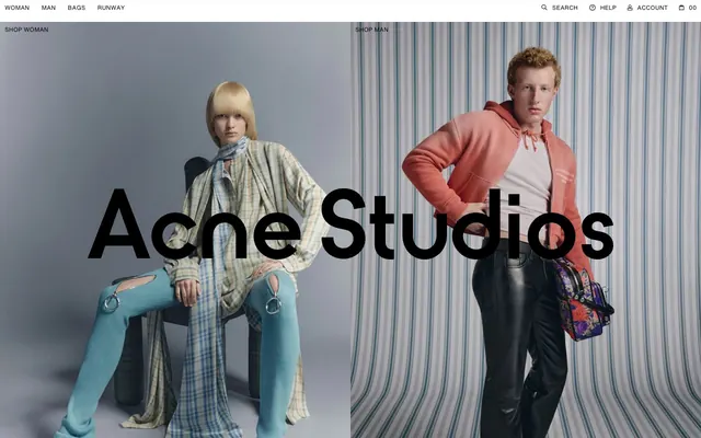
Reminiscent of COS, ARKET (sister brand), Filippa K, Acne Studios, Mr Porter.
# ARKET — Style Reference
> Editorial Minimal Canvas — Think high-contrast type on stark white pages, framed by precise, almost invisible borders, allowing rich product photography to dominate.

**Theme:** light

**Site:** https://arket.com

This design system presents an authoritative, understated retail experience, reminiscent of a high-end editorial magazine. A monochromatic palette with a subtle emphasis on crisp typography, particularly the distinct arketSansMono, defines its core. The sparing use of an inline link blue and subtle green for indicators provides functional accents without disrupting the minimal aesthetic. Element interactions are often border-based or purely typographical, favoring a quiet visual presence over ornate decoration.

## Tokens — Colors

| Name | Value | Token | Role |
|------|------|------|------|
| Command Blue | `#3860be` | `--color-command-blue` | Interactive link text, inline calls to action, drawing attention to clickable elements without being overly bright. |
| Canvas White | `#ffffff` | `--color-canvas-white` | Page backgrounds, elevated surfaces like cards, modal backgrounds, primary button backgrounds. |
| Ink Black | `#000000` | `--color-ink-black` | Primary text, headings, icon fill, borders on interactive elements, provides strong contrast against white. |
| Ash Gray | `#e0e0e0` | `--color-ash-gray` | Subtle borders, dividers, outlines for inactive elements, providing visual separation without harshness. |
| Soft Graphite | `#666666` | `--color-soft-graphite` | Placeholder text in input fields, secondary information, muted text on light backgrounds. |
| Hint of Gray | `#eaeae8` | `--color-hint-of-gray` | Subtle border color for non-primary buttons, providing a barely-there outline. |
| Body Text Gray | `#767676` | `--color-body-text-gray` | Secondary text colors, less prominent information, maintaining a subdued tone. |
| Success Green | `#38793f` | `--color-success-green` | Indicator icons for success states, subtle confirmation messages. |

## Tokens — Typography

### arketSansMono
- **Substitute:** IBM Plex Mono
- **Weights:** 400
- **Sizes:** 10px, 12px, 16px, 22px, 28px
- **Line height:** 1.21, 1.27, 1.38, 1.5, 1.88
- **Role:** All primary text elements including body copy, navigation, buttons, and most headings — its uniform width lends a technical, precise character to all content.

### Arket Sans
- **Substitute:** Inter
- **Weights:** 400
- **Sizes:** 10px, 13px, 16px, 18px, 24px
- **Line height:** 1.23, 1.5
- **Role:** Secondary text uses, providing a more conventional sans-serif feel for subtext or specific links.

### arketSCSansMono
- **Substitute:** IBM Plex Mono (short caps variant)
- **Weights:** 400
- **Sizes:** 10px, 12px, 16px
- **Line height:** 1, 1.38, 1.5
- **Letter spacing:** -0.05
- **Role:** Specific utility text or small labels, where a distinct slightly condensed, precisely tracked monospace feel is desired.

## Tokens — Type Scale

| Role | Size | Line height | Letter spacing |
|------|------|------|------|
| caption | 10px | 1.21 | — |
| body | 16px | 1.38 | — |
| subheading | 18px | 1.5 | — |
| heading | 22px | 1.5 | — |
| display | 28px | 1.88 | — |

## Tokens — Spacing

- **Section gap:** 80-128px
- **Card padding:** 16px
- **Element gap:** 8px

## Tokens — Radius

- **General:** 0px
- **Buttons:** 2px
- **Inputs:** 4px

## Tokens — Elevation

- **Callout Modal:** `rgba(0, 0, 0, 0.1) 0px 2px 10px 2px`

## Layout

The page adheres to a max-width contained layout rather than full-bleed, centering content to provide clear margins. The hero section often features large photography with minimal overlay text, setting a serene mood. Sections generally maintain consistent vertical spacing between 80px and 128px, fostering a spacious rhythm. Content arrangement frequently alternates between large images and text blocks, sometimes in two-column layouts. Feature sections can employ grid-based layouts for editorial cards. Navigation is a persistent top bar, with key navigational elements and search. Density is comfortable, with ample breathing room between elements.

## Imagery

The site heavily features high-quality, editorial lifestyle photography with a muted, natural aesthetic. Images are predominantly full-bleed or large, contained within the content flow without masks, sharp edges. They serve both decorative atmosphere and product showcasing roles, being central to the content rather than supplementary. Object-focused photography, like the denim shot, is common, presenting items in a raw, authentic manner. Product photography often integrates models within realistic settings, capturing candid moments. Iconography is minimalist, outlined, and monochromatic, primarily using Ink Black.

## Components

### Membership Callout Modal

### Announcement Banner

### Editorial Article Cards

### Primary Ghost Button
*Navigation links, inline actions*

Transparent background, Ink Black text, no borders or padding (like text links). `backgroundColor: rgba(0, 0, 0, 0)`, `color: #000000`, `borderRadius: 0px`.

### Subtle Outlined Button
*Secondary actions, filtering*

Transparent background, Ink Black text, with a subtle Hint of Gray border. `backgroundColor: rgba(0, 0, 0, 0)`, `color: #000000`, `borderTopColor: #eaeae8`, `borderRadius: 2px`, `padding: 0px 8px`.

### Filled Square Button
*Primary calls to action with specific borders*

Canvas White background, Ink Black text, with an Ink Black border. `backgroundColor: #ffffff`, `color: #000000`, `borderTopColor: #000000`, `borderRadius: 0px`, `padding: 10px`.

### Filled Rounded Button
*Standard calls to action*

Canvas White background, Ink Black text, no border. `backgroundColor: #ffffff`, `color: #000000`, `borderRadius: 2px`, `padding: 10px 16px`.

### Product Card
*Displaying product listings, editorial content*

Transparent background, no border radius or shadow. `backgroundColor: rgba(0, 0, 0, 0)`, `borderRadius: 0px`, `boxShadow: none`, `padding: 0px`.

### Callout Modal
*Promotional pop-ups, membership offers*

Canvas White background with subtle elevation shadow, containing dense text blocks. `backgroundColor: #ffffff`, `boxShadow: rgba(0, 0, 0, 0.1) 0px 2px 10px 2px`.

## Guidelines

### Do

- Prioritize arketSansMono (IBM Plex Mono) for almost all textual content to maintain brand consistency.
- Use Canvas White (#ffffff) as the dominant background color for all main content areas and modals.
- Implement Ink Black (#000000) for all primary text, headings, and interactive element borders for optimal contrast.
- Apply 2px border radius for buttons and 4px for input fields; almost all other elements should use 0px radius.
- Utilize 0px padding and 0px border radius for card-like elements to promote a clean, unframed aesthetic.
- Maintain comfortable element spacing, defaulting to 8px for internal element gaps and up to 16px for larger component separations.
- Employ Command Blue (#3860be) exclusively for navigation links and direct calls to action within text.

### Don't

- Avoid using highly saturated colors; confine chromatic accents to Command Blue (#3860be) and Success Green (#38793f) for specific functional purposes.
- Do not introduce complex shadows; stick to the single `rgba(0, 0, 0, 0.1) 0px 2px 10px 2px` for elevated containers.
- Refrain from using varied border radii across elements; adhere strictly to 0px, 2px, or 4px.
- Do not deviate from the established font families; custom typefaces are a core part of the brand identity.
- Avoid decorative background patterns or strong gradients; the design relies on clean, solid surfaces.
- Do not use generic system default link colors; all links must be styled with Command Blue (#3860be) or Ink Black (#000000) for ghost buttons.

## Agent Prompt Guide

Quick Color Reference:
- Text: #000000
- Background: #ffffff
- CTA (text): #3860be
- Border (subtle): #eaeae8
- Accent (success): #38793f

Example Component Prompts:
1. Create a Callout Modal: background #ffffff, with headline 'Te damos la bienvenida al programa de membresía' using arketSansMono 400 at 22px, color #000000, line-height 1.27. Body text 'Obtener un 10% de descuento...' using arketSansMono 400 at 16px, color #000000, line-height 1.38. Button 'Hacerse miembro' is Filled Square Button with background #ffffff, color #000000, border-color #000000, padding 10px. Apply elevation shadow `rgba(0, 0, 0, 0.1) 0px 2px 10px 2px`.
2. Design a navigation bar with 'Mujer', 'Hombre', 'Niños', 'Home' as Primary Ghost Buttons at arketSansMono 400, 16px, color #000000. The search input uses Input Search Field styling (background #f9f9f9, color rgba(0, 0, 0, 0.6), border-color rgba(0, 0, 0, 0.6), border-radius 4px, padding 0px 48px 0px 44px).
3. Generate a Product Card with a transparent background, 0px border radius, and no box-shadow. Inside, place an image, and below it, a heading 'Oskar Eriksson' with arketSansMono 400 at 22px, color #000000. Following text 'Entrevistas' with arketSansMono 400 at 12px, color #000000, line-height 1.27.
More like this









Keep what you find
A free account saves references to boards and can send you a weekly email of picks based on what you save.
To see every result, go Pro.