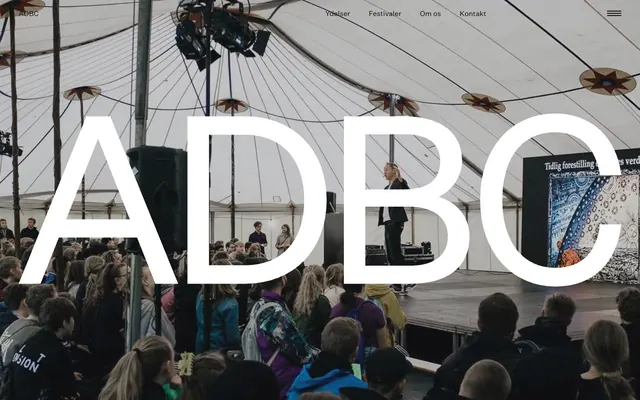
Preview image. Unlock full-res
alpine starkness on white canvas
Color palette
Decorative accents where a subtle, earthy color is desired, as indicated by CSS token hints
Dark borders and separators for elevated surfaces and inverted UI. Do not promote it to the primary CTA color
Page backgrounds, prominent surfaces. This bright white serves as the expansive, clean foundation for the entire layout
Decorative elements, iconography — used sparingly to punctuate specific UI elements
Subtle navigation text, as indicated by CSS token hints, providing a softer alternative to the main text color
Typography
- Weights
- 400
- Sizes
- 16px, 24px, 36px, 72px
- Line height
- 1.05, 1.25
- Letter spacing
- -0.0500em at 72px, -0.0250em at 36px, normal at 16px
- Fallback
- Inter
Primary headings, navigation, and most UI text. The custom sans-serif with subtle negative tracking on larger sizes delivers a clean, modern, and impactful statement.
- Weights
- 400
- Sizes
- 18px
- Line height
- 1.25
- Letter spacing
- normal
- Fallback
- Lora
Body copy. This serif font provides a readable, considered voice for long-form content, contrasting with the sans-serif headlines but maintaining a similar understated character.
Spacing & shape
Components
Text: Untitled Sans, 16px, weight 400, color Inkwell (#111111). Underlined with a 1px border on hover, using Inkwell. Generous 42px horizontal padding to ensure distinct clickable areas.
Text: Untitled Sans, 72px, weight 400, color Inkwell (#111111), lineHeight 1.05, letterSpacing -0.0500em. Appears centered on a photographic background.
Text: Untitled Serif, 18px, weight 400, color Inkwell (#111111), lineHeight 1.25. The text flows within a comfortable content width with standard letter spacing.
Background: Canvas White (#ffffff). No border or shadow (0px borderRadius, none boxShadow). Content is flush with the edges (0px padding).
Text: Untitled Sans, 36px, weight 400, color Inkwell (#111111), lineHeight 1.25, letterSpacing -0.0250em. Followed by a 4px marginBottom.
Text: Untitled Sans, 16px, weight 400, color Inkwell (#111111). Underlined to indicate interactivity.
Guidelines
- Use Canvas White (#ffffff) as the primary background for all page sections to enforce a clean, spacious aesthetic.
- Apply Inkwell (#111111) for all main text, ensuring maximum contrast and legibility.
- Prioritize Untitled Sans at 72px with -0.0500em letterSpacing for prominent headlines to achieve a modern, condensed feel.
- Maintain a clear visual hierarchy by consistently using 0px border-radius across all elements; sharp edges are part of the brand.
- Employ a 1px solid Inkwell (#111111) underline for all interactive links and navigation items, removing it on hover for an active state indication.
- Use 42px for section spacing and significant vertical gaps to create a spacious, breathable layout.
- Integrate photography full-bleed as background elements in hero sections, layering text with high contrast for readability.
- Avoid using drop shadows or complex elevation; maintain a flat, almost two-dimensional interface design.
- Do not introduce additional bright or saturated colors beyond the defined accent color for UI elements; keep the palette monochromatic.
- Refrain from using heavily decorative borders or frames on cards or content blocks; visual separation is achieved through spacing and typography.
- Do not deviate from the specified negative letter-spacing values for large headings, as it is a core characteristic of the typographic style.
- Avoid centered content blocks that take up the full viewport width; instead, use a comfortable reading width centered on the page.
- Do not use generic button styles with filled backgrounds, instead opt for text links with underlines to indicate interaction.
- Do not use complex gradient backgrounds or overlays; stick to solid color backgrounds for clarity.
About this system
ShowHide
ADBC employs a high-contrast, minimalist visual language, emphasizing strong typography and monochromatic imagery over decorative elements. A stark white background acts as a clean canvas, creating sharp legibility for the almost black text. The design relies on generous whitespace and a precise typographic system to establish hierarchy and a sense of understated authority. Interaction is conveyed through subtle underlines rather than overt button styling, making the experience feel direct and content-focused.
The page primarily uses a max-width contained model within a full-bleed structure. The hero features a full-bleed background image with a large, centered headline. Content sections below alternate between full-width blocks and a centered single-column layout for extensive text. There's a subtle left-aligned feel for content within these single-column sections. Vertical rhythm is established by consistent 42px section gaps, with additional 56px gaps appearing for emphasis. A simple top navigation bar is used, featuring text links and a hamburger menu icon.
This site predominantly uses photography. Hero sections and content blocks often feature full-bleed, high-quality, desaturated or monochrome candid photography showing landscapes, events, and people in natural settings, sometimes with a subtle vintage or muted filter. Imagery serves as a rich atmospheric backdrop or contextual visual for content, rather than purely decorative. There are no illustrations or distinct icon styles visible; interaction is conveyed primarily through text and underlined links. Imagery usage is substantial, often framing entire sections and making the site feel image-heavy.
Reminiscent of AIGA Design Archives, The New York Times, Apple (older branding), Dropbox (early design).
# ADBC — Style Reference
> alpine starkness on white canvas

**Theme:** light

**Site:** https://www.adbc.studio

ADBC employs a high-contrast, minimalist visual language, emphasizing strong typography and monochromatic imagery over decorative elements. A stark white background acts as a clean canvas, creating sharp legibility for the almost black text. The design relies on generous whitespace and a precise typographic system to establish hierarchy and a sense of understated authority. Interaction is conveyed through subtle underlines rather than overt button styling, making the experience feel direct and content-focused.

## Tokens — Colors

| Name | Value | Token | Role |
|------|------|------|------|
| Sage Accent | `#778652` | `--color-sage-accent` | Decorative accents where a subtle, earthy color is desired, as indicated by CSS token hints |
| Inkwell | `#111111` | `--color-inkwell` | Dark borders and separators for elevated surfaces and inverted UI. Do not promote it to the primary CTA color |
| Canvas White | `#ffffff` | `--color-canvas-white` | Page backgrounds, prominent surfaces. This bright white serves as the expansive, clean foundation for the entire layout |
| Pitch Black | `#000000` | `--color-pitch-black` | Decorative elements, iconography — used sparingly to punctuate specific UI elements |
| Muted Gray | `#cecece` | `--color-muted-gray` | Subtle navigation text, as indicated by CSS token hints, providing a softer alternative to the main text color |

## Tokens — Typography

### Untitled Sans
- **Substitute:** Inter
- **Weights:** 400
- **Sizes:** 16px, 24px, 36px, 72px
- **Line height:** 1.05, 1.25
- **Letter spacing:** -0.0500em at 72px, -0.0250em at 36px, normal at 16px
- **Role:** Primary headings, navigation, and most UI text. The custom sans-serif with subtle negative tracking on larger sizes delivers a clean, modern, and impactful statement.

### Untitled Serif
- **Substitute:** Lora
- **Weights:** 400
- **Sizes:** 18px
- **Line height:** 1.25
- **Letter spacing:** normal
- **Role:** Body copy. This serif font provides a readable, considered voice for long-form content, contrasting with the sans-serif headlines but maintaining a similar understated character.

## Tokens — Type Scale

Golden Ratio (1.618) from 18px base.

| Role | Size | Line height | Letter spacing |
|------|------|------|------|
| body | 18px | 1.25 | — |
| subheading | 24px | 1.25 | — |
| heading | 36px | 1.25 | -0.45px |
| display | 72px | 1.05 | -3.6px |

## Tokens — Spacing

- **Section gap:** 42px
- **Card padding:** 0px
- **Element gap:** 24px

## Tokens — Radius

- **none:** 0px

## Layout

The page primarily uses a max-width contained model within a full-bleed structure. The hero features a full-bleed background image with a large, centered headline. Content sections below alternate between full-width blocks and a centered single-column layout for extensive text. There's a subtle left-aligned feel for content within these single-column sections. Vertical rhythm is established by consistent 42px section gaps, with additional 56px gaps appearing for emphasis. A simple top navigation bar is used, featuring text links and a hamburger menu icon.

## Imagery

This site predominantly uses photography. Hero sections and content blocks often feature full-bleed, high-quality, desaturated or monochrome candid photography showing landscapes, events, and people in natural settings, sometimes with a subtle vintage or muted filter. Imagery serves as a rich atmospheric backdrop or contextual visual for content, rather than purely decorative. There are no illustrations or distinct icon styles visible; interaction is conveyed primarily through text and underlined links. Imagery usage is substantial, often framing entire sections and making the site feel image-heavy.

## Components

### Navigation Link
*Header and footer navigation items.*

Text: Untitled Sans, 16px, weight 400, color Inkwell (#111111). Underlined with a 1px border on hover, using Inkwell. Generous 42px horizontal padding to ensure distinct clickable areas.

### Hero Headline
*Large, impactful text for hero sections.*

Text: Untitled Sans, 72px, weight 400, color Inkwell (#111111), lineHeight 1.05, letterSpacing -0.0500em. Appears centered on a photographic background.

### Body Text Block
*Standard paragraphs and descriptive text.*

Text: Untitled Serif, 18px, weight 400, color Inkwell (#111111), lineHeight 1.25. The text flows within a comfortable content width with standard letter spacing.

### Promotional Card
*Informational content blocks, featuring image and text.*

Background: Canvas White (#ffffff). No border or shadow (0px borderRadius, none boxShadow). Content is flush with the edges (0px padding).

### Section Heading
*Titles for content sections.*

Text: Untitled Sans, 36px, weight 400, color Inkwell (#111111), lineHeight 1.25, letterSpacing -0.0250em. Followed by a 4px marginBottom.

### Call to Action Link
*Subtle calls to action embedded in text.*

Text: Untitled Sans, 16px, weight 400, color Inkwell (#111111). Underlined to indicate interactivity.

## Guidelines

### Do

- Use Canvas White (#ffffff) as the primary background for all page sections to enforce a clean, spacious aesthetic.
- Apply Inkwell (#111111) for all main text, ensuring maximum contrast and legibility.
- Prioritize Untitled Sans at 72px with -0.0500em letterSpacing for prominent headlines to achieve a modern, condensed feel.
- Maintain a clear visual hierarchy by consistently using 0px border-radius across all elements; sharp edges are part of the brand.
- Employ a 1px solid Inkwell (#111111) underline for all interactive links and navigation items, removing it on hover for an active state indication.
- Use 42px for section spacing and significant vertical gaps to create a spacious, breathable layout.
- Integrate photography full-bleed as background elements in hero sections, layering text with high contrast for readability.

### Don't

- Avoid using drop shadows or complex elevation; maintain a flat, almost two-dimensional interface design.
- Do not introduce additional bright or saturated colors beyond the defined accent color for UI elements; keep the palette monochromatic.
- Refrain from using heavily decorative borders or frames on cards or content blocks; visual separation is achieved through spacing and typography.
- Do not deviate from the specified negative letter-spacing values for large headings, as it is a core characteristic of the typographic style.
- Avoid centered content blocks that take up the full viewport width; instead, use a comfortable reading width centered on the page.
- Do not use generic button styles with filled backgrounds, instead opt for text links with underlines to indicate interaction.
- Do not use complex gradient backgrounds or overlays; stick to solid color backgrounds for clarity.

## Agent Prompt Guide

Quick Color Reference:
text: #111111
background: #ffffff
border: #111111
accent: #778652
primary action: no distinct CTA color

Example Component Prompts:
Create a hero banner with a full-bleed background image, centered text 'ADBC' in Untitled Sans, 72px, weight 400, color Inkwell (#111111), lineHeight 1.05, letterSpacing -0.0500em.
Create a navigation bar with 'Ydelser', 'Festivaler', 'Om os', 'Kontakt' as links, in Untitled Sans, 16px, weight 400, color Inkwell (#111111). Ensure links have a 1px Inkwell underline on hover.
Create a text section with a headline 'Vi er ADBC.' in Untitled Sans, 36px, weight 400, color Inkwell (#111111), letterSpacing -0.0250em, followed by a body paragraph in Untitled Serif, 18px, weight 400, color Inkwell (#111111), lineHeight 1.25.
Create a 'Learn more' link: Untitled Sans, 16px, weight 400, color Inkwell (#111111), underlined, with 16px marginBottom. Its text should be 'Lær os bedre at kende'.
More like this









Keep what you find
A free account saves references to boards and can send you a weekly email of picks based on what you save.
To see every result, go Pro.