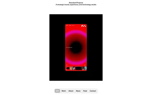
Preview image. Unlock full-res
Typographic Precision on White Canvas
Color palette
Primary text, icon fill, borders, active navigation background. Creates strong contrast on light surfaces
Page backgrounds, prominent card surfaces. Provides a clean, expansive base
Secondary text for headings and body content, darker borders. Offers slightly softer contrast than Midnight Ink
Subtle background surfaces, hover states for navigation. Provides a gentle visual separation from Canvas White
Helper text, muted links, secondary information, inactive states. Steps down in prominence from primary text
Subtle navigation background
Typography
- Weights
- 400
- Sizes
- 16px
- Line height
- 1.2
- Letter spacing
- normal
- Fallback
- serif
Decorative text and stylistic elements. Its serif nature provides a classic counterpoint to the primary sans-serif font.
- Weights
- 400, 500
- Sizes
- 12px, 16px, 20px, 40px
- Line height
- 1.1, 1.15, 1.2, 1.5
- Letter spacing
- 0.01em
- Fallback
- system-ui
Primary typography for headings, body text, links, and buttons. The specific letter-spacing creates a distinct, open feel, particularly at larger sizes. Weight 500 is used for bolder statements.
Spacing & shape
Components
Filled button with Midnight Ink background and Fog Gray text. Has a distinct 10px border-radius: `backgroundColor: #000000`, `color: #f0f0f0`, `borderRadius: 10px`, `padding: 10px 14px`.
Text links in FTAktual-Medium at 16px, Muted Gray text by default. A special 'S.P.' button has a 10px radius: `color: #808080`, `font-family: FTAktual-Medium`, `font-size: 16px`.
A fixed horizontal bar with button-like navigation items. Features a background of pale gray with a 10px border radius, contrasting with the dark text links. `backgroundColor: #c6c6c6`, `borderRadius: 10px` for the container and `10px` for individual items.
Transparent background with Muted Gray text, no border radius, and minimal padding. Used for discreet content tagging. `backgroundColor: rgba(0, 0, 0, 0)`, `color: #808080`, `borderRadius: 0px`, `padding: 0px`.
A visually distinct card primarily housing an image, with text rendered below. The card itself has a subtle 15px border radius. `padding: 4px` internal padding for text below image.
Guidelines
- Prioritize FTAktual-Medium for all primary text, leveraging its consistent 0.01em letter-spacing for refined readability.
- Utilize Canvas White (#ffffff) as the dominant background color for clarity and a spacious feel.
- Employ Midnight Ink (#000000) for primary text and major interactive elements to ensure strong contrast and visual weight.
- Apply a 10px `border-radius` to all buttons and prominent navigation elements for a subtle, rounded friendliness.
- Maintain generous spacing: `32px` vertical `sectionGap` between major content blocks and `16px` `elementGap` horizontally/vertically for internal elements.
- Use Muted Gray (#808080) for all secondary and tertiary text to create a subtle hierarchy without harshness.
- Incorporate the 'Times' font only for specific decorative or branding text, ensuring its unique features (`ss01`, `ss03`) provide a stylistic counterpoint.
- Avoid arbitrary use of multiple background colors; stick to Canvas White (#ffffff), Fog Gray (#f0f0f0), and Pale Gray (#c6c6c6) for surfaces.
- Do not introduce complex shadows or elevated components; the design system favors a flat, content-forward aesthetic.
- Refrain from using color to denote semantic states (e.g., green for success, red for error), as the system is achromatic-focused.
- Do not deviate from the specified `0.01em` letter-spacing for FTAktual-Medium to preserve its distinctive feel.
- Avoid adding strong borders to components unless they are specified for interactive elements like buttons or navigation to maintain visual lightness.
- Do not use type sizes outside the defined scale of 12px, 16px, 20px, 40px for FTAktual-Medium.
- Do not use `border-radius` values other than 0px, 10px, or 15px as these are the established design system values.
About this system
ShowHide
Standard Projects employs a classic, content-focused visual style with strong typographic emphasis. It features a predominantly stark black-and-white canvas, using minimal surface elevation. A single, soft gray gradient provides subtle background shifts. Typography is the primary visual communicator, leveraging distinct font weights and sizes to establish hierarchy, complemented by a subtly rounded UI for controls that contrasts with the generally sharp, angular image presentation. The overall impression is one of confident, understated authority.
The page maintains a full-width, full-bleed model, not confined by a `pageMaxWidth`. The hero section features a centered headline over a background that shifts between projects. Content is often arranged in a compact grid of visual project cards, typically showing a 3-column layout. Sections flow seamlessly with consistent vertical spacing of `32px` between major blocks, creating a spacious but continuous experience. Navigation is handled by a sticky footer bar, offering quick access to main sections.
The site predominantly uses product-focused photography and abstract graphics. Photography is often presented as clean, tight crops, sometimes against a white or neutral background, emphasizing the object without additional lifestyle context. Images appear within defined rectangular containers, maintaining sharp edges and isolated presentation. Icons, though not extensively visible, follow a monochrome, outlined style with consistent stroke weights. Imagery serves primarily as a decorative backdrop or as direct product showcases, forming a visually dominant element within a predominantly text-based layout with a balanced image-to-text density.
Reminiscent of Alinea Invest, Linear, Stripe, Vercel.
# Standard Projects — Style Reference
> Typographic Precision on White Canvas

**Theme:** light

**Site:** https://www.standard-projects.com

Standard Projects employs a classic, content-focused visual style with strong typographic emphasis. It features a predominantly stark black-and-white canvas, using minimal surface elevation. A single, soft gray gradient provides subtle background shifts. Typography is the primary visual communicator, leveraging distinct font weights and sizes to establish hierarchy, complemented by a subtly rounded UI for controls that contrasts with the generally sharp, angular image presentation. The overall impression is one of confident, understated authority.

## Tokens — Colors

| Name | Value | Token | Role |
|------|------|------|------|
| Midnight Ink | `#000000` | `--color-midnight-ink` | Primary text, icon fill, borders, active navigation background. Creates strong contrast on light surfaces |
| Canvas White | `#ffffff` | `--color-canvas-white` | Page backgrounds, prominent card surfaces. Provides a clean, expansive base |
| Charcoal Text | `#1a1a1a` | `--color-charcoal-text` | Secondary text for headings and body content, darker borders. Offers slightly softer contrast than Midnight Ink |
| Fog Gray | `#f0f0f0` | `--color-fog-gray` | Subtle background surfaces, hover states for navigation. Provides a gentle visual separation from Canvas White |
| Muted Gray | `#808080` | `--color-muted-gray` | Helper text, muted links, secondary information, inactive states. Steps down in prominence from primary text |
| Pale Gray | `#c6c6c6` | `--color-pale-gray` | Subtle navigation background |

## Tokens — Typography

### Times
- **Substitute:** serif
- **Weights:** 400
- **Sizes:** 16px
- **Line height:** 1.2
- **Letter spacing:** normal
- **Role:** Decorative text and stylistic elements. Its serif nature provides a classic counterpoint to the primary sans-serif font.

### FTAktual-Medium
- **Substitute:** system-ui
- **Weights:** 400, 500
- **Sizes:** 12px, 16px, 20px, 40px
- **Line height:** 1.1, 1.15, 1.2, 1.5
- **Letter spacing:** 0.01em
- **Role:** Primary typography for headings, body text, links, and buttons. The specific letter-spacing creates a distinct, open feel, particularly at larger sizes. Weight 500 is used for bolder statements.

## Tokens — Type Scale

Golden Ratio (1.618) from 16px base.

| Role | Size | Line height | Letter spacing |
|------|------|------|------|
| body | 16px | 1.2 | 0.16px |
| subheading | 20px | 1.15 | 0.2px |
| display | 40px | 1.1 | 0.4px |

## Tokens — Spacing

- **Section gap:** 32px
- **Card padding:** 14px
- **Element gap:** 16px

## Tokens — Radius

- **Buttons:** 10px
- **Cards:** 15px
- **body:** 15px
- **navigation:** 10px

## Layout

The page maintains a full-width, full-bleed model, not confined by a `pageMaxWidth`. The hero section features a centered headline over a background that shifts between projects. Content is often arranged in a compact grid of visual project cards, typically showing a 3-column layout. Sections flow seamlessly with consistent vertical spacing of `32px` between major blocks, creating a spacious but continuous experience. Navigation is handled by a sticky footer bar, offering quick access to main sections.

## Imagery

The site predominantly uses product-focused photography and abstract graphics. Photography is often presented as clean, tight crops, sometimes against a white or neutral background, emphasizing the object without additional lifestyle context. Images appear within defined rectangular containers, maintaining sharp edges and isolated presentation. Icons, though not extensively visible, follow a monochrome, outlined style with consistent stroke weights. Imagery serves primarily as a decorative backdrop or as direct product showcases, forming a visually dominant element within a predominantly text-based layout with a balanced image-to-text density.

## Components

### Primary Action Button
*Interactive element for key actions*

Filled button with Midnight Ink background and Fog Gray text. Has a distinct 10px border-radius: `backgroundColor: #000000`, `color: #f0f0f0`, `borderRadius: 10px`, `padding: 10px 14px`.

### Navigation Link
*Primary site navigation items*

Text links in FTAktual-Medium at 16px, Muted Gray text by default. A special 'S.P.' button has a 10px radius: `color: #808080`, `font-family: FTAktual-Medium`, `font-size: 16px`.

### Footer Navigation Bar
*Sticky, contextual navigation*

A fixed horizontal bar with button-like navigation items. Features a background of pale gray with a 10px border radius, contrasting with the dark text links. `backgroundColor: #c6c6c6`, `borderRadius: 10px` for the container and `10px` for individual items.

### Ghost Badge
*Categorization or subtle labeling*

Transparent background with Muted Gray text, no border radius, and minimal padding. Used for discreet content tagging. `backgroundColor: rgba(0, 0, 0, 0)`, `color: #808080`, `borderRadius: 0px`, `padding: 0px`.

### Project Card
*Container for showcasing project visuals and titles*

A visually distinct card primarily housing an image, with text rendered below. The card itself has a subtle 15px border radius. `padding: 4px` internal padding for text below image.

## Guidelines

### Do

- Prioritize FTAktual-Medium for all primary text, leveraging its consistent 0.01em letter-spacing for refined readability.
- Utilize Canvas White (#ffffff) as the dominant background color for clarity and a spacious feel.
- Employ Midnight Ink (#000000) for primary text and major interactive elements to ensure strong contrast and visual weight.
- Apply a 10px `border-radius` to all buttons and prominent navigation elements for a subtle, rounded friendliness.
- Maintain generous spacing: `32px` vertical `sectionGap` between major content blocks and `16px` `elementGap` horizontally/vertically for internal elements.
- Use Muted Gray (#808080) for all secondary and tertiary text to create a subtle hierarchy without harshness.
- Incorporate the 'Times' font only for specific decorative or branding text, ensuring its unique features (`ss01`, `ss03`) provide a stylistic counterpoint.

### Don't

- Avoid arbitrary use of multiple background colors; stick to Canvas White (#ffffff), Fog Gray (#f0f0f0), and Pale Gray (#c6c6c6) for surfaces.
- Do not introduce complex shadows or elevated components; the design system favors a flat, content-forward aesthetic.
- Refrain from using color to denote semantic states (e.g., green for success, red for error), as the system is achromatic-focused.
- Do not deviate from the specified `0.01em` letter-spacing for FTAktual-Medium to preserve its distinctive feel.
- Avoid adding strong borders to components unless they are specified for interactive elements like buttons or navigation to maintain visual lightness.
- Do not use type sizes outside the defined scale of 12px, 16px, 20px, 40px for FTAktual-Medium.
- Do not use `border-radius` values other than 0px, 10px, or 15px as these are the established design system values.

## Agent Prompt Guide

### Quick Color Reference
- text: #000000
- background: #ffffff
- border: #000000
- accent: no distinct accent color
- primary action: no distinct CTA color

### 3-5 Example Component Prompts
- Create a section headline: 'Our Work' in Charcoal Text (#1a1a1a), FTAktual-Medium, weight 500, size 40px, lineHeight 1.1, letterSpacing 0.4px.
No distinct primary action color was observed; use the extracted neutral button treatments instead of inventing a filled CTA color.
- Design a navigation item: text 'About' in Muted Gray (#808080), FTAktual-Medium, weight 400, size 16px, lineHeight 1.2, letterSpacing 0.16px.
- Construct a project display card: a 15px `border-radius` container with an internal `14px` padding, a project image, and body text 'Project Title' in Charcoal Text (#1a1a1a), FTAktual-Medium, weight 400, size 16px, lineHeight 1.2, letterSpacing 0.16px.
More like this









Keep what you find
A free account saves references to boards and can send you a weekly email of picks based on what you save.
To see every result, go Pro.