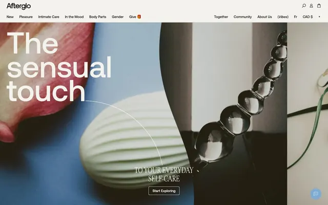
Preview image. Unlock full-res
Warm Minimalism
Color palette
Accent for decorative elements in the footer, providing a singular point of warm color
Primary page background, card surfaces, and form inputs. Establishes a bright and airy base
Most black text, primary button backgrounds, and strong borders. Provides high contrast against light surfaces
Navigation text, icons, and significant text elements. Used for ultimate contrast with light backgrounds
Subtle borders and dividers, providing visual separation without harsh lines
Secondary background color for subtle differentiation of sections or components, contributing to the muted palette
Text on dark backgrounds, selected badge backgrounds
Informational badges and subtle background hints for specific content
Typography
- Weights
- 400, 500
- Sizes
- 13px, 15px, 22px, 33px, 50px, 132px
- Line height
- 0.8, 0.9, 1, 1.1, 1.2, 1.3
- Letter spacing
- normal
- Fallback
- Inter
Primary sans-serif font for all body text, navigational elements, and most headings. Its clean, geometric nature provides a modern and understated readability across the interface.
- Weights
- 400, 500
- Sizes
- 33px, 42px, 54px, 187px
- Line height
- 1, 1.1
- Letter spacing
- normal
- Fallback
- Playfair Display
Decorative serif font used for select display headlines, adding a touch of classic sophistication and visual intrigue. Its unique character breaks the geometric monotony of Aeonik.
Spacing & shape
Components
Solid Deep Charcoal background (#131313) with Snow White text (#ffffff), 5px border-radius, and 10px vertical, 17px horizontal padding. Delivers a clear, confident action prompt.
Transparent background with Pure Black text (#000000) and border, no explicit padding, and 0px border-radius, maintaining a lightweight feel for less prominent actions.
Canvas White background (#f3f2ec) with 5px border-radius and 29px padding on all sides, used for containing product information or feature blocks.
Solid Pure Black background (#000000) with Snow White text (#ffffff), 5px border-radius, and 3px vertical, 5px horizontal padding. Indicates unavailability clearly.
Solid Snow White background (#ffffff) with Pure Black text (#000000), 5px border-radius, and 3px vertical, 5px horizontal padding. Signals curated content.
Solid Sky Mist background (#7faad2) with Snow White text (#ffffff), 5px border-radius, and 3px vertical, 5px horizontal padding. Highlights popular items.
Canvas White background (#f3f2ec) with a 1px solid Pure Black border (#000000) at 0px border-radius. Inset box-shadow using Canvas White effectively creates a subtle internal highlight.
Guidelines
- Prioritize Canvas White (#f3f2ec) for primary backgrounds and surfaces.
- Use Deep Charcoal (#131313) for most primary button fills and strong text accents.
- Apply 5px border-radius consistently to all interactive elements, cards, and badges.
- Utilize Aeonik for readability in body and navigation, pairing it with Cardinal Fruit for impactful, decorative headlines.
- Maintain a clear elementGap of 4px for fine-grained spacing between small UI elements.
- Employ Platinum Gray (#e3e4df) for subtle visual separation, like horizontal dividers or soft borders.
- Integrate warm, neutral-toned photography to add sensuality without overwhelming the minimal UI.
- Avoid using multiple accent colors; rely on Terra Cotta (#f68e6d) or Sky Mist (#7faad2) as single points of color.
- Do not use heavy shadows or gradients; subtle elevation or inset effects are preferred.
- Refrain from using strong, saturated colors for backgrounds; maintain a largely achromatic and muted palette.
- Do not introduce decorative elements that clash with the clean, minimalist aesthetic.
- Avoid excessive use of text treatments; stick to defined type scales and weights for hierarchy.
- Do not clutter layouts; ensure ample whitespace and compact component spacing.
- Avoid purely decorative icons; use icons sparingly and primarily for functional purposes.
About this system
ShowHide
Afterglo employs a visual style of subtle, almost clinical minimalism overlaid with soft, muted sensuality. Its design language combines stark achromatic typography and UI elements with warm, skin-toned imagery and a single vibrant accent color. Surfaces are clean and often borderless, maintaining a spacious, uncluttered presentation. The overall impression is one of grounded, refined intimacy where visual texture comes from photography rather than heavy UI treatments.
The page layout utilizes a contained, centered model, likely within a fluid max-width that isn't strictly fixed due to detected `null` but follows common web patterns. The hero section often features full-bleed, visually rich photography or abstract graphics acting as a background, with overlaying, large-format type. Content sections generally alternate between text-left/image-right or image-left/text-right patterns, creating a balanced visual flow. A prominent card grid system is used for product display, typically in multiple columns. Vertical spacing is consistent but compact, creating an information-rich yet breathable experience. Navigation is handled by a sticky top bar, featuring a minimal aesthetic with ghost controls and a sub-navigation menu for product categories.
Imagery primarily consists of high-quality, artfully composed photography featuring product shots or abstract and sensual human forms. When product-focused, they are typically tightly cropped on neutral backgrounds, highlighting texture and design. Abstract and human form photography uses muted, soft-focus, and skin-toned palettes, often with blurred elements or partial views, creating a sense of intimacy and softness. There are no explicit illustrations. Icons are minimal, outlined, and monochromatic, maintaining a clean, functional UI presence and supporting navigation rather than decorative flair. Imagery is dense, often occupying significant visual space and serving as a key textural and emotional component of the brand, contrasting with the stark UI.
Reminiscent of Maude, Dame Products, Necessaire, Parade.
# Afterglo — Style Reference
> Warm Minimalism

**Theme:** light

**Site:** https://myafterglo.com

Afterglo employs a visual style of subtle, almost clinical minimalism overlaid with soft, muted sensuality. Its design language combines stark achromatic typography and UI elements with warm, skin-toned imagery and a single vibrant accent color. Surfaces are clean and often borderless, maintaining a spacious, uncluttered presentation. The overall impression is one of grounded, refined intimacy where visual texture comes from photography rather than heavy UI treatments.

## Tokens — Colors

| Name | Value | Token | Role |
|------|------|------|------|
| Terra Cotta | `#f68e6d` | `--color-terra-cotta` | Accent for decorative elements in the footer, providing a singular point of warm color |
| Canvas White | `#f3f2ec` | `--color-canvas-white` | Primary page background, card surfaces, and form inputs. Establishes a bright and airy base |
| Deep Charcoal | `#131313` | `--color-deep-charcoal` | Most black text, primary button backgrounds, and strong borders. Provides high contrast against light surfaces |
| Pure Black | `#000000` | `--color-pure-black` | Navigation text, icons, and significant text elements. Used for ultimate contrast with light backgrounds |
| Platinum Gray | `#e3e4df` | `--color-platinum-gray` | Subtle borders and dividers, providing visual separation without harsh lines |
| Faded Stone | `#cbc9bd` | `--color-faded-stone` | Secondary background color for subtle differentiation of sections or components, contributing to the muted palette |
| Snow White | `#ffffff` | `--color-snow-white` | Text on dark backgrounds, selected badge backgrounds |
| Sky Mist | `#7faad2` | `--color-sky-mist` | Informational badges and subtle background hints for specific content |

## Tokens — Typography

### Aeonik
- **Substitute:** Inter
- **Weights:** 400, 500
- **Sizes:** 13px, 15px, 22px, 33px, 50px, 132px
- **Line height:** 0.8, 0.9, 1, 1.1, 1.2, 1.3
- **Letter spacing:** normal
- **Role:** Primary sans-serif font for all body text, navigational elements, and most headings. Its clean, geometric nature provides a modern and understated readability across the interface.

### Cardinal Fruit
- **Substitute:** Playfair Display
- **Weights:** 400, 500
- **Sizes:** 33px, 42px, 54px, 187px
- **Line height:** 1, 1.1
- **Letter spacing:** normal
- **Role:** Decorative serif font used for select display headlines, adding a touch of classic sophistication and visual intrigue. Its unique character breaks the geometric monotony of Aeonik.

## Tokens — Type Scale

Perfect Fifth (1.5) from 22px base.

| Role | Size | Line height | Letter spacing |
|------|------|------|------|
| caption | 13px | 1.3 | — |
| body-sm | 15px | 1.2 | — |
| body | 22px | 1.1 | — |
| subheading | 33px | 1.1 | — |
| heading | 42px | 1.1 | — |
| heading-lg | 50px | 1 | — |
| display | 132px | 0.8 | — |

## Tokens — Spacing

- **Section gap:** 25px
- **Card padding:** 29px
- **Element gap:** 4px

## Tokens — Radius

- **Default:** 5px

## Layout

The page layout utilizes a contained, centered model, likely within a fluid max-width that isn't strictly fixed due to detected `null` but follows common web patterns. The hero section often features full-bleed, visually rich photography or abstract graphics acting as a background, with overlaying, large-format type. Content sections generally alternate between text-left/image-right or image-left/text-right patterns, creating a balanced visual flow. A prominent card grid system is used for product display, typically in multiple columns. Vertical spacing is consistent but compact, creating an information-rich yet breathable experience. Navigation is handled by a sticky top bar, featuring a minimal aesthetic with ghost controls and a sub-navigation menu for product categories.

## Imagery

Imagery primarily consists of high-quality, artfully composed photography featuring product shots or abstract and sensual human forms. When product-focused, they are typically tightly cropped on neutral backgrounds, highlighting texture and design. Abstract and human form photography uses muted, soft-focus, and skin-toned palettes, often with blurred elements or partial views, creating a sense of intimacy and softness. There are no explicit illustrations. Icons are minimal, outlined, and monochromatic, maintaining a clean, functional UI presence and supporting navigation rather than decorative flair. Imagery is dense, often occupying significant visual space and serving as a key textural and emotional component of the brand, contrasting with the stark UI.

## Components

### Primary Filled Button
*Call to action button*

Solid Deep Charcoal background (#131313) with Snow White text (#ffffff), 5px border-radius, and 10px vertical, 17px horizontal padding. Delivers a clear, confident action prompt.

### Ghost Button
*Secondary action or navigation*

Transparent background with Pure Black text (#000000) and border, no explicit padding, and 0px border-radius, maintaining a lightweight feel for less prominent actions.

### Default Card
*Content container*

Canvas White background (#f3f2ec) with 5px border-radius and 29px padding on all sides, used for containing product information or feature blocks.

### Badge (Out of Stock)
*Informational label*

Solid Pure Black background (#000000) with Snow White text (#ffffff), 5px border-radius, and 3px vertical, 5px horizontal padding. Indicates unavailability clearly.

### Badge (Team Fav)
*Highlight label*

Solid Snow White background (#ffffff) with Pure Black text (#000000), 5px border-radius, and 3px vertical, 5px horizontal padding. Signals curated content.

### Badge (Best Seller)
*Semantic info label*

Solid Sky Mist background (#7faad2) with Snow White text (#ffffff), 5px border-radius, and 3px vertical, 5px horizontal padding. Highlights popular items.

### Form Input
*User entry field*

Canvas White background (#f3f2ec) with a 1px solid Pure Black border (#000000) at 0px border-radius. Inset box-shadow using Canvas White effectively creates a subtle internal highlight.

## Guidelines

### Do

- Prioritize Canvas White (#f3f2ec) for primary backgrounds and surfaces.
- Use Deep Charcoal (#131313) for most primary button fills and strong text accents.
- Apply 5px border-radius consistently to all interactive elements, cards, and badges.
- Utilize Aeonik for readability in body and navigation, pairing it with Cardinal Fruit for impactful, decorative headlines.
- Maintain a clear elementGap of 4px for fine-grained spacing between small UI elements.
- Employ Platinum Gray (#e3e4df) for subtle visual separation, like horizontal dividers or soft borders.
- Integrate warm, neutral-toned photography to add sensuality without overwhelming the minimal UI.

### Don't

- Avoid using multiple accent colors; rely on Terra Cotta (#f68e6d) or Sky Mist (#7faad2) as single points of color.
- Do not use heavy shadows or gradients; subtle elevation or inset effects are preferred.
- Refrain from using strong, saturated colors for backgrounds; maintain a largely achromatic and muted palette.
- Do not introduce decorative elements that clash with the clean, minimalist aesthetic.
- Avoid excessive use of text treatments; stick to defined type scales and weights for hierarchy.
- Do not clutter layouts; ensure ample whitespace and compact component spacing.
- Avoid purely decorative icons; use icons sparingly and primarily for functional purposes.

## Agent Prompt Guide

### Quick Color Reference
text: #000000
background: #f3f2ec
border: #e3e4df
accent: #f68e6d
primary action: #131313 (filled action)

### 3-5 Example Component Prompts
1. Create a Primary Action Button: #131313 background, #f3f2ec text, 9999px radius, compact pill padding. Use this filled treatment for the main CTA.
2. Design a product card: Canvas White (#f3f2ec) background, 5px border-radius, 29px padding. Use a product image, with 'Out of Stock' Badge (Pure Black #000000 background, Snow White #ffffff text) at the top, and product name in Aeonik 15px/lineHeight 1.2 Pure Black text.
3. Implement a navigation bar item: Ghost Button, transparent background, Pure Black text (#000000), Aeonik 13px/lineHeight 1.3. On hover, apply a subtle underline using Platinum Gray (#e3e4df).
More like this









Keep what you find
A free account saves references to boards and can send you a weekly email of picks based on what you save.
To see every result, go Pro.