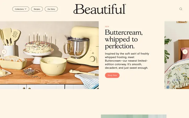
Preview image. Unlock full-res
Warm Home Goods Catalog: pages feel like browsing a tactile, sunlit lifestyle brand.
Color palette
Primary action button backgrounds, body text emphasis, heading borders — this vivid coral provides the main interactive highlight
Subtler button borders, ghost button text, decorative icons — a muted, earthy orange for secondary interactive elements or accents
Page backgrounds, subtle surface accents, text background in header. This color sets the inviting, soft base tone
Dominant canvas, input backgrounds, subtle dividers in the footer. Provides a slightly cooler, but still warm, baseline
Primary text, strong borders, navigation elements. Provides maximum contrast for readability against the warm neutrals
Secondary text, input text color, navigation borders. Offers a softer contrast than Deep Licorice
Card backgrounds, button text, selected heading borders. Creates a clean, crisp surface
Card borders, subtle dividers. Defines card outlines without being overly sharp
Tertiary text or decorative borders. A lighter neutral for less prominent elements
Typography
- Weights
- 400
- Sizes
- 10px, 13px, 14px, 16px, 18px, 21px
- Line height
- 1.2, 1.3
- Letter spacing
- -0.038em at 21px, -0.036em at 18px, -0.034em at 16px, -0.032em at 14px, -0.030em at 13px, -0.030em at 10px
- Fallback
- Inter
Primary sans-serif for body text, navigation, buttons, and general UI elements. Its confident but not aggressive character supports the overall approachable tone. Weights are consistently light, reinforcing the gentle visual system.
- Weights
- 400
- Sizes
- 14px, 16px, 18px, 19px
- Line height
- 1.3, 1.42
- Letter spacing
- -0.040em at 19px, -0.050em at 18px, -0.046em at 16px, -0.042em at 14px
- Fallback
- Space Mono
Monospaced font used sparingly for specific input fields, code-like accents, or potentially some labels, providing a technical contrast to the primary sans-serif.
- Weights
- 400, 500
- Sizes
- 25px, 28px, 30px, 32px, 39px, 43px, 52px
- Line height
- 1, 1.2
- Letter spacing
- normal
- Fallback
- Playfair Display
Distinctive serif font for headlines and prominent brand elements. Its elegant, slightly playful character defines the brand's sophisticated but warm voice. The normal letter spacing at larger sizes allows its unique form to shine.
Spacing & shape
Components
Filled button with 'Coral Kiss' (#fa7864) background, 'White Linen' (#ffffff) text. Features a highly rounded 999px border-radius, with 9.6px vertical and 19.2px horizontal padding using Basis Grotesque Pro 400.
Filled button with 'Coral Kiss' (#fa7864) background and 'White Linen' (#ffffff) text. Features a 50px border-radius, with 10px vertical and 30px horizontal padding using Basis Grotesque Pro 400. Slightly less rounded than Primary Action.
Outlined button with 'Desert Rose' (#dc8264) border (1px), 'Creamy Canvas' (#fff5e6) background, and 'Desert Rose' (#dc8264) text. Has a 50% border-radius, with minimal 1px vertical and 6px horizontal padding, used for small, decorative actions like category tags.
Outlined button style for top navigation items. Features a 'Desert Rose' (#dc8264) border, 'Creamy Canvas' (#fff5e6) background, and 'Desert Rose' (#dc8264) text. Has a 20px border-radius, likely with 10px vertical and 19px horizontal padding. Uses Basis Grotesque Pro 400.
Circular card for product categories with 'White Linen' (#ffffff) background, 'Pebble Gray' (#cccccc) 1px solid border, and 50% border-radius. Contains imagery and uses 10px padding inside.
Input field with 'Buttermilk' (#e8e8e1) background, 'Truffle' (#282828) text, and a 'Truffle' (#282828) 1px solid border. Has 10px vertical padding and 10px left padding, with extra right padding for icons or clear buttons.
Guidelines
- Use 'Creamy Canvas' (#fff5e6) as the primary background for sections with content, providing a soft base.
- Prioritize 'Coral Kiss' (#fa7864) for all primary calls to action, such as 'Shop Now' buttons, and for emphasizing key messaging.
- Apply a 999px border-radius to all filled action buttons to achieve a soft, pill-shaped aesthetic.
- Employ the GascogneTS font for all headlines and prominent brand text to establish the elegant and inviting tone, using 'Deep Licorice' (#000000) for contrast.
- Maintain a comfortable information density, utilizing 10px as a baseline for `elementGap` and `cardPadding` to allow content to breathe.
- Use 'Buttermilk' (#e8e8e1) for input fields and subtle background variations to layer content without harsh breaks.
- Ensure brand imagery features soft lighting, a slightly desaturated color palette, and is contained within clear bounds, often circular or soft-edged.
- Avoid harsh shadows or strong gradients; the system relies on subtle surface changes and color for hierarchy.
- Do not introduce new saturated primary colors; 'Coral Kiss' and 'Desert Rose' are the only brand accents intended for interactive elements.
- Refrain from using excessively bold or uppercase typography for calls to action or body text; the Basis Grotesque Pro 400 weight should maintain a gentle presence.
- Do not crop product photography tightly or use hard-edged imagery; images should complement the soft, inviting brand feel, often with a hint of lifestyle context.
- Avoid cluttering the layout; allow ample white space around elements, particularly with a `sectionGap` of 32px or more.
- Do not use dark backgrounds for main content sections; the theme is predominantly light, establishing a bright and airy feel.
- Do not use sharp 0px border-radii for interactive elements; all buttons and active components should maintain a soft, rounded appearance.
About this system
ShowHide
Beautiful™ uses a warm, inviting aesthetic with a creamy, almost edible color palette that feels like a home goods catalog. Typography blends classic serif with modern sans-serif for a confident yet approachable tone. Components emphasize soft, rounded edges and minimal elevation, fostering a tactile and gentle user experience. Color accents are reserved for primary calls to action, creating a subtle visual hierarchy without jarring contrasts.
The page model is primarily a max-width contained layout, though it appears to have full-bleed sections for hero imagery depending on viewport. The hero pattern includes a large visual of products on one side and a prominent headline and description on the other, reflecting a split-panel approach. Section rhythm maintains consistent vertical spacing, often distinguished by alternating background colors (Buttermilk vs Creamy Canvas). Content arrangement frequently utilizes 2-column layouts for text alongside visuals, and a 3-column grid for product cards. Overall density is comfortable, with ample breathing room between sections and elements. Navigation is a sticky top bar with the brand logo centered and dropdowns for collections.
The visual language for imagery on Beautiful™ is soft, inviting, and product-focused with a lifestyle touch. Photography is high-key, with bright, diffused lighting and slightly desaturated, warm tones. Products are often shown in a natural home setting or as clean, studio shots with soft shadows. Illustrations are flat, organic, and utilize the brand's warm color palette sparingly. Icons are outlined, with a moderate stroke weight, appearing monochrome. Images are typically contained, often within perfect circles for category navigation or soft-edged rectangles, providing decorative atmosphere and product showcasing. The site is image-heavy, balancing prominent visuals with concise text.
Reminiscent of Our Place, Parachute Home, Dyson, Great Jones, West Elm.
# Beautiful™ — Style Reference
> Warm Home Goods Catalog: pages feel like browsing a tactile, sunlit lifestyle brand.

**Theme:** light

**Site:** https://cookwithbeautiful.com

Beautiful™ uses a warm, inviting aesthetic with a creamy, almost edible color palette that feels like a home goods catalog. Typography blends classic serif with modern sans-serif for a confident yet approachable tone. Components emphasize soft, rounded edges and minimal elevation, fostering a tactile and gentle user experience. Color accents are reserved for primary calls to action, creating a subtle visual hierarchy without jarring contrasts.

## Tokens — Colors

| Name | Value | Token | Role |
|------|------|------|------|
| Coral Kiss | `#fa7864` | `--color-coral-kiss` | Primary action button backgrounds, body text emphasis, heading borders — this vivid coral provides the main interactive highlight |
| Desert Rose | `#dc8264` | `--color-desert-rose` | Subtler button borders, ghost button text, decorative icons — a muted, earthy orange for secondary interactive elements or accents |
| Creamy Canvas | `#fff5e6` | `--color-creamy-canvas` | Page backgrounds, subtle surface accents, text background in header. This color sets the inviting, soft base tone |
| Buttermilk | `#e8e8e1` | `--color-buttermilk` | Dominant canvas, input backgrounds, subtle dividers in the footer. Provides a slightly cooler, but still warm, baseline |
| Deep Licorice | `#000000` | `--color-deep-licorice` | Primary text, strong borders, navigation elements. Provides maximum contrast for readability against the warm neutrals |
| Truffle | `#282828` | `--color-truffle` | Secondary text, input text color, navigation borders. Offers a softer contrast than Deep Licorice |
| White Linen | `#ffffff` | `--color-white-linen` | Card backgrounds, button text, selected heading borders. Creates a clean, crisp surface |
| Pebble Gray | `#cccccc` | `--color-pebble-gray` | Card borders, subtle dividers. Defines card outlines without being overly sharp |
| Ash Mist | `#707070` | `--color-ash-mist` | Tertiary text or decorative borders. A lighter neutral for less prominent elements |

## Tokens — Typography

### Basis Grotesque Pro
- **Substitute:** Inter
- **Weights:** 400
- **Sizes:** 10px, 13px, 14px, 16px, 18px, 21px
- **Line height:** 1.2, 1.3
- **Letter spacing:** -0.038em at 21px, -0.036em at 18px, -0.034em at 16px, -0.032em at 14px, -0.030em at 13px, -0.030em at 10px
- **Role:** Primary sans-serif for body text, navigation, buttons, and general UI elements. Its confident but not aggressive character supports the overall approachable tone. Weights are consistently light, reinforcing the gentle visual system.

### BasisGrotesquePro-Mono
- **Substitute:** Space Mono
- **Weights:** 400
- **Sizes:** 14px, 16px, 18px, 19px
- **Line height:** 1.3, 1.42
- **Letter spacing:** -0.040em at 19px, -0.050em at 18px, -0.046em at 16px, -0.042em at 14px
- **Role:** Monospaced font used sparingly for specific input fields, code-like accents, or potentially some labels, providing a technical contrast to the primary sans-serif.

### GascogneTS
- **Substitute:** Playfair Display
- **Weights:** 400, 500
- **Sizes:** 25px, 28px, 30px, 32px, 39px, 43px, 52px
- **Line height:** 1, 1.2
- **Letter spacing:** normal
- **Role:** Distinctive serif font for headlines and prominent brand elements. Its elegant, slightly playful character defines the brand's sophisticated but warm voice. The normal letter spacing at larger sizes allows its unique form to shine.

## Tokens — Type Scale

Perfect Fourth (1.333) from 16px base.

| Role | Size | Line height | Letter spacing |
|------|------|------|------|
| caption | 10px | 1.3 | -0.03em |
| body | 16px | 1.2 | -0.034em |
| subheading | 21px | 1.2 | -0.038em |
| heading-sm | 25px | 1 | — |
| heading | 32px | 1.2 | — |
| heading-lg | 39px | 1 | — |
| display | 52px | 1 | — |

## Tokens — Spacing

- **Section gap:** 32px
- **Card padding:** 10px
- **Element gap:** 10px

## Tokens — Radius

- **Buttons:** 999px
- **Cards:** 50%
- **navigation:** 20px

## Layout

The page model is primarily a max-width contained layout, though it appears to have full-bleed sections for hero imagery depending on viewport. The hero pattern includes a large visual of products on one side and a prominent headline and description on the other, reflecting a split-panel approach. Section rhythm maintains consistent vertical spacing, often distinguished by alternating background colors (Buttermilk vs Creamy Canvas). Content arrangement frequently utilizes 2-column layouts for text alongside visuals, and a 3-column grid for product cards. Overall density is comfortable, with ample breathing room between sections and elements. Navigation is a sticky top bar with the brand logo centered and dropdowns for collections.

## Imagery

The visual language for imagery on Beautiful™ is soft, inviting, and product-focused with a lifestyle touch. Photography is high-key, with bright, diffused lighting and slightly desaturated, warm tones. Products are often shown in a natural home setting or as clean, studio shots with soft shadows. Illustrations are flat, organic, and utilize the brand's warm color palette sparingly. Icons are outlined, with a moderate stroke weight, appearing monochrome. Images are typically contained, often within perfect circles for category navigation or soft-edged rectangles, providing decorative atmosphere and product showcasing. The site is image-heavy, balancing prominent visuals with concise text.

## Components

### Primary Action Button
*Call to action*

Filled button with 'Coral Kiss' (#fa7864) background, 'White Linen' (#ffffff) text. Features a highly rounded 999px border-radius, with 9.6px vertical and 19.2px horizontal padding using Basis Grotesque Pro 400.

### Secondary Rounded Button
*Alternate call to action*

Filled button with 'Coral Kiss' (#fa7864) background and 'White Linen' (#ffffff) text. Features a 50px border-radius, with 10px vertical and 30px horizontal padding using Basis Grotesque Pro 400. Slightly less rounded than Primary Action.

### Ghost Action Button
*Subtle, outlined action*

Outlined button with 'Desert Rose' (#dc8264) border (1px), 'Creamy Canvas' (#fff5e6) background, and 'Desert Rose' (#dc8264) text. Has a 50% border-radius, with minimal 1px vertical and 6px horizontal padding, used for small, decorative actions like category tags.

### Navigation Link Button
*Navigational element*

Outlined button style for top navigation items. Features a 'Desert Rose' (#dc8264) border, 'Creamy Canvas' (#fff5e6) background, and 'Desert Rose' (#dc8264) text. Has a 20px border-radius, likely with 10px vertical and 19px horizontal padding. Uses Basis Grotesque Pro 400.

### Circular Category Card
*Product category navigation*

Circular card for product categories with 'White Linen' (#ffffff) background, 'Pebble Gray' (#cccccc) 1px solid border, and 50% border-radius. Contains imagery and uses 10px padding inside.

### Light Text Input
*User input field*

Input field with 'Buttermilk' (#e8e8e1) background, 'Truffle' (#282828) text, and a 'Truffle' (#282828) 1px solid border. Has 10px vertical padding and 10px left padding, with extra right padding for icons or clear buttons.

## Guidelines

### Do

- Use 'Creamy Canvas' (#fff5e6) as the primary background for sections with content, providing a soft base.
- Prioritize 'Coral Kiss' (#fa7864) for all primary calls to action, such as 'Shop Now' buttons, and for emphasizing key messaging.
- Apply a 999px border-radius to all filled action buttons to achieve a soft, pill-shaped aesthetic.
- Employ the GascogneTS font for all headlines and prominent brand text to establish the elegant and inviting tone, using 'Deep Licorice' (#000000) for contrast.
- Maintain a comfortable information density, utilizing 10px as a baseline for `elementGap` and `cardPadding` to allow content to breathe.
- Use 'Buttermilk' (#e8e8e1) for input fields and subtle background variations to layer content without harsh breaks.
- Ensure brand imagery features soft lighting, a slightly desaturated color palette, and is contained within clear bounds, often circular or soft-edged.

### Don't

- Avoid harsh shadows or strong gradients; the system relies on subtle surface changes and color for hierarchy.
- Do not introduce new saturated primary colors; 'Coral Kiss' and 'Desert Rose' are the only brand accents intended for interactive elements.
- Refrain from using excessively bold or uppercase typography for calls to action or body text; the Basis Grotesque Pro 400 weight should maintain a gentle presence.
- Do not crop product photography tightly or use hard-edged imagery; images should complement the soft, inviting brand feel, often with a hint of lifestyle context.
- Avoid cluttering the layout; allow ample white space around elements, particularly with a `sectionGap` of 32px or more.
- Do not use dark backgrounds for main content sections; the theme is predominantly light, establishing a bright and airy feel.
- Do not use sharp 0px border-radii for interactive elements; all buttons and active components should maintain a soft, rounded appearance.

## Agent Prompt Guide

Quick Color Reference:
text: #000000
background: #e8e8e1
border: #cccccc
accent: #fa7864
primary action: #fa7864 (filled action)

Example Component Prompts:
Create a Primary Action Button: #fa7864 background, #000000 text, 9999px radius, compact pill padding. Use this filled treatment for the main CTA.
Create a circular category card: 'White Linen' (#ffffff) background, 'Pebble Gray' (#cccccc) 1px solid border, 50% border-radius, Basis Grotesque Pro 400 13px text 'Deep Licorice' (#000000).
Create a navigation link button: 'Creamy Canvas' (#fff5e6) background, 'Desert Rose' (#dc8264) 1px solid border, 'Desert Rose' (#dc8264) text, 20px border-radius, Basis Grotesque Pro 400 14px text, 10px vertical and 19px horizontal padding.
Create a light text input field: 'Buttermilk' (#e8e8e1) background, 'Truffle' (#282828) 1px solid border, 'Truffle' (#282828) 14px BasisGrotesquePro-Mono 400 text, 10px vertical and 10px left padding.
More like this









Keep what you find
A free account saves references to boards and can send you a weekly email of picks based on what you save.
To see every result, go Pro.