Preview image. Unlock full-res
Midnight graphic stage
Color palette
Green decorative accent for icons, marks, and small graphic details. Do not promote it to the primary CTA color
Page backgrounds, card surfaces, navigation background — forms the primary dark canvas
Primary text, heading text, button text, borders for outlines and graphic elements, navigation text, icons
Muted text, secondary navigation text, subtle borders in certain contexts
Typography
- Weights
- 300, 400
- Sizes
- 11px, 14px, 16px, 20px, 35px, 94px, 115px, 137px
- Line height
- 0.7, 0.75, 0.87, 1.2, 1.3, 1.5
- Letter spacing
- normal
- Fallback
- system-ui, sans-serif
All textual content — headlines, body text, navigation, and buttons. Its varied weights and tightly-packed large sizes define the brand’s bold and graphic typographic voice.
Spacing & shape
Components
Transparent background, Ghost White text, 1px Ghost White border. Uses 0px border-radius, 25px horizontal padding, 0px vertical padding. Used for 'Menu' and 'Fermer le menu'.
Transparent background, Ghost White text, 3px Ghost White border. Features an extreme border-radius of 93506.4px creating a pill shape. Uses 28.08px horizontal padding and 20.592px top padding with 0px bottom padding. Used for 'Projets' and 'Agence'.
Ghost White text at 10px padding, no background. Elements are separated with 3px margin and have a 34965px border-radius for decorative elements like language toggle. Active states may use Pewter for background.
Guidelines
- Use Absolute Zero (#000000) for all primary backgrounds to maintain the dark canvas.
- Apply Ghost White (#ffffff) for all primary text, headlines, and interactive element borders.
- Utilize Lausanne font exclusively at its various weights for all text elements.
- Ensure all primary action buttons ('Ghost Button Thick Border Rounded') have a 3px Ghost White border and 93506.4px border-radius for a distinct pill shape.
- Maintain a compact density with 10px element gaps as a default for small interactive groups.
- Employ generous horizontal padding of 28px for buttons and 144px for main headlines to give text ample visual space.
- Use Electric Lime (#d3fd50) sparingly as a decorative stroke or accent, never for primary text or backgrounds.
- Avoid solid background colors for interactive elements, favoring outlines or ghost styles.
- Do not introduce sharp corners on buttons; maintain the rounded or pill-shaped aesthetic with 93506.4px radius for primary actions.
- Do not deviate from the Lausanne font family or its specified weights and sizes.
- Avoid using Electric Lime (#d3fd50) as a functional background color for buttons or text.
- Do not use generic system UI fonts; Lausanne is a core part of the brand's graphic identity.
- Do not introduce shadows or elevation; the system relies on flat surfaces and strong outlines.
About this system
ShowHide
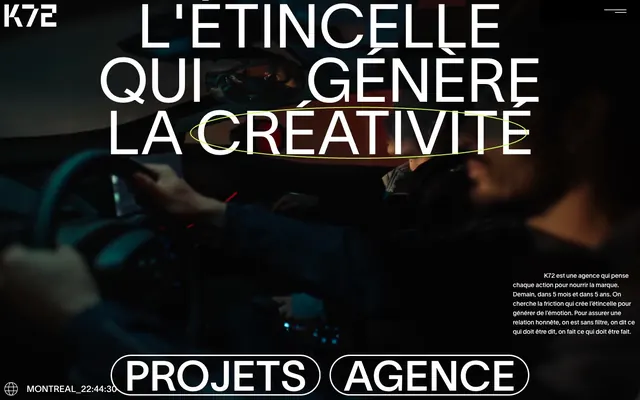
K72 utilizes a dark, high-contrast aesthetic with stark white typography against deep black surfaces, creating a bold and assertive tone. Interaction is signaled through vivid green accents and large, characterful outline buttons. The design emphasizes content through dramatic scaling typography and generous horizontal padding, giving elements ample room to breathe in a visually dense environment. Components are distinctly outlined, reinforcing a graphic, almost print-like quality.
The page uses a full-bleed layout, where background imagery stretches across the entire viewport. The hero section features a centered, dramatically scaled headline over the large background image. Content is primarily centered or arranged with significant horizontal padding. The navigation is a minimal top bar with discreet links, and primary actions are presented as large, pill-shaped outline buttons. The overall rhythm is expansive, with ample negative space around key elements, allowing the bold typography to command attention.
The site predominantly uses photography as a background element with a dark, moody overlay, often depicting human hands in activity. Imagery is full-bleed, serving as a textural backdrop for highly contrasting white text rather than an explicit content focus. There are no decorative illustrations or prominent product screenshots. Icons are minimal, rendered in Ghost White as simple lines, adhering to the high-contrast, graphic aesthetic. The visual density is image-heavy, with large ambient background images supporting prominent typography.
Reminiscent of Huge Inc., Basic Agency, AKQA.
# Agence K72 — Style Reference
> Midnight graphic stage

**Theme:** dark

**Site:** https://k72.ca

K72 utilizes a dark, high-contrast aesthetic with stark white typography against deep black surfaces, creating a bold and assertive tone. Interaction is signaled through vivid green accents and large, characterful outline buttons. The design emphasizes content through dramatic scaling typography and generous horizontal padding, giving elements ample room to breathe in a visually dense environment. Components are distinctly outlined, reinforcing a graphic, almost print-like quality.

## Tokens — Colors

| Name | Value | Token | Role |
|------|------|------|------|
| Electric Lime | `#d3fd50` | `--color-electric-lime` | Green decorative accent for icons, marks, and small graphic details. Do not promote it to the primary CTA color |
| Absolute Zero | `#000000` | `--color-absolute-zero` | Page backgrounds, card surfaces, navigation background — forms the primary dark canvas |
| Ghost White | `#ffffff` | `--color-ghost-white` | Primary text, heading text, button text, borders for outlines and graphic elements, navigation text, icons |
| Pewter | `#4d4d4d` | `--color-pewter` | Muted text, secondary navigation text, subtle borders in certain contexts |

## Tokens — Typography

### Lausanne
- **Substitute:** system-ui, sans-serif
- **Weights:** 300, 400
- **Sizes:** 11px, 14px, 16px, 20px, 35px, 94px, 115px, 137px
- **Line height:** 0.7, 0.75, 0.87, 1.2, 1.3, 1.5
- **Letter spacing:** normal
- **Role:** All textual content — headlines, body text, navigation, and buttons. Its varied weights and tightly-packed large sizes define the brand’s bold and graphic typographic voice.

## Tokens — Type Scale

Augmented Fourth (1.414) from 16px base.

| Role | Size | Line height | Letter spacing |
|------|------|------|------|
| caption | 11px | 1.2 | — |
| body-sm | 14px | 1.2 | — |
| body | 16px | 1.2 | — |
| body-lg | 20px | 1.2 | — |
| heading-sm | 35px | 1.2 | — |
| heading | 94px | 1.2 | — |
| heading-lg | 115px | 1.2 | — |
| display-sm | 137px | 1.2 | — |

## Tokens — Spacing

- **Section gap:** 40px
- **Card padding:** 28px
- **Element gap:** 10px

## Tokens — Radius

- **Buttons:** 93506.4px
- **navBadges:** 34965px

## Layout

The page uses a full-bleed layout, where background imagery stretches across the entire viewport. The hero section features a centered, dramatically scaled headline over the large background image. Content is primarily centered or arranged with significant horizontal padding. The navigation is a minimal top bar with discreet links, and primary actions are presented as large, pill-shaped outline buttons. The overall rhythm is expansive, with ample negative space around key elements, allowing the bold typography to command attention.

## Imagery

The site predominantly uses photography as a background element with a dark, moody overlay, often depicting human hands in activity. Imagery is full-bleed, serving as a textural backdrop for highly contrasting white text rather than an explicit content focus. There are no decorative illustrations or prominent product screenshots. Icons are minimal, rendered in Ghost White as simple lines, adhering to the high-contrast, graphic aesthetic. The visual density is image-heavy, with large ambient background images supporting prominent typography.

## Components

### Ghost Button Thin Border
*Action button*

Transparent background, Ghost White text, 1px Ghost White border. Uses 0px border-radius, 25px horizontal padding, 0px vertical padding. Used for 'Menu' and 'Fermer le menu'.

### Ghost Button Thick Border Rounded
*Primary action button*

Transparent background, Ghost White text, 3px Ghost White border. Features an extreme border-radius of 93506.4px creating a pill shape. Uses 28.08px horizontal padding and 20.592px top padding with 0px bottom padding. Used for 'Projets' and 'Agence'.

### Nav Item
*Navigation link*

Ghost White text at 10px padding, no background. Elements are separated with 3px margin and have a 34965px border-radius for decorative elements like language toggle. Active states may use Pewter for background.

## Guidelines

### Do

- Use Absolute Zero (#000000) for all primary backgrounds to maintain the dark canvas.
- Apply Ghost White (#ffffff) for all primary text, headlines, and interactive element borders.
- Utilize Lausanne font exclusively at its various weights for all text elements.
- Ensure all primary action buttons ('Ghost Button Thick Border Rounded') have a 3px Ghost White border and 93506.4px border-radius for a distinct pill shape.
- Maintain a compact density with 10px element gaps as a default for small interactive groups.
- Employ generous horizontal padding of 28px for buttons and 144px for main headlines to give text ample visual space.
- Use Electric Lime (#d3fd50) sparingly as a decorative stroke or accent, never for primary text or backgrounds.

### Don't

- Avoid solid background colors for interactive elements, favoring outlines or ghost styles.
- Do not introduce sharp corners on buttons; maintain the rounded or pill-shaped aesthetic with 93506.4px radius for primary actions.
- Do not deviate from the Lausanne font family or its specified weights and sizes.
- Avoid using Electric Lime (#d3fd50) as a functional background color for buttons or text.
- Do not use generic system UI fonts; Lausanne is a core part of the brand's graphic identity.
- Do not introduce shadows or elevation; the system relies on flat surfaces and strong outlines.

## Agent Prompt Guide

Quick Color Reference: text: #ffffff, background: #000000, border: #ffffff, accent: #d3fd50, primary action: no distinct CTA color

Example Component Prompts:
No distinct primary action color was observed; use the extracted neutral button treatments instead of inventing a filled CTA color.
Generate a main headline: 'YOUR CREATIVE SPARK' using Lausanne font, weight 300, 115px size, #ffffff color, and normal letter-spacing, with 144px left/right padding.
Design a navigation link 'About Us' with Lausanne font, weight 400, 14px size, #ffffff color, and 10px total padding, with 3px right margin.
Create a subtle text element for 'Copyright 2024' using Lausanne font, weight 400, 11px size, #4d4d4d color.
More like this








Keep what you find
A free account saves references to boards and can send you a weekly email of picks based on what you save.
To see every result, go Pro.