Preview image. Unlock full-res
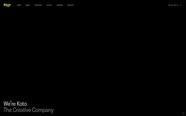
Midnight gallery, etched steel.
Color palette
Yellow decorative accent for icons, marks, and small graphic details. Do not promote it to the primary CTA color
Page background, primary surface
Secondary background, subtle elevation for elements like icons and images
Muted body text, secondary headings, inactive borders
Subtle text, tertiary borders, less prominent UI elements
Hairline borders and dividers, providing minimal visual separation
Lightest grey for subtle highlights or specific text emphasis
Hairline borders, dividers, input outlines, and card edges on light surfaces. Do not promote it to the primary CTA color
Typography
- Weights
- 300
- Sizes
- 38px, 48px
- Line height
- 1, 1.1
- Letter spacing
- -0.0100em
- Fallback
- Oswald Light
Display headlines and hero text. The light weight (300) combined with slight condensation creates an impression of restrained authority.
- Weights
- 350, 400
- Sizes
- 12px, 14px, 16px
- Line height
- 1.25, 1.5
- Letter spacing
- normal
- Fallback
- Inter
Body text, navigation, and supplemental information. The standard weight ensures legibility, while the 'salt' feature subtly enhances character consistency.
Spacing & shape
Components
Text in White Canvas, with a transparent background. Relies on state changes for interaction feedback. Border radius 0px.
Text in Silver Whisper, with a transparent background. Border radius 0px.
Background transparency of 10% based on Midnight Charcoal. Padding is 36px on all sides. Border radius is 6px, creating a soft container within the hard-edged layout.
Transparent background, White Canvas text, and White Canvas 1px border. No padding or radius by default; relies on parent container's padding for active area.
Text in Koto Yellow. Height and width define its interactive area without explicit padding.
Foreground color White Canvas. No background, border, or padding.
Guidelines
- Use Midnight Charcoal (#060606) for all primary page and section backgrounds.
- Apply gtKotoheimCondensed (weight 300) with -0.0100em letter-spacing for all headlines and display text larger than 16px.
- Ensure all primary interactive elements (links, buttons) are rendered in White Canvas (#ffffff) against dark backgrounds.
- Utilize a 1px solid White Canvas (#ffffff) border for subtle ghost button treatments.
- Employ the 6px border-radius for all card-like containers and interactive surface elements.
- Maintain generous padding of 36px for all card panels to ensure content breathability.
- Use Koto Yellow (#ffe800) exclusively for brand elements or critical accents requiring high visual callout.
- Avoid using heavy shadows or strong background fills for interactive elements; prefer ghost styles with subtle borders and text color changes.
- Do not introduce additional background colors outside of the defined neutral palette for surfaces.
- Refrain from using saturated colors other than Koto Yellow; maintain the achromatic dominance.
- Do not deviate from the specified letter-spacing for gtKotoheimCondensed; it is a signature characteristic.
- Avoid using default browser link styles; always override with White Canvas text and ghost interaction patterns.
- Do not apply rounded corners to buttons or navigation links; they should maintain a 0px border radius for a sharp, precise aesthetic.
About this system
ShowHide
Koto employs a high-contrast dark mode aesthetic, utilizing a deep charcoal canvas as the primary background. Typography is kept minimal and precise, featuring a distinctive condensed display font for headlines and a more functional sans-serif for body text. Interaction elements are rendered subtly with ghost-like borders, relying on text color and subtle background changes for state indication, rather than heavy fills or shadows. The overall impression is one of stark sophistication and understated control.
The page adheres to a full-bleed dark canvas model. The hero section features a vertically centered, large-scale headline over the Midnight Charcoal background. Content sections follow a consistent, vertically stacked rhythm with ample spacing. Text blocks are primarily left-aligned. The top navigation is a fixed minimalist bar with left-aligned brand logo and right-aligned compact links, providing global access without occupying significant visual space.
The visual language is UI-dominant, with a strict absence of photography or complex illustrations on the main pages. Icons are minimal, outlined, and monochromatic, typically in White Canvas against Dark Void backgrounds. Imagery is used functionally (e.g., small brand logos within case studies) or within specific product showcase sections, but does not serve as a primary decorative element. The density is text-dominant with UI elements guiding the eye.
Reminiscent of AIGA, Pentagram, FutureDeluxe.
# Koto — Style Reference
> Midnight gallery, etched steel.

**Theme:** dark

**Site:** https://koto.com

Koto employs a high-contrast dark mode aesthetic, utilizing a deep charcoal canvas as the primary background. Typography is kept minimal and precise, featuring a distinctive condensed display font for headlines and a more functional sans-serif for body text. Interaction elements are rendered subtly with ghost-like borders, relying on text color and subtle background changes for state indication, rather than heavy fills or shadows. The overall impression is one of stark sophistication and understated control.

## Tokens — Colors

| Name | Value | Token | Role |
|------|------|------|------|
| Koto Yellow | `#ffe800` | `--color-koto-yellow` | Yellow decorative accent for icons, marks, and small graphic details. Do not promote it to the primary CTA color |
| Midnight Charcoal | `#060606` | `--color-midnight-charcoal` | Page background, primary surface |
| Dark Void | `#141414` | `--color-dark-void` | Secondary background, subtle elevation for elements like icons and images |
| Silver Whisper | `#989898` | `--color-silver-whisper` | Muted body text, secondary headings, inactive borders |
| Ghost Gray | `#595959` | `--color-ghost-gray` | Subtle text, tertiary borders, less prominent UI elements |
| Lineage Edge | `#202020` | `--color-lineage-edge` | Hairline borders and dividers, providing minimal visual separation |
| Pale Ash | `#b4b4b4` | `--color-pale-ash` | Lightest grey for subtle highlights or specific text emphasis |
| White Canvas | `#ffffff` | `--color-white-canvas` | Hairline borders, dividers, input outlines, and card edges on light surfaces. Do not promote it to the primary CTA color |

## Tokens — Typography

### gtKotoheimCondensed
- **Substitute:** Oswald Light
- **Weights:** 300
- **Sizes:** 38px, 48px
- **Line height:** 1, 1.1
- **Letter spacing:** -0.0100em
- **Role:** Display headlines and hero text. The light weight (300) combined with slight condensation creates an impression of restrained authority.

### gtKotoheim
- **Substitute:** Inter
- **Weights:** 350, 400
- **Sizes:** 12px, 14px, 16px
- **Line height:** 1.25, 1.5
- **Letter spacing:** normal
- **Role:** Body text, navigation, and supplemental information. The standard weight ensures legibility, while the 'salt' feature subtly enhances character consistency.

## Tokens — Type Scale

Golden Ratio (1.618) from 14px base.

| Role | Size | Line height | Letter spacing |
|------|------|------|------|
| caption | 12px | 1.5 | — |
| body | 14px | 1.5 | — |
| heading | 38px | 1.1 | -0.48px |
| display | 48px | 1 | -0.48px |

## Tokens — Spacing

- **Section gap:** 48px
- **Card padding:** 36px
- **Element gap:** 8px

## Tokens — Radius

- **Default:** 2px
- **Buttons:** 0px
- **Cards:** 6px

## Layout

The page adheres to a full-bleed dark canvas model. The hero section features a vertically centered, large-scale headline over the Midnight Charcoal background. Content sections follow a consistent, vertically stacked rhythm with ample spacing. Text blocks are primarily left-aligned. The top navigation is a fixed minimalist bar with left-aligned brand logo and right-aligned compact links, providing global access without occupying significant visual space.

## Imagery

The visual language is UI-dominant, with a strict absence of photography or complex illustrations on the main pages. Icons are minimal, outlined, and monochromatic, typically in White Canvas against Dark Void backgrounds. Imagery is used functionally (e.g., small brand logos within case studies) or within specific product showcase sections, but does not serve as a primary decorative element. The density is text-dominant with UI elements guiding the eye.

## Components

### Ghost Navigation Link
*Primary navigation and interactive text links.*

Text in White Canvas, with a transparent background. Relies on state changes for interaction feedback. Border radius 0px.

### Footer Link
*Secondary navigation and informational links within the footer.*

Text in Silver Whisper, with a transparent background. Border radius 0px.

### Content Card
*Container for showcasing work, content, or features.*

Background transparency of 10% based on Midnight Charcoal. Padding is 36px on all sides. Border radius is 6px, creating a soft container within the hard-edged layout.

### Ghost Button
*Generic interactive element, with a text label.*

Transparent background, White Canvas text, and White Canvas 1px border. No padding or radius by default; relies on parent container's padding for active area.

### Koto Logo
*Brand identification in header.*

Text in Koto Yellow. Height and width define its interactive area without explicit padding.

### Minimal Text Button
*Actionable text without explicit button styling, often for secondary actions.*

Foreground color White Canvas. No background, border, or padding.

## Guidelines

### Do

- Use Midnight Charcoal (#060606) for all primary page and section backgrounds.
- Apply gtKotoheimCondensed (weight 300) with -0.0100em letter-spacing for all headlines and display text larger than 16px.
- Ensure all primary interactive elements (links, buttons) are rendered in White Canvas (#ffffff) against dark backgrounds.
- Utilize a 1px solid White Canvas (#ffffff) border for subtle ghost button treatments.
- Employ the 6px border-radius for all card-like containers and interactive surface elements.
- Maintain generous padding of 36px for all card panels to ensure content breathability.
- Use Koto Yellow (#ffe800) exclusively for brand elements or critical accents requiring high visual callout.

### Don't

- Avoid using heavy shadows or strong background fills for interactive elements; prefer ghost styles with subtle borders and text color changes.
- Do not introduce additional background colors outside of the defined neutral palette for surfaces.
- Refrain from using saturated colors other than Koto Yellow; maintain the achromatic dominance.
- Do not deviate from the specified letter-spacing for gtKotoheimCondensed; it is a signature characteristic.
- Avoid using default browser link styles; always override with White Canvas text and ghost interaction patterns.
- Do not apply rounded corners to buttons or navigation links; they should maintain a 0px border radius for a sharp, precise aesthetic.

## Agent Prompt Guide

Quick Color Reference:
text: #ffffff
background: #060606
border: #ffffff
accent: #ffe800
primary action: no distinct CTA color

Example Component Prompts:
1. Create a Hero Section: Background is Midnight Charcoal (#060606). The headline 'We're Koto The Creative Company' uses gtKotoheimCondensed, size 48px, weight 300, White Canvas (#ffffff) color, and -0.48px letter-spacing. Place it centered vertically and left-aligned.
2. Create a Navigation Bar link: 'Work' uses gtKotoheim, size 16px, weight 400, White Canvas (#ffffff) color, no letter-spacing. It has a 1px White Canvas (#ffffff) border on hover, 0px radius.
3. Create a Content Card: Background is the semi-transparent oklab(0.999994 0.0000455678 0.0000200868 / 0.1). It has 36px padding on all sides and a 6px border-radius. Inner text elements like titles should be White Canvas (#ffffff) and body text Silver Whisper (#989898).
4. Create a Ghost Button: 'Show widgets' uses gtKotoheim, size 14px, weight 400, White Canvas (#ffffff) color. It has a 1px White Canvas (#ffffff) border, 0px padding and 0px border-radius, relying on parent for interaction area.
More like this









Keep what you find
A free account saves references to boards and can send you a weekly email of picks based on what you save.
To see every result, go Pro.