Preview image. Unlock full-res
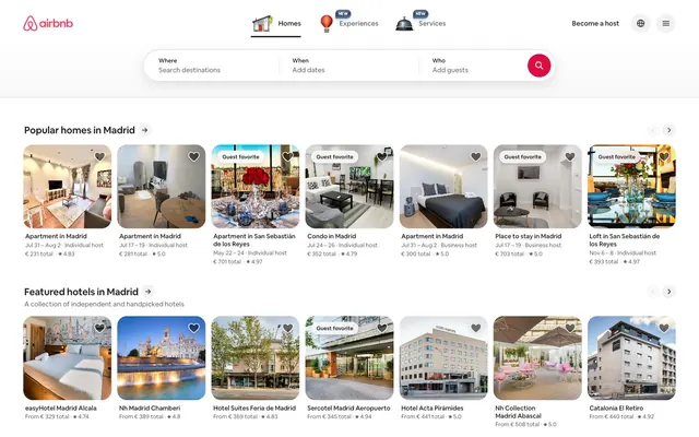
Vacation photos pinned to a white corkboard — bright photography contained in rounded frames against a near-white surface, with a single coral pin holding everything together.
Color palette
Brand logo fill, active nav underline, search button icon background, carousel dot active state — the single chromatic signature that makes the interface recognizable
Hover state darkening of Rausch Coral on interactive brand elements
Primary text, headings, borders, icon strokes — the dominant neutral forming almost all typographic content
Secondary text (metadata, subtext, secondary labels), secondary icon fill
Disabled button text and icon strokes, inactive carousel navigation arrows
Skeleton/loading placeholder backgrounds
Card image placeholder backgrounds, tertiary borders, disabled borders
Subtle dividers and secondary section borders
Page canvas, footer background, button hover/selected state background
Card surfaces, header background, modal/popover backgrounds, pill badge fills
Typography
- Weights
- 400, 500, 600, 700
- Sizes
- 8px, 11px, 12px, 13px, 14px, 16px, 20px, 21px, 22px, 28px
- Line height
- 1.18
- Letter spacing
- -0.02em at large sizes (20px+), -0.009em at mid sizes (14–16px), +0.04em at small caps/label contexts (11–12px)
- Fallback
- Inter Variable
The sole typeface for every text element across the UI. Weight 400 handles body and metadata; 500 lifts labels and secondary headings; 600 marks section titles; 700 for price display and primary emphasis. The custom variable font brings tight optical metrics at display sizes that generic fonts cannot replicate — negative letter-spacing at -0.02em pulls large numerals together. The 'salt' feature set activates alternate letterforms that distinguish it from system sans-serifs.
Spacing & shape
Elevation
Components
Background #dddddd placeholder transitioning to full-bleed photography. 20px border-radius. No visible border. No shadow by default. Image occupies full card width; below image: 12px padding wrapping title (14px weight 600 #222222), host type (12px weight 400 #6a6a6a), date range and price (14px weight 400 #222222). Star rating shown at 12px with #222222. Aspect ratio approximately 1:1 on image portion. 'Guest favorite' badge: white background, #222222 text at 11px weight 600, 4px radius, absolute positioned top-left over image.
White (#ffffff) background pill, 4px border-radius, 6px vertical / 10px horizontal padding. Text 'Guest favorite' at 11px weight 600 #222222, letter-spacing +0.04em. Positioned top-left absolute over card image with a subtle drop-shadow: rgba(0,0,0,0.25) 0px 2px 6px.
Three segmented inputs (Where / When / Who) in a single white (#ffffff) pill container with 20px radius and layered shadow: rgba(0,0,0,0.02) 0px 0px 0px 1px, rgba(0,0,0,0.04) 0px 2px 6px 0px, rgba(0,0,0,0.1) 0px 4px 8px 0px. Label text 12px weight 600 #222222; placeholder text 14px weight 400 #6a6a6a. Dividers between segments are 1px #ebebeb. Search trigger: 40px circle button, background #ff385c, white magnifying glass icon.
50% border-radius. Two states: transparent background with #222222 icon stroke (active), and #f7f7f7 background with #c1c1c1 icon stroke (disabled). No padding; button is icon-sized only. Shadow: rgba(0,0,0,0.02) 0px 0px 0px 1px, rgba(0,0,0,0.16) 0px 2px 4px 0px applied to carousel arrows.
Background transparent or #f7f7f7 on selected. Border 1px solid #222222. Text 14px weight 500 #222222. 8px border-radius. 10px vertical / 10px horizontal padding. On hover background shifts to #f7f7f7.
No background, no border. Text 14px weight 600 #222222. Active state shows 2px solid #222222 underline. 'NEW' badge: 11px weight 600 #ff385c, positioned top-right of label. Padding 8px vertical.
No background fill, no border. Text 14px weight 600 #222222. On hover background #f7f7f7, 8px radius. Sits inline in the right nav cluster alongside the globe icon and hamburger menu.
Heading text 22px weight 600 #222222 with letter-spacing -0.2px. Followed inline by a right-arrow icon link in #222222. 'See all' fallback link: 14px weight 500 #222222, no underline by default, underline on hover. Margin-bottom 12px before card carousel.
Star icon filled #222222 at 10px. Rating number 12px weight 600 #222222. Review count 12px weight 400 #6a6a6a in parentheses. Displayed inline with 2px gap.
White (#ffffff) background, 96px height, 1px bottom border #ebebeb. Airbnb logo left-aligned: coral (#ff385c) mark + wordmark at 30px. Center: Homes/Experiences/Services nav with active underline. Right: 'Become a host' text, globe icon button (circular), hamburger menu button (circular, #f7f7f7 background). On scroll, search collapses into a compact pill with shadow.
Cards arranged in a single horizontal row with 12px column gap. Left/right chevron navigation buttons (circular, 40px diameter, white fill with shadow) positioned at vertical center of image portion. Scroll is paginated. No visible scrollbar.
Guidelines
- Use #ff385c exclusively for the brand logo, the search trigger button background, and active/selected state indicators — never for decorative fills or text blocks.
- Apply 20px border-radius to all listing cards and the main search bar container; use 8px for filter pill buttons and input fields; reserve 50% (circular) for icon-only buttons.
- Set all typography in Airbnb Cereal VF (substitute: Inter Variable) with font-feature-settings: 'salt'; apply letter-spacing -0.02em at 20px+ sizes and +0.04em for small-caps labels at 11–12px.
- Layer shadows as the three-value stack — rgba(0,0,0,0.02) 0px 0px 0px 1px, rgba(0,0,0,0.04) 0px 2px 6px 0px, rgba(0,0,0,0.1) 0px 4px 8px 0px — on elevated containers like the search bar and modals only; listing cards use no shadow.
- Maintain the surface hierarchy strictly: page canvas #f7f7f7 → card/header surface #ffffff → disabled/placeholder fills #dddddd → skeleton loaders #b0b0b0.
- Keep section headings at 22px weight 600 with the inline arrow-link pattern; use 14px weight 400 #6a6a6a for all metadata (dates, host type, review counts).
- Use 12px as the base gap for intra-card elements and 48px for vertical section rhythm between listing rows.
- Never use #ff385c for body text, headings, or decorative strokes — its appearance outside logo/search-button/active-states breaks the signature scarcity of the brand color.
- Don't add heavy drop shadows to listing cards — cards use no shadow; the #dddddd placeholder color and 20px radius carry the visual weight without elevation.
- Never set headings above weight 700 or below weight 500; Airbnb Cereal VF at weight 800+ is not in the design system and breaks the measured typographic rhythm.
- Don't use border-radius values other than 4px, 8px, 14px, 20px, 32px, or 50% — mixing arbitrary radii (e.g. 6px, 12px, 24px) disrupts the deliberate radius vocabulary.
- Never place text directly on card photography without a scrim or badge surface — overlay content uses #ffffff or semi-transparent white containers, not raw text on image.
- Don't use the blue gradient (rgb(45,60,91) → rgb(128,157,192)) as a UI surface — it is specific to the hero CTA card animation and not part of the repeatable component palette.
- Never omit the 'salt' font feature setting on Airbnb Cereal VF — without it, the alternate letterforms revert to generic shapes that undermine brand distinctiveness.
About this system
ShowHide
Airbnb's interface is a warm, airy marketplace built on near-white surfaces and a single coral-red brand heartbeat. The #f7f7f7 canvas with #ffffff card surfaces creates a barely-there depth — paper stacked on paper — where photography does all the visual heavy lifting. The custom Airbnb Cereal VF variable font runs at weights 400–700 across a compact, tight scale with negative letter-spacing at larger sizes, giving the UI a quiet confidence without needing decorative elements. The singular #ff385c coral-red appears exclusively on brand touchpoints (logo, active states, the search button), making it feel like a signature rather than a system color. Card images bleed edge-to-edge with 20px rounded corners — the only generous radius in an otherwise compact, information-dense layout.
Max-width approximately 1760px, centered, with ~24px horizontal page padding. The header is fixed at 96px with white fill, containing logo left, tab nav center, utility right. Below the header, a search bar pill floats centered at roughly 72px height. The main content begins at ~200px from top with a section heading + horizontal card carousel pattern that repeats every 48px of vertical rhythm. Each section is a label + scrollable single-row card strip (7–8 cards visible, paginated). Cards maintain equal width (~160–180px) with 12px gutters. There is no alternating dark/light band rhythm — every section sits on the same #f7f7f7 canvas with white card surfaces. The footer is a dense multi-column link grid on #f7f7f7. Navigation is a slim top bar with no sidebar, no mega-menu, and no sticky secondary nav.
Full-bleed interior and architectural photography with no color treatment — images are vibrant and unfiltered, occupying 70–75% of each listing card's visual area. Photos are contained within 20px rounded-corner cards; no sharp-edge or full-bleed-to-viewport images on the listing grid. The images are lifestyle-adjacent but product-focused: rooms, beds, living spaces shot in natural light, staged but not dramatically lit. No illustrations, no abstract graphics, no 3D renders. Icons are outlined (thin ~1.5px stroke), monochromatic in #222222, used only for functional UI (navigation, save, search, share). The design is heavily image-dense — in any section, photography accounts for roughly 4× the visual area of text — making the listing grid feel like a photo album with metadata annotations rather than a product catalog.
Reminiscent of Booking.com, Vrbo, Tripadvisor, Etsy.
# Airbnb — Style Reference
> Vacation photos pinned to a white corkboard — bright photography contained in rounded frames against a near-white surface, with a single coral pin holding everything together.

**Theme:** light

**Site:** https://www.airbnb.com

Airbnb's interface is a warm, airy marketplace built on near-white surfaces and a single coral-red brand heartbeat. The #f7f7f7 canvas with #ffffff card surfaces creates a barely-there depth — paper stacked on paper — where photography does all the visual heavy lifting. The custom Airbnb Cereal VF variable font runs at weights 400–700 across a compact, tight scale with negative letter-spacing at larger sizes, giving the UI a quiet confidence without needing decorative elements. The singular #ff385c coral-red appears exclusively on brand touchpoints (logo, active states, the search button), making it feel like a signature rather than a system color. Card images bleed edge-to-edge with 20px rounded corners — the only generous radius in an otherwise compact, information-dense layout.

## Tokens — Colors

| Name | Value | Token | Role |
|------|------|------|------|
| Rausch Coral | `#ff385c` | `--color-rausch-coral` | Brand logo fill, active nav underline, search button icon background, carousel dot active state — the single chromatic signature that makes the interface recognizable |
| Rausch Deep | `#e00b41` | `--color-rausch-deep` | Hover state darkening of Rausch Coral on interactive brand elements |
| Carbon | `#222222` | `--color-carbon` | Primary text, headings, borders, icon strokes — the dominant neutral forming almost all typographic content |
| Slate | `#6a6a6a` | `--color-slate` | Secondary text (metadata, subtext, secondary labels), secondary icon fill |
| Silver | `#c1c1c1` | `--color-silver` | Disabled button text and icon strokes, inactive carousel navigation arrows |
| Stone | `#b0b0b0` | `--color-stone` | Skeleton/loading placeholder backgrounds |
| Pebble | `#dddddd` | `--color-pebble` | Card image placeholder backgrounds, tertiary borders, disabled borders |
| Mist | `#ebebeb` | `--color-mist` | Subtle dividers and secondary section borders |
| Fog | `#f7f7f7` | `--color-fog` | Page canvas, footer background, button hover/selected state background |
| Cloud | `#ffffff` | `--color-cloud` | Card surfaces, header background, modal/popover backgrounds, pill badge fills |

## Tokens — Typography

### Airbnb Cereal VF
- **Substitute:** Inter Variable
- **Weights:** 400, 500, 600, 700
- **Sizes:** 8px, 11px, 12px, 13px, 14px, 16px, 20px, 21px, 22px, 28px
- **Line height:** 1.18
- **Letter spacing:** -0.02em at large sizes (20px+), -0.009em at mid sizes (14–16px), +0.04em at small caps/label contexts (11–12px)
- **Role:** The sole typeface for every text element across the UI. Weight 400 handles body and metadata; 500 lifts labels and secondary headings; 600 marks section titles; 700 for price display and primary emphasis. The custom variable font brings tight optical metrics at display sizes that generic fonts cannot replicate — negative letter-spacing at -0.02em pulls large numerals together. The 'salt' feature set activates alternate letterforms that distinguish it from system sans-serifs.

## Tokens — Type Scale

Major Third (1.25) from 14px base.

| Role | Size | Line height | Letter spacing |
|------|------|------|------|
| caption | 11px | 1.29 | 0.44px |
| body | 14px | 1.43 | -0.13px |
| heading-sm | 20px | 1.25 | -0.18px |
| heading | 22px | 1.23 | -0.2px |
| display | 28px | 1.18 | -0.56px |

## Tokens — Spacing

- **Max width:** 1760px
- **Section gap:** 48px
- **Card padding:** 12px
- **Element gap:** 8px

## Tokens — Radius

- **Buttons:** 8px
- **Inputs:** 14px
- **Cards:** 20px
- **badges:** 4px
- **iconButtons:** 50%
- **pills:** 32px
- **searchBar:** 20px

## Tokens — Elevation

- **Search Bar / Elevated Popover:** `rgba(0, 0, 0, 0.02) 0px 0px 0px 1px, rgba(0, 0, 0, 0.04) 0px 2px 6px 0px, rgba(0, 0, 0, 0.1) 0px 4px 8px 0px`
- **Carousel Navigation Arrow Button:** `rgba(0, 0, 0, 0.02) 0px 0px 0px 1px, rgba(0, 0, 0, 0.16) 0px 2px 4px 0px`
- **Guest Favorite Badge:** `drop-shadow(rgba(0, 0, 0, 0.25) 0px 2px 6px)`

## Layout

Max-width approximately 1760px, centered, with ~24px horizontal page padding. The header is fixed at 96px with white fill, containing logo left, tab nav center, utility right. Below the header, a search bar pill floats centered at roughly 72px height. The main content begins at ~200px from top with a section heading + horizontal card carousel pattern that repeats every 48px of vertical rhythm. Each section is a label + scrollable single-row card strip (7–8 cards visible, paginated). Cards maintain equal width (~160–180px) with 12px gutters. There is no alternating dark/light band rhythm — every section sits on the same #f7f7f7 canvas with white card surfaces. The footer is a dense multi-column link grid on #f7f7f7. Navigation is a slim top bar with no sidebar, no mega-menu, and no sticky secondary nav.

## Imagery

Full-bleed interior and architectural photography with no color treatment — images are vibrant and unfiltered, occupying 70–75% of each listing card's visual area. Photos are contained within 20px rounded-corner cards; no sharp-edge or full-bleed-to-viewport images on the listing grid. The images are lifestyle-adjacent but product-focused: rooms, beds, living spaces shot in natural light, staged but not dramatically lit. No illustrations, no abstract graphics, no 3D renders. Icons are outlined (thin ~1.5px stroke), monochromatic in #222222, used only for functional UI (navigation, save, search, share). The design is heavily image-dense — in any section, photography accounts for roughly 4× the visual area of text — making the listing grid feel like a photo album with metadata annotations rather than a product catalog.

## Components

### Primary Search Bar

### Listing Card

### Navigation Tab Bar

### Listing Card
*Primary browsable content unit in scrollable horizontal carousels*

Background #dddddd placeholder transitioning to full-bleed photography. 20px border-radius. No visible border. No shadow by default. Image occupies full card width; below image: 12px padding wrapping title (14px weight 600 #222222), host type (12px weight 400 #6a6a6a), date range and price (14px weight 400 #222222). Star rating shown at 12px with #222222. Aspect ratio approximately 1:1 on image portion. 'Guest favorite' badge: white background, #222222 text at 11px weight 600, 4px radius, absolute positioned top-left over image.

### Guest Favorite Badge
*Trust signal overlaid on listing card images*

White (#ffffff) background pill, 4px border-radius, 6px vertical / 10px horizontal padding. Text 'Guest favorite' at 11px weight 600 #222222, letter-spacing +0.04em. Positioned top-left absolute over card image with a subtle drop-shadow: rgba(0,0,0,0.25) 0px 2px 6px.

### Primary Search Bar
*Main search interface in the header*

Three segmented inputs (Where / When / Who) in a single white (#ffffff) pill container with 20px radius and layered shadow: rgba(0,0,0,0.02) 0px 0px 0px 1px, rgba(0,0,0,0.04) 0px 2px 6px 0px, rgba(0,0,0,0.1) 0px 4px 8px 0px. Label text 12px weight 600 #222222; placeholder text 14px weight 400 #6a6a6a. Dividers between segments are 1px #ebebeb. Search trigger: 40px circle button, background #ff385c, white magnifying glass icon.

### Circular Icon Button — Default
*Carousel navigation arrows, save/wishlist toggles*

50% border-radius. Two states: transparent background with #222222 icon stroke (active), and #f7f7f7 background with #c1c1c1 icon stroke (disabled). No padding; button is icon-sized only. Shadow: rgba(0,0,0,0.02) 0px 0px 0px 1px, rgba(0,0,0,0.16) 0px 2px 4px 0px applied to carousel arrows.

### Rounded Pill Button — Secondary
*Filter category tabs (Popular, Beach, Cities, Historic)*

Background transparent or #f7f7f7 on selected. Border 1px solid #222222. Text 14px weight 500 #222222. 8px border-radius. 10px vertical / 10px horizontal padding. On hover background shifts to #f7f7f7.

### Ghost Text Button — Nav Link
*Top navigation links: Homes, Experiences, Services*

No background, no border. Text 14px weight 600 #222222. Active state shows 2px solid #222222 underline. 'NEW' badge: 11px weight 600 #ff385c, positioned top-right of label. Padding 8px vertical.

### Become a Host Button
*Tertiary CTA in global header navigation*

No background fill, no border. Text 14px weight 600 #222222. On hover background #f7f7f7, 8px radius. Sits inline in the right nav cluster alongside the globe icon and hamburger menu.

### Section Header with Arrow Link
*Section title + 'See all' inline link*

Heading text 22px weight 600 #222222 with letter-spacing -0.2px. Followed inline by a right-arrow icon link in #222222. 'See all' fallback link: 14px weight 500 #222222, no underline by default, underline on hover. Margin-bottom 12px before card carousel.

### Star Rating Indicator
*Listing quality signal below card image*

Star icon filled #222222 at 10px. Rating number 12px weight 600 #222222. Review count 12px weight 400 #6a6a6a in parentheses. Displayed inline with 2px gap.

### Global Header
*Sticky top bar containing logo, nav, and search*

White (#ffffff) background, 96px height, 1px bottom border #ebebeb. Airbnb logo left-aligned: coral (#ff385c) mark + wordmark at 30px. Center: Homes/Experiences/Services nav with active underline. Right: 'Become a host' text, globe icon button (circular), hamburger menu button (circular, #f7f7f7 background). On scroll, search collapses into a compact pill with shadow.

### Carousel Scroll Container
*Horizontal scrollable listing row per section*

Cards arranged in a single horizontal row with 12px column gap. Left/right chevron navigation buttons (circular, 40px diameter, white fill with shadow) positioned at vertical center of image portion. Scroll is paginated. No visible scrollbar.

## Guidelines

### Do

- Use #ff385c exclusively for the brand logo, the search trigger button background, and active/selected state indicators — never for decorative fills or text blocks.
- Apply 20px border-radius to all listing cards and the main search bar container; use 8px for filter pill buttons and input fields; reserve 50% (circular) for icon-only buttons.
- Set all typography in Airbnb Cereal VF (substitute: Inter Variable) with font-feature-settings: 'salt'; apply letter-spacing -0.02em at 20px+ sizes and +0.04em for small-caps labels at 11–12px.
- Layer shadows as the three-value stack — rgba(0,0,0,0.02) 0px 0px 0px 1px, rgba(0,0,0,0.04) 0px 2px 6px 0px, rgba(0,0,0,0.1) 0px 4px 8px 0px — on elevated containers like the search bar and modals only; listing cards use no shadow.
- Maintain the surface hierarchy strictly: page canvas #f7f7f7 → card/header surface #ffffff → disabled/placeholder fills #dddddd → skeleton loaders #b0b0b0.
- Keep section headings at 22px weight 600 with the inline arrow-link pattern; use 14px weight 400 #6a6a6a for all metadata (dates, host type, review counts).
- Use 12px as the base gap for intra-card elements and 48px for vertical section rhythm between listing rows.

### Don't

- Never use #ff385c for body text, headings, or decorative strokes — its appearance outside logo/search-button/active-states breaks the signature scarcity of the brand color.
- Don't add heavy drop shadows to listing cards — cards use no shadow; the #dddddd placeholder color and 20px radius carry the visual weight without elevation.
- Never set headings above weight 700 or below weight 500; Airbnb Cereal VF at weight 800+ is not in the design system and breaks the measured typographic rhythm.
- Don't use border-radius values other than 4px, 8px, 14px, 20px, 32px, or 50% — mixing arbitrary radii (e.g. 6px, 12px, 24px) disrupts the deliberate radius vocabulary.
- Never place text directly on card photography without a scrim or badge surface — overlay content uses #ffffff or semi-transparent white containers, not raw text on image.
- Don't use the blue gradient (rgb(45,60,91) → rgb(128,157,192)) as a UI surface — it is specific to the hero CTA card animation and not part of the repeatable component palette.
- Never omit the 'salt' font feature setting on Airbnb Cereal VF — without it, the alternate letterforms revert to generic shapes that undermine brand distinctiveness.

## Agent Prompt Guide

**Quick Color Reference**
- Text primary: #222222
- Text secondary: #6a6a6a
- Background (canvas): #f7f7f7
- Surface (cards, header): #ffffff
- Border / divider: #ebebeb
- Brand accent: #ff385c
- primary action: no distinct CTA color

**Example Component Prompts**

1. **Listing Card**: White (#ffffff) info area below a full-bleed photo placeholder (#dddddd), 20px border-radius, no shadow. Below image: listing title at 14px Airbnb Cereal VF weight 600 #222222; host type + dates at 12px weight 400 #6a6a6a; price at 14px weight 600 #222222. Star icon + rating at 12px weight 600 #222222 with review count at 12px #6a6a6a. 'Guest Favorite' badge: absolute top-left, white background, 4px radius, 11px weight 600 #222222, letter-spacing +0.04em, shadow drop-shadow(rgba(0,0,0,0.25) 0px 2px 6px).

2. **Search Bar**: White (#ffffff) pill, 20px radius, shadow rgba(0,0,0,0.02) 0px 0px 0px 1px + rgba(0,0,0,0.04) 0px 2px 6px + rgba(0,0,0,0.1) 0px 4px 8px. Three inline segments (Where / When / Who) with 12px vertical padding, label 12px weight 600 #222222, placeholder 14px weight 400 #6a6a6a, separated by 1px #ebebeb dividers. Right-end: 40px circle #ff385c background with white search icon.

3. **Section Header**: Text 22px Airbnb Cereal VF weight 600 #222222, letter-spacing -0.2px, followed immediately by a →  arrow icon in #222222. Bottom margin 12px before the card carousel. Subtext (optional) 14px weight 400 #6a6a6a directly below heading.

4. **Filter Pill Button**: 8px border-radius, 1px solid #222222 border, transparent background (hover: #f7f7f7). Text 14px Airbnb Cereal VF weight 500 #222222. Padding 10px all sides. Selected state: background #222222, text #ffffff.

5. **Carousel Arrow Button**: 40px diameter circle, 50% radius. Active: white (#ffffff) background, #222222 chevron icon, shadow rgba(0,0,0,0.02) 0px 0px 0px 1px + rgba(0,0,0,0.16) 0px 2px 4px. Disabled: #f7f7f7 background, #c1c1c1 icon, no shadow.

## Motion Philosophy

Transitions run at 0.25s ease for most interactive state changes (hover backgrounds, shadow lifts), with 0.1s for immediate snap feedback (button presses). The homepage hero card stack uses a custom spring curve — linear(0 0%, 0.238367 8.33%... 1 100%) — for the stacked card fan animation, giving it a physical bounce that distinguishes it from the otherwise utilitarian transition vocabulary. Transform is the primary transitioned property (141 instances), reinforcing that the design moves things rather than fades them. The backdrop-filter: blur(32px) is used on overlay surfaces (e.g. sticky compact search on scroll).
More like this










Keep what you find
A free account saves references to boards and can send you a weekly email of picks based on what you save.
To see every result, go Pro.