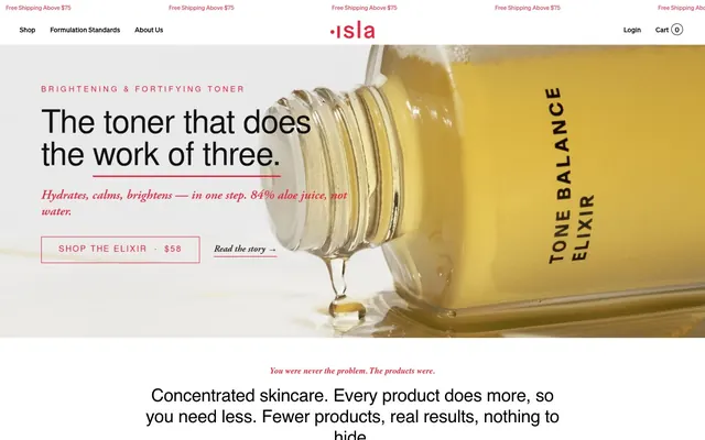
Preview image. Unlock full-res
Clinical purity on a canvas.
Color palette
Primary action buttons, critical links, brand accents, small heading underlines. It provides a confident punctuation to the otherwise neutral palette
Primary text, core borders, header elements. It grounds the design with strong contrast
Secondary text, subheadings, badge text, and deeper neutral components. Offers a softer alternative to Pure Black for text
Dominant page background, soft card backgrounds, and subtle badges. Establishes the light, welcoming tone
Main card backgrounds, elevated sections, and button text when paired with Isla Red. Provides bright contrast
Muted text in navigation and other secondary UI elements. Darker than Ink Grey, yet lighter than Pure Black, providing a specific hierarchy
Subtle borders on ghost buttons and delicate dividing lines. Adds texture without strong visual weight
Fine print, helper text, and secondary badge text where readability is paramount but visual hierarchy needs to be lower than primary text
Tertiary text, descriptive labels, and badge text when a warmer, softer tone is needed
Dark borders and separators for elevated surfaces and inverted UI. Do not promote it to the primary CTA color
Subtle background for informational badges or highlight areas. Adds a touch of warmth to the neutral palette
Typography
- Weights
- 400
- Sizes
- 12px, 13px, 15px, 16px
- Line height
- 1, 1.2, 1.4
- Letter spacing
- normal
- Fallback
- Inter
Standard body text, navigation links, and smaller UI elements. Its clean, readable nature handles the bulk of informational content.
- Weights
- 400, 500, 700
- Sizes
- 10px, 11px, 13px, 14px, 15px, 16px, 17px, 30px, 36px, 54px, 68px
- Line height
- 1, 1.05, 1.1, 1.2, 1.55
- Letter spacing
- -0.0300em at 68px, -0.0200em at 54px, -0.0100em at 36px, 0.0050em at 17px, 0.0400em at 11px
- Fallback
- Roboto
Headlines, product titles, and key UI elements requiring precise tracking and strong hierarchy. The varied weights and condensed letter spacing create a modern, efficient voice.
- Weights
- 400, 500
- Sizes
- 11px, 12px, 14px, 60px
- Line height
- 0.98, 1, 1.2, 1.4
- Letter spacing
- -0.0250em at 60px, 0.0700em at 14px, 0.1000em at 12px
- Fallback
- Inter
Brand elements and impactful statements, using a more robust sans-serif character. The tighter tracking for larger sizes reinforces a sense of directness.
- Weights
- 600
- Sizes
- 14px, 17px, 20px, 26px, 54px
- Line height
- 1.05, 1.25, 1.3, 1.35
- Letter spacing
- -0.0200em
- Fallback
- IBM Plex Serif
Elegant, editorial headings and block quotes. The subtle negative letter spacing at this weight gives a refined, composed feel.
- Weights
- 500, 600
- Sizes
- 14px, 19px
- Line height
- 1.2, 1.4
- Letter spacing
- -0.0100em
- Fallback
- Garamond
Refined secondary headings and descriptive text, adding an approachable, classic touch.
- Weights
- 400
- Sizes
- 13px, 16px
- Line height
- 1.2, 1.55
- Letter spacing
- 0.0050em
- Fallback
- Garamond
Emphasized body copy, subtle quotes, and small contextual asides. The slight positive tracking ensures legibility at smaller italic sizes alongside the serifs.
Spacing & shape
Components
Solid Isla Red (#e4263d) background with White Surface text (#ffffff). Features a 3px border-radius and 15px padding for a prominent, direct interaction.
Transparent background with Pure Black (#000000) text and a 1px Pure Black border. Has 1px padding for a minimal, integrated look.
Transparent background with Pure Black (#000000) text, no border. Offers minimal styling for less critical actions, using 1px vertical and 6px horizontal padding.
White Surface (#ffffff) background with 32px padding, 4px border-radius, and no box-shadow to maintain a flat, clean presentation.
Cream Canvas (#f8f6f3) background with 32px padding, 4px border-radius, and no box-shadow. Provides a slightly warmer surface for content.
Transparent background with a 1px Pure Black (#000000) bottom border. Uses 12px vertical padding and 20px right padding with a 3px border-radius.
Cream Canvas (#f8f6f3) background with Ink Grey (#1a1a1a) text and 0px border-radius. Padding is 0px, creating a compact label.
Soft Peach (#f5e7df) background with Muted Text Grey (#6f6f6f) text. Features a 2px border-radius and 3px vertical, 8px horizontal padding for a soft, distinct look.
Guidelines
- Use Cream Canvas (#f8f6f3) as the default background for large content areas to establish the light, clinical tone.
- Apply Isla Red (#e4263d) exclusively for primary action buttons, critical links, and subtle brand accents, ensuring its impact is reserved and clear.
- Pair Nimbus Sans with tight letter spacing for headlines and product titles, applying values like -0.0300em at 68px, to achieve a modern, efficient look.
- Maintain a comfortable density with elementGap of 10px and cardPadding of 15px, providing breathing room between content without feeling sparse.
- Round all interactive elements and cards with a 3px border-radius, subtly softening edges for a consistent, precise feel.
- Use Pure Black (#000000) for primary text and critical borders to ensure high contrast and readability on light backgrounds.
- For emphasized body copy or quotes, use Garamond Italic at weight 400 with a slight positive letter spacing of 0.0050em for legibility at small sizes.
- Do not use Isla Red (#e4263d) for non-interactive elements or large background areas; its impact should be limited to actions and key highlights.
- Avoid strong shadows or heavy borders on cards and components; rely on background color variations and generous spacing for visual separation.
- Do not introduce additional vibrant colors beyond Isla Red; maintain the largely neutral palette to preserve the clinical, understated aesthetic.
- Steer clear of open, generous letter spacing for headlines; the tighter tracking is a signature element that makes headlines feel concise and impactful.
- Do not use a border-radius value other than 3px for interactive elements and cards, or 999px for pill-shaped elements, as this will disrupt the system's geometric consistency.
- Avoid using multiple different sans-serif families that conflict with Soehne or Nimbus Sans; these two families dictate the modern typographic voice.
- Do not use a strong background image or pattern that competes with the clean surfaces; imagery should be contained and product-focused.
About this system
ShowHide
Isla Beauty presents a clinical-minimal aesthetic: clean white and cream surfaces, precise typography pairing classic serifs with modern sans-serifs, and a bold, singular red accent. Content is structured with a comfortable density, relying on generous spacing and subtle surface variations rather than heavy dividers. The overall impression is one of trusted efficacy and understated luxury.
Reminiscent of Glossier, Peach & Lily, Drunk Elephant, Aesop.
# Isla Beauty — Style Reference
> Clinical purity on a canvas.

**Theme:** light

**Site:** https://isla-beauty.com

Isla Beauty presents a clinical-minimal aesthetic: clean white and cream surfaces, precise typography pairing classic serifs with modern sans-serifs, and a bold, singular red accent. Content is structured with a comfortable density, relying on generous spacing and subtle surface variations rather than heavy dividers. The overall impression is one of trusted efficacy and understated luxury.

## Tokens — Colors

| Name | Value | Token | Role |
|------|------|------|------|
| Isla Red | `#e4263d` | `--color-isla-red` | Primary action buttons, critical links, brand accents, small heading underlines. It provides a confident punctuation to the otherwise neutral palette |
| Pure Black | `#000000` | `--color-pure-black` | Primary text, core borders, header elements. It grounds the design with strong contrast |
| Ink Grey | `#1a1a1a` | `--color-ink-grey` | Secondary text, subheadings, badge text, and deeper neutral components. Offers a softer alternative to Pure Black for text |
| Cream Canvas | `#f8f6f3` | `--color-cream-canvas` | Dominant page background, soft card backgrounds, and subtle badges. Establishes the light, welcoming tone |
| White Surface | `#ffffff` | `--color-white-surface` | Main card backgrounds, elevated sections, and button text when paired with Isla Red. Provides bright contrast |
| Deep Grey | `#2e2e2e` | `--color-deep-grey` | Muted text in navigation and other secondary UI elements. Darker than Ink Grey, yet lighter than Pure Black, providing a specific hierarchy |
| Warm Grey Border | `#e4dfd9` | `--color-warm-grey-border` | Subtle borders on ghost buttons and delicate dividing lines. Adds texture without strong visual weight |
| Muted Text Grey | `#6f6f6f` | `--color-muted-text-grey` | Fine print, helper text, and secondary badge text where readability is paramount but visual hierarchy needs to be lower than primary text |
| Stone Grey | `#8a8580` | `--color-stone-grey` | Tertiary text, descriptive labels, and badge text when a warmer, softer tone is needed |
| Minimal Border Grey | `#212121` | `--color-minimal-border-grey` | Dark borders and separators for elevated surfaces and inverted UI. Do not promote it to the primary CTA color |
| Soft Peach | `#f5e7df` | `--color-soft-peach` | Subtle background for informational badges or highlight areas. Adds a touch of warmth to the neutral palette |

## Tokens — Typography

### Soehne Buch
- **Substitute:** Inter
- **Weights:** 400
- **Sizes:** 12px, 13px, 15px, 16px
- **Line height:** 1, 1.2, 1.4
- **Letter spacing:** normal
- **Role:** Standard body text, navigation links, and smaller UI elements. Its clean, readable nature handles the bulk of informational content.

### Nimbus Sans
- **Substitute:** Roboto
- **Weights:** 400, 500, 700
- **Sizes:** 10px, 11px, 13px, 14px, 15px, 16px, 17px, 30px, 36px, 54px, 68px
- **Line height:** 1, 1.05, 1.1, 1.2, 1.55
- **Letter spacing:** -0.0300em at 68px, -0.0200em at 54px, -0.0100em at 36px, 0.0050em at 17px, 0.0400em at 11px
- **Role:** Headlines, product titles, and key UI elements requiring precise tracking and strong hierarchy. The varied weights and condensed letter spacing create a modern, efficient voice.

### Soehne Kraftig
- **Substitute:** Inter
- **Weights:** 400, 500
- **Sizes:** 11px, 12px, 14px, 60px
- **Line height:** 0.98, 1, 1.2, 1.4
- **Letter spacing:** -0.0250em at 60px, 0.0700em at 14px, 0.1000em at 12px
- **Role:** Brand elements and impactful statements, using a more robust sans-serif character. The tighter tracking for larger sizes reinforces a sense of directness.

### AGaramondPro
- **Substitute:** IBM Plex Serif
- **Weights:** 600
- **Sizes:** 14px, 17px, 20px, 26px, 54px
- **Line height:** 1.05, 1.25, 1.3, 1.35
- **Letter spacing:** -0.0200em
- **Role:** Elegant, editorial headings and block quotes. The subtle negative letter spacing at this weight gives a refined, composed feel.

### EB Garamond
- **Substitute:** Garamond
- **Weights:** 500, 600
- **Sizes:** 14px, 19px
- **Line height:** 1.2, 1.4
- **Letter spacing:** -0.0100em
- **Role:** Refined secondary headings and descriptive text, adding an approachable, classic touch.

### Garamond Italic
- **Substitute:** Garamond
- **Weights:** 400
- **Sizes:** 13px, 16px
- **Line height:** 1.2, 1.55
- **Letter spacing:** 0.0050em
- **Role:** Emphasized body copy, subtle quotes, and small contextual asides. The slight positive tracking ensures legibility at smaller italic sizes alongside the serifs.

## Tokens — Type Scale

| Role | Size | Line height | Letter spacing |
|------|------|------|------|
| caption | 10px | 1.55 | 0.04em |
| body | 15px | 1.2 | 0.005em |
| subheading | 20px | 1.25 | -0.02em |
| heading-sm | 30px | 1.1 | -0.01em |
| heading | 36px | 1.05 | -0.01em |
| heading-lg | 54px | 1.05 | -0.02em |
| display | 68px | 1 | -0.03em |

## Tokens — Spacing

- **Section gap:** 50px
- **Card padding:** 15px
- **Element gap:** 10px

## Tokens — Radius

- **Buttons:** 3px
- **Inputs:** 3px
- **Cards:** 3px
- **badges:** 3px
- **pills:** 999px

## Components

### Primary Action Button
*Primary Call to Action*

Solid Isla Red (#e4263d) background with White Surface text (#ffffff). Features a 3px border-radius and 15px padding for a prominent, direct interaction.

### Ghost Button
*Secondary Action, Navigation*

Transparent background with Pure Black (#000000) text and a 1px Pure Black border. Has 1px padding for a minimal, integrated look.

### Subtle Link Button
*Tertiary Action, Inline Navigation*

Transparent background with Pure Black (#000000) text, no border. Offers minimal styling for less critical actions, using 1px vertical and 6px horizontal padding.

### Product Card
*Display individual products or features.*

White Surface (#ffffff) background with 32px padding, 4px border-radius, and no box-shadow to maintain a flat, clean presentation.

### Cream Information Card
*Informational panels or content blocks.*

Cream Canvas (#f8f6f3) background with 32px padding, 4px border-radius, and no box-shadow. Provides a slightly warmer surface for content.

### Standard Input Field
*User input for forms.*

Transparent background with a 1px Pure Black (#000000) bottom border. Uses 12px vertical padding and 20px right padding with a 3px border-radius.

### Minimal Badge
*Categorization or lightweight labels.*

Cream Canvas (#f8f6f3) background with Ink Grey (#1a1a1a) text and 0px border-radius. Padding is 0px, creating a compact label.

### Highlight Badge
*Emphasized categories or informational tags.*

Soft Peach (#f5e7df) background with Muted Text Grey (#6f6f6f) text. Features a 2px border-radius and 3px vertical, 8px horizontal padding for a soft, distinct look.

## Guidelines

### Do

- Use Cream Canvas (#f8f6f3) as the default background for large content areas to establish the light, clinical tone.
- Apply Isla Red (#e4263d) exclusively for primary action buttons, critical links, and subtle brand accents, ensuring its impact is reserved and clear.
- Pair Nimbus Sans with tight letter spacing for headlines and product titles, applying values like -0.0300em at 68px, to achieve a modern, efficient look.
- Maintain a comfortable density with elementGap of 10px and cardPadding of 15px, providing breathing room between content without feeling sparse.
- Round all interactive elements and cards with a 3px border-radius, subtly softening edges for a consistent, precise feel.
- Use Pure Black (#000000) for primary text and critical borders to ensure high contrast and readability on light backgrounds.
- For emphasized body copy or quotes, use Garamond Italic at weight 400 with a slight positive letter spacing of 0.0050em for legibility at small sizes.

### Don't

- Do not use Isla Red (#e4263d) for non-interactive elements or large background areas; its impact should be limited to actions and key highlights.
- Avoid strong shadows or heavy borders on cards and components; rely on background color variations and generous spacing for visual separation.
- Do not introduce additional vibrant colors beyond Isla Red; maintain the largely neutral palette to preserve the clinical, understated aesthetic.
- Steer clear of open, generous letter spacing for headlines; the tighter tracking is a signature element that makes headlines feel concise and impactful.
- Do not use a border-radius value other than 3px for interactive elements and cards, or 999px for pill-shaped elements, as this will disrupt the system's geometric consistency.
- Avoid using multiple different sans-serif families that conflict with Soehne or Nimbus Sans; these two families dictate the modern typographic voice.
- Do not use a strong background image or pattern that competes with the clean surfaces; imagery should be contained and product-focused.

## Agent Prompt Guide

Quick Color Reference:
text: #000000
background: #f8f6f3
border: #000000
accent: #e4263d
primary action: #e4263d (filled action)

Example Component Prompts:
Create a Primary Action Button: #e4263d background, #ffffff text, 9999px radius, compact pill padding. Use this filled treatment for the main CTA.

Create a product card: White Surface background '#ffffff', 32px padding, 4px border-radius. Product title at 16px Soehne Buch weight 400, #000000. Price at 15px Soehne Buch weight 400, #000000. 'ADD TO CART' button in Isla Red '#e4263d' with White Surface '#ffffff' text, 3px border-radius, 15px padding.

Create a descriptive text block with an emphasized statement: Cream Canvas background '#f8f6f3'. Main body text at 15px Soehne Buch weight 400, #000000, line-height 1.2. Emphasized quote 'You were never the problem. The products were.' at 19px EB Garamond weight 500, #000000, letter-spacing -0.0100em.

Create a navigation item: Link 'Shop' at 15px Soehne Buch weight 400, Deep Grey '#2e2e2e'. On hover, color changes to Isla Red '#e4263d'.
More like this









Keep what you find
A free account saves references to boards and can send you a weekly email of picks based on what you save.
To see every result, go Pro.