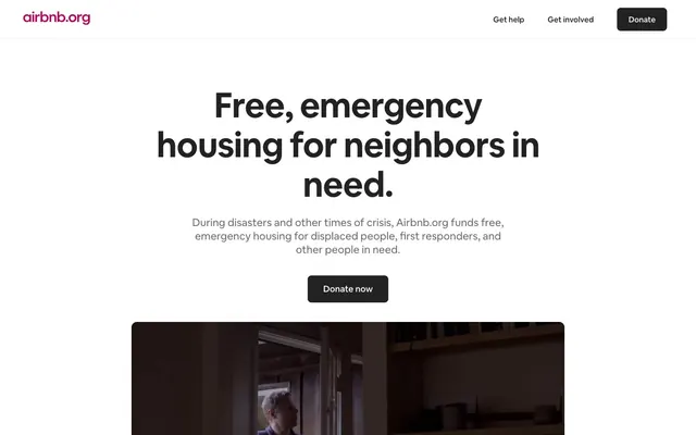
Preview image. Unlock full-res
High-contrast editorial canvas
Color palette
Primary text, deep surface backgrounds, strong button fills, interactive element borders — creates high contrast against white
Page backgrounds, inverse text, ghost button borders — provides a clean, expansive base
Secondary section backgrounds, subtle surface separation, footer background — adds a soft visual break from Canvas White
Muted text, secondary headings — provides visual relief without losing legibility
Subtle background shifts, faint dividers
Subtle button backgrounds, decorative strokes
Hairline borders, subtle separators
Typography
- Weights
- 400, 500, 700
- Sizes
- 14px, 16px, 18px, 22px, 26px, 48px, 52px, 72px
- Line height
- 1.13, 1.14, 1.15, 1.18, 1.19, 1.2, 1.25, 1.27, 1.29, 1.33, 1.43, 1.56
- Letter spacing
- -0.0300em, -0.0200em, -0.0100em
- Fallback
- system-ui, sans-serif
The core brand typeface, used across all textual elements from large, impactful headlines to small utility text. Its variable nature allows for precise weight control, contributing to the site's clear, confident, and direct tone. Letter spacing is subtly tightened for display sizes to enhance visual density without sacrificing legibility.
Spacing & shape
Components
Filled button with Carbon Black background (#222222), Canvas White text (#ffffff), 8px border-radius, and generous padding of 16px vertical, 32px horizontal.
Semi-transparent dark circular button (rgba(32, 32, 32, 0.4)) with Canvas White icon (#ffffff), 50% border-radius, and compact 7px padding.
Transparent background, Carbon Black text (#222222), 8px border-radius, with 6px vertical and 8px horizontal padding. Borders are implicitly handled by the text color.
Carbon Black background (#222222), 12px border-radius, no internal padding or shadows.
Guidelines
- Prioritize high contrast using Carbon Black (#222222) for dominant text and interactive elements against Canvas White (#ffffff) backgrounds.
- Utilize Faint Gray (#f7f7f7) for subtle background shifts to imply section breaks without harsh dividers.
- Apply 8px border-radius to all primary buttons and 12px to content cards to ensure consistent contemporary shaping.
- Maintain generous vertical spacing between content sections (48-64px) to create an open and comfortable reading experience.
- Use Airbnb Cereal VF weight 700 for page headings and key calls-to-action to establish clear hierarchy and strong messaging.
- Keep components visually lightweight, relying on color and spacing for differentiation rather than heavy borders or shadows.
- Tighten letter spacing for larger type sizes (e.g., -0.03em at 72px) to optimize visual density and impact.
- Avoid using multiple chromatic colors; limit the palette primarily to neutrals, reserving color for semantic accents not present on this page.
- Do not introduce decorative gradients or complex shadows; maintain the flat, high-contrast aesthetic.
- Do not vary border-radius arbitrarily; stick to the established 12px for cards, 8px for buttons, and 4px for specific links.
- Do not clutter layouts with extraneous elements; embrace negative space to spotlight core content and messages.
- Avoid using light text on light backgrounds; always ensure a AAA contrast ratio for readability, especially for body text.
- Do not deviate from the Airbnb Cereal VF typeface; ensure all text adheres to its defined weights and line heights.
- Do not introduce complex UI animations; favor direct transitions and subtle hovers that align with the site's straightforward nature.
About this system
ShowHide
Airbnb.org utilizes a stark, high-contrast visual system with strong typographic emphasis. It pairs a near-achromatic palette of warm blacks and cool grays with ample negative space to spotlight content. Headings are bold and expansive, while body text remains precise and legible. Components are minimally styled, relying on shape and hierarchy rather than elaborate ornamentation, creating an atmosphere of directness and clarity.
The site employs a max-width contained layout, centering content on an expansive Canvas White background. The hero section features a prominent, centered headline with supporting text, typically followed by a focused video or informational graphic. Sections alternate between Canvas White and Faint Gray backgrounds, with consistent vertical spacing (48-64px) creating a clear rhythm. Content blocks are often centered stacks of text or simple 1-column layouts, emphasizing direct readability over complex grid structures. The navigation is a minimalist top bar with ghost links and a single primary action button.
Minimal imagery focused on high-quality video embeds and maps. Videos are contained within dark, rounded-corner elements, presenting content directly without heavy styling. The map treatment is a flat, monochromatic vector graphic, reinforcing the clean, informational aesthetic. Icons, when present, are simple, outlined, and monochromatic, aligning with the UI's understated nature. Imagery serves primarily to explain or provide context, not to decorate heavily, leaving the textual content dominant.
Reminiscent of Stripe, Linear, Apple (services pages), Notion.
# Airbnb — Style Reference
> High-contrast editorial canvas

**Theme:** light

**Site:** https://airbnb.org

Airbnb.org utilizes a stark, high-contrast visual system with strong typographic emphasis. It pairs a near-achromatic palette of warm blacks and cool grays with ample negative space to spotlight content. Headings are bold and expansive, while body text remains precise and legible. Components are minimally styled, relying on shape and hierarchy rather than elaborate ornamentation, creating an atmosphere of directness and clarity.

## Tokens — Colors

| Name | Value | Token | Role |
|------|------|------|------|
| Carbon Black | `#222222` | `--color-carbon-black` | Primary text, deep surface backgrounds, strong button fills, interactive element borders — creates high contrast against white |
| Canvas White | `#ffffff` | `--color-canvas-white` | Page backgrounds, inverse text, ghost button borders — provides a clean, expansive base |
| Faint Gray | `#f7f7f7` | `--color-faint-gray` | Secondary section backgrounds, subtle surface separation, footer background — adds a soft visual break from Canvas White |
| Storm Gray | `#6a6a6a` | `--color-storm-gray` | Muted text, secondary headings — provides visual relief without losing legibility |
| Pale Drift | `#ebebeb` | `--color-pale-drift` | Subtle background shifts, faint dividers |
| Dust Bunny | `#a6a6a6` | `--color-dust-bunny` | Subtle button backgrounds, decorative strokes |
| Soft Divider | `#dddddd` | `--color-soft-divider` | Hairline borders, subtle separators |

## Tokens — Typography

### Airbnb Cereal VF
- **Substitute:** system-ui, sans-serif
- **Weights:** 400, 500, 700
- **Sizes:** 14px, 16px, 18px, 22px, 26px, 48px, 52px, 72px
- **Line height:** 1.13, 1.14, 1.15, 1.18, 1.19, 1.2, 1.25, 1.27, 1.29, 1.33, 1.43, 1.56
- **Letter spacing:** -0.0300em, -0.0200em, -0.0100em
- **Role:** The core brand typeface, used across all textual elements from large, impactful headlines to small utility text. Its variable nature allows for precise weight control, contributing to the site's clear, confident, and direct tone. Letter spacing is subtly tightened for display sizes to enhance visual density without sacrificing legibility.

## Tokens — Type Scale

Augmented Fourth (1.414) from 18px base.

| Role | Size | Line height | Letter spacing |
|------|------|------|------|
| body | 18px | 1.56 | -0.01em |
| subheading | 22px | 1.33 | -0.01em |
| heading | 26px | 1.25 | -0.02em |
| heading-lg | 48px | 1.2 | -0.03em |
| display | 72px | 1.13 | -0.03em |

## Tokens — Spacing

- **Section gap:** 48-64px
- **Card padding:** 24px
- **Element gap:** 8px

## Tokens — Radius

- **Default:** 12px
- **Buttons:** 8px
- **links:** 4px

## Layout

The site employs a max-width contained layout, centering content on an expansive Canvas White background. The hero section features a prominent, centered headline with supporting text, typically followed by a focused video or informational graphic. Sections alternate between Canvas White and Faint Gray backgrounds, with consistent vertical spacing (48-64px) creating a clear rhythm. Content blocks are often centered stacks of text or simple 1-column layouts, emphasizing direct readability over complex grid structures. The navigation is a minimalist top bar with ghost links and a single primary action button.

## Imagery

Minimal imagery focused on high-quality video embeds and maps. Videos are contained within dark, rounded-corner elements, presenting content directly without heavy styling. The map treatment is a flat, monochromatic vector graphic, reinforcing the clean, informational aesthetic. Icons, when present, are simple, outlined, and monochromatic, aligning with the UI's understated nature. Imagery serves primarily to explain or provide context, not to decorate heavily, leaving the textual content dominant.

## Components

### Primary Action Button
*Main call to action, drawing immediate attention.*

Filled button with Carbon Black background (#222222), Canvas White text (#ffffff), 8px border-radius, and generous padding of 16px vertical, 32px horizontal.

### Video Player Control Button
*Overlay controls for embedded video content.*

Semi-transparent dark circular button (rgba(32, 32, 32, 0.4)) with Canvas White icon (#ffffff), 50% border-radius, and compact 7px padding.

### Ghost Header Button
*Secondary actions in the header navigation.*

Transparent background, Carbon Black text (#222222), 8px border-radius, with 6px vertical and 8px horizontal padding. Borders are implicitly handled by the text color.

### Content Card
*Container for distinct blocks of information or media.*

Carbon Black background (#222222), 12px border-radius, no internal padding or shadows.

## Guidelines

### Do

- Prioritize high contrast using Carbon Black (#222222) for dominant text and interactive elements against Canvas White (#ffffff) backgrounds.
- Utilize Faint Gray (#f7f7f7) for subtle background shifts to imply section breaks without harsh dividers.
- Apply 8px border-radius to all primary buttons and 12px to content cards to ensure consistent contemporary shaping.
- Maintain generous vertical spacing between content sections (48-64px) to create an open and comfortable reading experience.
- Use Airbnb Cereal VF weight 700 for page headings and key calls-to-action to establish clear hierarchy and strong messaging.
- Keep components visually lightweight, relying on color and spacing for differentiation rather than heavy borders or shadows.
- Tighten letter spacing for larger type sizes (e.g., -0.03em at 72px) to optimize visual density and impact.

### Don't

- Avoid using multiple chromatic colors; limit the palette primarily to neutrals, reserving color for semantic accents not present on this page.
- Do not introduce decorative gradients or complex shadows; maintain the flat, high-contrast aesthetic.
- Do not vary border-radius arbitrarily; stick to the established 12px for cards, 8px for buttons, and 4px for specific links.
- Do not clutter layouts with extraneous elements; embrace negative space to spotlight core content and messages.
- Avoid using light text on light backgrounds; always ensure a AAA contrast ratio for readability, especially for body text.
- Do not deviate from the Airbnb Cereal VF typeface; ensure all text adheres to its defined weights and line heights.
- Do not introduce complex UI animations; favor direct transitions and subtle hovers that align with the site's straightforward nature.

## Agent Prompt Guide

Quick Color Reference:
text: #222222
background: #ffffff
border: #222222
accent: no distinct accent color
primary action: #222222 (filled action)

3-5 Example Component Prompts:
1. Create a Primary Action Button: #222222 background, #ffffff text, 9999px radius, compact pill padding. Use this filled treatment for the main CTA.
2. Design a content section: Faint Gray (#f7f7f7) background. Section title 'Reinventing emergency stays.' in Airbnb Cereal VF weight 700 at 48px, #222222, letter-spacing -0.03em. Body text 'We believe that...' in Airbnb Cereal VF weight 400 at 18px, #6a6a6a, line-height 1.56, letter-spacing -0.01em.
More like this









Keep what you find
A free account saves references to boards and can send you a weekly email of picks based on what you save.
To see every result, go Pro.