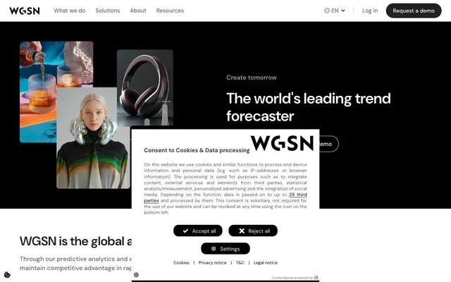
Preview image. Unlock full-res
High-contrast monochrome canvas.
Color palette
Page backgrounds, card surfaces, ghost button backgrounds, default text color for dark components
Primary headline text, key interface elements on white backgrounds, section backgrounds, accent for focus states
Secondary text, link text, borders for dark ghost buttons
Muted body text, subtle borders, inactive elements
Placeholder text, very subtle borders, decorative lines
Subtle background for card surfaces and input fields, creating soft visual separation
Hairline separators and subtle outlines
Text color specifically for input fields
Primary button background, active navigation backgrounds — an almost-black that offers better contrast than pure black against white text
Typography
- Weights
- 400, 500, 600, 700
- Sizes
- 12px, 13px, 14px, 16px, 17px, 18px, 20px, 24px, 28px, 32px, 36px, 40px, 48px, 92px
- Line height
- 0.79, 1.1, 1.17, 1.18, 1.2, 1.33, 1.5, 1.6, 1.9
- Letter spacing
- -0.0110em at larger sizes (e.g. 92px), 0.0560em at smaller sizes (e.g. 12px)
- Fallback
- system-ui
The sole typeface, used across all elements from headlines to body text. Its clean, geometric sans-serif nature underpins the system's precise and direct communication style. Varied letter-spacing tightens tracking for larger display text and loosens it slightly for smaller body text, enhancing legibility at different scales.
Spacing & shape
Components
Filled with Button Solid Black (#212121), white text (Canvas White, #ffffff). Uses a highly rounded (40px) border-radius for a distinct visual. Padding is 12px top, 22px right, 11px bottom, 22px left.
Transparent background, white text (Canvas White, #ffffff), outlined with Canvas White (#ffffff). Inherits the 40px border-radius and 12px top, 22px right, 11px bottom, 22px left padding of other buttons.
Transparent background, text in Graphite (#333333), outlined with Ink Black (#000000). Also uses 40px border-radius and 12px top, 22px right, 11px bottom, 22px left padding.
Transparent background with a 0px border-radius by default, or Fog Gray (#f5f5f5) background with 16px border-radius where elevation is implied. No box-shadows are used. Padding is internal to content blocks, not on the card itself (0px total).
White background (Canvas White, #ffffff) and a 16px border-radius. No box-shadow. Padding is internal to content blocks (0px on the card itself), emphasizing the content within.
Background is Fog Gray (#f5f5f5), text color is Input Text Gray (#495057). Has a distinct 8px border-radius. Padding is 13px all around, with the border color matching the background, indicating an inset style rather than an explicit border.
Transparent background with white text (Canvas White, #ffffff). Has a 0px border-radius, relying on an Ink Black (#000000) border bottom for definition. Padding is 4px top, 12px right, 4px bottom, 0px left.
Transparent background with muted white text (Canvas White, #ffffff at 70% opacity). Minimal styling with 0px border-radius and no padding, designed to sit unobtrusively.
Guidelines
- Use DM Sans exclusively for all typography, leveraging its weights and responsive letter-spacing for hierarchy.
- Maintain high contrast ratios for text and interactive elements. Against Canvas White (#ffffff), use Ink Black (#000000) or Button Solid Black (#212121).
- Apply a 40px border-radius to all interactive buttons and navigation elements for a consistent soft pill-shape.
- Utilize Fog Gray (#f5f5f5) sparingly for subtle surface distinction on cards and input fields, never for primary background.
- Ensure section gaps between content blocks are consistent, defaulting to elementGap (18px) or sectionGap (32px) for major divisions.
- Use Steel Gray (#666666) for secondary informational text, not for primary content or interactive labels.
- Adopt the maximum page width of 1370px for all main content, centered on the screen.
- Avoid using box-shadows for elevation; rely on background color changes or subtle borders for visual layering.
- Do not introduce new colors; adhere strictly to the monochrome palette with its specific gray values.
- Do not deviate from the defined border-radii; 40px for buttons, 16px for cards, and 8px for inputs are fixed values.
- Avoid decorative gradients; the system is flat and high-contrast.
- Do not use highly saturated brand colors. The visual system does not rely on typical chromatic accents.
- Do not use overly dense text blocks without appropriate contrast; prioritize readability with varied text weights and colors.
- Avoid complex overlapping elements; maintain a clean, organized, and explicit separation of components.
About this system
ShowHide
WGSN's visual system evokes a precise, authoritative environment through high-contrast typography and a stark monochrome palette. Information is presented on a clean white canvas, punctuated by dark, almost black, interactive elements. The design prioritizes clear communication and efficient navigation, using compact components and minimal decorative flourishes. Large, impactful headlines command attention, while subtle gray text provides supporting details, establishing a clear visual hierarchy.
The page adheres to a max-width of 1370px, centered on the screen. The hero section is characterized by a full-bleed dark background (Ink Black) with a prominent centered headline, framed by images for visual interest. Content sections alternate between the primary Canvas White and the slightly distinct Fog Gray backgrounds, creating a clear vertical rhythm. Content is generally arranged in two-column text-left/image-right or centered stacks. Feature sections often employ a multi-column card grid. The navigation is a sticky top bar, providing persistent access to key links.
Imagery consists primarily of tight product crops, lifestyle photography, and abstract studio shots, often presented without strong visual effects. Photography is contained within cards or grids, rarely full-bleed, emphasizing the product or a specific detail. There are no consistent illustration styles, implying a focus on real-world examples and sophisticated UI. Icons are typically solid, monochromatic, with a moderate stroke weight, serving functional roles rather than decorative ones. The density is moderate, allowing space for text, with imagery mainly serving to contextualize content.
Reminiscent of Figma, Stripe, Linear.
# WGSN — Style Reference
> High-contrast monochrome canvas.

**Theme:** light

**Site:** https://www.wgsn.com/en

WGSN's visual system evokes a precise, authoritative environment through high-contrast typography and a stark monochrome palette. Information is presented on a clean white canvas, punctuated by dark, almost black, interactive elements. The design prioritizes clear communication and efficient navigation, using compact components and minimal decorative flourishes. Large, impactful headlines command attention, while subtle gray text provides supporting details, establishing a clear visual hierarchy.

## Tokens — Colors

| Name | Value | Token | Role |
|------|------|------|------|
| Canvas White | `#ffffff` | `--color-canvas-white` | Page backgrounds, card surfaces, ghost button backgrounds, default text color for dark components |
| Ink Black | `#000000` | `--color-ink-black` | Primary headline text, key interface elements on white backgrounds, section backgrounds, accent for focus states |
| Graphite | `#333333` | `--color-graphite` | Secondary text, link text, borders for dark ghost buttons |
| Steel Gray | `#666666` | `--color-steel-gray` | Muted body text, subtle borders, inactive elements |
| Ash Gray | `#999999` | `--color-ash-gray` | Placeholder text, very subtle borders, decorative lines |
| Fog Gray | `#f5f5f5` | `--color-fog-gray` | Subtle background for card surfaces and input fields, creating soft visual separation |
| Divider Gray | `#cccccc` | `--color-divider-gray` | Hairline separators and subtle outlines |
| Input Text Gray | `#495057` | `--color-input-text-gray` | Text color specifically for input fields |
| Button Solid Black | `#212121` | `--color-button-solid-black` | Primary button background, active navigation backgrounds — an almost-black that offers better contrast than pure black against white text |

## Tokens — Typography

### DM Sans
- **Substitute:** system-ui
- **Weights:** 400, 500, 600, 700
- **Sizes:** 12px, 13px, 14px, 16px, 17px, 18px, 20px, 24px, 28px, 32px, 36px, 40px, 48px, 92px
- **Line height:** 0.79, 1.1, 1.17, 1.18, 1.2, 1.33, 1.5, 1.6, 1.9
- **Letter spacing:** -0.0110em at larger sizes (e.g. 92px), 0.0560em at smaller sizes (e.g. 12px)
- **Role:** The sole typeface, used across all elements from headlines to body text. Its clean, geometric sans-serif nature underpins the system's precise and direct communication style. Varied letter-spacing tightens tracking for larger display text and loosens it slightly for smaller body text, enhancing legibility at different scales.

## Tokens — Type Scale

| Role | Size | Line height | Letter spacing |
|------|------|------|------|
| body-lg | 14px | 1.6 | 0.784px |
| heading-sm | 18px | 1.6 | -0.198px |
| heading | 20px | 1.6 | -0.22px |
| heading-lg | 24px | 1.5 | -0.264px |
| display-sm | 32px | 1.33 | -0.352px |
| display | 48px | 1.18 | -0.528px |
| display-lg | 92px | 0.79 | -1.012px |

## Tokens — Spacing

- **Max width:** 1370px
- **Section gap:** 32px
- **Card padding:** 24px
- **Element gap:** 18px

## Tokens — Radius

- **Buttons:** 40px
- **Inputs:** 8px
- **Cards:** 16px

## Layout

The page adheres to a max-width of 1370px, centered on the screen. The hero section is characterized by a full-bleed dark background (Ink Black) with a prominent centered headline, framed by images for visual interest. Content sections alternate between the primary Canvas White and the slightly distinct Fog Gray backgrounds, creating a clear vertical rhythm. Content is generally arranged in two-column text-left/image-right or centered stacks. Feature sections often employ a multi-column card grid. The navigation is a sticky top bar, providing persistent access to key links.

## Imagery

Imagery consists primarily of tight product crops, lifestyle photography, and abstract studio shots, often presented without strong visual effects. Photography is contained within cards or grids, rarely full-bleed, emphasizing the product or a specific detail. There are no consistent illustration styles, implying a focus on real-world examples and sophisticated UI. Icons are typically solid, monochromatic, with a moderate stroke weight, serving functional roles rather than decorative ones. The density is moderate, allowing space for text, with imagery mainly serving to contextualize content.

## Components

### Primary Filled Button
*Call-to-action button for initiating key actions.*

Filled with Button Solid Black (#212121), white text (Canvas White, #ffffff). Uses a highly rounded (40px) border-radius for a distinct visual. Padding is 12px top, 22px right, 11px bottom, 22px left.

### Outlined Light Button
*Secondary action button on dark backgrounds.*

Transparent background, white text (Canvas White, #ffffff), outlined with Canvas White (#ffffff). Inherits the 40px border-radius and 12px top, 22px right, 11px bottom, 22px left padding of other buttons.

### Outlined Dark Button
*Secondary action button on light backgrounds.*

Transparent background, text in Graphite (#333333), outlined with Ink Black (#000000). Also uses 40px border-radius and 12px top, 22px right, 11px bottom, 22px left padding.

### Standard Card
*Container for content sections, often with imagery.*

Transparent background with a 0px border-radius by default, or Fog Gray (#f5f5f5) background with 16px border-radius where elevation is implied. No box-shadows are used. Padding is internal to content blocks, not on the card itself (0px total).

### Feature Card
*Prominent content card, often with an associated image.*

White background (Canvas White, #ffffff) and a 16px border-radius. No box-shadow. Padding is internal to content blocks (0px on the card itself), emphasizing the content within.

### Primary Input Field
*Standard editable text input.*

Background is Fog Gray (#f5f5f5), text color is Input Text Gray (#495057). Has a distinct 8px border-radius. Padding is 13px all around, with the border color matching the background, indicating an inset style rather than an explicit border.

### Dark Overlay Input
*Input field designed for dark backgrounds.*

Transparent background with white text (Canvas White, #ffffff). Has a 0px border-radius, relying on an Ink Black (#000000) border bottom for definition. Padding is 4px top, 12px right, 4px bottom, 0px left.

### Headline Badge
*Small, descriptive text element above headlines.*

Transparent background with muted white text (Canvas White, #ffffff at 70% opacity). Minimal styling with 0px border-radius and no padding, designed to sit unobtrusively.

## Guidelines

### Do

- Use DM Sans exclusively for all typography, leveraging its weights and responsive letter-spacing for hierarchy.
- Maintain high contrast ratios for text and interactive elements. Against Canvas White (#ffffff), use Ink Black (#000000) or Button Solid Black (#212121).
- Apply a 40px border-radius to all interactive buttons and navigation elements for a consistent soft pill-shape.
- Utilize Fog Gray (#f5f5f5) sparingly for subtle surface distinction on cards and input fields, never for primary background.
- Ensure section gaps between content blocks are consistent, defaulting to elementGap (18px) or sectionGap (32px) for major divisions.
- Use Steel Gray (#666666) for secondary informational text, not for primary content or interactive labels.
- Adopt the maximum page width of 1370px for all main content, centered on the screen.

### Don't

- Avoid using box-shadows for elevation; rely on background color changes or subtle borders for visual layering.
- Do not introduce new colors; adhere strictly to the monochrome palette with its specific gray values.
- Do not deviate from the defined border-radii; 40px for buttons, 16px for cards, and 8px for inputs are fixed values.
- Avoid decorative gradients; the system is flat and high-contrast.
- Do not use highly saturated brand colors. The visual system does not rely on typical chromatic accents.
- Do not use overly dense text blocks without appropriate contrast; prioritize readability with varied text weights and colors.
- Avoid complex overlapping elements; maintain a clean, organized, and explicit separation of components.

## Agent Prompt Guide

Quick Color Reference:
text: #000000
background: #ffffff
border: #666666
accent: no distinct accent color
primary action: #212121 (filled action)

Example Component Prompts:
Create a Primary Action Button: #212121 background, #ffffff text, 9999px radius, compact pill padding. Use this filled treatment for the main CTA.
Create a feature card: Fog Gray (#f5f5f5) background, 16px radius. Heading at 24px DM Sans weight 700 (#000000). Body text at 14px DM Sans weight 400, Steel Gray (#666666). A link using Ink Black (#000000) with a subtle Ink Black (#000000) inset border on hover.
Create a modal button group for a cookie consent banner: two buttons side-by-side. 'Accept all' button: Button Solid Black (#212121) background, Canvas White (#ffffff) text, 40px radius. 'Reject all' button: transparent background, Graphite (#333333) text, Ink Black (#000000) border, 40px radius. Both with 12px top, 22px right, 11px bottom, 22px left padding.
Create an input field: Background Fog Gray (#f5f5f5), text Input Text Gray (#495057), 8px radius. Padding: 13px all sides. Border color matches background. Placeholder text Ash Gray (#999999).
Create a header navigation link: text Graphite (#333333), DM Sans weight 500, size 16px, transparent background.
More like this









Keep what you find
A free account saves references to boards and can send you a weekly email of picks based on what you save.
To see every result, go Pro.