Preview image. Unlock full-res
Architectural blueprint on linen
Color palette
Hairline borders, dividers, input outlines, and card edges on light surfaces. Do not promote it to the primary CTA color
Primary text, heading text, ghost button borders, link borders, icon fills
Muted link borders, secondary text in outline components
Typography
- Weights
- 300
- Sizes
- 12px, 14px, 16px, 24px
- Line height
- 1, 1.25, 1.29, 1.33, 1.71, 1.75
- Letter spacing
- normal
- Fallback
- Inter
Primary body text, link text, navigation items, general UI labels — its lightness maintains an airy feel across most readable content
- Weights
- 500
- Sizes
- 13px, 16px, 18px, 24px, 40px
- Line height
- 1.2, 1.21, 1.5, 1.85
- Letter spacing
- 0.021em at 13px, 0.417em at 16px, 0.750em at 24px and 40px
- Fallback
- Space Grotesk
Headings, emphasized navigation, and specific accent text — its wide tracking creates a sense of gravitas and spaciousness, distinguishing it from the body text
Spacing & shape
Components
Text in Midnight Graphite, border in Midnight Graphite at 1px, background transparent White Linen, 22.5px border-radius. Padding 0px vertical, 14px horizontal.
Text in Midnight Graphite, border in Faded Stone at 1px, background transparent White Linen, 22.5px border-radius. Padding 0px vertical, 14px horizontal.
Guidelines
- Use White Linen (#ffffff) for all main background surfaces to maintain a clean, airy canvas.
- Apply Midnight Graphite (#000000) for all primary text, headings, and outlines of ghost components.
- Employ ABCWhyte (300 weight) for readable body text and navigation where a delicate presence is desired.
- Utilize Ekstra (500 weight) with significant letter-spacing for all headings and emphasized branding text to establish visual weight and rhythm.
- Maintain a generous elementGap of 14px between most inline features and a sectionGap of 60px between major content blocks.
- Apply a consistent 22.5px border-radius to all buttons, navigation items, and interactive links to soften interactions.
- Define interactive elements primarily through a 1px border using Midnight Graphite or Faded Stone against a transparent background.
- Avoid using solid background colors for interactive elements; prefer ghosted appearances with borders.
- Do not introduce strong accent colors; the palette is strictly achromatic to preserve the serene atmosphere.
- Do not apply drop shadows or heavy elevation to components; surfaces should maintain a flat, architectural feel.
- Refrain from using bold or heavy weights for ABCWhyte; its lightness is crucial to the brand's typographic tone.
- Do not deviate from the specified letter-spacing for Ekstra; the wide tracking is a signature visual characteristic.
- Avoid tight spacing between elements or sections; the design relies on ample whitespace.
- Do not use default browser link styling; all links should conform to the outlined ghost button style.
About this system
ShowHide
Alba Condos employs a serene, minimalist aesthetic through a predominantly achromatic palette, emphasizing clean lines and spacious compositions. The design uses very subtle surface distinctions defined by thin borders rather than heavy shadows or color. Typography balances a delicate sans-serif with a more structured, widely tracked serif for an elevated, considered feel. Components are lightweight and ghosted, appearing as outlines that blend seamlessly into the neutral background.
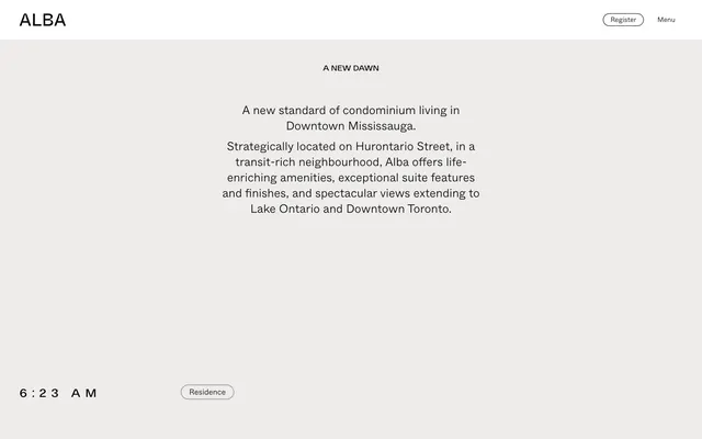
The page uses a maximum-width contained model where content is centered, ensuring readability. The hero section features a centered headline and body text, allowing for a strong initial statement without visual clutter. Section rhythm is predominantly consistent vertical spacing, creating an open, unhurried flow. Content arrangements are generally centered stacks of text, with interactive elements like 'Residence' appearing as subtly outlined tags floating within the whitespace. Navigation is minimal, consisting of top-right 'Register' and 'Menu' ghost buttons, and a persistent brand logo on the top-left.
No prominent imagery is detected in the provided context, suggesting a UI-dominant, text-focused approach. Any future imagery should be treated to complement the minimalist, elegant tone, likely as full-bleed, high-quality photography or subtle abstract graphics.
Reminiscent of Fathom Analytics, Linear, Gather Content, Pleasure Magazine.
# Alba Condos — Style Reference
> Architectural blueprint on linen

**Theme:** light

**Site:** https://www.albacondos.com

Alba Condos employs a serene, minimalist aesthetic through a predominantly achromatic palette, emphasizing clean lines and spacious compositions. The design uses very subtle surface distinctions defined by thin borders rather than heavy shadows or color. Typography balances a delicate sans-serif with a more structured, widely tracked serif for an elevated, considered feel. Components are lightweight and ghosted, appearing as outlines that blend seamlessly into the neutral background.

## Tokens — Colors

| Name | Value | Token | Role |
|------|------|------|------|
| White Linen | `#ffffff` | `--color-white-linen` | Hairline borders, dividers, input outlines, and card edges on light surfaces. Do not promote it to the primary CTA color |
| Midnight Graphite | `#000000` | `--color-midnight-graphite` | Primary text, heading text, ghost button borders, link borders, icon fills |
| Faded Stone | `#737373` | `--color-faded-stone` | Muted link borders, secondary text in outline components |

## Tokens — Typography

### ABCWhyte
- **Substitute:** Inter
- **Weights:** 300
- **Sizes:** 12px, 14px, 16px, 24px
- **Line height:** 1, 1.25, 1.29, 1.33, 1.71, 1.75
- **Letter spacing:** normal
- **Role:** Primary body text, link text, navigation items, general UI labels — its lightness maintains an airy feel across most readable content

### Ekstra
- **Substitute:** Space Grotesk
- **Weights:** 500
- **Sizes:** 13px, 16px, 18px, 24px, 40px
- **Line height:** 1.2, 1.21, 1.5, 1.85
- **Letter spacing:** 0.021em at 13px, 0.417em at 16px, 0.750em at 24px and 40px
- **Role:** Headings, emphasized navigation, and specific accent text — its wide tracking creates a sense of gravitas and spaciousness, distinguishing it from the body text

## Tokens — Type Scale

Perfect Fifth (1.5) from 14px base.

| Role | Size | Line height | Letter spacing |
|------|------|------|------|
| caption | 12px | 1.75 | — |
| body | 14px | 1.71 | — |
| heading | 24px | 1.25 | 0.75px |
| display | 40px | 1.2 | 0.75px |

## Tokens — Spacing

- **Section gap:** 60px
- **Card padding:** 14px
- **Element gap:** 14px

## Tokens — Radius

- **Buttons:** 22.5px
- **links:** 22.5px
- **navItems:** 22.5px

## Layout

The page uses a maximum-width contained model where content is centered, ensuring readability. The hero section features a centered headline and body text, allowing for a strong initial statement without visual clutter. Section rhythm is predominantly consistent vertical spacing, creating an open, unhurried flow. Content arrangements are generally centered stacks of text, with interactive elements like 'Residence' appearing as subtly outlined tags floating within the whitespace. Navigation is minimal, consisting of top-right 'Register' and 'Menu' ghost buttons, and a persistent brand logo on the top-left.

## Imagery

No prominent imagery is detected in the provided context, suggesting a UI-dominant, text-focused approach. Any future imagery should be treated to complement the minimalist, elegant tone, likely as full-bleed, high-quality photography or subtle abstract graphics.

## Components

### Ghost Navigation Button
*Primary navigation interaction and site registration*

Text in Midnight Graphite, border in Midnight Graphite at 1px, background transparent White Linen, 22.5px border-radius. Padding 0px vertical, 14px horizontal.

### Ghost Tag Button
*Secondary navigation and filtering, used for interactive tags like 'Residence' or 'Neighbourhood'*

Text in Midnight Graphite, border in Faded Stone at 1px, background transparent White Linen, 22.5px border-radius. Padding 0px vertical, 14px horizontal.

## Guidelines

### Do

- Use White Linen (#ffffff) for all main background surfaces to maintain a clean, airy canvas.
- Apply Midnight Graphite (#000000) for all primary text, headings, and outlines of ghost components.
- Employ ABCWhyte (300 weight) for readable body text and navigation where a delicate presence is desired.
- Utilize Ekstra (500 weight) with significant letter-spacing for all headings and emphasized branding text to establish visual weight and rhythm.
- Maintain a generous elementGap of 14px between most inline features and a sectionGap of 60px between major content blocks.
- Apply a consistent 22.5px border-radius to all buttons, navigation items, and interactive links to soften interactions.
- Define interactive elements primarily through a 1px border using Midnight Graphite or Faded Stone against a transparent background.

### Don't

- Avoid using solid background colors for interactive elements; prefer ghosted appearances with borders.
- Do not introduce strong accent colors; the palette is strictly achromatic to preserve the serene atmosphere.
- Do not apply drop shadows or heavy elevation to components; surfaces should maintain a flat, architectural feel.
- Refrain from using bold or heavy weights for ABCWhyte; its lightness is crucial to the brand's typographic tone.
- Do not deviate from the specified letter-spacing for Ekstra; the wide tracking is a signature visual characteristic.
- Avoid tight spacing between elements or sections; the design relies on ample whitespace.
- Do not use default browser link styling; all links should conform to the outlined ghost button style.

## Agent Prompt Guide

Quick Color Reference:
text: #000000
background: #ffffff
border: #000000
accent: no distinct accent color
primary action: no distinct CTA color

Example Component Prompts:
Create a hero section: background White Linen (#ffffff). Headline 'A New Dawn' using Ekstra 500 at 40px, Midnight Graphite (#000000), letter-spacing 0.75em. Body text 'A new standard of condominium living...' using ABCWhyte 300 at 16px, Midnight Graphite (#000000), normal letter-spacing, line height 1.29.
Create a ghost navigation button: 'Register' using ABCWhyte 300 at 16px, Midnight Graphite (#000000), background transparent White Linen (#ffffff), 1px border of Midnight Graphite (#000000), 22.5px border-radius, 0px vertical padding, 14px horizontal padding.
Create a tag button: 'Residence' using ABCWhyte 300 at 14px, Midnight Graphite (#000000), background transparent White Linen (#ffffff), 1px border of Faded Stone (#737373), 22.5px border-radius, 0px vertical padding, 14px horizontal padding.
Create a text link: 'Learn more' using ABCWhyte 300 at 14px, Midnight Graphite (#000000), normal letter-spacing, with a subtle 1px border of Faded Stone (#737373) and 22.5px border-radius for interactive states.
More like this









Keep what you find
A free account saves references to boards and can send you a weekly email of picks based on what you save.
To see every result, go Pro.