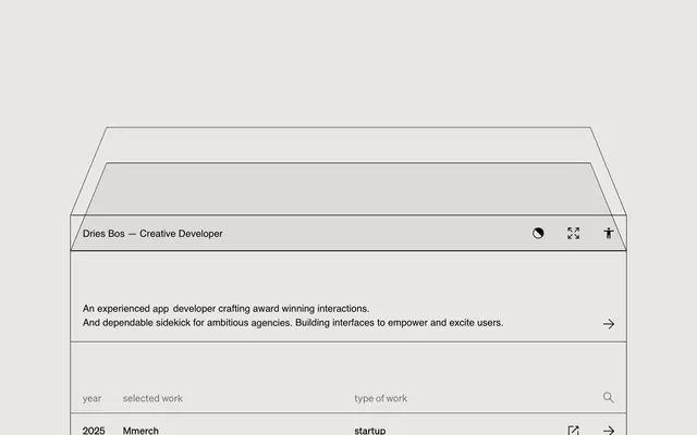
Preview image. Unlock full-res
Wireframe on parchment
Color palette
Primary page and card backgrounds, providing a soft, desaturated base
Neutral form states, badge text, and quiet UI feedback where color should stay understated. Do not promote it to the primary CTA color
Muted text, secondary borders, and icon strokes. Used for ghost button borders and placeholder text, offering reduced visual weight
Decorative icon fills, high-contrast text on specific elements, offering maximum visual impact for small details
Typography
- Weights
- 400
- Sizes
- 20px
- Line height
- 1.45
- Fallback
- Inter, Public Sans
All primary body text, links, and button labels. Its clean, sans-serif form maintains readability and directness within the structured layout. This custom font's subtle character aids in brand recognition; 'Inter' or 'Public Sans' could serve as substitutes for similar neutrality.
- Weights
- 400
- Sizes
- 20px
- Line height
- 1
- Fallback
- JetBrains Mono, IBM Plex Mono
Used for table headers and specific input fields, characterized by its strict single-line height, contributing to the system's rigid, tabular feel. A monospace font like 'JetBrains Mono' or 'IBM Plex Mono' could provide a similar aesthetic.
Spacing & shape
Components
Transparent background, 'Ink Jot' text, 'Ink Jot' top border. Padding 25px horizontal and vertical. No border radius. Hover state makes the top border 'Ash Outline'.
Transparent background, 'Ink Jot' text, 'Ink Jot' border. Padding 15px horizontal, 10px vertical. No border radius. This style appears on table headers.
Canvas Parchment background, 'Ink Jot' text. Padding 15px horizontal, 9px bottom, 10px top. 1000px (fully rounded) border radius. Primarily seen on individual content badges.
Transparent background, 'Ink Jot' text, 'Ink Jot' bottom border 2px thick. No padding. Only the bottom border indicates an input area.
Guidelines
- Prioritize 'Canvas Parchment' (#e8e7e3) for all significant background surfaces to maintain a consistent light theme.
- Use 'Ink Jot' (#050200) for all primary text, borders, and interactive element outlines.
- Apply a 0px border-radius consistently to all card-like containers, buttons, and input fields to maintain a sharp, angular aesthetic.
- Employ a strict 25px padding horizontally and vertically for most interactive block elements like table rows and list items.
- Maintain a spacious rhythm with section gaps of 79px to delineate major content blocks.
- Use 'Ash Outline' (#747472) for secondary text, placeholder elements, and subtle icon strokes where a slightly less dominant presence is desired.
- Leverage the 'myFont' for tabular headings or specific data points where precise, compact text is required, otherwise default to 'Sohne Buch'.
- Avoid using bold or highly chromatic accent colors; the system relies on a strictly achromatic palette.
- Do not use explicit box-shadows or heavy elevation; surfaces should appear flat and delineated by borders.
- Do not introduce rounded corners on primary UI elements such as buttons, cards, or inputs, as this contradicts the system's sharp geometry.
- Do not deviate from the defined primary typography; avoid using system fonts or other sans-serifs that might break the visual consistency of 'Sohne Buch'.
- Refrain from complex background gradients or imagery; the design relies on solid, monochromatic surfaces.
- Do not vary line-height significantly for 'Sohne Buch' text; maintain 1.45 to ensure a consistent reading rhythm.
- Do not use letter-spacing other than normal, as it could disrupt the precise textual alignment established by the custom fonts.
About this system
ShowHide
Dries Bos presents a 'digital architect' aesthetic, combining a minimalist, achromatic canvas with precise, almost wireframe-like detailing. The system maintains a low-contrast, muted palette, focusing on structure through fine lines and ample negative space. Typography is compact and precise, anchoring content within a strict grid, while interactive elements are subtly delineated, relying on hover states to reveal activity rather than bold colors or heavy fills. The overall impression is one of meticulous order and understated functionality.
The page adheres to a maximal width of 1150px, with content centered. The hero section features a unique, abstract window-frame graphic in 'Ink Jot' line art, with primary information presented as a compact text block. Below the hero, content is structured as a series of vertically stacked, full-width sections. Information is often presented in a list or table-like format, using thin 'Ink Jot' horizontal dividers that create a clear, rigid grid. The visual rhythm is largely consistent, with the 'sectionGap' of 79px providing generous, uniform spacing between logical content groups.
The site employs a primarily icon-based visual language, alongside abstract line art for decorative elements. Icons are either 'Ink Jot' (#050200) or 'Pure Black', typically filled or outlined with a fine stroke, often acting as functional pointers or status indicators (e.g., arrows, external link icons, search icon). Abstract graphics, like the illustrative window frame, are minimal, line-based, and monochromatic, serving as subtle atmospheric cues rather than prominent content. There is a strong absence of photography, colorful illustrations, or product screenshots, underscoring the site's focus on pure UI and information.
Reminiscent of Linear, Stripe, Read.cv, Cultured Code (Things app).
# Dries Bos — Style Reference
> Wireframe on parchment

**Theme:** light

**Site:** https://www.driesbos.com

Dries Bos presents a 'digital architect' aesthetic, combining a minimalist, achromatic canvas with precise, almost wireframe-like detailing. The system maintains a low-contrast, muted palette, focusing on structure through fine lines and ample negative space. Typography is compact and precise, anchoring content within a strict grid, while interactive elements are subtly delineated, relying on hover states to reveal activity rather than bold colors or heavy fills. The overall impression is one of meticulous order and understated functionality.

## Tokens — Colors

| Name | Value | Token | Role |
|------|------|------|------|
| Canvas Parchment | `#e8e7e3` | `--color-canvas-parchment` | Primary page and card backgrounds, providing a soft, desaturated base |
| Ink Jot | `#050200` | `--color-ink-jot` | Neutral form states, badge text, and quiet UI feedback where color should stay understated. Do not promote it to the primary CTA color |
| Ash Outline | `#747472` | `--color-ash-outline` | Muted text, secondary borders, and icon strokes. Used for ghost button borders and placeholder text, offering reduced visual weight |
| Pure Black | `#000000` | `--color-pure-black` | Decorative icon fills, high-contrast text on specific elements, offering maximum visual impact for small details |

## Tokens — Typography

### Sohne Buch
- **Substitute:** Inter, Public Sans
- **Weights:** 400
- **Sizes:** 20px
- **Line height:** 1.45
- **Role:** All primary body text, links, and button labels. Its clean, sans-serif form maintains readability and directness within the structured layout. This custom font's subtle character aids in brand recognition; 'Inter' or 'Public Sans' could serve as substitutes for similar neutrality.

### myFont
- **Substitute:** JetBrains Mono, IBM Plex Mono
- **Weights:** 400
- **Sizes:** 20px
- **Line height:** 1
- **Role:** Used for table headers and specific input fields, characterized by its strict single-line height, contributing to the system's rigid, tabular feel. A monospace font like 'JetBrains Mono' or 'IBM Plex Mono' could provide a similar aesthetic.

## Tokens — Type Scale

| Role | Size | Line height | Letter spacing |
|------|------|------|------|
| body | 20px | 1.45 | — |

## Tokens — Spacing

- **Max width:** 1150px
- **Section gap:** 79px
- **Card padding:** 25px
- **Element gap:** 10px

## Tokens — Radius

- **Buttons:** 0px
- **Cards:** 0px
- **tags:** 1000px

## Layout

The page adheres to a maximal width of 1150px, with content centered. The hero section features a unique, abstract window-frame graphic in 'Ink Jot' line art, with primary information presented as a compact text block. Below the hero, content is structured as a series of vertically stacked, full-width sections. Information is often presented in a list or table-like format, using thin 'Ink Jot' horizontal dividers that create a clear, rigid grid. The visual rhythm is largely consistent, with the 'sectionGap' of 79px providing generous, uniform spacing between logical content groups.

## Imagery

The site employs a primarily icon-based visual language, alongside abstract line art for decorative elements. Icons are either 'Ink Jot' (#050200) or 'Pure Black', typically filled or outlined with a fine stroke, often acting as functional pointers or status indicators (e.g., arrows, external link icons, search icon). Abstract graphics, like the illustrative window frame, are minimal, line-based, and monochromatic, serving as subtle atmospheric cues rather than prominent content. There is a strong absence of photography, colorful illustrations, or product screenshots, underscoring the site's focus on pure UI and information.

## Components

### Naked Table Row Button
*Interactive row element within lists and tables, serving as a primary navigation trigger.*

Transparent background, 'Ink Jot' text, 'Ink Jot' top border. Padding 25px horizontal and vertical. No border radius. Hover state makes the top border 'Ash Outline'.

### Outlined Category Tag
*Small, informational tags for categorization or status.*

Transparent background, 'Ink Jot' text, 'Ink Jot' border. Padding 15px horizontal, 10px vertical. No border radius. This style appears on table headers.

### Subtle Pill Tag
*Discrete labels for content details, like 'startup' or 'mobile'.*

Canvas Parchment background, 'Ink Jot' text. Padding 15px horizontal, 9px bottom, 10px top. 1000px (fully rounded) border radius. Primarily seen on individual content badges.

### Underlined Input Field
*Text input areas with a subtle bottom border.*

Transparent background, 'Ink Jot' text, 'Ink Jot' bottom border 2px thick. No padding. Only the bottom border indicates an input area.

## Guidelines

### Do

- Prioritize 'Canvas Parchment' (#e8e7e3) for all significant background surfaces to maintain a consistent light theme.
- Use 'Ink Jot' (#050200) for all primary text, borders, and interactive element outlines.
- Apply a 0px border-radius consistently to all card-like containers, buttons, and input fields to maintain a sharp, angular aesthetic.
- Employ a strict 25px padding horizontally and vertically for most interactive block elements like table rows and list items.
- Maintain a spacious rhythm with section gaps of 79px to delineate major content blocks.
- Use 'Ash Outline' (#747472) for secondary text, placeholder elements, and subtle icon strokes where a slightly less dominant presence is desired.
- Leverage the 'myFont' for tabular headings or specific data points where precise, compact text is required, otherwise default to 'Sohne Buch'.

### Don't

- Avoid using bold or highly chromatic accent colors; the system relies on a strictly achromatic palette.
- Do not use explicit box-shadows or heavy elevation; surfaces should appear flat and delineated by borders.
- Do not introduce rounded corners on primary UI elements such as buttons, cards, or inputs, as this contradicts the system's sharp geometry.
- Do not deviate from the defined primary typography; avoid using system fonts or other sans-serifs that might break the visual consistency of 'Sohne Buch'.
- Refrain from complex background gradients or imagery; the design relies on solid, monochromatic surfaces.
- Do not vary line-height significantly for 'Sohne Buch' text; maintain 1.45 to ensure a consistent reading rhythm.
- Do not use letter-spacing other than normal, as it could disrupt the precise textual alignment established by the custom fonts.

## Agent Prompt Guide

Quick Color Reference:
text: #050200
background: #e8e7e3
border: #050200
accent: no distinct accent color
primary action: no distinct CTA color

Example Component Prompts:
1. Create a table header row: 'Canvas Parchment' background, 'myFont' 20px text in 'Ink Jot', 0px radius. Use 25px horizontal padding and 10px top/9px bottom padding for the cells. Thin 1px 'Ink Jot' bottom border.
2. Design a primary navigational link: 'Sohne Buch' 20px text in 'Ink Jot'. No background, 0px radius. On hover, apply an 'Ash Outline' (#747472) bottom border (underlined state).
3. Generate an input field with a label 'Your Name': Label in 'Sohne Buch' 20px 'Ink Jot' text. Input field should have a transparent background, 'Ink Jot' text, and a 2px 'Ink Jot' bottom border, no explicit padding, 0px radius.
More like this









Keep what you find
A free account saves references to boards and can send you a weekly email of picks based on what you save.
To see every result, go Pro.