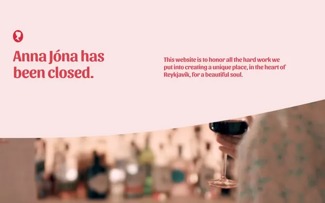
Preview image. Unlock full-res
Warm Raspberry Vignette – a soft, inviting space defined by gentle curves and heartfelt reds.
Color palette
Primary headings, active text, button backgrounds for critical actions, decorative borders, and brand accents. This vivid red carries emotional weight and draws the eye
Deep background for feature sections, overlay elements (if present). This muted violet adds depth and contrast
Page backgrounds, large decorative shapes, occasional subtle strokes
Dark borders and separators for elevated surfaces and inverted UI. Do not promote it to the primary CTA color
Subtext for dark backgrounds, button text on colored backgrounds, content elements where high contrast is needed
Typography
- Weights
- 700
- Sizes
- 28px, 39px, 49px, 70px
- Line height
- 1.06, 1.11, 1.14, 1.17, 1.4
- Letter spacing
- -0.48
- Fallback
- DM Serif Display
Display and main headings. The ornamental and condensed nature at these weights provides a distinctive brand voice.
- Weights
- 400, 700
- Sizes
- 18px, 25px, 72px
- Line height
- 1.2, 1.5
- Fallback
- Open Sans
Body text, subheadings, and secondary information. Its clean, approachable structure balances the expressiveness of Sansita.
- Weights
- 400, 700
- Sizes
- 18px, 25px, 72px
- Line height
- 1.2, 1.5
- Fallback
- Open Sans
Buttons, emphasized body text, and callouts. Provides hierarchy within body content.
- Weights
- 400
- Sizes
- 18px
- Line height
- 1.5, 1.7
- Fallback
- Georgia
Specialized body text for letters or descriptive paragraphs. Its more serif-like qualities evoke a classic, personal feel.
Spacing & shape
Components
Filled button with a 'Heartfelt Red' background, 'Pure White' text at Nunito Sans 700, and fully rounded '300px' border-radius. Padding is 0px vertical and 39.6px horizontal.
Transparent background with 'Pitch Black' text at Nunito Sans 400. No border-radius (0px), with 8px padding on all sides.
Transparent background, no shadow, no padding (0px on all sides), and 0px border-radius. The organic shape is derived from parent containers or decorative background elements, rather than the card itself.
Guidelines
- Prioritize 'Canvas Blush' (#fce1e3) as the default background for most page sections, extending beyond typical layout boundaries to create a large curved canvas.
- Use 'Heartfelt Red' (#db404f) exclusively for primary headlines, critical call-to-actions, and strong brand accents; resist using it for general body text or secondary elements.
- Employ the 'Sansita' font for display headings only, in weights 700 and its specified letter spacing of -0.0200em, to maintain its distinctive ornamental character.
- Apply '300px' border-radius to all buttons for a distinctly soft, pill-shaped appearance.
- Maintain comfortable '11px' element gaps for most content blocks and a generous '115px' vertical section gap to ensure airy, readable layouts.
- Incorporate organic, sweeping curves and gentle arcs within background elements, particularly the large '90px' radius for decorative shapes, to echo the brand's soft aesthetic.
- Avoid sharp corners on interactive elements; all buttons and significant decorative elements should use the specified '300px' or '90px' radii.
- Do not use generic system fonts for headings; always use 'Sansita' at its specified weights and sizes for prominent titles.
- Refrain from adding hard shadows or distinct borders to content cards; surfaces should blend with the background or be differentiated by subtle color shifts or organic shapes.
- Do not use 'Heartfelt Red' (#db404f) for small text or low-contrast elements, as its readability is compromised on light backgrounds.
- Avoid dense, tightly packed content blocks; ensure generous vertical spacing of '115px' between major sections and '11px' between inline elements.
- Do not introduce strong, contrasting colors outside of the defined palette; the brand relies on a limited, warm color scheme.
About this system
ShowHide
Anna Jóna exudes a warm, sentimental aesthetic, anchored by a delicate pastel pink canvas and bold, heartfelt red accents. Typography is a key differentiator, combining an ornamental, expressive display font for headlines with a clean sans-serif for body text. Curved edges and organic shapes are prevalent, appearing in background elements and UI components, contributing to a soft, inviting atmosphere. The design prioritizes comfortable spacing and a touch of vintage charm, creating a distinct visual experience that feels both personal and curated.
The page primarily uses a full-bleed layout, with content sections extending to the edge of the viewport. The hero section features a large, full-width image overlaid by a softly curved pastel pink panel containing central headlines. Subsequent sections use a similar full-width pattern, with large, curved background elements framing body text and images. Content often alternates between large photographic elements and text blocks. Vertical rhythm is established through generous section gaps, creating a spacious and unhurried browsing experience.
This site uses a mix of warm, inviting photography and subtle, decorative illustrations. Photography features soft-focus, candid lifestyle shots (person holding a drink) and interior architectural photography, showcasing the venue's ambiance with warm lighting and curved structures. Imagery often appears full-bleed or cropped with soft, organic curves, blending into the pastel background. There are no outlined icons; the visual language is primarily photographic and illustrative, serving to create atmosphere and show the physical space rather than explain concepts directly.
Reminiscent of Glossier, Airbnb (early branding), Mailchimp (old branding), Sunday Somewhere.
# Anna Jóna — Style Reference
> Warm Raspberry Vignette – a soft, inviting space defined by gentle curves and heartfelt reds.

**Theme:** light

**Site:** https://annajona.is

Anna Jóna exudes a warm, sentimental aesthetic, anchored by a delicate pastel pink canvas and bold, heartfelt red accents. Typography is a key differentiator, combining an ornamental, expressive display font for headlines with a clean sans-serif for body text. Curved edges and organic shapes are prevalent, appearing in background elements and UI components, contributing to a soft, inviting atmosphere. The design prioritizes comfortable spacing and a touch of vintage charm, creating a distinct visual experience that feels both personal and curated.

## Tokens — Colors

| Name | Value | Token | Role |
|------|------|------|------|
| Heartfelt Red | `#db404f` | `--color-heartfelt-red` | Primary headings, active text, button backgrounds for critical actions, decorative borders, and brand accents. This vivid red carries emotional weight and draws the eye |
| Midnight Ink | `#0e1736` | `--color-midnight-ink` | Deep background for feature sections, overlay elements (if present). This muted violet adds depth and contrast |
| Canvas Blush | `#fce1e3` | `--color-canvas-blush` | Page backgrounds, large decorative shapes, occasional subtle strokes |
| Pitch Black | `#000000` | `--color-pitch-black` | Dark borders and separators for elevated surfaces and inverted UI. Do not promote it to the primary CTA color |
| Pure White | `#ffffff` | `--color-pure-white` | Subtext for dark backgrounds, button text on colored backgrounds, content elements where high contrast is needed |

## Tokens — Typography

### Sansita
- **Substitute:** DM Serif Display
- **Weights:** 700
- **Sizes:** 28px, 39px, 49px, 70px
- **Line height:** 1.06, 1.11, 1.14, 1.17, 1.4
- **Letter spacing:** -0.48
- **Role:** Display and main headings. The ornamental and condensed nature at these weights provides a distinctive brand voice.

### Nunito Sans
- **Substitute:** Open Sans
- **Weights:** 400, 700
- **Sizes:** 18px, 25px, 72px
- **Line height:** 1.2, 1.5
- **Role:** Body text, subheadings, and secondary information. Its clean, approachable structure balances the expressiveness of Sansita.

### Nunito Sans
- **Substitute:** Open Sans
- **Weights:** 400, 700
- **Sizes:** 18px, 25px, 72px
- **Line height:** 1.2, 1.5
- **Role:** Buttons, emphasized body text, and callouts. Provides hierarchy within body content.

### Clarkson
- **Substitute:** Georgia
- **Weights:** 400
- **Sizes:** 18px
- **Line height:** 1.5, 1.7
- **Role:** Specialized body text for letters or descriptive paragraphs. Its more serif-like qualities evoke a classic, personal feel.

## Tokens — Type Scale

| Role | Size | Line height | Letter spacing |
|------|------|------|------|
| caption | 18px | 1.5 | — |
| body-sm | 25px | 1.3 | — |
| body | 72px | 1.3 | — |

## Tokens — Spacing

- **Section gap:** 115px
- **Card padding:** 40px
- **Element gap:** 11px

## Tokens — Radius

- **Buttons:** 300px
- **decorativeElements:** 90px

## Layout

The page primarily uses a full-bleed layout, with content sections extending to the edge of the viewport. The hero section features a large, full-width image overlaid by a softly curved pastel pink panel containing central headlines. Subsequent sections use a similar full-width pattern, with large, curved background elements framing body text and images. Content often alternates between large photographic elements and text blocks. Vertical rhythm is established through generous section gaps, creating a spacious and unhurried browsing experience.

## Imagery

This site uses a mix of warm, inviting photography and subtle, decorative illustrations. Photography features soft-focus, candid lifestyle shots (person holding a drink) and interior architectural photography, showcasing the venue's ambiance with warm lighting and curved structures. Imagery often appears full-bleed or cropped with soft, organic curves, blending into the pastel background. There are no outlined icons; the visual language is primarily photographic and illustrative, serving to create atmosphere and show the physical space rather than explain concepts directly.

## Components

### Primary Action Button
*Crucial calls to action*

Filled button with a 'Heartfelt Red' background, 'Pure White' text at Nunito Sans 700, and fully rounded '300px' border-radius. Padding is 0px vertical and 39.6px horizontal.

### Ghost Button
*Secondary actions or navigation*

Transparent background with 'Pitch Black' text at Nunito Sans 400. No border-radius (0px), with 8px padding on all sides.

### Curved Information Card
*Content container with an organic shape*

Transparent background, no shadow, no padding (0px on all sides), and 0px border-radius. The organic shape is derived from parent containers or decorative background elements, rather than the card itself.

## Guidelines

### Do

- Prioritize 'Canvas Blush' (#fce1e3) as the default background for most page sections, extending beyond typical layout boundaries to create a large curved canvas.
- Use 'Heartfelt Red' (#db404f) exclusively for primary headlines, critical call-to-actions, and strong brand accents; resist using it for general body text or secondary elements.
- Employ the 'Sansita' font for display headings only, in weights 700 and its specified letter spacing of -0.0200em, to maintain its distinctive ornamental character.
- Apply '300px' border-radius to all buttons for a distinctly soft, pill-shaped appearance.
- Maintain comfortable '11px' element gaps for most content blocks and a generous '115px' vertical section gap to ensure airy, readable layouts.
- Incorporate organic, sweeping curves and gentle arcs within background elements, particularly the large '90px' radius for decorative shapes, to echo the brand's soft aesthetic.

### Don't

- Avoid sharp corners on interactive elements; all buttons and significant decorative elements should use the specified '300px' or '90px' radii.
- Do not use generic system fonts for headings; always use 'Sansita' at its specified weights and sizes for prominent titles.
- Refrain from adding hard shadows or distinct borders to content cards; surfaces should blend with the background or be differentiated by subtle color shifts or organic shapes.
- Do not use 'Heartfelt Red' (#db404f) for small text or low-contrast elements, as its readability is compromised on light backgrounds.
- Avoid dense, tightly packed content blocks; ensure generous vertical spacing of '115px' between major sections and '11px' between inline elements.
- Do not introduce strong, contrasting colors outside of the defined palette; the brand relies on a limited, warm color scheme.

## Agent Prompt Guide

Quick Color Reference:
text: #000000
background: #fce1e3
border: no distinct border color
accent: #db404f
primary action: #db404f (filled action)

Example Component Prompts:
1. Create a Primary Action Button: #db404f background, #ffffff text, 9999px radius, compact pill padding. Use this filled treatment for the main CTA.
2. Design a feature block: 'Midnight Ink' (#0e1736) background. Headline 'Including purdy bathrooms.' in 'Pure White' (#ffffff), Nunito Sans 700, 25px, lineHeight 1.2. Below, provide descriptive text in 'Pure White' (#ffffff), Clarkson 400, 18px, lineHeight 1.7.
3. Create a 'Ghost Button' with the text 'Back to homepage' using 'Pitch Black' (#000000), Nunito Sans 400, 18px, lineHeight 1.5, with 8px padding on all sides. This button should have a 0px border-radius and no background.
More like this









Keep what you find
A free account saves references to boards and can send you a weekly email of picks based on what you save.
To see every result, go Pro.