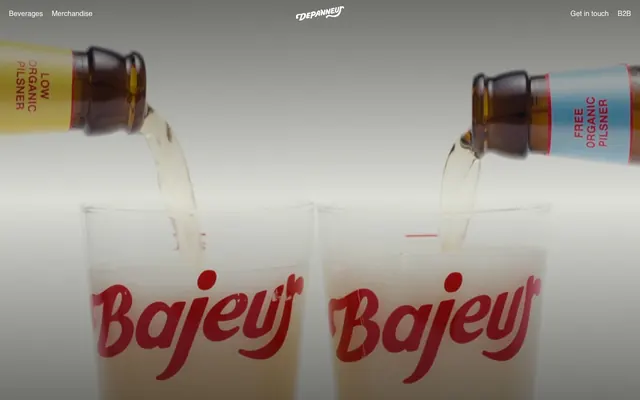
Preview image. Unlock full-res
Warm neighborhood corner store
Color palette
Brand accents, footer copyright text, decorative elements within content — a singular vibrant red that punctuates the otherwise neutral palette
Primary text, navigation links, outline borders, icon strokes — creates high contrast against light backgrounds
Page backgrounds, prominent surface accents, secondary navigation text
Subtle section dividers, inactive element borders, muted backgrounds
Typography
- Weights
- 400
- Sizes
- 14px, 16px
- Line height
- 1.5
- Letter spacing
- normal
- Fallback
- Helvetica Neue
All text roles: navigation, body text, footer links. Its consistent weight and generous line-height ensure clarity across functional elements.
Spacing & shape
Components
Text in Absolute Zero (#000000) at 14px or 16px, weight 400. No discernible border or background, relying on color contrast for visibility. Hover state is implied to be a subtle color change (e.g., #e3e3dc based on --black-hover hint), while active/current states are not explicitly styled in a unique way from the data.
A horizontal divider line in Dusty Gray (#e5e5e5) with a default thickness of 1px, providing subtle visual breaks across the neutral canvas.
Guidelines
- Use Absolute Zero (#000000) for all primary text elements to maintain high contrast and readability.
- Apply Alabaster (#ffffff) as the default background for all page content, upholding the bright brand theme.
- Employ Dusty Gray (#e5e5e5) for all subtle visual dividers and inactive UI element borders.
- Introduce Brand Ruby (#c62127) exclusively as a functional accent color, such as for copyright text or specific brand highlights.
- Maintain a comfortable vertical rhythm using 66px as the primary section gap between major content blocks.
- Keep all interactive elements, like navigation links, text-based and styled with Absolute Zero (#000000) as their default state.
- Utilize Helvetica Neue LT W05 55 Roman weight 400 for all typography, ensuring a consistent and clean textual presence.
- Avoid using multiple chromatic colors; limit brand expression strictly to Brand Ruby (#c62127).
- Do not add shadows or complex gradients to UI elements; flatten surfaces to align with the direct aesthetic.
- Refrain from using heavily decorative fonts or extreme typographic manipulations; maintain the functional and clean typographic style.
- Do not deviate from the established spacing values of 20px for element gaps and 66px for section gaps, unless explicitly creating a tighter component.
- Avoid circular or heavily rounded elements; the dominant shape aesthetic is implied to be sharp/minimal-radius. (Radius is 0px by default).
- Do not use dark backgrounds for main content sections; the system is designed around a light theme.
- Introduce additional border colors or varied line styles beyond Dusty Gray (#e5e5e5) for dividers or borders.
About this system
ShowHide
Depanneur's design system evokes a warm, no-nonsense retail experience with a focused use of red as a brand signature. The UI opts for a direct, high-contrast monochrome base with a single, clear brand accent. Typography is functional and understated, favoring ample spacing and clear boundaries rather than decorative elements or complex layouts. Surfaces are predominantly white, providing a bright, inviting backdrop for sparse content.
The layout appears to be full-bleed horizontally but with implicit content containment, suggesting a maximum width rather than stretching content edge-to-edge. The hero section uses full-bleed video or photography as a background with minimal UI elements overlaid. Sections are separated by consistent vertical spacing (66px), though explicit dividers are also used. Navigation is a minimalist top bar, with additional navigation links appearing in footer sections, characterized by stacked, left-aligned links, and minimal styling.
This site features product-focused photography and potentially video, demonstrated by the bottles and glasses. The imagery is realistic, well-lit, and appears product-centric with clear branding elements visible on the bottles. There are no apparent abstract graphics or complex illustrations. Iconography (e.g., in the header) is minimalist and monochromatic, likely outlined or filled in Absolute Zero (#000000) to blend with the text. Imagery serves to showcase products and is positioned decoratively within content areas.
Reminiscent of Sweetgreen, Everlane, Patagonia (online store), Trader Joe's (informal brand aesthetic).
# Depanneur — Style Reference
> Warm neighborhood corner store

**Theme:** light

**Site:** https://depanneur.dk

Depanneur's design system evokes a warm, no-nonsense retail experience with a focused use of red as a brand signature. The UI opts for a direct, high-contrast monochrome base with a single, clear brand accent. Typography is functional and understated, favoring ample spacing and clear boundaries rather than decorative elements or complex layouts. Surfaces are predominantly white, providing a bright, inviting backdrop for sparse content.

## Tokens — Colors

| Name | Value | Token | Role |
|------|------|------|------|
| Brand Ruby | `#c62127` | `--color-brand-ruby` | Brand accents, footer copyright text, decorative elements within content — a singular vibrant red that punctuates the otherwise neutral palette |
| Absolute Zero | `#000000` | `--color-absolute-zero` | Primary text, navigation links, outline borders, icon strokes — creates high contrast against light backgrounds |
| Alabaster | `#ffffff` | `--color-alabaster` | Page backgrounds, prominent surface accents, secondary navigation text |
| Dusty Gray | `#e5e5e5` | `--color-dusty-gray` | Subtle section dividers, inactive element borders, muted backgrounds |

## Tokens — Typography

### Helvetica Neue LT W05 55 Roman
- **Substitute:** Helvetica Neue
- **Weights:** 400
- **Sizes:** 14px, 16px
- **Line height:** 1.5
- **Letter spacing:** normal
- **Role:** All text roles: navigation, body text, footer links. Its consistent weight and generous line-height ensure clarity across functional elements.

## Tokens — Type Scale

| Role | Size | Line height | Letter spacing |
|------|------|------|------|
| body-sm | 14px | 1.5 | — |
| body | 16px | 1.5 | — |

## Tokens — Spacing

- **Section gap:** 66px
- **Card padding:** 20px
- **Element gap:** 20px

## Tokens — Radius

- **Default:** 0px

## Layout

The layout appears to be full-bleed horizontally but with implicit content containment, suggesting a maximum width rather than stretching content edge-to-edge. The hero section uses full-bleed video or photography as a background with minimal UI elements overlaid. Sections are separated by consistent vertical spacing (66px), though explicit dividers are also used. Navigation is a minimalist top bar, with additional navigation links appearing in footer sections, characterized by stacked, left-aligned links, and minimal styling.

## Imagery

This site features product-focused photography and potentially video, demonstrated by the bottles and glasses. The imagery is realistic, well-lit, and appears product-centric with clear branding elements visible on the bottles. There are no apparent abstract graphics or complex illustrations. Iconography (e.g., in the header) is minimalist and monochromatic, likely outlined or filled in Absolute Zero (#000000) to blend with the text. Imagery serves to showcase products and is positioned decoratively within content areas.

## Components

### Navigation Link
*Primary navigation, footer links, and B2B contact. Understated interactive elements.*

Text in Absolute Zero (#000000) at 14px or 16px, weight 400. No discernible border or background, relying on color contrast for visibility. Hover state is implied to be a subtle color change (e.g., #e3e3dc based on --black-hover hint), while active/current states are not explicitly styled in a unique way from the data.

### Divided Section
*Creates clear vertical separation between page sections.*

A horizontal divider line in Dusty Gray (#e5e5e5) with a default thickness of 1px, providing subtle visual breaks across the neutral canvas.

## Guidelines

### Do

- Use Absolute Zero (#000000) for all primary text elements to maintain high contrast and readability.
- Apply Alabaster (#ffffff) as the default background for all page content, upholding the bright brand theme.
- Employ Dusty Gray (#e5e5e5) for all subtle visual dividers and inactive UI element borders.
- Introduce Brand Ruby (#c62127) exclusively as a functional accent color, such as for copyright text or specific brand highlights.
- Maintain a comfortable vertical rhythm using 66px as the primary section gap between major content blocks.
- Keep all interactive elements, like navigation links, text-based and styled with Absolute Zero (#000000) as their default state.
- Utilize Helvetica Neue LT W05 55 Roman weight 400 for all typography, ensuring a consistent and clean textual presence.

### Don't

- Avoid using multiple chromatic colors; limit brand expression strictly to Brand Ruby (#c62127).
- Do not add shadows or complex gradients to UI elements; flatten surfaces to align with the direct aesthetic.
- Refrain from using heavily decorative fonts or extreme typographic manipulations; maintain the functional and clean typographic style.
- Do not deviate from the established spacing values of 20px for element gaps and 66px for section gaps, unless explicitly creating a tighter component.
- Avoid circular or heavily rounded elements; the dominant shape aesthetic is implied to be sharp/minimal-radius. (Radius is 0px by default).
- Do not use dark backgrounds for main content sections; the system is designed around a light theme.
- Introduce additional border colors or varied line styles beyond Dusty Gray (#e5e5e5) for dividers or borders.

## Agent Prompt Guide

Quick Color Reference:
text: #000000
background: #ffffff
border: #e5e5e5
accent: #c62127
primary action: no distinct CTA color

Example Component Prompts:
1. Create a header navigation: background Alabaster (#ffffff). Links (Beverages, Merchandise, Get in touch, B2B) are Absolute Zero (#000000), Helvetica Neue LT W05 55 Roman, weight 400, size 14px. Depanneur logo (placeholder) centered. All navigation items have 20px padding left/right, and a 10px vertical padding.
2. Create a footer copyright text: Brand Ruby (#c62127), Helvetica Neue LT W05 55 Roman, weight 400, size 14px. This block should be centered on an Alabaster (#ffffff) background.
3. Create a conceptual 'secondary section divider': a full-width line 1px thick, in Dusty Gray (#e5e5e5), with a vertical spacing of 66px above and below.
More like this









Keep what you find
A free account saves references to boards and can send you a weekly email of picks based on what you save.
To see every result, go Pro.