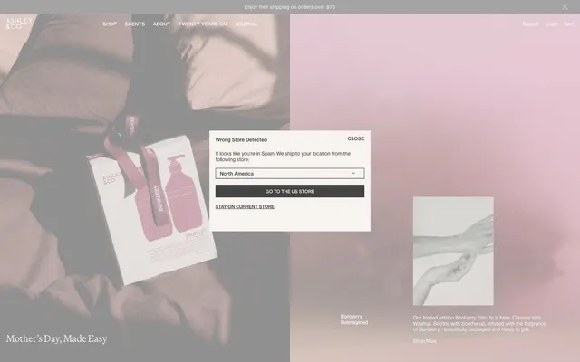
Preview image. Unlock full-res
Warm gray minimalism on unbleached paper.
Color palette
Page backgrounds, large content sections, subtle background wash for hero areas
Primary text, strong borders, key structural icons, active navigation links. This deep charcoal provides contrast without harshness
Dark borders and separators for elevated surfaces and inverted UI. Do not promote it to the primary CTA color
Fine dividers, subtle borders for cards and inputs, delineating sections with minimal visual weight
Hairline borders, dividers, input outlines, and card edges on light surfaces. Do not promote it to the primary CTA color
Background for primary buttons, creating a muted call to action against lighter surfaces
Muted secondary text, inactive links, subtle helper text, and secondary borders
Typography
- Weights
- 400, 500
- Sizes
- 11px, 12px, 18px, 24px
- Line height
- 1.1, 1.2
- Letter spacing
- -0.0050em at 24px and 18px, 0.0230em at 12px and 11px
- Fallback
- Helvetica Neue, Arial
Primary UI font, used for body text, navigation, buttons, and most interactive elements. Its neutral character supports the understated aesthetic. Weights 400 and 500 maintain a clear hierarchy.
- Weights
- 400, 500
- Sizes
- 20px, 24px, 42px
- Line height
- 0.72, 1.1
- Letter spacing
- -0.0050em at 42px and 24px, 0.0140em at 20px
Decorative display font for headlines and evocative marketing copy. Its distinct character adds a touch of classic sophistication to key textual elements.
Spacing & shape
Components
Transparent background, #000000 text color, #000000 border color, 0px border-radius, 0px padding. Uses Neue Haas Grotesk Text 400.
Transparent background, #3c3c3c text color, #3c3c3c border color, 0px border-radius, 0px padding. Uses Neue Haas Grotesk Text 400.
Transparent background, #ffffff text color, #ffffff border color, 0px border-radius, 0px padding. Uses Neue Haas Grotesk Text 400.
#434343 background, #f6f3f0 text color, #434343 border color, 0px border-radius. Padding 8px vertical, 20px horizontal. Uses Neue Haas Grotesk Text 400.
Transparent background, no specific shadow, 0px border-radius, 0px padding. Content within defines its presentation.
Solid #f6f3f0 background, 10px general border-radius. Padding for internal content is often dynamically defined.
Guidelines
- Prioritize Neue Haas Grotesk Text 400 for all body copy and most UI elements, reserving Martina Plant for headlines to maintain visual hierarchy.
- Use #f6f3f0 (Canvas) as the primary background color for most page sections, ensuring a consistent light aesthetic.
- Employ #3c3c3c (Ink) for primary text and strong outline borders to define interactive areas without heavy fills.
- Define interactive states with subtle border changes using #000000 (Onyx) for active ghost buttons.
- Apply 0px border-radius to most buttons and interactive elements for a crisp, rectangular aesthetic.
- Maintain a clear visual hierarchy by utilizing the 80px section gap for content block separation.
- Use #434343 (Ash) for primary button backgrounds with #f6f3f0 (Canvas) text, creating a soft but distinct call to action.
- Avoid using highly saturated or vibrant colors; stick to the established achromatic and muted palette.
- Do not introduce significant box-shadows or elevation effects; the design relies on flat surfaces and subtle borders.
- Do not use generic system fonts; always specify Neue Haas Grotesk Text or Martina Plant.
- Avoid unnecessary decorative elements or heavy gradients; minimalism is key to the brand's identity.
- Do not deviate from the general 0px border-radius for interactive components unless a specific, subtle 10px radius is explicitly required for a card or modal.
- Do not vary line-height significantly from the type scale values; maintain the controlled density.
- Avoid aggressive letter-spacing for body text; apply tracking judiciously as specified by the type profiles.
About this system
ShowHide
Ashleyandco presents a serene and understated aesthetic, rooted in subtle monochromatic branding. The interface uses generous white space and clean typography, establishing an atmosphere of calm and elegance. Components are defined by their soft ghost states and minimal borders, often blending seamlessly into surfaces, with primary actions expressed through subtle fill and text color shifts. The overall impression is one of quiet luxury, allowing content to take precedence.
The page layout utilizes a contained maximum width for primary content, centered on a light canvas. The hero section often features full-bleed atmospheric photography with text overlaid, immediately establishing a refined tone. Sections are demarcated by consistent vertical spacing (80px), creating a comfortable rhythm. Content typically alternates between text-dominant blocks, two-column text-and-image arrangements, and multi-column product grids. Navigation is a top-bar sticky header, minimal and unobtrusive. The density is spacious, providing ample breathing room around elements.
This site predominantly uses clean, product-focused photography and minimal graphic elements. Photography features tightly cropped products on soft, often desaturated backgrounds, with occasional lifestyle shots that maintain a muted, high-key aesthetic. Images are typically contained within rectangular frames, with sharp edges and no overlap. Icons are minimal, outlined, and monochromatic, with a fine stroke weight. The imagery serves to showcase products and create an atmospheric, curated feel rather than providing dense informational content.
Reminiscent of Aesop, Frama, Byredo, Jenni Kayne.
# Ashleyandco — Style Reference
> Warm gray minimalism on unbleached paper.

**Theme:** light

**Site:** https://ashleyandco.co

Ashleyandco presents a serene and understated aesthetic, rooted in subtle monochromatic branding. The interface uses generous white space and clean typography, establishing an atmosphere of calm and elegance. Components are defined by their soft ghost states and minimal borders, often blending seamlessly into surfaces, with primary actions expressed through subtle fill and text color shifts. The overall impression is one of quiet luxury, allowing content to take precedence.

## Tokens — Colors

| Name | Value | Token | Role |
|------|------|------|------|
| Canvas | `#f6f3f0` | `--color-canvas` | Page backgrounds, large content sections, subtle background wash for hero areas |
| Ink | `#3c3c3c` | `--color-ink` | Primary text, strong borders, key structural icons, active navigation links. This deep charcoal provides contrast without harshness |
| Onyx | `#000000` | `--color-onyx` | Dark borders and separators for elevated surfaces and inverted UI. Do not promote it to the primary CTA color |
| Mist | `#dedfdb` | `--color-mist` | Fine dividers, subtle borders for cards and inputs, delineating sections with minimal visual weight |
| Porcelain | `#ffffff` | `--color-porcelain` | Hairline borders, dividers, input outlines, and card edges on light surfaces. Do not promote it to the primary CTA color |
| Ash | `#434343` | `--color-ash` | Background for primary buttons, creating a muted call to action against lighter surfaces |
| Stone | `#939393` | `--color-stone` | Muted secondary text, inactive links, subtle helper text, and secondary borders |

## Tokens — Typography

### Neue Haas Grotesk Text
- **Substitute:** Helvetica Neue, Arial
- **Weights:** 400, 500
- **Sizes:** 11px, 12px, 18px, 24px
- **Line height:** 1.1, 1.2
- **Letter spacing:** -0.0050em at 24px and 18px, 0.0230em at 12px and 11px
- **Role:** Primary UI font, used for body text, navigation, buttons, and most interactive elements. Its neutral character supports the understated aesthetic. Weights 400 and 500 maintain a clear hierarchy.

### Martina Plant
- **Weights:** 400, 500
- **Sizes:** 20px, 24px, 42px
- **Line height:** 0.72, 1.1
- **Letter spacing:** -0.0050em at 42px and 24px, 0.0140em at 20px
- **Role:** Decorative display font for headlines and evocative marketing copy. Its distinct character adds a touch of classic sophistication to key textual elements.

## Tokens — Type Scale

Augmented Fourth (1.414) from 18px base.

| Role | Size | Line height | Letter spacing |
|------|------|------|------|
| caption | 11px | 1.1 | 0.253px |
| body | 18px | 1.1 | -0.09em |
| subheading | 20px | 1.1 | 0.28px |
| heading | 24px | 1.1 | -0.12px |
| display | 42px | 0.72 | -0.21px |

## Tokens — Spacing

- **Section gap:** 80px
- **Card padding:** 20px
- **Element gap:** 15px

## Tokens — Radius

- **Default:** 10px

## Layout

The page layout utilizes a contained maximum width for primary content, centered on a light canvas. The hero section often features full-bleed atmospheric photography with text overlaid, immediately establishing a refined tone. Sections are demarcated by consistent vertical spacing (80px), creating a comfortable rhythm. Content typically alternates between text-dominant blocks, two-column text-and-image arrangements, and multi-column product grids. Navigation is a top-bar sticky header, minimal and unobtrusive. The density is spacious, providing ample breathing room around elements.

## Imagery

This site predominantly uses clean, product-focused photography and minimal graphic elements. Photography features tightly cropped products on soft, often desaturated backgrounds, with occasional lifestyle shots that maintain a muted, high-key aesthetic. Images are typically contained within rectangular frames, with sharp edges and no overlap. Icons are minimal, outlined, and monochromatic, with a fine stroke weight. The imagery serves to showcase products and create an atmospheric, curated feel rather than providing dense informational content.

## Components

### Ghost Button - Light Text
*Default interactive element, often for secondary actions or navigation.*

Transparent background, #000000 text color, #000000 border color, 0px border-radius, 0px padding. Uses Neue Haas Grotesk Text 400.

### Ghost Button - Muted Text
*Subtle interactive elements, often found in footers or less prominent areas.*

Transparent background, #3c3c3c text color, #3c3c3c border color, 0px border-radius, 0px padding. Uses Neue Haas Grotesk Text 400.

### Ghost Button - Hero White Text
*Interactive elements against dark or image backgrounds.*

Transparent background, #ffffff text color, #ffffff border color, 0px border-radius, 0px padding. Uses Neue Haas Grotesk Text 400.

### Primary Filled Button
*Key call-to-action button for initiating primary actions.*

#434343 background, #f6f3f0 text color, #434343 border color, 0px border-radius. Padding 8px vertical, 20px horizontal. Uses Neue Haas Grotesk Text 400.

### Untouched Card/Media Holder
*Container for images, product listings, or informational content.*

Transparent background, no specific shadow, 0px border-radius, 0px padding. Content within defines its presentation.

### Modal Overlay Card
*Dialogs and pop-ups that require a distinct surface.*

Solid #f6f3f0 background, 10px general border-radius. Padding for internal content is often dynamically defined.

## Guidelines

### Do

- Prioritize Neue Haas Grotesk Text 400 for all body copy and most UI elements, reserving Martina Plant for headlines to maintain visual hierarchy.
- Use #f6f3f0 (Canvas) as the primary background color for most page sections, ensuring a consistent light aesthetic.
- Employ #3c3c3c (Ink) for primary text and strong outline borders to define interactive areas without heavy fills.
- Define interactive states with subtle border changes using #000000 (Onyx) for active ghost buttons.
- Apply 0px border-radius to most buttons and interactive elements for a crisp, rectangular aesthetic.
- Maintain a clear visual hierarchy by utilizing the 80px section gap for content block separation.
- Use #434343 (Ash) for primary button backgrounds with #f6f3f0 (Canvas) text, creating a soft but distinct call to action.

### Don't

- Avoid using highly saturated or vibrant colors; stick to the established achromatic and muted palette.
- Do not introduce significant box-shadows or elevation effects; the design relies on flat surfaces and subtle borders.
- Do not use generic system fonts; always specify Neue Haas Grotesk Text or Martina Plant.
- Avoid unnecessary decorative elements or heavy gradients; minimalism is key to the brand's identity.
- Do not deviate from the general 0px border-radius for interactive components unless a specific, subtle 10px radius is explicitly required for a card or modal.
- Do not vary line-height significantly from the type scale values; maintain the controlled density.
- Avoid aggressive letter-spacing for body text; apply tracking judiciously as specified by the type profiles.

## Agent Prompt Guide

**Quick Color Reference:**
text: #3c3c3c
background: #f6f3f0
border: #dedfdb
accent: no distinct accent color
primary action: no distinct CTA color

**3-5 Example Component Prompts:**
1. Create a modal header: "Wrong Store Detected" in Neue Haas Grotesk Text 500, 18px, #000000. "CLOSE" in Neue Haas Grotesk Text 400, 12px, #000000, 0px padding. Place these in a #f6f3f0 container with 10px radius.
No distinct primary action color was observed; use the extracted neutral button treatments instead of inventing a filled CTA color.
3. Implement a muted ghost link: "STAY ON CURRENT STORE" with #3c3c3c text color, Neue Haas Grotesk Text 400, 18px. Ensure there is no background or border, following the ghost button style.
4. Create a page section with a heading "Shop" in Martina Plant 400, 42px, #000000, letter-spacing -0.21px. Below it, body copy "Browse our complete collection..." in Neue Haas Grotesk Text 400, 18px, #3c3c3c. Set the section background to #f6f3f0, with an 80px top and bottom padding.
More like this





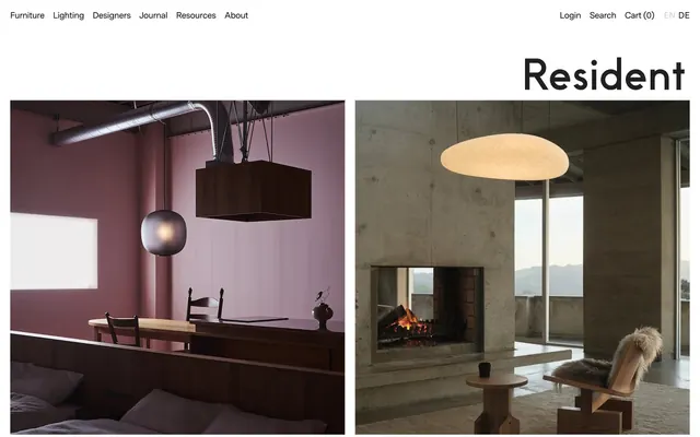




Keep what you find
A free account saves references to boards and can send you a weekly email of picks based on what you save.
To see every result, go Pro.