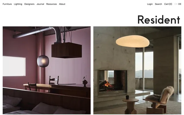
Preview image. Unlock full-res
Gallery Grid Serenity
Color palette
Page backgrounds, card surfaces, ghost button fills
Primary text, headings, strong link and button borders, active states, most icons — establishes a stark, high-contrast visual identity
Muted helper text, secondary information, soft border accents for inputs or subtle dividers
Muted icon strokes, separators, and secondary graphic details. Do not promote it to the primary CTA color
Typography
- Weights
- 400
- Sizes
- 12px, 14px
- Line height
- 1.2, 1.3
- Letter spacing
- normal
- Fallback
- system-ui
Utility text for navigation, small print, image captions, and general body content where unobtrusive clarity is key. Its system-font nature aids quick loading and broad compatibility.
- Weights
- 400, 500
- Sizes
- 14px, 18px, 19px, 23px, 27px
- Line height
- 1, 1.2, 1.29, 1.4
- Letter spacing
- -0.0370em at 27px, -0.0300em at 23px
- Fallback
- Helvetica Neue
Primary headings, article titles, prominent body text, and some navigation elements. Tightly tracked letter spacing, especially at larger sizes, gives a refined and architectural precision.
Spacing & shape
Components
Ink Black text at MessinaSansWeb, weight 400, 14px, lineHeight 1.4. No padding, no border. Interactive via hover for subtle change.
Canvas White background, Ink Black text (sans-serif, weight 400), 0px border-radius, 0px padding. Designed to be unobtrusive and blend with the Canvas White background.
Transparent background, Graphite text (333333), 1px Graphite border, 50% border-radius (pill shape). Minimal 1px vertical, 6px horizontal padding. A subtle, functional touch.
Transparent background, 0px border-radius, no shadow. Product image acts as its visual anchor. Content padding is 0px directly surrounding the image, with Ink Black text for titles and pricing.
Transparent background, Ink Black text (sans-serif, weight 400) and 1px Ink Black border only on the bottom. No border-radius. Features 9.8px vertical padding. Focus state likely uses a similar subtle border highlight.
Guidelines
- Prioritize product photography as the focal point, allowing images to extend full-bleed or occupy significant visual space without heavy UI overlays.
- Use Ink Black (#000000) for all primary text and headings against Canvas White (#ffffff) backgrounds to maintain a high-contrast, editorial feel.
- Maintain a density of comfortable spacing by defaulting to 21px for element gaps and 14px for card padding, creating breathing room around content.
- Apply 0px border-radius to all major interactive elements and cards, preserving the sharp, architectural aesthetic.
- Utilize MessinaSansWeb for headlines and prominent body text with letter-spacing adjusted for precise visual fit, like -0.0370em at 27px.
- Employ `sans-serif` (system font) for secondary and utility text, ensuring high legibility and efficiency for smaller, functional details.
- Use subtle, text-based interactive elements (buttons, links) with minimal styling — often transparent backgrounds and thin borders instead of filled shapes.
- Avoid using saturated or bright colors; restrict the palette almost entirely to achromatic neutrals (Canvas White, Ink Black, Muted Ash, Graphite).
- Do not use box-shadows or elevated elements; maintain a flat, two-dimensional design language for all UI components.
- Refrain from using heavily styled buttons with solid color fills; default to text links, ghost buttons, or subtly outlined elements.
- Do not introduce decorative gradients or complex backgrounds; interfaces should be clean Canvas White to highlight content.
- Avoid generic large-scale letter-spacing; use the precise, negative letter-spacing defined for MessinaSansWeb at larger sizes for consistency.
- Do not break away from the minimal, stark presentation of interactive elements; avoid hover effects that drastically change component appearance.
About this system
ShowHide
Resident employs a disciplined, gallery-like visual language, emphasizing product photography with stark white space and precise, minimal typography. Achromatic tones of black and white dominate, providing a quiet canvas for product hero shots. The design system leans into content-rich layouts, using tight typographic control for an authoritative, editorial feel, with interactive elements sparingly articulated through subtle borders and text rather than bold fills.
The imagery is dominated by high-quality product photography and architectural interior shots. Treatment is often full-bleed or large-format, allowing the visual to dictate the section. Products are typically shown in sophisticated, minimalist environments, often with stark lighting. Some lifestyle and landscape photography provides contextual atmosphere. Image density is high, with visuals often taking precedence over text. Icons (e.g., search, cart) are minimal, outlined, and in Ink Black, reinforcing the austere aesthetic.
Reminiscent of Fritz Hansen, Carl Hansen & Søn, String Furniture, Menu (now Audo Copenhagen).
# Resident — Style Reference
> Gallery Grid Serenity

**Theme:** light

**Site:** https://resident.co.nz

Resident employs a disciplined, gallery-like visual language, emphasizing product photography with stark white space and precise, minimal typography. Achromatic tones of black and white dominate, providing a quiet canvas for product hero shots. The design system leans into content-rich layouts, using tight typographic control for an authoritative, editorial feel, with interactive elements sparingly articulated through subtle borders and text rather than bold fills.

## Tokens — Colors

| Name | Value | Token | Role |
|------|------|------|------|
| Canvas White | `#ffffff` | `--color-canvas-white` | Page backgrounds, card surfaces, ghost button fills |
| Ink Black | `#000000` | `--color-ink-black` | Primary text, headings, strong link and button borders, active states, most icons — establishes a stark, high-contrast visual identity |
| Muted Ash | `#979797` | `--color-muted-ash` | Muted helper text, secondary information, soft border accents for inputs or subtle dividers |
| Graphite | `#333333` | `--color-graphite` | Muted icon strokes, separators, and secondary graphic details. Do not promote it to the primary CTA color |

## Tokens — Typography

### sans-serif
- **Substitute:** system-ui
- **Weights:** 400
- **Sizes:** 12px, 14px
- **Line height:** 1.2, 1.3
- **Letter spacing:** normal
- **Role:** Utility text for navigation, small print, image captions, and general body content where unobtrusive clarity is key. Its system-font nature aids quick loading and broad compatibility.

### MessinaSansWeb
- **Substitute:** Helvetica Neue
- **Weights:** 400, 500
- **Sizes:** 14px, 18px, 19px, 23px, 27px
- **Line height:** 1, 1.2, 1.29, 1.4
- **Letter spacing:** -0.0370em at 27px, -0.0300em at 23px
- **Role:** Primary headings, article titles, prominent body text, and some navigation elements. Tightly tracked letter spacing, especially at larger sizes, gives a refined and architectural precision.

## Tokens — Type Scale

Minor Third (1.2) from 12px base.

| Role | Size | Line height | Letter spacing |
|------|------|------|------|
| caption | 12px | 1.2 | — |
| body-sm | 14px | 1.3 | — |
| subheading | 18px | 1.2 | -0.03em |
| heading | 23px | 1.29 | -0.03em |
| display | 27px | 1 | -0.037em |

## Tokens — Spacing

- **Section gap:** 35px
- **Card padding:** 14px
- **Element gap:** 21px

## Tokens — Radius

- **none:** 0px
- **pill:** 50%

## Imagery

The imagery is dominated by high-quality product photography and architectural interior shots. Treatment is often full-bleed or large-format, allowing the visual to dictate the section. Products are typically shown in sophisticated, minimalist environments, often with stark lighting. Some lifestyle and landscape photography provides contextual atmosphere. Image density is high, with visuals often taking precedence over text. Icons (e.g., search, cart) are minimal, outlined, and in Ink Black, reinforcing the austere aesthetic.

## Components

### Primary Navigation Link
*Top-level navigation items*

Ink Black text at MessinaSansWeb, weight 400, 14px, lineHeight 1.4. No padding, no border. Interactive via hover for subtle change.

### Secondary Ghost Button
*Language switcher, login links*

Canvas White background, Ink Black text (sans-serif, weight 400), 0px border-radius, 0px padding. Designed to be unobtrusive and blend with the Canvas White background.

### Outlined Pill Button
*Small interactive elements like language selection (e.g. 'EN/DE')*

Transparent background, Graphite text (333333), 1px Graphite border, 50% border-radius (pill shape). Minimal 1px vertical, 6px horizontal padding. A subtle, functional touch.

### Product Grid Card
*Displaying product images and brief descriptions in a gallery format*

Transparent background, 0px border-radius, no shadow. Product image acts as its visual anchor. Content padding is 0px directly surrounding the image, with Ink Black text for titles and pricing.

### Text Input Field
*Form fields like login, password*

Transparent background, Ink Black text (sans-serif, weight 400) and 1px Ink Black border only on the bottom. No border-radius. Features 9.8px vertical padding. Focus state likely uses a similar subtle border highlight.

## Guidelines

### Do

- Prioritize product photography as the focal point, allowing images to extend full-bleed or occupy significant visual space without heavy UI overlays.
- Use Ink Black (#000000) for all primary text and headings against Canvas White (#ffffff) backgrounds to maintain a high-contrast, editorial feel.
- Maintain a density of comfortable spacing by defaulting to 21px for element gaps and 14px for card padding, creating breathing room around content.
- Apply 0px border-radius to all major interactive elements and cards, preserving the sharp, architectural aesthetic.
- Utilize MessinaSansWeb for headlines and prominent body text with letter-spacing adjusted for precise visual fit, like -0.0370em at 27px.
- Employ `sans-serif` (system font) for secondary and utility text, ensuring high legibility and efficiency for smaller, functional details.
- Use subtle, text-based interactive elements (buttons, links) with minimal styling — often transparent backgrounds and thin borders instead of filled shapes.

### Don't

- Avoid using saturated or bright colors; restrict the palette almost entirely to achromatic neutrals (Canvas White, Ink Black, Muted Ash, Graphite).
- Do not use box-shadows or elevated elements; maintain a flat, two-dimensional design language for all UI components.
- Refrain from using heavily styled buttons with solid color fills; default to text links, ghost buttons, or subtly outlined elements.
- Do not introduce decorative gradients or complex backgrounds; interfaces should be clean Canvas White to highlight content.
- Avoid generic large-scale letter-spacing; use the precise, negative letter-spacing defined for MessinaSansWeb at larger sizes for consistency.
- Do not break away from the minimal, stark presentation of interactive elements; avoid hover effects that drastically change component appearance.

## Agent Prompt Guide

### Quick Color Reference
text: #000000
background: #ffffff
border: #000000
accent: no distinct accent color
primary action: no distinct CTA color

### 3-5 Example Component Prompts
1. Create a navigational menu item: 'Furniture' text in Ink Black (#000000), MessinaSansWeb font, weight 400, 14px, lineHeight 1.4. No background, no border, 0px padding.
2. Design a product grid item: A large image (placeholder) with a transparent background, Ink Black (#000000) text below it for 'Plane Lounge Chair Jamie McLellan', MessinaSansWeb, 14px, weight 400, 0px border radius, 0px padding.
3. Implement a form input field: Transparent background, Ink Black (#000000) text (sans-serif, weight 400), with a 1px solid Ink Black (#000000) bottom border, 0px border-radius, 9.8px vertical padding. Placeholder text in Muted Ash (#979797).
4. Create a small informational link: 'Forgot your password?' text in Muted Ash (#979797), sans-serif font, weight 400, 14px, lineHeight 1.3.
More like this









Keep what you find
A free account saves references to boards and can send you a weekly email of picks based on what you save.
To see every result, go Pro.