Preview image. Unlock full-res
Crisp White Canvas
Color palette
Primary call-to-action background, active states, key interactive indicators
Outlined button borders, decorative strokes and accents, links requiring emphasis
Decorative card borders, subtle highlights, specific data points
Green outline accent for tags, dividers, and focused UI edges. Use as a supporting accent, not as a status color
Red accent for outlined action borders, linked labels, and lightweight interactive emphasis. Use as a supporting accent, not as a status color
Informational highlights, secondary data points, decorative icons
Informational links, decorative borders, specific icon states
Background for subtle highlights, decorative fills for illustrations
Primary text, strong headings, prominent icons, dark borders
Page background, button backgrounds
Subtle borders, dividers, secondary backgrounds
Card backgrounds, elevated surfaces, button text on colored backgrounds
Secondary text, muted links, subtle icons, placeholder text
Tertiary text, decorative strokes, very light borders
Deepest text, high-contrast borders
Typography
- Weights
- 400, 600
- Sizes
- 12px, 14px, 16px, 18px, 20px, 40px
- Line height
- 1.2, 1.33, 1.38, 1.43, 1.5, 1.56
- Letter spacing
- normal
- Fallback
- Inter
Primary UI text for body copy, navigation, buttons, and most headings — the core workhorse sans-serif for readability and clean modern feel.
- Weights
- 400, 500, 600
- Sizes
- 12px, 13px, 14px, 16px
- Line height
- 1, 1.14, 1.33, 1.43, 1.5, 1.54
- Letter spacing
- 0.0400em for smaller sizes, 0.1000em for emphasized labels.
- Fallback
- JetBrains Mono
Monospaced text for code blocks, tags, and data points where precise alignment and character distinction are important.
- Weights
- 400
- Sizes
- 18px, 80px
- Line height
- 1.1, 1.33
- Letter spacing
- normal
- Fallback
- serif font like Playfair Display
Display font used for prominent page titles and hero headlines, adding a touch of classic sophistication and distinctiveness.
- Weights
- 400
- Sizes
- 24px
- Line height
- 1.33
- Letter spacing
- normal
- Fallback
- Montserrat
Specialized font for specific body text sections, offering unique character for product descriptions or callouts.
- Weights
- 400
- Sizes
- 16px
- Line height
- 1.5
- Letter spacing
- normal
- Fallback
- system-ui
Fallback sans-serif for general text, ensuring readability across all platforms if custom fonts fail to load.
Spacing & shape
Elevation
Components
Filled with Violet Action (#615fff), text in Snow (#ffffff). 8px border radius, 8px vertical padding, 24px horizontal padding. Uses Geist font at 16px, weight 600.
Transparent background with Ink (#292524) text and a 1px Ink (#292524) border. 8px border radius, 8px vertical padding, 24px horizontal padding. Uses Geist font at 16px, weight 400.
No background or border. Text in Ink (#292524) or Graphite (#79716b). 4px vertical padding, 16px horizontal padding. Uses Geist font at 14px, weight 400.
Snow (#ffffff) background, 16px border radius. Uses a subtle shadow: rgba(0, 0, 0, 0.1) 0px 20px 25px -5px, rgba(0, 0, 0, 0.1) 0px 8px 10px -6px. Padding varies depending on content, but typically 16px.
Paper (#fafaf9) background, 16px border radius, no shadow. 16px top and bottom padding, 12px horizontal padding. Often used for grouped information or statistical displays.
White background, with a 1px Whisper (#e7e5e4) border. Input text in Ink (#292524), placeholder text in Graphite (#79716b). 8px border radius. 8px vertical padding, 12px horizontal padding for contained input fields.
Ink (#292524) text, Geist font, 16px, weight 400. Hover state with a subtle underline or color change to Graphite (#79716b). Minimum 8px padding around text.
Paper (#fafaf9) background, Ink (#292524) text, 12px border radius. 6px vertical padding, 16px horizontal padding. Uses Geist Mono font, 12px, weight 400.
Guidelines
- Prioritize Geist for all marketing and UI text, reserving cooperLtBT exclusively for hero headlines and prominent display text.
- Use Paper (#fafaf9) for main page backgrounds and Snow (#ffffff) for card and elevated surfaces to establish surface hierarchy.
- Apply Violet Action (#615fff) strictly to primary call-to-actions, ensuring it consistently signals interactivity and importance.
- Maintain a clear visual rhythm with section gaps of 80px and elemental gaps of 24px.
- Use 8px border-radius for all interactive elements like buttons and input fields, and 16px for larger content cards.
- For subtle depth, apply the card shadow (rgba(0, 0, 0, 0.1) 0px 20px 25px -5px, rgba(0, 0, 0, 0.1) 0px 8px 10px -6px) sparingly, primarily on content cards.
- Utilize Geist Mono for all code snippets, data labels, and elements requiring monospace alignment, applying 0.04em or 0.10em letter-spacing as appropriate for emphasis.
- Avoid using saturated accent colors other than Violet Action (#615fff) for primary button backgrounds; these are reserved for borders, icons, or specific highlights.
- Do not deviate from the defined border radii; mixing different radius values will disrupt the systematic feel.
- Refrain from introducing new shadow styles; rely solely on the specified card shadow for elevation.
- Do not use generic system fonts for headings or body text, as Geist and cooperLtBT define the brand's typographic identity.
- Avoid excessive use of borders; many components rely on background color differences or subtle shadows for separation.
- Do not use the neutral colors with chromatic names like 'Twilight Indigo' when creating new color tokens; stick to neutral descriptions.
- Do not apply letter-spacing to regular body text set in Geist; it should remain 'normal' for optimal readability.
About this system
ShowHide
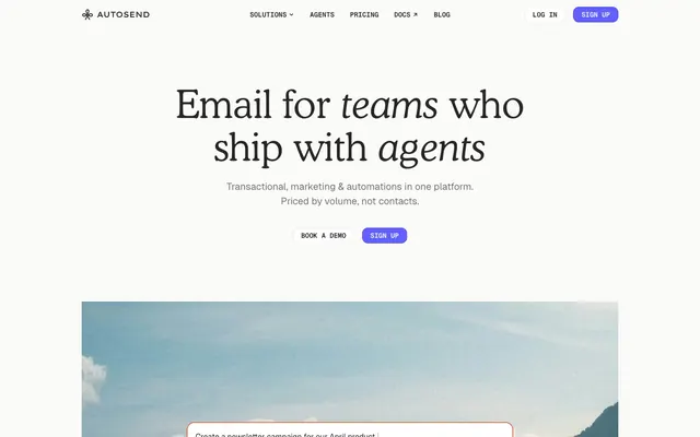
AutoSend employs a crisp, modern aesthetic built on a soft white canvas and strong typographic presence. A single vibrant violet is designated for primary actions, contrasting with otherwise subdued interactions. Surfaces are clean and often borderless, relying on subtle shadows for depth rather than heavy outlines. The system prioritizes clear information hierarchy and lightweight components, allowing content to take precedence.
The layout is primarily a max-width contained design at 1200px, centered on the page. The hero section is a full-width dark background visually extending beyond the content area, featuring a large, centered headline and subtext with stacked call-to-action buttons. Sections below maintain a consistent vertical rhythm with 80px gaps, often featuring two-column layouts that alternate between text-left/image-right compositions. Content is presented in clean, well-defined blocks and card grids for features and data points. Navigation is a sticky top bar with a logo, text links, and two prominent buttons. The overall density suggests a comfortable reading experience with ample breathing room.
Imagery on AutoSend is functional and often abstract or illustrative, maintaining a clean, product-focused aesthetic. Product screenshots are contained and clearly framed, not full-bleed. Illustrations are geometric and clean, using a limited palette that integrates with the brand colors. Icons are primarily outlined or filled in a mono-color style, typically Ink (#292524) or Graphite (#79716b), occasionally with Violet Accent (#4f39f6) for emphasis. The blue-tinted gradient in the hero functions as an abstract background, suggesting scale and technology without being a literal image. The role of visuals is primarily explanatory and decorative, supporting product points rather than being the main content.
Reminiscent of Stripe, Linear, Vercel, Resend.
# AutoSend — Style Reference
> Crisp White Canvas

**Theme:** light

**Site:** https://autosend.com

AutoSend employs a crisp, modern aesthetic built on a soft white canvas and strong typographic presence. A single vibrant violet is designated for primary actions, contrasting with otherwise subdued interactions. Surfaces are clean and often borderless, relying on subtle shadows for depth rather than heavy outlines. The system prioritizes clear information hierarchy and lightweight components, allowing content to take precedence.

## Tokens — Colors

| Name | Value | Token | Role |
|------|------|------|------|
| Violet Action | `#615fff` | `--color-violet-action` | Primary call-to-action background, active states, key interactive indicators |
| Violet Accent | `#4f39f6` | `--color-violet-accent` | Outlined button borders, decorative strokes and accents, links requiring emphasis |
| Sunset Orange | `#d97757` | `--color-sunset-orange` | Decorative card borders, subtle highlights, specific data points |
| Emerald Green | `#5ea500` | `--color-emerald-green` | Green outline accent for tags, dividers, and focused UI edges. Use as a supporting accent, not as a status color |
| Alert Red | `#ff0000` | `--color-alert-red` | Red accent for outlined action borders, linked labels, and lightweight interactive emphasis. Use as a supporting accent, not as a status color |
| Ocean Teal | `#22b8cd` | `--color-ocean-teal` | Informational highlights, secondary data points, decorative icons |
| Sky Blue | `#007ebb` | `--color-sky-blue` | Informational links, decorative borders, specific icon states |
| Lime Accent | `#9ae600` | `--color-lime-accent` | Background for subtle highlights, decorative fills for illustrations |
| Ink | `#292524` | `--color-ink` | Primary text, strong headings, prominent icons, dark borders |
| Paper | `#fafaf9` | `--color-paper` | Page background, button backgrounds |
| Whisper | `#e7e5e4` | `--color-whisper` | Subtle borders, dividers, secondary backgrounds |
| Snow | `#ffffff` | `--color-snow` | Card backgrounds, elevated surfaces, button text on colored backgrounds |
| Graphite | `#79716b` | `--color-graphite` | Secondary text, muted links, subtle icons, placeholder text |
| Stone | `#a6a09b` | `--color-stone` | Tertiary text, decorative strokes, very light borders |
| Ebony | `#0c0a09` | `--color-ebony` | Deepest text, high-contrast borders |

## Tokens — Typography

### Geist
- **Substitute:** Inter
- **Weights:** 400, 600
- **Sizes:** 12px, 14px, 16px, 18px, 20px, 40px
- **Line height:** 1.2, 1.33, 1.38, 1.43, 1.5, 1.56
- **Letter spacing:** normal
- **Role:** Primary UI text for body copy, navigation, buttons, and most headings — the core workhorse sans-serif for readability and clean modern feel.

### Geist Mono
- **Substitute:** JetBrains Mono
- **Weights:** 400, 500, 600
- **Sizes:** 12px, 13px, 14px, 16px
- **Line height:** 1, 1.14, 1.33, 1.43, 1.5, 1.54
- **Letter spacing:** 0.0400em for smaller sizes, 0.1000em for emphasized labels.
- **Role:** Monospaced text for code blocks, tags, and data points where precise alignment and character distinction are important.

### cooperLtBT
- **Substitute:** serif font like Playfair Display
- **Weights:** 400
- **Sizes:** 18px, 80px
- **Line height:** 1.1, 1.33
- **Letter spacing:** normal
- **Role:** Display font used for prominent page titles and hero headlines, adding a touch of classic sophistication and distinctiveness.

### dataType
- **Substitute:** Montserrat
- **Weights:** 400
- **Sizes:** 24px
- **Line height:** 1.33
- **Letter spacing:** normal
- **Role:** Specialized font for specific body text sections, offering unique character for product descriptions or callouts.

### ui-sans-serif
- **Substitute:** system-ui
- **Weights:** 400
- **Sizes:** 16px
- **Line height:** 1.5
- **Letter spacing:** normal
- **Role:** Fallback sans-serif for general text, ensuring readability across all platforms if custom fonts fail to load.

## Tokens — Type Scale

| Role | Size | Line height | Letter spacing |
|------|------|------|------|
| caption | 12px | 1.5 | 0.48px |
| body-sm | 14px | 1.43 | 0.56px |
| body | 16px | 1.5 | — |
| subheading | 18px | 1.38 | 0.72px |
| heading | 40px | 1.2 | — |
| display | 80px | 1.1 | — |

## Tokens — Spacing

- **Max width:** 1200px
- **Section gap:** 80px
- **Card padding:** 16px
- **Element gap:** 24px

## Tokens — Radius

- **Buttons:** 8px
- **Cards:** 16px
- **interactiveElements:** 8px
- **tags:** 12px

## Tokens — Elevation

- **Feature Card:** `rgba(0, 0, 0, 0.1) 0px 20px 25px -5px, rgba(0, 0, 0, 0.1) 0px 8px 10px -6px`

## Layout

The layout is primarily a max-width contained design at 1200px, centered on the page. The hero section is a full-width dark background visually extending beyond the content area, featuring a large, centered headline and subtext with stacked call-to-action buttons. Sections below maintain a consistent vertical rhythm with 80px gaps, often featuring two-column layouts that alternate between text-left/image-right compositions. Content is presented in clean, well-defined blocks and card grids for features and data points. Navigation is a sticky top bar with a logo, text links, and two prominent buttons. The overall density suggests a comfortable reading experience with ample breathing room.

## Imagery

Imagery on AutoSend is functional and often abstract or illustrative, maintaining a clean, product-focused aesthetic. Product screenshots are contained and clearly framed, not full-bleed. Illustrations are geometric and clean, using a limited palette that integrates with the brand colors. Icons are primarily outlined or filled in a mono-color style, typically Ink (#292524) or Graphite (#79716b), occasionally with Violet Accent (#4f39f6) for emphasis. The blue-tinted gradient in the hero functions as an abstract background, suggesting scale and technology without being a literal image. The role of visuals is primarily explanatory and decorative, supporting product points rather than being the main content.

## Components

### Primary Filled Button
*Primary call-to-action button.*

Filled with Violet Action (#615fff), text in Snow (#ffffff). 8px border radius, 8px vertical padding, 24px horizontal padding. Uses Geist font at 16px, weight 600.

### Ghost Button
*Secondary action button.*

Transparent background with Ink (#292524) text and a 1px Ink (#292524) border. 8px border radius, 8px vertical padding, 24px horizontal padding. Uses Geist font at 16px, weight 400.

### Text Button
*Minimal interactive element, inline actions.*

No background or border. Text in Ink (#292524) or Graphite (#79716b). 4px vertical padding, 16px horizontal padding. Uses Geist font at 14px, weight 400.

### Feature Card
*Content container for features or articles with subtle elevation.*

Snow (#ffffff) background, 16px border radius. Uses a subtle shadow: rgba(0, 0, 0, 0.1) 0px 20px 25px -5px, rgba(0, 0, 0, 0.1) 0px 8px 10px -6px. Padding varies depending on content, but typically 16px.

### Minimal Card
*Flat content container without elevation.*

Paper (#fafaf9) background, 16px border radius, no shadow. 16px top and bottom padding, 12px horizontal padding. Often used for grouped information or statistical displays.

### Input Field
*Standard text input field.*

White background, with a 1px Whisper (#e7e5e4) border. Input text in Ink (#292524), placeholder text in Graphite (#79716b). 8px border radius. 8px vertical padding, 12px horizontal padding for contained input fields.

### Navigation Link
*Primary site navigation items.*

Ink (#292524) text, Geist font, 16px, weight 400. Hover state with a subtle underline or color change to Graphite (#79716b). Minimum 8px padding around text.

### Badge
*Small, informative labels or tags.*

Paper (#fafaf9) background, Ink (#292524) text, 12px border radius. 6px vertical padding, 16px horizontal padding. Uses Geist Mono font, 12px, weight 400.

## Guidelines

### Do

- Prioritize Geist for all marketing and UI text, reserving cooperLtBT exclusively for hero headlines and prominent display text.
- Use Paper (#fafaf9) for main page backgrounds and Snow (#ffffff) for card and elevated surfaces to establish surface hierarchy.
- Apply Violet Action (#615fff) strictly to primary call-to-actions, ensuring it consistently signals interactivity and importance.
- Maintain a clear visual rhythm with section gaps of 80px and elemental gaps of 24px.
- Use 8px border-radius for all interactive elements like buttons and input fields, and 16px for larger content cards.
- For subtle depth, apply the card shadow (rgba(0, 0, 0, 0.1) 0px 20px 25px -5px, rgba(0, 0, 0, 0.1) 0px 8px 10px -6px) sparingly, primarily on content cards.
- Utilize Geist Mono for all code snippets, data labels, and elements requiring monospace alignment, applying 0.04em or 0.10em letter-spacing as appropriate for emphasis.

### Don't

- Avoid using saturated accent colors other than Violet Action (#615fff) for primary button backgrounds; these are reserved for borders, icons, or specific highlights.
- Do not deviate from the defined border radii; mixing different radius values will disrupt the systematic feel.
- Refrain from introducing new shadow styles; rely solely on the specified card shadow for elevation.
- Do not use generic system fonts for headings or body text, as Geist and cooperLtBT define the brand's typographic identity.
- Avoid excessive use of borders; many components rely on background color differences or subtle shadows for separation.
- Do not use the neutral colors with chromatic names like 'Twilight Indigo' when creating new color tokens; stick to neutral descriptions.
- Do not apply letter-spacing to regular body text set in Geist; it should remain 'normal' for optimal readability.

## Agent Prompt Guide

Quick Color Reference:
- text: #292524
- background: #fafaf9
- border: #e7e5e4
- accent: #d97757
- primary action: #615fff (filled action)

Example Component Prompts:
- Create a hero section: Paper background, centered cooperLtBT weight 400 headline at 80px in Ink. Subtext in Geist weight 400 at 18px in Graphite. Primary Filled Button (#615fff, text Snow, 8px radius, 8px vertical padding, 24px horizontal padding) and a Ghost Button (Ink text and border, 8px radius, 8px vertical padding, 24px horizontal padding).
- Generate a feature card: Snow background, 16px radius, with the subtle card shadow. Use Geist weight 600 at 20px for headings in Ink, and Geist weight 400 at 16px for body text in Graphite. Card padding 16px. Include a small icon in Violet Accent (#4f39f6).
- Create a Primary Action Button: #615fff background, #ffffff text, 9999px radius, compact pill padding. Use this filled treatment for the main CTA.
More like this









Keep what you find
A free account saves references to boards and can send you a weekly email of picks based on what you save.
To see every result, go Pro.