Preview image. Unlock full-res
Vivid violet productivity canvas
Color palette
Primary action buttons, accented links, interactive elements — a deep, vivid violet that energizes the UI
Background for bold hero sections or prominent feature blocks, adding depth to the violet palette
Decorative background for featured sections and badges, symbolizing technological fluidity and motion
Violet wash for highlight backgrounds, decorative bands, and soft emphasis behind content
Subtle borders, interactive highlights, and soft background accents, providing a muted counterpoint to Violet Empress
Green action color for filled buttons, selected navigation states, and focused conversion moments. Use as a supporting accent, not as a status color
Primary text for headlines and prominent UI labels, ensuring maximum contrast
Page backgrounds, card surfaces, and text on darker backgrounds
Subtle card backgrounds, section separators, and hover states, providing soft visual distinction
Secondary text, descriptive body copy, and icons, offering readability without harshness
Subtle borders, dividers, and input field outlines, providing soft structure
Tertiary text, helper text, and disabled states, receding gracefully into the background
Placeholder text and subtle input borders, hinting at interactivity
Darker background accents, subtle text for contrast on lighter elements
Background for regional information banners
Typography
- Weights
- 300, 500, 600, 700, 800, 900, 1000
- Sizes
- 18px, 24px, 28px, 32px, 38px, 42px, 60px, 80px
- Line height
- 1.06, 1.08, 1.1, 1.14, 1.25, 1.55
- Letter spacing
- -0.008em at 80px, -0.007em at 60px, -0.006em at 42px, -0.005em at 38px, -0.003em at 32px, -0.002em at 28px
- Fallback
- Montserrat
Display and primary headlines — custom font with tight tracking and a bold presence, establishing a modern, authoritative voice. The higher weights, up to 1000, create a robust visual impact.
- Weights
- 300, 400, 500, 600, 700, 800, 900
- Sizes
- 10px, 12px, 14px, 16px, 18px, 24px, 28px, 36px
- Line height
- 1, 1.13, 1.14, 1.25, 1.33, 1.43, 1.5, 1.55, 1.67, 2.67
- Letter spacing
- normal
- Fallback
- Inter
Body copy, subheadings, interface labels, and buttons — a highly legible and versatile sans-serif that balances the impact of Saiga.
- Weights
- 400, 600
- Sizes
- 13px, 16px
- Line height
- 1, 1.2
- Letter spacing
- normal
Utility text for small components like quick actions, certain input fields, or system messages, ensuring ubiquitous availability.
Spacing & shape
Components
Filled with Violet Empress (#7622d7), white text, fully rounded (32px radius). Padding: 14px vertical, 24px horizontal. Text uses DM Sans.
Transparent background, white text, 4px radius. No internal padding, relying on external layout. Text uses DM Sans.
White background, text in Violet Empress (#7622d7), 12px radius. Padding: 0px vertical, 12px horizontal. Border is 1px Violet Empress. Text uses DM Sans.
Transparent background, white text, 32px radius. Border is 1px Silver Thread (#f4f4f5). Padding: 6px vertical, 16px horizontal. Text uses DM Sans.
Transparent background, 0px border radius, no shadow. Internal content padding is 40px top, 20px bottom, 0px horizontal.
Ghost White (#ffffff) background, 12px border radius, no shadow. No internal padding, content provides its own layout.
Whisper Lilac (#f9f5ff) background, 20px border radius, no shadow. No internal padding, content provides its own layout.
Transparent background, Dark Charcoal (#27272a) text. Border bottom is 1px Dark Charcoal. No radius. Padding: 0px top, 8px right, 8px bottom, 0px left. DM Sans font.
Transparent background, Near Black (#27272a) text. Border is 1px Cloud Gray (#a9a9b2), 6px radius. Padding: 8px vertical, 12px left, 36px right. DM Sans font.
Transparent background with the AI Gradient applied as a border or background image. Text in Near Black (#121214), 9999px (pill-shaped) border radius. No padding, uses intrinsic text sizing.
Guidelines
- Prioritize Violet Empress (#7622d7) for all primary calls-to-action and critical interactive elements.
- Use Saiga for all display and large headlines, applying tight letter-spacing for visual impact.
- Utilize DM Sans (weights 400-600) for all body text, subheadings, and interface components, preferring normal letter-spacing for legibility.
- Apply a 32px border-radius to all primary buttons for a soft, approachable feel.
- Separate content sections with subtle Whisper Lilac (#f9f5ff) background fills or by increasing vertical spacing using a 32px sectionGap.
- For all text, ensure sufficient contrast by pairing with Obsidian (#000000) for headlines and Near Black (#121214) for body copy on light backgrounds.
- Employ the AI Gradient for decorative elements such as badges or subtle background washes, to reinforce the brand's AI theme.
- Avoid generic system fonts for prominent headlines; Saiga is a key brand identifier.
- Do not use harsh, square corners; adhere to the established radii of 8px for general elements, 12px for cards, and 32px for buttons.
- Refrain from introducing new accent colors outside of Violet Empress (#7622d7) or Cybernetic Green (#94e022).
- Avoid heavy drop shadows or glows; the design system favors clean, flat surfaces and subtle background tints for hierarchy.
- Do not use small text sizes (below 14px DM Sans) for critical information; prioritize readability over density.
- Do not use black backgrounds except for specific, deeply intentional hero sections or banners where Deep Violet or Info Banner colors are preferred.
- Do not deviate from the defined spacing scale; maintain comfortable density with elementGap at 4px and cardPadding at 24px.
About this system
ShowHide
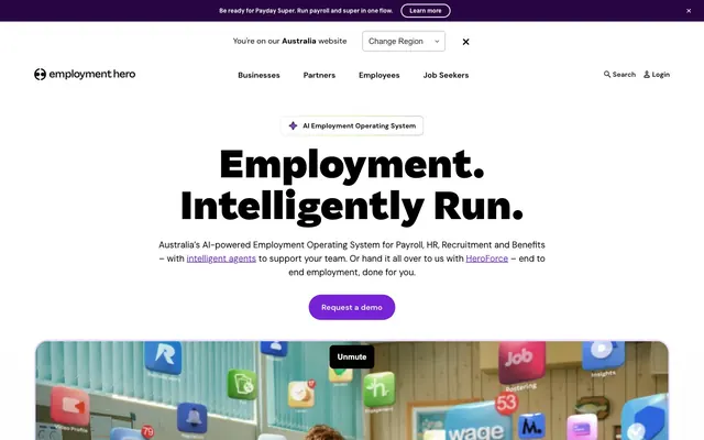
Employment Hero employs a vibrant, confident design language using a clean white canvas offset by a dominant, vivid violet. Typography is bold and assertive for headlines, while functional elements remain crisp and legible. Components exhibit softer, rounded edges for approachability, and subtle background tints introduce visual segmentation without heavy dividers, creating a sense of clarity and focused information presentation.
Reminiscent of Rippling, Deel, Gusto, Carta.
# Employment Hero — Style Reference
> Vivid violet productivity canvas

**Theme:** light

**Site:** https://employmenthero.com

Employment Hero employs a vibrant, confident design language using a clean white canvas offset by a dominant, vivid violet. Typography is bold and assertive for headlines, while functional elements remain crisp and legible. Components exhibit softer, rounded edges for approachability, and subtle background tints introduce visual segmentation without heavy dividers, creating a sense of clarity and focused information presentation.

## Tokens — Colors

| Name | Value | Token | Role |
|------|------|------|------|
| Violet Empress | `#7622d7` | `--color-violet-empress` | Primary action buttons, accented links, interactive elements — a deep, vivid violet that energizes the UI |
| Deep Violet | `#460078` | `--color-deep-violet` | Background for bold hero sections or prominent feature blocks, adding depth to the violet palette |
| AI Gradient | `#9a58fc` | `--color-ai-gradient` | Decorative background for featured sections and badges, symbolizing technological fluidity and motion |
| Info Banner | `#280541` | `--color-info-banner` | Violet wash for highlight backgrounds, decorative bands, and soft emphasis behind content |
| Lavender Mist | `#e6d5fe` | `--color-lavender-mist` | Subtle borders, interactive highlights, and soft background accents, providing a muted counterpoint to Violet Empress |
| Cybernetic Green | `#94e022` | `--color-cybernetic-green` | Green action color for filled buttons, selected navigation states, and focused conversion moments. Use as a supporting accent, not as a status color |
| Obsidian | `#000000` | `--color-obsidian` | Primary text for headlines and prominent UI labels, ensuring maximum contrast |
| Ghost White | `#ffffff` | `--color-ghost-white` | Page backgrounds, card surfaces, and text on darker backgrounds |
| Whisper Lilac | `#f9f5ff` | `--color-whisper-lilac` | Subtle card backgrounds, section separators, and hover states, providing soft visual distinction |
| Near Black | `#121214` | `--color-near-black` | Secondary text, descriptive body copy, and icons, offering readability without harshness |
| Silver Thread | `#e4e4e7` | `--color-silver-thread` | Subtle borders, dividers, and input field outlines, providing soft structure |
| Stone Gray | `#71717a` | `--color-stone-gray` | Tertiary text, helper text, and disabled states, receding gracefully into the background |
| Cloud Gray | `#a9a9b2` | `--color-cloud-gray` | Placeholder text and subtle input borders, hinting at interactivity |
| Dark Charcoal | `#27272a` | `--color-dark-charcoal` | Darker background accents, subtle text for contrast on lighter elements |
| Region Banner | `#f0e6fa` | `--color-region-banner` | Background for regional information banners |

## Tokens — Typography

### Saiga
- **Substitute:** Montserrat
- **Weights:** 300, 500, 600, 700, 800, 900, 1000
- **Sizes:** 18px, 24px, 28px, 32px, 38px, 42px, 60px, 80px
- **Line height:** 1.06, 1.08, 1.1, 1.14, 1.25, 1.55
- **Letter spacing:** -0.008em at 80px, -0.007em at 60px, -0.006em at 42px, -0.005em at 38px, -0.003em at 32px, -0.002em at 28px
- **Role:** Display and primary headlines — custom font with tight tracking and a bold presence, establishing a modern, authoritative voice. The higher weights, up to 1000, create a robust visual impact.

### DM Sans
- **Substitute:** Inter
- **Weights:** 300, 400, 500, 600, 700, 800, 900
- **Sizes:** 10px, 12px, 14px, 16px, 18px, 24px, 28px, 36px
- **Line height:** 1, 1.13, 1.14, 1.25, 1.33, 1.43, 1.5, 1.55, 1.67, 2.67
- **Letter spacing:** normal
- **Role:** Body copy, subheadings, interface labels, and buttons — a highly legible and versatile sans-serif that balances the impact of Saiga.

### Arial
- **Weights:** 400, 600
- **Sizes:** 13px, 16px
- **Line height:** 1, 1.2
- **Letter spacing:** normal
- **Role:** Utility text for small components like quick actions, certain input fields, or system messages, ensuring ubiquitous availability.

## Tokens — Type Scale

Perfect Fourth (1.333) from 14px base.

| Role | Size | Line height | Letter spacing |
|------|------|------|------|
| caption | 10px | 1.5 | — |
| body | 14px | 1.5 | — |
| body-lg | 18px | 1.55 | -0.002em |
| subheading | 24px | 1.14 | — |
| heading-sm | 28px | 1.14 | -0.002em |
| heading | 36px | 1.14 | — |
| heading-lg | 42px | 1.1 | -0.006em |
| display | 80px | 1.06 | -0.008em |

## Tokens — Spacing

- **Max width:** 1200px
- **Section gap:** 32px
- **Card padding:** 24px
- **Element gap:** 4px

## Tokens — Radius

- **Default:** 8px
- **Buttons:** 32px
- **Inputs:** 6px
- **Cards:** 12px
- **Images:** 8px
- **badges:** 9999px

## Components

### Primary Action Button
*Main call-to-action throughout the site.*

Filled with Violet Empress (#7622d7), white text, fully rounded (32px radius). Padding: 14px vertical, 24px horizontal. Text uses DM Sans.

### Ghost Action Button (White)
*Secondary calls-to-action on dark backgrounds.*

Transparent background, white text, 4px radius. No internal padding, relying on external layout. Text uses DM Sans.

### Outlined Action Button
*Secondary calls-to-action on light backgrounds.*

White background, text in Violet Empress (#7622d7), 12px radius. Padding: 0px vertical, 12px horizontal. Border is 1px Violet Empress. Text uses DM Sans.

### Region Selector Button
*Small, outlined button for changing region.*

Transparent background, white text, 32px radius. Border is 1px Silver Thread (#f4f4f5). Padding: 6px vertical, 16px horizontal. Text uses DM Sans.

### Clean Card
*Content container without visual hierarchy.*

Transparent background, 0px border radius, no shadow. Internal content padding is 40px top, 20px bottom, 0px horizontal.

### Elevated Card
*Standard content container to highlight information.*

Ghost White (#ffffff) background, 12px border radius, no shadow. No internal padding, content provides its own layout.

### Soft Tint Card
*Segmented content areas for features or categories.*

Whisper Lilac (#f9f5ff) background, 20px border radius, no shadow. No internal padding, content provides its own layout.

### Minimal Input Field
*Text input fields for forms.*

Transparent background, Dark Charcoal (#27272a) text. Border bottom is 1px Dark Charcoal. No radius. Padding: 0px top, 8px right, 8px bottom, 0px left. DM Sans font.

### Bordered Input Field
*Standard input fields for user data.*

Transparent background, Near Black (#27272a) text. Border is 1px Cloud Gray (#a9a9b2), 6px radius. Padding: 8px vertical, 12px left, 36px right. DM Sans font.

### Gradient AI Badge
*Visual indicator for AI-driven features.*

Transparent background with the AI Gradient applied as a border or background image. Text in Near Black (#121214), 9999px (pill-shaped) border radius. No padding, uses intrinsic text sizing.

## Guidelines

### Do

- Prioritize Violet Empress (#7622d7) for all primary calls-to-action and critical interactive elements.
- Use Saiga for all display and large headlines, applying tight letter-spacing for visual impact.
- Utilize DM Sans (weights 400-600) for all body text, subheadings, and interface components, preferring normal letter-spacing for legibility.
- Apply a 32px border-radius to all primary buttons for a soft, approachable feel.
- Separate content sections with subtle Whisper Lilac (#f9f5ff) background fills or by increasing vertical spacing using a 32px sectionGap.
- For all text, ensure sufficient contrast by pairing with Obsidian (#000000) for headlines and Near Black (#121214) for body copy on light backgrounds.
- Employ the AI Gradient for decorative elements such as badges or subtle background washes, to reinforce the brand's AI theme.

### Don't

- Avoid generic system fonts for prominent headlines; Saiga is a key brand identifier.
- Do not use harsh, square corners; adhere to the established radii of 8px for general elements, 12px for cards, and 32px for buttons.
- Refrain from introducing new accent colors outside of Violet Empress (#7622d7) or Cybernetic Green (#94e022).
- Avoid heavy drop shadows or glows; the design system favors clean, flat surfaces and subtle background tints for hierarchy.
- Do not use small text sizes (below 14px DM Sans) for critical information; prioritize readability over density.
- Do not use black backgrounds except for specific, deeply intentional hero sections or banners where Deep Violet or Info Banner colors are preferred.
- Do not deviate from the defined spacing scale; maintain comfortable density with elementGap at 4px and cardPadding at 24px.

## Agent Prompt Guide

Quick Color Reference:
text: #000000
background: #ffffff
border: #e4e4e7
accent: #e6d5fe
primary action: #7622d7 (filled action)

Example Component Prompts:
1. Create a Primary Action Button labeled 'Request a demo': Violet Empress (#7622d7) background, white text, 32px radius, 14px vertical padding, 24px horizontal padding, DM Sans font.
2. Create a Soft Tint Card: Whisper Lilac (#f9f5ff) background, 20px border radius, no internal padding. Place a heading 'FOR BUSINESSES' using Saiga weight 700, 24px, #000000, 40px top padding.
3. Create a Ghost Action Link labeled 'Learn more': Transparent background, white text, 4px radius, DM Sans font, no padding.
4. Create a Bordered Input Field: Transparent background, 1px Cloud Gray (#a9a9b2) border, 6px radius, 8px vertical padding, 12px left padding, DM Sans font. The placeholder text should be Stone Gray (#71717a).
More like this








Keep what you find
A free account saves references to boards and can send you a weekly email of picks based on what you save.
To see every result, go Pro.