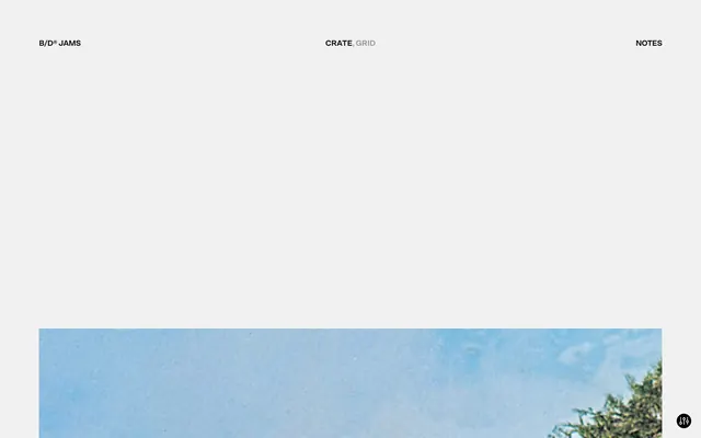
Preview image. Unlock full-res
Editorial White Canvas
Color palette
Primary page background, expansive surfaces
Primary text, strong headings, button borders, and essential UI strokes. Establishes a bold, high-contrast presence
Subtle borders and dividers for nuanced separation
Secondary text in specific contexts, subtle border accents, and for maximum contrast elements
Typography
- Weights
- 300, 700
- Sizes
- 16px, 24px, 48px
- Line height
- 1, 1.13, 1.17
- Letter spacing
- -0.04em at 48px, -0.03em at 24px and 16px
- Fallback
- Inter
All textual content, from navigation links and body text to prominent headings. The varied weights with tight letter-spacing contribute to its editorial, almost typewritten feel, emphasizing clarity and precision over decorative flair.
Spacing & shape
Components
Background transparent (rgba(0, 0, 0, 0)), text color Ink Black (#0e0e0e), with no padding or border by default. Focus states are indicated by border.
Background transparent (rgba(0, 0, 0, 0)), no border, no shadow, and zero padding. Achieves separation primarily through generous vertical spacing.
Guidelines
- Prioritize Canvas Ice (#f1f1f1) for all background surfaces to maintain a clean, expansive feel.
- Use Ink Black (#0e0e0e) for primary text and borders to ensure strong contrast and visual hierarchy.
- Apply SctoGroteskA (or Inter) with letter-spacing -0.04em for headings at 48px, and -0.03em for 16px and 24px text to consistently deliver the concise, editorial aesthetic.
- Maintain a zero border-radius for all interactive elements and containers to preserve the sharp, angular aesthetic.
- Utilize 80px for vertical spacing between major sections, and 30px for horizontal and vertical spacing within content blocks to ensure generous whitespace.
- Implement Ghost Navigation Buttons with a transparent background and Ink Black (#0e0e0e) text, only showing a border on hover/focus using Ink Black (#0e0e0e).
- Do not use highly saturated colors for main UI elements; chromatic colors are not part of the brand's core palette.
- Avoid using box-shadows or elevated elements; the design emphasizes a flat, two-dimensional aesthetic.
- Do not introduce decorative borders or excessive padding on cards; they should remain minimalist and transparent.
- Do not use rounded corners on any UI element; all corners should be sharp and angular.
- Avoid dense information blocks; instead, use ample whitespace and clear typographic hierarchy for content organization.
- Do not use generic system fonts; always prioritize SctoGroteskA (or Inter) to maintain the brand's unique typographic voice.
About this system
ShowHide
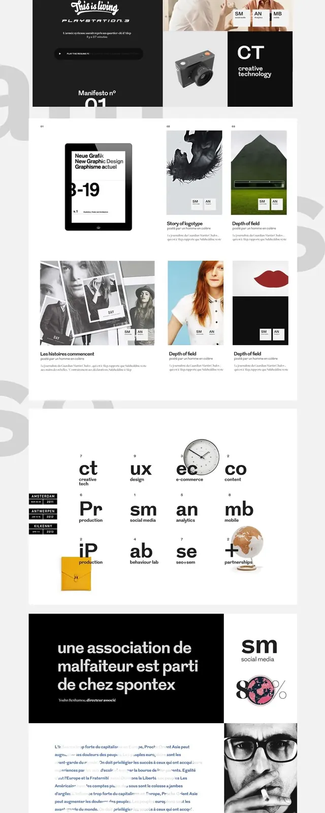
The B/D® JAMS design system presents a clean, editorial aesthetic reminiscent of a digital zine, prioritizing spaciousness and direct typography over decorative elements. Its visual language relies on a monochrome palette of stark black text and crisp backgrounds, occasionally softened by subtle gray borders. Layouts are deliberately sparse, framing content with generous whitespace, and interactions are signaled through direct text changes rather than elaborate animations or vivid highlights. Components are minimalist, focusing on function with zero radii and transparent backgrounds.
The page maintains a full-bleed, canvas-like aesthetic, allowing background imagery to extend edge-to-edge. Content appears to be horizontally centered within a broad but undefined maximum width. The hero pattern features minimal navigation text elements positioned prominently at the top, overlaying the background. Sections are separated by generous vertical spacing, typically 80px, maintaining significant breathing room between content blocks. The primary content arrangement is a simple, stacked typographic hierarchy creating an editorial, almost printed page feel with no complex grids or alternating visual patterns.
The site's imagery primarily consists of full-bleed, raw photographic or abstract visuals acting as background elements, specifically a weathered-looking sky. These images are treated without specific masking or prominent borders, integrating seamlessly into the minimalist design, acting more as atmospheric textures than focal points. There are no obvious icons or complex illustrations, preserving a text-dominant and stark visual environment.
Reminiscent of Are.na, Basic Type Foundry, The New York Times (digital archives).
# B/D® JAMS — Style Reference
> Editorial White Canvas

**Theme:** light

**Site:** https://jams.basicagency.com

The B/D® JAMS design system presents a clean, editorial aesthetic reminiscent of a digital zine, prioritizing spaciousness and direct typography over decorative elements. Its visual language relies on a monochrome palette of stark black text and crisp backgrounds, occasionally softened by subtle gray borders. Layouts are deliberately sparse, framing content with generous whitespace, and interactions are signaled through direct text changes rather than elaborate animations or vivid highlights. Components are minimalist, focusing on function with zero radii and transparent backgrounds.

## Tokens — Colors

| Name | Value | Token | Role |
|------|------|------|------|
| Canvas Ice | `#f1f1f1` | `--color-canvas-ice` | Primary page background, expansive surfaces |
| Ink Black | `#0e0e0e` | `--color-ink-black` | Primary text, strong headings, button borders, and essential UI strokes. Establishes a bold, high-contrast presence |
| Border Fog | `#e5e7eb` | `--color-border-fog` | Subtle borders and dividers for nuanced separation |
| True White | `#ffffff` | `--color-true-white` | Secondary text in specific contexts, subtle border accents, and for maximum contrast elements |

## Tokens — Typography

### SctoGroteskA
- **Substitute:** Inter
- **Weights:** 300, 700
- **Sizes:** 16px, 24px, 48px
- **Line height:** 1, 1.13, 1.17
- **Letter spacing:** -0.04em at 48px, -0.03em at 24px and 16px
- **Role:** All textual content, from navigation links and body text to prominent headings. The varied weights with tight letter-spacing contribute to its editorial, almost typewritten feel, emphasizing clarity and precision over decorative flair.

## Tokens — Type Scale

| Role | Size | Line height | Letter spacing |
|------|------|------|------|
| body | 16px | 1.17 | -0.48px |
| subheading | 24px | 1.13 | -0.72px |
| heading | 48px | 1 | -1.92px |

## Tokens — Spacing

- **Section gap:** 80px
- **Card padding:** 0px
- **Element gap:** 30px

## Tokens — Radius

- **Default:** 0px

## Layout

The page maintains a full-bleed, canvas-like aesthetic, allowing background imagery to extend edge-to-edge. Content appears to be horizontally centered within a broad but undefined maximum width. The hero pattern features minimal navigation text elements positioned prominently at the top, overlaying the background. Sections are separated by generous vertical spacing, typically 80px, maintaining significant breathing room between content blocks. The primary content arrangement is a simple, stacked typographic hierarchy creating an editorial, almost printed page feel with no complex grids or alternating visual patterns.

## Imagery

The site's imagery primarily consists of full-bleed, raw photographic or abstract visuals acting as background elements, specifically a weathered-looking sky. These images are treated without specific masking or prominent borders, integrating seamlessly into the minimalist design, acting more as atmospheric textures than focal points. There are no obvious icons or complex illustrations, preserving a text-dominant and stark visual environment.

## Components

### Ghost Navigation Button
*Interactive element for navigation and primary actions.*

Background transparent (rgba(0, 0, 0, 0)), text color Ink Black (#0e0e0e), with no padding or border by default. Focus states are indicated by border.

### Information Card (minimal)
*Container for content.*

Background transparent (rgba(0, 0, 0, 0)), no border, no shadow, and zero padding. Achieves separation primarily through generous vertical spacing.

## Guidelines

### Do

- Prioritize Canvas Ice (#f1f1f1) for all background surfaces to maintain a clean, expansive feel.
- Use Ink Black (#0e0e0e) for primary text and borders to ensure strong contrast and visual hierarchy.
- Apply SctoGroteskA (or Inter) with letter-spacing -0.04em for headings at 48px, and -0.03em for 16px and 24px text to consistently deliver the concise, editorial aesthetic.
- Maintain a zero border-radius for all interactive elements and containers to preserve the sharp, angular aesthetic.
- Utilize 80px for vertical spacing between major sections, and 30px for horizontal and vertical spacing within content blocks to ensure generous whitespace.
- Implement Ghost Navigation Buttons with a transparent background and Ink Black (#0e0e0e) text, only showing a border on hover/focus using Ink Black (#0e0e0e).

### Don't

- Do not use highly saturated colors for main UI elements; chromatic colors are not part of the brand's core palette.
- Avoid using box-shadows or elevated elements; the design emphasizes a flat, two-dimensional aesthetic.
- Do not introduce decorative borders or excessive padding on cards; they should remain minimalist and transparent.
- Do not use rounded corners on any UI element; all corners should be sharp and angular.
- Avoid dense information blocks; instead, use ample whitespace and clear typographic hierarchy for content organization.
- Do not use generic system fonts; always prioritize SctoGroteskA (or Inter) to maintain the brand's unique typographic voice.

## Agent Prompt Guide

Quick Color Reference:
text: #0e0e0e
background: #f1f1f1
border: #e5e7eb
accent: no distinct accent color
primary action: no distinct CTA color

Example Component Prompts:
1. Create a top navigation bar: Canvas Ice background (#f1f1f1). Left-aligned text 'B/D® JAMS' at 16px SctoGroteskA weight 700, color Ink Black (#0e0e0e), letter-spacing -0.48px. Right-aligned 'Notes' link at 16px SctoGroteskA weight 700, color Ink Black (#0e0e0e), letter-spacing -0.48px. No padding, no border, no radius.
2. Create a heading section: Canvas Ice background (#f1f1f1). Centered text 'Press Option+1 for screen-reader mode, Option+0 to cancel' at 48px SctoGroteskA weight 700, color Ink Black (#0e0e0e), letter-spacing -1.92px. Padding 80px top and bottom.
3. Create a Ghost Grid Button: Transparent background (rgba(0,0,0,0)), text 'Grid' at 16px SctoGroteskA weight 700, color Ink Black (#0e0e0e), letter-spacing -0.48px. No padding, border, or radius. Should respond to hover/focus by showing a 1px solid Ink Black (#0e0e0e) border.
More like this






Keep what you find
A free account saves references to boards and can send you a weekly email of picks based on what you save.
To see every result, go Pro.