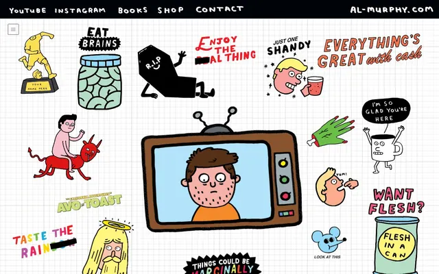
Preview image. Unlock full-res
Sketchbook of absurdities
Color palette
Page background, primary surface for content areas
Illustrations, text, borders, and general UI outlines
Subtle background shading for interface sections
Text and other elements contrasting against Near Black backgrounds or borders
Typography
- Weights
- 400
- Sizes
- 10px, 13px
- Line height
- 1.2
- Letter spacing
- normal
- Fallback
- Arial
Navigation links, general body text, and small descriptive labels, ensuring readability within the whimsical context.
- Weights
- 400
- Sizes
- 14px
- Line height
- 1.1
- Letter spacing
- normal
- Fallback
- Helvetica Neue
Decorative headlines and expressive textual elements, contributing to the hand-drawn, illustrative character of the site.
Spacing & shape
Components
A ghost button with no background or padding, using Line Art Black as border and text color. Radius is 0px. Used for navigation and minimal interactive elements.
Guidelines
- Prioritize use of Canvas White (#ebebeb) for page backgrounds to maintain the sketchbook aesthetic.
- Use Line Art Black (#000000) for all text color, borders, and UI outlines to unify the hand-drawn style.
- Maintain the whimsical, illustrative tone with helvetica-w01-roman for decorative headings at 14px 400 weight.
- Employ Arial 400 weight at 10px or 13px for all body text, links, and navigation, ensuring legibility without distracting from illustrations.
- Ensure generous use of Element Gap (17px) and Section Gap (61px) to create breathing room between illustrations and content sections.
- Utilize Button Primary Fill (#143b0a) with Button Primary Text (#8bff82) for any primary call-to-action buttons.
- Feature 'Ghost Button' for navigation and secondary actions, defined by a 1px Line Art Black (#000000) border and 0px radius.
- Avoid using strong, saturated colors for backgrounds or large areas; restrict color to illustrations and defined interactive states.
- Do not introduce sharp, geometric shapes or hard edges; maintain the organic, hand-drawn feel with 0px radii.
- Do not use elaborate hover states or complex animations on UI elements; keep interactions simple and swift.
- Avoid heavy shadows, gradients, or elevated components that would contradict the flat, illustrated visual language.
- Do not break away from the dominant monochrome and hand-drawn line style for any new pictorial elements or icons.
- Do not use strong typographic hierarchy with varying weights or extended type scales beyond the defined Arial and helvetica-w01-roman roles.
- Avoid dense information blocks; instead, distribute content with generous spacing and illustration breaks.
About this system
ShowHide
The design system for Al Murphy embraces a whimsical, hand-drawn aesthetic, appearing as illustrations on a digital sketchbook. It features a high contrast monochrome palette of black and white, with thin, hand-sketched lines defining all elements. Typography is minimal, relying on system fonts for navigation and a custom, expressive font for decorative elements, maintaining a light and unpolished feel. The layout provides ample negative space allowing the 'sticker-like' illustrations to breathe and maintain their organic, playful rhythm.
The page operates on a full-bleed grid pattern, resembling notebook paper with a light gray Canvas White background (#ebebeb) and faint grid lines. Content, primarily illustrations, is scattered freely without a strict max-width container, embracing an artistic collage-like arrangement. The hero section is characterized by a central, dominant illustration surrounded by smaller, equally dispersed graphics. Sections are implicitly defined by the arrangement of these visual elements and consistent vertical spacing rather than explicit dividers or alternating bands. Navigation is minimal, a simple top bar with Ghost Buttons for links. Overall density is high with imagery but sections maintain breathability through generous element gaps.
The site is dominated by a diverse collection of highly stylized, often absurd, hand-drawn illustrations. These are flat, outlined with black, and filled with a limited, vibrant color palette. The illustrations are contained, appearing like stickers scattered across the page, without overlap or complex masking. They serve primarily as decorative atmosphere and elements of brand identity, rather than explanatory content. The site is visually dense with these illustrations, creating a rich, whimsical, and somewhat chaotic visual experience.
Reminiscent of The Oatmeal, Saturday Morning Breakfast Cereal (SMBC), Cyanide & Happiness.
# My Site 3 — Style Reference
> Sketchbook of absurdities

**Theme:** light

**Site:** https://www.al-murphy.com

The design system for Al Murphy embraces a whimsical, hand-drawn aesthetic, appearing as illustrations on a digital sketchbook. It features a high contrast monochrome palette of black and white, with thin, hand-sketched lines defining all elements. Typography is minimal, relying on system fonts for navigation and a custom, expressive font for decorative elements, maintaining a light and unpolished feel. The layout provides ample negative space allowing the 'sticker-like' illustrations to breathe and maintain their organic, playful rhythm.

## Tokens — Colors

| Name | Value | Token | Role |
|------|------|------|------|
| Canvas White | `#ebebeb` | `--color-canvas-white` | Page background, primary surface for content areas |
| Line Art Black | `#000000` | `--color-line-art-black` | Illustrations, text, borders, and general UI outlines |
| Near Black | `#000308` | `--color-near-black` | Subtle background shading for interface sections |
| Paper White | `#ffffff` | `--color-paper-white` | Text and other elements contrasting against Near Black backgrounds or borders |

## Tokens — Typography

### Arial
- **Substitute:** Arial
- **Weights:** 400
- **Sizes:** 10px, 13px
- **Line height:** 1.2
- **Letter spacing:** normal
- **Role:** Navigation links, general body text, and small descriptive labels, ensuring readability within the whimsical context.

### helvetica-w01-roman
- **Substitute:** Helvetica Neue
- **Weights:** 400
- **Sizes:** 14px
- **Line height:** 1.1
- **Letter spacing:** normal
- **Role:** Decorative headlines and expressive textual elements, contributing to the hand-drawn, illustrative character of the site.

## Tokens — Spacing

- **Section gap:** 61px
- **Card padding:** 17px
- **Element gap:** 17px

## Tokens — Radius

- **none:** 0px

## Layout

The page operates on a full-bleed grid pattern, resembling notebook paper with a light gray Canvas White background (#ebebeb) and faint grid lines. Content, primarily illustrations, is scattered freely without a strict max-width container, embracing an artistic collage-like arrangement. The hero section is characterized by a central, dominant illustration surrounded by smaller, equally dispersed graphics. Sections are implicitly defined by the arrangement of these visual elements and consistent vertical spacing rather than explicit dividers or alternating bands. Navigation is minimal, a simple top bar with Ghost Buttons for links. Overall density is high with imagery but sections maintain breathability through generous element gaps.

## Imagery

The site is dominated by a diverse collection of highly stylized, often absurd, hand-drawn illustrations. These are flat, outlined with black, and filled with a limited, vibrant color palette. The illustrations are contained, appearing like stickers scattered across the page, without overlap or complex masking. They serve primarily as decorative atmosphere and elements of brand identity, rather than explanatory content. The site is visually dense with these illustrations, creating a rich, whimsical, and somewhat chaotic visual experience.

## Components

### Ghost Button
*Interactive element*

A ghost button with no background or padding, using Line Art Black as border and text color. Radius is 0px. Used for navigation and minimal interactive elements.

## Guidelines

### Do

- Prioritize use of Canvas White (#ebebeb) for page backgrounds to maintain the sketchbook aesthetic.
- Use Line Art Black (#000000) for all text color, borders, and UI outlines to unify the hand-drawn style.
- Maintain the whimsical, illustrative tone with helvetica-w01-roman for decorative headings at 14px 400 weight.
- Employ Arial 400 weight at 10px or 13px for all body text, links, and navigation, ensuring legibility without distracting from illustrations.
- Ensure generous use of Element Gap (17px) and Section Gap (61px) to create breathing room between illustrations and content sections.
- Utilize Button Primary Fill (#143b0a) with Button Primary Text (#8bff82) for any primary call-to-action buttons.
- Feature 'Ghost Button' for navigation and secondary actions, defined by a 1px Line Art Black (#000000) border and 0px radius.

### Don't

- Avoid using strong, saturated colors for backgrounds or large areas; restrict color to illustrations and defined interactive states.
- Do not introduce sharp, geometric shapes or hard edges; maintain the organic, hand-drawn feel with 0px radii.
- Do not use elaborate hover states or complex animations on UI elements; keep interactions simple and swift.
- Avoid heavy shadows, gradients, or elevated components that would contradict the flat, illustrated visual language.
- Do not break away from the dominant monochrome and hand-drawn line style for any new pictorial elements or icons.
- Do not use strong typographic hierarchy with varying weights or extended type scales beyond the defined Arial and helvetica-w01-roman roles.
- Avoid dense information blocks; instead, distribute content with generous spacing and illustration breaks.

## Agent Prompt Guide

Quick Color Reference:
text: #000000
background: #ebebeb
border: #000000
accent: no distinct accent color
primary action: no distinct CTA color

Example Component Prompts:
1. Create a navigation link: 'Books' using Arial font, 13px, weight 400, color #000000, 0px border-radius, no background.
No distinct primary action color was observed; use the extracted neutral button treatments instead of inventing a filled CTA color.
3. Create a hero section headline using helvetica-w01-roman, 14px, weight 400, color #000000, positioned as a decorative element.
More like this






Keep what you find
A free account saves references to boards and can send you a weekly email of picks based on what you save.
To see every result, go Pro.