Preview image. Unlock full-res
Graphic Monochrome Canvas: crisp, high-contrast, typographic art.
Color palette
Page background, primary button fill, interactive link borders — establishing a high-contrast dark theme
Primary text color, button and navigation borders, active button fill — serves as the primary contrasting element against Canvas Black
Secondary text and muted borders — offering a slight de-emphasis while maintaining readability on Canvas Black
Typography
- Weights
- 400
- Sizes
- 24px, 72px
- Line height
- 1, 1.2
- Fallback
- Inter
Headings, body text, and interactive elements – a custom typeface providing a strong, modern, and distinct voice, critical for the brand's graphic identity.
- Weights
- 400
- Sizes
- 24px
- Line height
- 1.2
- Fallback
- Lora
Decorative or specific content text – a custom serif font used sparingly to add a subtle contrasting texture.
- Weights
- 400
- Sizes
- 24px
- Line height
- 1
- Fallback
- DM Mono
Highly specific, rarely used content – a custom font reserved for unique graphic elements, emphasizing rarity.
Spacing & shape
Components
Solid Canvas Black background with Arctic White text and a 2px Arctic White border, 120px border radius for a distinct pill shape. Padding is 12px vertical, 13.2px horizontal.
Arctic White background with Arctic White text and a 2px Arctic White border, 120px border radius. Padding is 12px vertical, 13.2px horizontal. This button likely inverts on hover/active.
Transparent background with Arctic White text and a 2px Arctic White border, 120px border radius. Padding is 12px vertical, 13.2px horizontal. Used for most interactive elements where a visual hierarchy is not needed over the background.
Transparent background with no border radius or shadow, effectively blending into the Canvas Black page background. Padding is 0px allowing content to dictate visual spacing. Contains specific project imagery and text.
Arctic White text on Canvas Black, 2px Arctic White border on inactive state, 13px padding applied for interactive area. Text uses Lausanne font at 24px.
Guidelines
- Prioritize Canvas Black (#000000) as the dominant background color for all primary surfaces.
- Use Arctic White (#ffffff) exclusively for primary text, borders, and active states to maintain high contrast.
- Apply a 120px border radius to all interactive elements like buttons and navigation items for a consistent 'pill' shape.
- Maintain a 2px stroke width for all borders, particularly for ghost buttons and interactive links (e.g., Arctic White on Canvas Black).
- Employ the Lausanne font for all navigational text, headings, and body copy to ensure brand consistency.
- Utilize 13px as the primary 'elementGap' between interactive components and internal card padding.
- Avoid using saturated colors; the system relies strictly on a monochrome palette of Canvas Black, Arctic White, and Subtle Gray.
- Do not introduce shadows or elevation; surfaces are flat and blend seamlessly into the background.
- Never deviate from the 2px border width for interactive elements, as this is a core stylistic cue.
- Do not use highly decorative gradients or background images in primary UI components; the focus is on typography and clean interaction.
- Avoid arbitrary changes in border radius; the 120px value is a signature design element for interactive components.
- Do not use font weights other than 400 for any of the typefaces, as weight variation is not part of the system's expressive range.
About this system
ShowHide
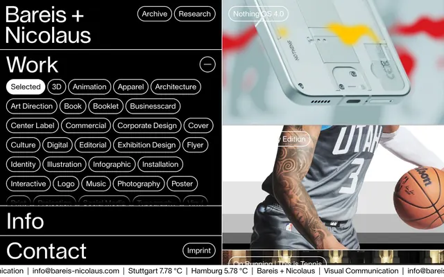
Bareis + Nicolaus employs a high-contrast, starkly monochrome aesthetic defined by a dominant black canvas and pure white typography. The visual focus is on precise typographic hierarchy and minimal, utilitarian components. Interactivity is signaled through inverted color states or simple bordering, maintaining a graphic, almost print-like presentation with deep, comfortable spacing that allows elements to breathe.
The page structure is a split layout: a dominant left-hand navigation and content area, set against a dynamic, image-heavy right column that showcases projects in a full-bleed manner. The left column maintains a contained max-width of 721px. Sections are visually separated by deep vertical spacing provided by a 29px section gap. The hero section is characterized by large, bold typography on the left and a prominent, full-bleed image on the right. Content within the left column is often a centered stack of typographic elements and pill-shaped filters. Navigation is a sticky top bar within the left column.
This system features a dynamic mix of product photography and lifestyle imagery, often cropped and presented within a full-bleed grid pattern that contrasts sharply with the typographic UI. Photography is typically vibrant and detailed, often showing close-ups or action shots. The imagery acts as the visual counterpoint to the stark, minimal UI, providing bursts of detailed, contextual information. Images are generally contained within their own visual blocks, without overlapping, and often appear as part of a two-column grid. Icons are simple, outlined, and monochromatic, matching the overall UI aesthetic.
Reminiscent of Kerem Suer, Basic Type, Build in Amsterdam, Anthony Gribben.
# Bareis + Nicolaus — Style Reference
> Graphic Monochrome Canvas: crisp, high-contrast, typographic art.

**Theme:** dark

**Site:** https://www.bareis-nicolaus.com

Bareis + Nicolaus employs a high-contrast, starkly monochrome aesthetic defined by a dominant black canvas and pure white typography. The visual focus is on precise typographic hierarchy and minimal, utilitarian components. Interactivity is signaled through inverted color states or simple bordering, maintaining a graphic, almost print-like presentation with deep, comfortable spacing that allows elements to breathe.

## Tokens — Colors

| Name | Value | Token | Role |
|------|------|------|------|
| Canvas Black | `#000000` | `--color-canvas-black` | Page background, primary button fill, interactive link borders — establishing a high-contrast dark theme |
| Arctic White | `#ffffff` | `--color-arctic-white` | Primary text color, button and navigation borders, active button fill — serves as the primary contrasting element against Canvas Black |
| Subtle Gray | `#a9a9a9` | `--color-subtle-gray` | Secondary text and muted borders — offering a slight de-emphasis while maintaining readability on Canvas Black |

## Tokens — Typography

### Lausanne
- **Substitute:** Inter
- **Weights:** 400
- **Sizes:** 24px, 72px
- **Line height:** 1, 1.2
- **Role:** Headings, body text, and interactive elements – a custom typeface providing a strong, modern, and distinct voice, critical for the brand's graphic identity.

### Victor Serif
- **Substitute:** Lora
- **Weights:** 400
- **Sizes:** 24px
- **Line height:** 1.2
- **Role:** Decorative or specific content text – a custom serif font used sparingly to add a subtle contrasting texture.

### Black Tie
- **Substitute:** DM Mono
- **Weights:** 400
- **Sizes:** 24px
- **Line height:** 1
- **Role:** Highly specific, rarely used content – a custom font reserved for unique graphic elements, emphasizing rarity.

## Tokens — Spacing

- **Max width:** 721px
- **Section gap:** 29px
- **Card padding:** 13px
- **Element gap:** 13px

## Tokens — Radius

- **all:** 120px

## Layout

The page structure is a split layout: a dominant left-hand navigation and content area, set against a dynamic, image-heavy right column that showcases projects in a full-bleed manner. The left column maintains a contained max-width of 721px. Sections are visually separated by deep vertical spacing provided by a 29px section gap. The hero section is characterized by large, bold typography on the left and a prominent, full-bleed image on the right. Content within the left column is often a centered stack of typographic elements and pill-shaped filters. Navigation is a sticky top bar within the left column.

## Imagery

This system features a dynamic mix of product photography and lifestyle imagery, often cropped and presented within a full-bleed grid pattern that contrasts sharply with the typographic UI. Photography is typically vibrant and detailed, often showing close-ups or action shots. The imagery acts as the visual counterpoint to the stark, minimal UI, providing bursts of detailed, contextual information. Images are generally contained within their own visual blocks, without overlapping, and often appear as part of a two-column grid. Icons are simple, outlined, and monochromatic, matching the overall UI aesthetic.

## Components

### Pill Button - Dark Filled
*Primary action, navigation items*

Solid Canvas Black background with Arctic White text and a 2px Arctic White border, 120px border radius for a distinct pill shape. Padding is 12px vertical, 13.2px horizontal.

### Pill Button - Light Filled
*Active state or selected filter*

Arctic White background with Arctic White text and a 2px Arctic White border, 120px border radius. Padding is 12px vertical, 13.2px horizontal. This button likely inverts on hover/active.

### Pill Button - Ghost
*Secondary actions, filters, navigation*

Transparent background with Arctic White text and a 2px Arctic White border, 120px border radius. Padding is 12px vertical, 13.2px horizontal. Used for most interactive elements where a visual hierarchy is not needed over the background.

### Content Card - Default
*Project showcase, content containers*

Transparent background with no border radius or shadow, effectively blending into the Canvas Black page background. Padding is 0px allowing content to dictate visual spacing. Contains specific project imagery and text.

### Footer Link
*Informational links in the footer*

Arctic White text on Canvas Black, 2px Arctic White border on inactive state, 13px padding applied for interactive area. Text uses Lausanne font at 24px.

## Guidelines

### Do

- Prioritize Canvas Black (#000000) as the dominant background color for all primary surfaces.
- Use Arctic White (#ffffff) exclusively for primary text, borders, and active states to maintain high contrast.
- Apply a 120px border radius to all interactive elements like buttons and navigation items for a consistent 'pill' shape.
- Maintain a 2px stroke width for all borders, particularly for ghost buttons and interactive links (e.g., Arctic White on Canvas Black).
- Employ the Lausanne font for all navigational text, headings, and body copy to ensure brand consistency.
- Utilize 13px as the primary 'elementGap' between interactive components and internal card padding.

### Don't

- Avoid using saturated colors; the system relies strictly on a monochrome palette of Canvas Black, Arctic White, and Subtle Gray.
- Do not introduce shadows or elevation; surfaces are flat and blend seamlessly into the background.
- Never deviate from the 2px border width for interactive elements, as this is a core stylistic cue.
- Do not use highly decorative gradients or background images in primary UI components; the focus is on typography and clean interaction.
- Avoid arbitrary changes in border radius; the 120px value is a signature design element for interactive components.
- Do not use font weights other than 400 for any of the typefaces, as weight variation is not part of the system's expressive range.

## Agent Prompt Guide

Quick Color Reference:
text: #ffffff
background: #000000
border: #ffffff
accent: no distinct accent color
primary action: #000000 (filled action)

Example Component Prompts:
1. Create a primary navigation item: Lausanne font, 24px weight 400, Arctic White text (#ffffff), 2px Arctic White border (#ffffff), Canvas Black background (#000000), 120px radius, 12px top/bottom padding, 13.2px left/right padding.
2. Design a selected category filter: Lausanne font, 24px weight 400, Arctic White text (#ffffff), Arctic White background (#ffffff), 120px radius, 12px top/bottom padding, 13.2px left/right padding.
3. Build a project showcase card: Canvas Black background (#000000), no border, no radius, 0px padding. Content includes Lausanne font at 24px, Arctic White (#ffffff) text, and a full-bleed image within the card itself.
More like this









Keep what you find
A free account saves references to boards and can send you a weekly email of picks based on what you save.
To see every result, go Pro.