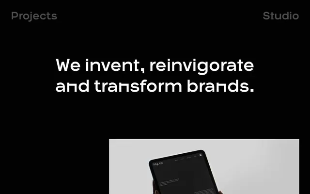
Preview image. Unlock full-res
Deep night canvas
Color palette
Page background, primary surface for content blocks
Dark borders and separators for elevated surfaces and inverted UI. Do not promote it to the primary CTA color
Dark borders and separators for elevated surfaces and inverted UI. Do not promote it to the primary CTA color
Primary text color for headlines and body copy, hover state for ghost buttons, primary border for ghost buttons
Muted helper text, secondary navigation text, subtle decorative borders
Typography
- Weights
- 400
- Sizes
- 18px
- Line height
- 1.67
- Letter spacing
- normal
- Fallback
- Noto Sans
Standard body text for descriptive content. Its common availability balances the custom typeface for readability.
- Weights
- 400
- Sizes
- 18px, 20px, 26px, 35px, 50px, 80px, 111px
- Line height
- 1, 1.07, 1.21, 1.29, 1.38, 1.4, 1.42, 1.73
- Letter spacing
- normal
- Fallback
- Montserrat
Headlines, navigation, main body copy, and link text where impact is needed. Its singular weight at varying sizes creates a very formal, architectural hierarchy.
- Weights
- 500
- Sizes
- 14px
- Line height
- 1.67
- Letter spacing
- normal
- Fallback
- Inter
Small, functional link text. Its slightly bolder weight ensures legibility even at smaller sizes in the dark theme.
- Weights
- 400
- Sizes
- 18px
- Line height
- 1.67
Helvetica — detected in extracted data but not described by AI
Spacing & shape
Components
Text: Void Black (#000000), OPX-Medium 18px. Border: 1px solid Snow (#ffffff), 45px radius. Padding: 7px vertical, 30px horizontal.
Text: Snow (#ffffff), OPX-Medium 111px. Hover state changes text to Ghost Gray (#292a2c). No background or explicit padding, relies on high font size for separation.
Text: Slate Mist (#9b9b9b), Untitled 500 at 14px for main info, Open Sans 400 at 18px for social links. No distinct background or border.
Text: Snow (#ffffff), OPX-Medium at 26px for project titles. Paired closely with Ghost Button below.
Guidelines
- Always use Midnight (#020202) for primary page backgrounds to maintain the dark canvas theme.
- Utilize Snow (#ffffff) for all main headings and primary body text to ensure maximum contrast.
- Apply Ghost Gray (#292a2c) to borders and secondary interactive elements for subtle definition.
- Implement a 45px border-radius for all interactive components like buttons and cards to preserve the soft, rounded aesthetic.
- Maintain generous vertical spacing with 100px between major sections to emphasize content segmentation.
- Avoid introducing bright or saturated colors beyond imagery, as the system relies on a high-contrast achromatic palette.
- Do not use small line heights for display typography; maintain the defined line heights for OPX-Medium to ensure strong visual impact and clarity.
- Do not use box-shadows or elevation effects, as the system achieves visual depth through color contrast and spacing.
- Never use less than 20px of padding around content within confined elements.
- Do not vary from the specific text color choices for primary or secondary text; Snow and Slate Mist define the text hierarchy.
About this system
ShowHide
OPX Studio employs a high-contrast, minimalist dark aesthetic, making content feel bold and impactful. The design prioritizes stark text-heavy layouts on a deep black canvas, with subtle gray borders and accents to define interactive elements. Photography and visuals are given prominence within these dark sections, often full-bleed. Typography is confident and direct, relying on strong weights and generous letter-spacing to command attention.
The page primarily uses a max-width contained layout alternating with full-bleed sections for imagery. The hero section features a centered headline over a full-width background, setting a bold, direct tone. Content often arranges in two-column layouts, with text-left and visual-right, or stacked centered blocks. There's a subtle grid for project showcases, featuring 3-column cards. Vertical spacing between sections is consistently large, creating a spacious and intentional rhythm. Navigation is minimal, consisting of a sticky top bar with two main links.
The site uses high-quality, often full-bleed photography and product mockups. Imagery is typically well-lit against dark or neutral backgrounds, showcasing product UI or professional-looking scenes with a focus on human interaction. Visuals serve an explanatory or showcase role, often appearing as large blocks that break up the text. Icons are minimal, outlined, and monochromatic, integrated within the text for decorative accents or link indicators.
# OPX Studio — Style Reference
> Deep night canvas

**Theme:** dark

**Site:** https://opx.studio

OPX Studio employs a high-contrast, minimalist dark aesthetic, making content feel bold and impactful. The design prioritizes stark text-heavy layouts on a deep black canvas, with subtle gray borders and accents to define interactive elements. Photography and visuals are given prominence within these dark sections, often full-bleed. Typography is confident and direct, relying on strong weights and generous letter-spacing to command attention.

## Tokens — Colors

| Name | Value | Token | Role |
|------|------|------|------|
| Midnight | `#020202` | `--color-midnight` | Page background, primary surface for content blocks |
| Void Black | `#000000` | `--color-void-black` | Dark borders and separators for elevated surfaces and inverted UI. Do not promote it to the primary CTA color |
| Ghost Gray | `#292a2c` | `--color-ghost-gray` | Dark borders and separators for elevated surfaces and inverted UI. Do not promote it to the primary CTA color |
| Snow | `#ffffff` | `--color-snow` | Primary text color for headlines and body copy, hover state for ghost buttons, primary border for ghost buttons |
| Slate Mist | `#9b9b9b` | `--color-slate-mist` | Muted helper text, secondary navigation text, subtle decorative borders |

## Tokens — Typography

### Open Sans
- **Substitute:** Noto Sans
- **Weights:** 400
- **Sizes:** 18px
- **Line height:** 1.67
- **Letter spacing:** normal
- **Role:** Standard body text for descriptive content. Its common availability balances the custom typeface for readability.

### OPX-Medium
- **Substitute:** Montserrat
- **Weights:** 400
- **Sizes:** 18px, 20px, 26px, 35px, 50px, 80px, 111px
- **Line height:** 1, 1.07, 1.21, 1.29, 1.38, 1.4, 1.42, 1.73
- **Letter spacing:** normal
- **Role:** Headlines, navigation, main body copy, and link text where impact is needed. Its singular weight at varying sizes creates a very formal, architectural hierarchy.

### Untitled
- **Substitute:** Inter
- **Weights:** 500
- **Sizes:** 14px
- **Line height:** 1.67
- **Letter spacing:** normal
- **Role:** Small, functional link text. Its slightly bolder weight ensures legibility even at smaller sizes in the dark theme.

### Helvetica
- **Weights:** 400
- **Sizes:** 18px
- **Line height:** 1.67
- **Role:** Helvetica — detected in extracted data but not described by AI

## Tokens — Type Scale

Perfect Fourth (1.333) from 18px base.

| Role | Size | Line height | Letter spacing |
|------|------|------|------|
| caption | 14px | 1.67 | — |
| body | 18px | 1.67 | — |
| subheading | 20px | 1.42 | — |
| heading-sm | 26px | 1.4 | — |
| heading | 35px | 1.38 | — |
| heading-lg | 50px | 1.29 | — |
| display | 80px | 1.21 | — |
| display-lg | 111px | 1 | — |

## Tokens — Spacing

- **Section gap:** 100px
- **Card padding:** 20px
- **Element gap:** 20px

## Tokens — Radius

- **Buttons:** 45px
- **Cards:** 45px

## Layout

The page primarily uses a max-width contained layout alternating with full-bleed sections for imagery. The hero section features a centered headline over a full-width background, setting a bold, direct tone. Content often arranges in two-column layouts, with text-left and visual-right, or stacked centered blocks. There's a subtle grid for project showcases, featuring 3-column cards. Vertical spacing between sections is consistently large, creating a spacious and intentional rhythm. Navigation is minimal, consisting of a sticky top bar with two main links.

## Imagery

The site uses high-quality, often full-bleed photography and product mockups. Imagery is typically well-lit against dark or neutral backgrounds, showcasing product UI or professional-looking scenes with a focus on human interaction. Visuals serve an explanatory or showcase role, often appearing as large blocks that break up the text. Icons are minimal, outlined, and monochromatic, integrated within the text for decorative accents or link indicators.

## Components

### Ghost Button
*Outlined clickable element for secondary actions and case study links.*

Text: Void Black (#000000), OPX-Medium 18px. Border: 1px solid Snow (#ffffff), 45px radius. Padding: 7px vertical, 30px horizontal.

### Navigation Link
*Primary navigation item.*

Text: Snow (#ffffff), OPX-Medium 111px. Hover state changes text to Ghost Gray (#292a2c). No background or explicit padding, relies on high font size for separation.

### Footer Link
*Informational links in the footer.*

Text: Slate Mist (#9b9b9b), Untitled 500 at 14px for main info, Open Sans 400 at 18px for social links. No distinct background or border.

### Content Card Headline
*Headline for project previews.*

Text: Snow (#ffffff), OPX-Medium at 26px for project titles. Paired closely with Ghost Button below.

## Guidelines

### Do

- Always use Midnight (#020202) for primary page backgrounds to maintain the dark canvas theme.
- Utilize Snow (#ffffff) for all main headings and primary body text to ensure maximum contrast.
- Apply Ghost Gray (#292a2c) to borders and secondary interactive elements for subtle definition.
- Implement a 45px border-radius for all interactive components like buttons and cards to preserve the soft, rounded aesthetic.
- Maintain generous vertical spacing with 100px between major sections to emphasize content segmentation.

### Don't

- Avoid introducing bright or saturated colors beyond imagery, as the system relies on a high-contrast achromatic palette.
- Do not use small line heights for display typography; maintain the defined line heights for OPX-Medium to ensure strong visual impact and clarity.
- Do not use box-shadows or elevation effects, as the system achieves visual depth through color contrast and spacing.
- Never use less than 20px of padding around content within confined elements.
- Do not vary from the specific text color choices for primary or secondary text; Snow and Slate Mist define the text hierarchy.

## Agent Prompt Guide

primary action: no distinct CTA color
More like this
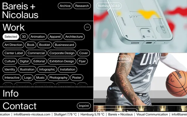









Keep what you find
A free account saves references to boards and can send you a weekly email of picks based on what you save.
To see every result, go Pro.