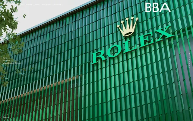
Preview image. Unlock full-res
Architectural Gray Canvas
Color palette
Page backgrounds, card surfaces, primary text color for ghost buttons
Primary text color for headings and body text on light backgrounds
Subtle borders for cards, list items, navigation links, and ghost buttons
Typography
- Weights
- 400
- Sizes
- 14px
- Line height
- 1.4
- Letter spacing
- normal
- Fallback
- Montserrat
Primary typeface for all text elements. Its singular weight and size observed across various contexts (navigation, headings, body text, buttons) suggests an intentional uniformity, prioritizing clarity and directness over typographic hierarchy.
Spacing & shape
Components
A ghost link with Lead Text (#000000) on a Canvas White (#ffffff) background. Activated state is indicated by a subtle Ghost Border (#e5e7eb) under the text. Uses ABCROM 14px, weight 400.
A button with Canvas White (#ffffff) text on a transparent background, featuring a subtle Ghost Border (#e5e7eb) of 1px. The radius is extreme (9999px) for a pill-like or circular shape. Uses ABCROM 14px, weight 400. Padding is implicitly minimal, focusing on the text and border.
List items that use ABCROM 14px, weight 400 Lead Text (#000000) and are often bordered by Ghost Border (#e5e7eb) on one or more sides to create distinct divisions.
Guidelines
- Prioritize Canvas White (#ffffff) for all primary backgrounds to maintain the light, expansive canvas.
- Use Lead Text (#000000) for all textual content to ensure high contrast against light backgrounds.
- Implement Ghost Border (#e5e7eb) for all subtle dividers, card outlines, and interactive element states.
- Apply a 9999px border-radius to all buttons for a highly rounded, distinct shape.
- Maintain a clear elementGap of 20px between interactive elements and content blocks.
- Utilize ABCROM 14px, 400 weight for all typography, embracing a uniform and disciplined textual hierarchy.
- Emphasize large sectionGap of 112px to create significant visual breathing room between major content blocks.
- Avoid introducing new chromatic colors; the palette is strictly neutral-focused.
- Do not use heavy shadows or gradients; rely on discreet borders and spacing for visual separation.
- Do not deviate from the ABCROM typeface or its singular observed weight and size.
- Avoid tight spacing; maintain the open and airy feel established by the 20px element gap and 112px section gap.
- Do not use square or minimally rounded corners for interactive elements; the 9999px radius is a signature visual cue.
About this system
ShowHide
BBA Studio presents a stark, almost monochromatic design system built on a foundation of neutral tones. The visual language relies heavily on spaciousness and precise typography rather than vibrant color. Interactions are subtle, often indicated by a faint border change or a ghost button. The overall impression is one of restraint and architectural clarity, with content taking center stage on a light, unadorned canvas.
# BBA Studio — Style Reference
> Architectural Gray Canvas

**Theme:** light

**Site:** https://www.bbastudio.eu

BBA Studio presents a stark, almost monochromatic design system built on a foundation of neutral tones. The visual language relies heavily on spaciousness and precise typography rather than vibrant color. Interactions are subtle, often indicated by a faint border change or a ghost button. The overall impression is one of restraint and architectural clarity, with content taking center stage on a light, unadorned canvas.

## Tokens — Colors

| Name | Value | Token | Role |
|------|------|------|------|
| Canvas White | `#ffffff` | `--color-canvas-white` | Page backgrounds, card surfaces, primary text color for ghost buttons |
| Lead Text | `#000000` | `--color-lead-text` | Primary text color for headings and body text on light backgrounds |
| Ghost Border | `#e5e7eb` | `--color-ghost-border` | Subtle borders for cards, list items, navigation links, and ghost buttons |

## Tokens — Typography

### ABCROM
- **Substitute:** Montserrat
- **Weights:** 400
- **Sizes:** 14px
- **Line height:** 1.4
- **Letter spacing:** normal
- **Role:** Primary typeface for all text elements. Its singular weight and size observed across various contexts (navigation, headings, body text, buttons) suggests an intentional uniformity, prioritizing clarity and directness over typographic hierarchy.

## Tokens — Type Scale

| Role | Size | Line height | Letter spacing |
|------|------|------|------|
| body | 14px | 1.4 | — |

## Tokens — Spacing

- **Section gap:** 112px
- **Card padding:** 20px
- **Element gap:** 20px

## Tokens — Radius

- **Buttons:** 9999px

## Components

### Ghost Navigation Link
*Navigation, interactive elements*

A ghost link with Lead Text (#000000) on a Canvas White (#ffffff) background. Activated state is indicated by a subtle Ghost Border (#e5e7eb) under the text. Uses ABCROM 14px, weight 400.

### Circular Ghost Button
*Primary interactive element, typically for calls to action or navigation.*

A button with Canvas White (#ffffff) text on a transparent background, featuring a subtle Ghost Border (#e5e7eb) of 1px. The radius is extreme (9999px) for a pill-like or circular shape. Uses ABCROM 14px, weight 400. Padding is implicitly minimal, focusing on the text and border.

### List Item with Border
*Structured content lists or navigation menus.*

List items that use ABCROM 14px, weight 400 Lead Text (#000000) and are often bordered by Ghost Border (#e5e7eb) on one or more sides to create distinct divisions.

## Guidelines

### Do

- Prioritize Canvas White (#ffffff) for all primary backgrounds to maintain the light, expansive canvas.
- Use Lead Text (#000000) for all textual content to ensure high contrast against light backgrounds.
- Implement Ghost Border (#e5e7eb) for all subtle dividers, card outlines, and interactive element states.
- Apply a 9999px border-radius to all buttons for a highly rounded, distinct shape.
- Maintain a clear elementGap of 20px between interactive elements and content blocks.
- Utilize ABCROM 14px, 400 weight for all typography, embracing a uniform and disciplined textual hierarchy.
- Emphasize large sectionGap of 112px to create significant visual breathing room between major content blocks.

### Don't

- Avoid introducing new chromatic colors; the palette is strictly neutral-focused.
- Do not use heavy shadows or gradients; rely on discreet borders and spacing for visual separation.
- Do not deviate from the ABCROM typeface or its singular observed weight and size.
- Avoid tight spacing; maintain the open and airy feel established by the 20px element gap and 112px section gap.
- Do not use square or minimally rounded corners for interactive elements; the 9999px radius is a signature visual cue.

## Agent Prompt Guide

primary action: no distinct CTA color
More like this









Keep what you find
A free account saves references to boards and can send you a weekly email of picks based on what you save.
To see every result, go Pro.