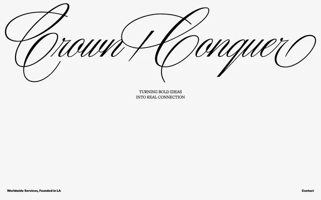
Preview image. Unlock full-res
Color palette
Page backgrounds, underlying surfaces
Dark borders and separators for elevated surfaces and inverted UI. Do not promote it to the primary CTA color
Typography
- Weights
- 400, 700
- Sizes
- 14px, 16px
- Line height
- 1.43, 1.5
- Fallback
- Montserrat, Open Sans
Functional text: used for all body copy, navigation links, and footer information, usually in an all-caps form. Its consistent weight and clear letterforms provide an anchor to the unique branding.
- Weights
- 700
- Sizes
- 16px
- Line height
- 1.5
- Fallback
- Tangerine, Great Vibes
Decorative display font for primary brand statements, giving an elegant, bespoke feel. Used sparingly for key headings.
Spacing & shape
Components
Fokus font, 14px, weight 400, color #000000. Underlined on hover.
Fokus font, 14px, weight 400, color #000000, uppercase. Padded by 32px on top, right, and bottom. Margins of 16px between elements.
Chronik font, 16px, weight 700, color #000000, uppercase. Line height 1.5. Centered on the page.
Custom script font rendered as an image, visually large and centered.
Guidelines
- Use Canvas (#f5f5f5) as the primary background for all page sections.
- Employ Midnight Ink (#000000) for all text elements to maintain high contrast and sophistication.
- Apply Fokus font with a weight of 400 for all body text, navigation, and footer details, typically in uppercase.
- Utilize Chronik font exclusively for primary brand statements or key headings, maintaining its default weight of 700.
- Maintain a minimum element gap of 16px between UI items horizontally and vertically.
- Use 32px for section padding, especially for top and bottom margins of major content blocks.
- Center all significant page sections and content blocks, adhering to the expansive full-bleed page model.
- Do not introduce additional background colors; maintain the stark #f5f5f5 background throughout.
- Avoid using saturated or chromatic accent colors in UI elements; color is reserved for content if present, not interface.
- Do not use multiple font sizes or weights for Fokus text within the same semantic block (e.g., body text); stick to 14px/16px at weight 400.
- Do not use Chronik for body text; its script style is for impactful, sparse headings only.
- Avoid shadows or complex elevation; the design relies on flat, high-contrast separation.
- Do not add border radii to UI elements; the system emphasizes sharp, clean edges.
- Do not introduce gradients into the UI; maintain flat colors.
About this system
ShowHide
The Crown + Conquer design system exudes a minimalist, high-contrast aesthetic, built on a foundation of stark black text on a subtly off-white canvas. The visual identity is defined by a striking custom script display font for brand elements, juxtaposed with a utilitarian, all-caps sans-serif for functional text. Spacing is generous, creating an atmosphere of exclusivity and focus, with interactive elements subtly outlined rather than filled, reinforcing an understated directness.
The page operates on a full-bleed model, with content centered horizontally without a defined `pageMaxWidth`. The hero features a large, centered brandmark image followed by a centered headline statement. Sections appear to have consistent vertical spacing (32px padding surrounding content blocks, 16px element gaps). The footer is minimal, also centered, with text details and a contact link. The overall rhythm is sparse and symmetrical, emphasizing individual elements rather than dense information blocks.
Imagery style is not explicitly defined in the provided data or screenshot; the visual focus is on typography and stark contrast. Any imagery would need to align with a minimalist, high-contrast, potentially monochrome aesthetic, serving as decorative atmosphere rather than content explanation.
Reminiscent of Acne Studios, The Row, Squarespace, Zara.
# Crown + Conquer — Style Reference
> Minimalist gallery wall

**Theme:** light

**Site:** https://crownandconquer.com

The Crown + Conquer design system exudes a minimalist, high-contrast aesthetic, built on a foundation of stark black text on a subtly off-white canvas. The visual identity is defined by a striking custom script display font for brand elements, juxtaposed with a utilitarian, all-caps sans-serif for functional text. Spacing is generous, creating an atmosphere of exclusivity and focus, with interactive elements subtly outlined rather than filled, reinforcing an understated directness.

## Tokens — Colors

| Name | Value | Token | Role |
|------|------|------|------|
| Canvas | `#f5f5f5` | `--color-canvas` | Page backgrounds, underlying surfaces |
| Midnight Ink | `#000000` | `--color-midnight-ink` | Dark borders and separators for elevated surfaces and inverted UI. Do not promote it to the primary CTA color |

## Tokens — Typography

### Fokus
- **Substitute:** Montserrat, Open Sans
- **Weights:** 400, 700
- **Sizes:** 14px, 16px
- **Line height:** 1.43, 1.5
- **Role:** Functional text: used for all body copy, navigation links, and footer information, usually in an all-caps form. Its consistent weight and clear letterforms provide an anchor to the unique branding.

### Chronik
- **Substitute:** Tangerine, Great Vibes
- **Weights:** 700
- **Sizes:** 16px
- **Line height:** 1.5
- **Role:** Decorative display font for primary brand statements, giving an elegant, bespoke feel. Used sparingly for key headings.

## Tokens — Spacing

- **Section gap:** 32px
- **Card padding:** 32px
- **Element gap:** 16px

## Layout

The page operates on a full-bleed model, with content centered horizontally without a defined `pageMaxWidth`. The hero features a large, centered brandmark image followed by a centered headline statement. Sections appear to have consistent vertical spacing (32px padding surrounding content blocks, 16px element gaps). The footer is minimal, also centered, with text details and a contact link. The overall rhythm is sparse and symmetrical, emphasizing individual elements rather than dense information blocks.

## Imagery

Imagery style is not explicitly defined in the provided data or screenshot; the visual focus is on typography and stark contrast. Any imagery would need to align with a minimalist, high-contrast, potentially monochrome aesthetic, serving as decorative atmosphere rather than content explanation.

## Components

### Navigation Link
*Interactive text link in the footer.*

Fokus font, 14px, weight 400, color #000000. Underlined on hover.

### Footer Text Block
*Informational text in the page footer.*

Fokus font, 14px, weight 400, color #000000, uppercase. Padded by 32px on top, right, and bottom. Margins of 16px between elements.

### Call to Action Headline
*Prominent statement text to draw attention to the brand's purpose.*

Chronik font, 16px, weight 700, color #000000, uppercase. Line height 1.5. Centered on the page.

### Brandmark Text
*Main company logo text.*

Custom script font rendered as an image, visually large and centered.

## Guidelines

### Do

- Use Canvas (#f5f5f5) as the primary background for all page sections.
- Employ Midnight Ink (#000000) for all text elements to maintain high contrast and sophistication.
- Apply Fokus font with a weight of 400 for all body text, navigation, and footer details, typically in uppercase.
- Utilize Chronik font exclusively for primary brand statements or key headings, maintaining its default weight of 700.
- Maintain a minimum element gap of 16px between UI items horizontally and vertically.
- Use 32px for section padding, especially for top and bottom margins of major content blocks.
- Center all significant page sections and content blocks, adhering to the expansive full-bleed page model.

### Don't

- Do not introduce additional background colors; maintain the stark #f5f5f5 background throughout.
- Avoid using saturated or chromatic accent colors in UI elements; color is reserved for content if present, not interface.
- Do not use multiple font sizes or weights for Fokus text within the same semantic block (e.g., body text); stick to 14px/16px at weight 400.
- Do not use Chronik for body text; its script style is for impactful, sparse headings only.
- Avoid shadows or complex elevation; the design relies on flat, high-contrast separation.
- Do not add border radii to UI elements; the system emphasizes sharp, clean edges.
- Do not introduce gradients into the UI; maintain flat colors.

## Agent Prompt Guide

**Quick Color Reference**
text: #000000
background: #f5f5f5
border: #000000
accent: no distinct accent color
primary action: no distinct CTA color

**3-5 Example Component Prompts**
Create a centered brand statement: Chronik font, 16px, weight 700, color #000000, uppercase, line height 1.5. Place it on a Canvas (#f5f5f5) background.
Create a footer navigation link: Fokus font, 14px, weight 400, color #000000, uppercase. Add 32px padding below the entire footer block.
Create a simple body text paragraph: Fokus font, 14px, weight 400, color #000000, on a Canvas (#f5f5f5) background. Enforce 16px vertical gap to the next element.
Create a page with a centered main headline 'TURNING BOLD IDEAS INTO REAL CONNECTION' using Chronik, 16px, weight 700, #000000, uppercase. Below it, add 'Worldwide Services, Founded in LA' using Fokus, 14px, weight 400, #000000, uppercase. Ensure 16px element gap between them.
More like this









Keep what you find
A free account saves references to boards and can send you a weekly email of picks based on what you save.
To see every result, go Pro.