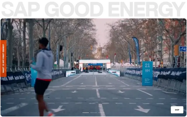
Preview image. Unlock full-res
Athletic Minimalism: black ink on white canvas, with bursts of energetic orange.
Color palette
Call-to-action buttons, active navigation indicators — a singular vivid accent color to drive interaction
Primary text, major headlines, prominent borders, primary buttons — creating a bold, assertive presence
Main page background, card backgrounds, white text on dark surfaces
Subtle background for UI elements, slightly off-white to distinguish from pure canvas
Card backgrounds, subtle fills, secondary borders
Secondary text, subtle borders, UI elements that need to be present but not dominant
Muted text, placeholder text, disabled states, subtle graphic elements
Helper text, less prominent body copy, lower-contrast UI elements
Typography
- Weights
- 400, 500, 600, 700
- Sizes
- 10px, 13px, 14px, 16px, 24px
- Line height
- 1, 1.08, 1.13, 1.14, 1.2, 1.6
- Fallback
- Inter
Primary text for body, links, navigation, and input fields. Its geometric sans-serif quality supports the site's modern, straightforward feel.
- Weights
- 500, 800
- Sizes
- 14px, 18px, 30px, 38px, 53px, 56px
- Line height
- 1, 1.03, 1.11, 1.6
- Letter spacing
- -0.0500em at 56px, -0.0400em at 38px
- Fallback
- Arial
Used for prominent headlines and buttons, conveying authority and impact. The tighter letter-spacing on larger sizes creates a condensed, powerful visual.
- Weights
- 500
- Sizes
- 14px
- Line height
- 1.5
- Fallback
- Montserrat
A secondary display font, used sparingly for specific headings or branding elements to add textural variation without deviating from the overall sans-serif aesthetic.
Spacing & shape
Components
Solid 'Energy Burst Orange' background (#ff7840) with 'Canvas White' text (#ffffff). Features a 7px border-radius and generous horizontal padding (0px top/bottom, 32px left/right). Text uses Helvetica Neue LT Std 14px weight 800.
Transparent background with 'Midnight Ink' text (#000000) and 'Midnight Ink' border (#000000). No border-radius, maintaining sharp edges. Text uses GT Pressura LC Standard 14px weight 500.
Transparent background with muted 'Graphite' text (rgba(0, 0, 0, 0.81)) and matching border. No border-radius. Used for less prominent calls to action. Text uses GT Pressura LC Standard 14px weight 500.
Features a semi-transparent 'Alabaster' background (oklab(0.999994 0.0000455678 0.0000200868 / 0.3)) with an 18px border-radius. Padding is 24px top, 21px left/right, 30px bottom.
'Ash Grey' background (#e7e7e7) with an 18px border-radius. No explicit padding applied directly to the card container, intended for content to define its own spacing within.
Background is a subtle 'Midnight Ink' tint (rgba(0, 0, 0, 0.1)) with 'Midnight Ink' text (#000000). Features a 9px border-radius. Placeholder text is 'Pewter'. Padding is 0px top/bottom, 16px left.
Left-aligned banner with a solid 'Energy Burst Orange' background (#ff7840). Text is 'Canvas White' (#ffffff) using GT Pressura LC Standard 14px weight 700. Features a 7px border-radius.
Guidelines
- Prioritize 'Midnight Ink' (#000000) for all primary text and calls to action on 'Canvas White' (#ffffff) backgrounds.
- Use 'Energy Burst Orange' (#ff7840) exclusively for primary action elements like CTA buttons and key highlights.
- Employ a 7px border-radius for all interactive elements like buttons and input fields.
- Maintain generous horizontal padding (e.g., 32px) around primary buttons to give them breathing room.
- Utilize 'Ash Grey' (#e7e7e7) and 'Alabaster' (oklab blend) for background surfaces that need to subtly stand out from 'Canvas White' (#ffffff).
- Apply tighter letter-spacing (-0.05em, -0.04em) to large 'Helvetica Neue LT Std' headlines to create a dense, impactful visual.
- Ensure consistent spacing for inner card content with 24px top, 21px left/right, and 30px bottom for Callout Cards.
- Avoid introducing new chromatic colors; 'Energy Burst Orange' (#ff7840) is the sole accent.
- Do not use gradients; the system relies on solid colors for clear, direct communication.
- Do not use overly decorative elements; keep the aesthetic clean and functional.
- Avoid small text sizes for 'Helvetica Neue LT Std'; reserve it for impactful headlines and buttons.
- Do not vary border-radius significantly; adhere to 7px for interactive elements and 18px for larger containers.
- Avoid crowded layouts; prioritize ample white space between sections and elements.
- Do not mix font families within a single element where one family would suffice; leverage weight variations within GT Pressura LC Standard and Helvetica Neue LT Std.
About this system
ShowHide
SAPGOODENERGY uses a high-contrast athletic minimalism: stark black typography on vast white canvases, punctuated by a single vibrant orange accent. The design leans into raw energy, with strong sans-serifs and a focus on essential information. Large, generous spacing emphasizes content and creates a focused, almost clinical, presentation. Elements are clean-edged, with soft rounded corners on interactive components providing a subtle human touch.
Reminiscent of Aesthetic fitness brands (e.g. Ten Thousand), High-end direct-to-consumer athletic wear, Modern tech-focused e-commerce.
# SAPGOODENERGY — Style Reference
> Athletic Minimalism: black ink on white canvas, with bursts of energetic orange.

**Theme:** light

**Site:** https://sapgoodenergy.com

SAPGOODENERGY uses a high-contrast athletic minimalism: stark black typography on vast white canvases, punctuated by a single vibrant orange accent. The design leans into raw energy, with strong sans-serifs and a focus on essential information. Large, generous spacing emphasizes content and creates a focused, almost clinical, presentation. Elements are clean-edged, with soft rounded corners on interactive components providing a subtle human touch.

## Tokens — Colors

| Name | Value | Token | Role |
|------|------|------|------|
| Energy Burst Orange | `#ff7840` | `--color-energy-burst-orange` | Call-to-action buttons, active navigation indicators — a singular vivid accent color to drive interaction |
| Midnight Ink | `#000000` | `--color-midnight-ink` | Primary text, major headlines, prominent borders, primary buttons — creating a bold, assertive presence |
| Canvas White | `#ffffff` | `--color-canvas-white` | Main page background, card backgrounds, white text on dark surfaces |
| Alabaster | `#fffffb` | `--color-alabaster` | Subtle background for UI elements, slightly off-white to distinguish from pure canvas |
| Ash Grey | `#e7e7e7` | `--color-ash-grey` | Card backgrounds, subtle fills, secondary borders |
| Graphite | `#303030` | `--color-graphite` | Secondary text, subtle borders, UI elements that need to be present but not dominant |
| Pewter | `#c0c0c0` | `--color-pewter` | Muted text, placeholder text, disabled states, subtle graphic elements |
| Slate | `#707070` | `--color-slate` | Helper text, less prominent body copy, lower-contrast UI elements |

## Tokens — Typography

### GT Pressura LC Standard
- **Substitute:** Inter
- **Weights:** 400, 500, 600, 700
- **Sizes:** 10px, 13px, 14px, 16px, 24px
- **Line height:** 1, 1.08, 1.13, 1.14, 1.2, 1.6
- **Role:** Primary text for body, links, navigation, and input fields. Its geometric sans-serif quality supports the site's modern, straightforward feel.

### Helvetica Neue LT Std
- **Substitute:** Arial
- **Weights:** 500, 800
- **Sizes:** 14px, 18px, 30px, 38px, 53px, 56px
- **Line height:** 1, 1.03, 1.11, 1.6
- **Letter spacing:** -0.0500em at 56px, -0.0400em at 38px
- **Role:** Used for prominent headlines and buttons, conveying authority and impact. The tighter letter-spacing on larger sizes creates a condensed, powerful visual.

### GTStandard-M
- **Substitute:** Montserrat
- **Weights:** 500
- **Sizes:** 14px
- **Line height:** 1.5
- **Role:** A secondary display font, used sparingly for specific headings or branding elements to add textural variation without deviating from the overall sans-serif aesthetic.

## Tokens — Type Scale

| Role | Size | Line height | Letter spacing |
|------|------|------|------|
| caption | 10px | 1.6 | — |
| heading | 24px | 1.2 | — |
| heading-lg | 30px | 1.11 | — |
| display | 56px | 1 | -0.672px |

## Tokens — Spacing

- **Section gap:** 100px
- **Card padding:** 24px
- **Element gap:** 4px

## Tokens — Radius

- **Buttons:** 7px
- **Inputs:** 7px
- **Cards:** 18px
- **interactiveElements:** 14px
- **smallInteractiveElements:** 4px

## Components

### Primary Action Button
*Filled button*

Solid 'Energy Burst Orange' background (#ff7840) with 'Canvas White' text (#ffffff). Features a 7px border-radius and generous horizontal padding (0px top/bottom, 32px left/right). Text uses Helvetica Neue LT Std 14px weight 800.

### Secondary Ghost Button
*Outlined/ghost button*

Transparent background with 'Midnight Ink' text (#000000) and 'Midnight Ink' border (#000000). No border-radius, maintaining sharp edges. Text uses GT Pressura LC Standard 14px weight 500.

### Tertiary Ghost Button
*Outlined/ghost button (muted)*

Transparent background with muted 'Graphite' text (rgba(0, 0, 0, 0.81)) and matching border. No border-radius. Used for less prominent calls to action. Text uses GT Pressura LC Standard 14px weight 500.

### Callout Card
*Informational card with soft background*

Features a semi-transparent 'Alabaster' background (oklab(0.999994 0.0000455678 0.0000200868 / 0.3)) with an 18px border-radius. Padding is 24px top, 21px left/right, 30px bottom.

### Content Card
*Container card*

'Ash Grey' background (#e7e7e7) with an 18px border-radius. No explicit padding applied directly to the card container, intended for content to define its own spacing within.

### Text Input (with placeholder)
*Form input field*

Background is a subtle 'Midnight Ink' tint (rgba(0, 0, 0, 0.1)) with 'Midnight Ink' text (#000000). Features a 9px border-radius. Placeholder text is 'Pewter'. Padding is 0px top/bottom, 16px left.

### Adhesion Banner
*Sticky promotional banner*

Left-aligned banner with a solid 'Energy Burst Orange' background (#ff7840). Text is 'Canvas White' (#ffffff) using GT Pressura LC Standard 14px weight 700. Features a 7px border-radius.

## Guidelines

### Do

- Prioritize 'Midnight Ink' (#000000) for all primary text and calls to action on 'Canvas White' (#ffffff) backgrounds.
- Use 'Energy Burst Orange' (#ff7840) exclusively for primary action elements like CTA buttons and key highlights.
- Employ a 7px border-radius for all interactive elements like buttons and input fields.
- Maintain generous horizontal padding (e.g., 32px) around primary buttons to give them breathing room.
- Utilize 'Ash Grey' (#e7e7e7) and 'Alabaster' (oklab blend) for background surfaces that need to subtly stand out from 'Canvas White' (#ffffff).
- Apply tighter letter-spacing (-0.05em, -0.04em) to large 'Helvetica Neue LT Std' headlines to create a dense, impactful visual.
- Ensure consistent spacing for inner card content with 24px top, 21px left/right, and 30px bottom for Callout Cards.

### Don't

- Avoid introducing new chromatic colors; 'Energy Burst Orange' (#ff7840) is the sole accent.
- Do not use gradients; the system relies on solid colors for clear, direct communication.
- Do not use overly decorative elements; keep the aesthetic clean and functional.
- Avoid small text sizes for 'Helvetica Neue LT Std'; reserve it for impactful headlines and buttons.
- Do not vary border-radius significantly; adhere to 7px for interactive elements and 18px for larger containers.
- Avoid crowded layouts; prioritize ample white space between sections and elements.
- Do not mix font families within a single element where one family would suffice; leverage weight variations within GT Pressura LC Standard and Helvetica Neue LT Std.

## Agent Prompt Guide

Quick Color Reference:
text: #000000
background: #ffffff
border: #000000
accent: #ff7840
primary action: #ff7840 (filled action)

Example Component Prompts:
1. Create a Primary Action Button: #ff7840 background, #000000 text, 9999px radius, compact pill padding. Use this filled treatment for the main CTA.
2. Create a Callout Card: oklab(0.999994 0.0000455678 0.0000200868 / 0.3) background, 18px border-radius, 24px top, 21px left/right, 30px bottom padding. Place a 'Midnight Ink' (#000000) heading (Helvetica Neue LT Std 30px weight 500) inside.
3. Create a secondary ghost button: transparent background, 'Midnight Ink' (#000000) text and border, 0px border-radius, GT Pressura LC Standard 14px weight 500.
More like this









Keep what you find
A free account saves references to boards and can send you a weekly email of picks based on what you save.
To see every result, go Pro.