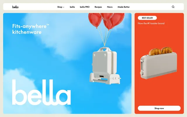
Preview image. Unlock full-res
Warm kitchen canvas
Color palette
Orange wash for highlight backgrounds, decorative bands, and soft emphasis behind content. Do not promote it to the primary CTA color
Dark borders and separators for elevated surfaces and inverted UI. Do not promote it to the primary CTA color
Dominant page background for a soft, inviting base layer
Component backgrounds, button fills, and secondary surface layers
Subtle background for cards and secondary page sections, providing gentle visual separation
Typography
- Weights
- 400, 700
- Sizes
- 16px, 32px
- Line height
- 1
- Fallback
- Times New Roman
Fallback and decorative usage, often for short, impactful statements or where a classic serif feel is desired.
- Weights
- 400, 700
- Sizes
- 13px, 14px, 16px, 18px, 22px, 24px, 40px
- Line height
- 0.89, 1.1, 1.4, 1.5, 1.83
- Letter spacing
- -0.0500em
- Fallback
- Arial
Primary brand typeface for all body text, headings, and interactive elements. Its subtle tracking adds a distinctive, composed feel.
Spacing & shape
Components
Utilizes Ink text color, 0px border-radius, and 0px padding. The hover state implies only text color change or subtle underline.
Features a Snow background with Ink text, a border-radius of 999px (full pill shape), and padding of 5px top, 10px right, 10px bottom, 10px left.
Transparent background with Ink text and an Ink border, 0px border-radius, and 0px padding. It integrates seamlessly into surrounding text.
Filled with a vivid Tangerine background, corners rounded at 12px. Internal padding is 22px top, 0px horizontal, 24px bottom.
Uses a soft Sandstone background, with 12px rounded corners. Internal padding is 40px top, 0px horizontal, 48px bottom.
Guidelines
- Use Canvas (#ebeadf) as the base background for most page sections, ensuring a warm and inviting feel.
- Apply Ink (#000000) for all primary text, borders, and iconography to maintain high contrast and legibility.
- Round corners with a 12px radius for all general cards and containers, and 999px for pill-shaped buttons and tags.
- Elevate critical information or calls to action by placing them on Tangerine (#f04923) backgrounds.
- Utilize Supreme LL TT for all typographic elements, leveraging its specific letter-spacing of -0.0500em for a refined appearance.
- Break up content with sections using Sandstone (#d5cec0) to create subtle, visual segmentation without harsh divisions.
- Maintain an element gap of 12px for consistent spacing between interactive elements and content blocks.
- Avoid using harsh white backgrounds unless for specific component surfaces, to preserve the warm aesthetic.
- Do not use multiple accent colors; Tangerine (#f04923) should be the singular vibrant accent.
- Do not vary border radii outside of 12px for cards and 999px for buttons, to maintain shape consistency.
- Avoid generic system fonts; always prioritize Supreme LL TT for brand consistency.
- Do not over-emphasize elements with heavy shadows or gradients; the design relies on color and spacing for hierarchy.
- Do not use Tangerine (#f04923) for text or small icons unless against a very light background, due to insufficient contrast against other brand colors.
- Avoid excessive padding or small element gaps, as the system favors comfortable density with an element gap of 12px and card padding of 24px.
About this system
ShowHide
The bella design system presents a warm, inviting feel through its use of soft, off-white backgrounds and a prominent, vibrant orange accent. Typography is a blend of classic and modern, conveying a comfortable yet sophisticated brand. Product showcases feature rounded cards that bring a friendly, approachable quality, contrasting with the crisp product imagery. The overall impression is clean, approachable, and focused on clear product presentation.
The page structure utilizes a contained layout with a comfortable density. Hero sections are dynamic, often featuring full-bleed vibrant backgrounds with product-focused imagery and overlaid text. Content sections follow a patterned rhythm, alternating between full-width immersive scenes (like the kitchen environment) and structured grid layouts for product display. A consistent vertical spacing strategy is employed using a base unit of 4px. Navigation is handled by a sticky top bar with minimal links. Product grids are typically 4-column, displaying items with associated pricing and 'Bestseller' tags.
The site heavily features product photography, presented as hero assets against vibrant backgrounds or styled within realistic kitchen environments. Products are typically shown cleanly, often against white or neutral backdrops in a studio setting, or as central objects in lifestyle vignettes. Illustrations are minimal, predominantly used for branding or small decorative accents. Icons are monochromatic, using clean outlines. Imagery serves to showcase product functionality and aesthetic appeal.
Reminiscent of Our Place, Fellow Products, Made In Cookware.
# bella Kitchen Appliances — Style Reference
> Warm kitchen canvas

**Theme:** light

**Site:** https://bellakitchenware.com

The bella design system presents a warm, inviting feel through its use of soft, off-white backgrounds and a prominent, vibrant orange accent. Typography is a blend of classic and modern, conveying a comfortable yet sophisticated brand. Product showcases feature rounded cards that bring a friendly, approachable quality, contrasting with the crisp product imagery. The overall impression is clean, approachable, and focused on clear product presentation.

## Tokens — Colors

| Name | Value | Token | Role |
|------|------|------|------|
| Tangerine | `#f04923` | `--color-tangerine` | Orange wash for highlight backgrounds, decorative bands, and soft emphasis behind content. Do not promote it to the primary CTA color |
| Ink | `#000000` | `--color-ink` | Dark borders and separators for elevated surfaces and inverted UI. Do not promote it to the primary CTA color |
| Canvas | `#ebeadf` | `--color-canvas` | Dominant page background for a soft, inviting base layer |
| Snow | `#ffffff` | `--color-snow` | Component backgrounds, button fills, and secondary surface layers |
| Sandstone | `#d5cec0` | `--color-sandstone` | Subtle background for cards and secondary page sections, providing gentle visual separation |

## Tokens — Typography

### Times
- **Substitute:** Times New Roman
- **Weights:** 400, 700
- **Sizes:** 16px, 32px
- **Line height:** 1
- **Role:** Fallback and decorative usage, often for short, impactful statements or where a classic serif feel is desired.

### Supreme LL TT
- **Substitute:** Arial
- **Weights:** 400, 700
- **Sizes:** 13px, 14px, 16px, 18px, 22px, 24px, 40px
- **Line height:** 0.89, 1.1, 1.4, 1.5, 1.83
- **Letter spacing:** -0.0500em
- **Role:** Primary brand typeface for all body text, headings, and interactive elements. Its subtle tracking adds a distinctive, composed feel.

## Tokens — Type Scale

Perfect Fourth (1.333) from 13px base.

| Role | Size | Line height | Letter spacing |
|------|------|------|------|
| caption | 13px | 1.5 | -0.05em |
| heading-sm | 18px | 1.4 | -0.05em |
| heading | 22px | 1.1 | -0.05em |
| heading-lg | 24px | 1.1 | -0.05em |
| display | 40px | 0.89 | -0.05em |

## Tokens — Spacing

- **Section gap:** 167px
- **Card padding:** 24px
- **Element gap:** 12px

## Tokens — Radius

- **General:** 12px
- **Buttons:** 999px
- **Cards:** 12px

## Layout

The page structure utilizes a contained layout with a comfortable density. Hero sections are dynamic, often featuring full-bleed vibrant backgrounds with product-focused imagery and overlaid text. Content sections follow a patterned rhythm, alternating between full-width immersive scenes (like the kitchen environment) and structured grid layouts for product display. A consistent vertical spacing strategy is employed using a base unit of 4px. Navigation is handled by a sticky top bar with minimal links. Product grids are typically 4-column, displaying items with associated pricing and 'Bestseller' tags.

## Imagery

The site heavily features product photography, presented as hero assets against vibrant backgrounds or styled within realistic kitchen environments. Products are typically shown cleanly, often against white or neutral backdrops in a studio setting, or as central objects in lifestyle vignettes. Illustrations are minimal, predominantly used for branding or small decorative accents. Icons are monochromatic, using clean outlines. Imagery serves to showcase product functionality and aesthetic appeal.

## Components

### Text Link
*Navigational and descriptive links.*

Utilizes Ink text color, 0px border-radius, and 0px padding. The hover state implies only text color change or subtle underline.

### Pill Button
*Primary interaction button for calls to action.*

Features a Snow background with Ink text, a border-radius of 999px (full pill shape), and padding of 5px top, 10px right, 10px bottom, 10px left.

### Ghost Button
*Secondary or alternative actions where visual weight is less important.*

Transparent background with Ink text and an Ink border, 0px border-radius, and 0px padding. It integrates seamlessly into surrounding text.

### Product Highlight Card
*Showcasing featured products or promotions with high visual impact.*

Filled with a vivid Tangerine background, corners rounded at 12px. Internal padding is 22px top, 0px horizontal, 24px bottom.

### General Content Card
*Standard container for product listings and informational blocks.*

Uses a soft Sandstone background, with 12px rounded corners. Internal padding is 40px top, 0px horizontal, 48px bottom.

## Guidelines

### Do

- Use Canvas (#ebeadf) as the base background for most page sections, ensuring a warm and inviting feel.
- Apply Ink (#000000) for all primary text, borders, and iconography to maintain high contrast and legibility.
- Round corners with a 12px radius for all general cards and containers, and 999px for pill-shaped buttons and tags.
- Elevate critical information or calls to action by placing them on Tangerine (#f04923) backgrounds.
- Utilize Supreme LL TT for all typographic elements, leveraging its specific letter-spacing of -0.0500em for a refined appearance.
- Break up content with sections using Sandstone (#d5cec0) to create subtle, visual segmentation without harsh divisions.
- Maintain an element gap of 12px for consistent spacing between interactive elements and content blocks.

### Don't

- Avoid using harsh white backgrounds unless for specific component surfaces, to preserve the warm aesthetic.
- Do not use multiple accent colors; Tangerine (#f04923) should be the singular vibrant accent.
- Do not vary border radii outside of 12px for cards and 999px for buttons, to maintain shape consistency.
- Avoid generic system fonts; always prioritize Supreme LL TT for brand consistency.
- Do not over-emphasize elements with heavy shadows or gradients; the design relies on color and spacing for hierarchy.
- Do not use Tangerine (#f04923) for text or small icons unless against a very light background, due to insufficient contrast against other brand colors.
- Avoid excessive padding or small element gaps, as the system favors comfortable density with an element gap of 12px and card padding of 24px.

## Agent Prompt Guide

Quick Color Reference:
text: #000000
background: #ebeadf
border: #000000
accent: #f04923
primary action: no distinct CTA color

Example Component Prompts:
1. Create a primary hero section with a blue sky background image. Overlay 'Fits-anywhere™ kitchenware' in Supreme LL TT, 40px, weight 400, #000000. Feature a product rising from the bottom, tied to red balloons, set against this background. On the right, include a Tangerine (#f04923) card with 'BEST-SELLER' in #000000, Supreme LL TT 13px, 999px radius on a Snow (#ffffff) badge, and a centered image of a toaster with 'Shop now' button (Snow background, Ink text, 999px radius, 5px top, 10px right/bottom/left padding) at the bottom.
2. Design a product listing grid: Four columns of product cards against a Canvas (#ebeadf) background. Each card should use the General Content Card style (Sandstone background, 12px radius, 40px top, 0px horizontal, 48px bottom padding). Product names are Supreme LL TT 16px, #000000, and prices are Supreme LL TT 14px, #000000.
3. Create a navigation bar: Snow (#ffffff) background, with 'bella' logo (black text, Supreme LL TT 22px, weight 700) on the left. Navigation links ('Shop', 'bella PRO', 'Recipes', etc.) right-aligned, using #000000 text, Supreme LL TT 16px, 0px padding, no border.
More like this









Keep what you find
A free account saves references to boards and can send you a weekly email of picks based on what you save.
To see every result, go Pro.