Preview image. Unlock full-res
Sun-baked Tactile Canvas
Color palette
Primary brand accent, interactive element borders, text links, critical full-bleed sections, and footer background — adds energetic contrast to the soft neutrals
Page backgrounds, card surfaces, button backgrounds, and secondary text where contrast is needed against a darker background
Subtle background for hero sections and light accent surfaces
Primary body text, headings, and iconography when high contrast is required
Typography
- Weights
- 400
- Sizes
- 40px, 80px, 100px
- Line height
- 0.8, 1.1
- Letter spacing
- -0.022em at 40px, -0.010em at 80-100px
- Fallback
- serif
Display headlines and sub-headings – its classic serif structure and wide letter-spacing create a sophisticated, spacious feel, counterbalancing the sans-serif for body copy.
- Weights
- 400
- Sizes
- 15px, 16px, 20px, 30px, 180px
- Line height
- 0.8, 1, 1.2, 1.25, 1.33
- Letter spacing
- -0.033em at 180px, -0.027em at 30px, -0.020em at 20px, -0.013em at 15-16px
- Fallback
- sans-serif
Body copy, input text, buttons, navigation, and large decorative typography. Its consistent weight and varied letter-spacing allow it to adapt from functional text to impactful display elements.
Spacing & shape
Components
Ghost button with 1440px (pill-shaped) border-radius, 10px vertical and 30px horizontal padding. Border and text color are Burnt Orange (#f74c25). Background is transparent. Used for 'Order' button.
Ghost button with 0px radius, transparent background, and Burnt Orange (#f74c25) text and bottom border. 0px padding overall, with 20px bottom padding where active.
Ghost button with 0px radius, transparent background, and Cream Canvas (#f7f6f2) text. Used for 'Menu' button.
Solid button with 0px radius, Cream Canvas (#f7f6f2) background, and Burnt Orange (#f74c25) text. 0px padding. Seen on the footer.
Transparent background, 0px border-radius, no shadow, with 0px padding. Relies on layout for separation.
Cream Canvas (#f7f6f2) background, 1440px (pill-shaped) border-radius, no shadow, with 0px padding. Used for the product filter labels.
Transparent background with Burnt Orange (#f74c25) text. Has a Cream Canvas (#f7f6f2) bottom border, 0px border-radius. 10px vertical padding, 30px left padding.
Transparent background, Burnt Orange (#f74c25) text color, 0px border-radius, 0px padding. Relies on inherent text shape and spacing for definition.
Guidelines
- Use Burnt Orange (#f74c25) as a border or underline for interactive states and primary actions where a full-fill background would be too heavy.
- Employ the ITC Garamond W01 Book Narrow font for all prominent headlines and section titles to convey a classic yet spacious feel, specifically at weights 400 and sizes 40px, 80px, or 100px.
- Maintain a clear visual hierarchy by setting primary body text in Suisse Int'l at 15px or 16px, with a neutral Rich Espresso (#000000) color.
- Apply 1440px border-radius to all buttons, cards, and tags, creating a soft, pill-shaped aesthetic.
- Utilize Cream Canvas (#f7f6f2) as the default background for most content sections and product cards, providing a consistent base surface.
- Use tight negative letter-spacing for large display text (Suisse Int'l 180px: -0.033em, ITC Garamond 100px: -0.010em) to create impactful, visually dense typography.
- Section containers should be implicitly separated by Cream Canvas (#f7f6f2) backgrounds and generous section gaps, maintaining an open and breathable layout.
- Avoid using Cream Canvas (#f7f6f2) text on a Desert Sand (#efede7) background due to insufficient contrast (1.1:1 fail).
- Do not use dark, heavy shadows; the system relies on flat surfaces and color contrast for visual separation.
- Avoid arbitrary border-radius values; always use 1440px for soft-edged elements or 0px for sharp edges, as defined by the design system.
- Do not introduce new vibrant colors outside of Burnt Orange; the palette is intentionally restrained to this single accent hue.
- Avoid dense, text-heavy blocks without ample whitespace; the design system values open layouts and clear content distinctions.
- Do not use highly saturated photography that competes with the brand's Burnt Orange; imagery should have a natural, often muted, or product-focused aesthetic.
- Avoid using generic sans-serifs for headlines; stick to ITC Garamond W01 Book Narrow for distinct brand voice in display text.
About this system
ShowHide
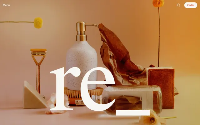
re_ grocery uses a sun-baked tactile aesthetic, blending friendly serif typography with modern sans-serifs, all set against a warm, off-white canvas. A singular vibrant orange serves as the brand's energetic accent, appearing predominantly as an outline for interactive elements and as a solid background for key navigation or critical sections. The layout favors ample whitespace and clearly defined content blocks, emphasizing product-focused imagery and maintaining a focused yet approachable shopping experience.
The page employs a contained layout with a maximum width, centered on a Cream Canvas background after the initial full-bleed hero. The hero section features large, inviting serif typography centered over a warm product still-life. Content sections typically alternate between a full-width background (Burnt Orange for hero/footer-like blocks) and the Cream Canvas. Product listings use a consistent grid, often 4-column, with clean, borderless cards. Vertical rhythm is established through generous section and element gaps. Navigation is a sticky top bar with a 'Menu' and 'Order' button on either side, and a search icon.
The site predominantly uses product-focused photography and lifestyle imagery, typically framed in warm, natural lighting. Product shots are clean and often feature items isolated or arranged artfully with complementary props on light backgrounds or with soft focus. Lifestyle photography, when present, maintains a warm, earthy tone. Illustrations are not prominent, but iconography uses simple, filled forms in Rich Espresso or Burnt Orange. Imagery serves both decorative atmosphere and direct product showcasing, with a medium density, allowing ample space for text.
Reminiscent of Burlap & Barrel, Oatly, Grove Collaborative, Necessaire.
# re_ grocery — Style Reference
> Sun-baked Tactile Canvas

**Theme:** light

**Site:** https://regrocery.co

re_ grocery uses a sun-baked tactile aesthetic, blending friendly serif typography with modern sans-serifs, all set against a warm, off-white canvas. A singular vibrant orange serves as the brand's energetic accent, appearing predominantly as an outline for interactive elements and as a solid background for key navigation or critical sections. The layout favors ample whitespace and clearly defined content blocks, emphasizing product-focused imagery and maintaining a focused yet approachable shopping experience.

## Tokens — Colors

| Name | Value | Token | Role |
|------|------|------|------|
| Burnt Orange | `#f74c25` | `--color-burnt-orange` | Primary brand accent, interactive element borders, text links, critical full-bleed sections, and footer background — adds energetic contrast to the soft neutrals |
| Cream Canvas | `#f7f6f2` | `--color-cream-canvas` | Page backgrounds, card surfaces, button backgrounds, and secondary text where contrast is needed against a darker background |
| Desert Sand | `#efede7` | `--color-desert-sand` | Subtle background for hero sections and light accent surfaces |
| Rich Espresso | `#000000` | `--color-rich-espresso` | Primary body text, headings, and iconography when high contrast is required |

## Tokens — Typography

### ITC Garamond W01 Book Narrow
- **Substitute:** serif
- **Weights:** 400
- **Sizes:** 40px, 80px, 100px
- **Line height:** 0.8, 1.1
- **Letter spacing:** -0.022em at 40px, -0.010em at 80-100px
- **Role:** Display headlines and sub-headings – its classic serif structure and wide letter-spacing create a sophisticated, spacious feel, counterbalancing the sans-serif for body copy.

### Suisse Int'l
- **Substitute:** sans-serif
- **Weights:** 400
- **Sizes:** 15px, 16px, 20px, 30px, 180px
- **Line height:** 0.8, 1, 1.2, 1.25, 1.33
- **Letter spacing:** -0.033em at 180px, -0.027em at 30px, -0.020em at 20px, -0.013em at 15-16px
- **Role:** Body copy, input text, buttons, navigation, and large decorative typography. Its consistent weight and varied letter-spacing allow it to adapt from functional text to impactful display elements.

## Tokens — Type Scale

Perfect Fifth (1.5) from 15px base.

| Role | Size | Line height | Letter spacing |
|------|------|------|------|
| body-sm | 15px | 1.33 | -0.19px |
| subheading | 20px | 1.25 | -0.4px |
| heading | 30px | 1.2 | -0.81px |
| heading-lg | 40px | 1.1 | -0.88px |
| display | 80px | 0.8 | -0.8px |
| display-xl | 100px | 0.8 | -1px |
| display-hero | 180px | 0.8 | -5.94px |

## Tokens — Spacing

- **Section gap:** 40px
- **Card padding:** 20px
- **Element gap:** 10px

## Tokens — Radius

- **Buttons:** 1440px
- **Inputs:** 0px
- **Cards:** 1440px
- **tags:** 1440px

## Layout

The page employs a contained layout with a maximum width, centered on a Cream Canvas background after the initial full-bleed hero. The hero section features large, inviting serif typography centered over a warm product still-life. Content sections typically alternate between a full-width background (Burnt Orange for hero/footer-like blocks) and the Cream Canvas. Product listings use a consistent grid, often 4-column, with clean, borderless cards. Vertical rhythm is established through generous section and element gaps. Navigation is a sticky top bar with a 'Menu' and 'Order' button on either side, and a search icon.

## Imagery

The site predominantly uses product-focused photography and lifestyle imagery, typically framed in warm, natural lighting. Product shots are clean and often feature items isolated or arranged artfully with complementary props on light backgrounds or with soft focus. Lifestyle photography, when present, maintains a warm, earthy tone. Illustrations are not prominent, but iconography uses simple, filled forms in Rich Espresso or Burnt Orange. Imagery serves both decorative atmosphere and direct product showcasing, with a medium density, allowing ample space for text.

## Components

### Outline Accent Button
*Primary call to action and navigation in the header.*

Ghost button with 1440px (pill-shaped) border-radius, 10px vertical and 30px horizontal padding. Border and text color are Burnt Orange (#f74c25). Background is transparent. Used for 'Order' button.

### Ghost Nav Button
*Navigation links and filter tags.*

Ghost button with 0px radius, transparent background, and Burnt Orange (#f74c25) text and bottom border. 0px padding overall, with 20px bottom padding where active.

### Cream Text Button
*Navigation links against dark backgrounds.*

Ghost button with 0px radius, transparent background, and Cream Canvas (#f7f6f2) text. Used for 'Menu' button.

### Filled Cream Button
*Subtle interactive elements contrasting against a Burnt Orange background.*

Solid button with 0px radius, Cream Canvas (#f7f6f2) background, and Burnt Orange (#f74c25) text. 0px padding. Seen on the footer.

### Plain Product Card
*Display individual product items within grids.*

Transparent background, 0px border-radius, no shadow, with 0px padding. Relies on layout for separation.

### Callout Card
*Highlight specific product groups or information with a subtle background.*

Cream Canvas (#f7f6f2) background, 1440px (pill-shaped) border-radius, no shadow, with 0px padding. Used for the product filter labels.

### Underlined Input
*Email newsletter sign-up fields.*

Transparent background with Burnt Orange (#f74c25) text. Has a Cream Canvas (#f7f6f2) bottom border, 0px border-radius. 10px vertical padding, 30px left padding.

### Outline Badge
*Product attribute tags.*

Transparent background, Burnt Orange (#f74c25) text color, 0px border-radius, 0px padding. Relies on inherent text shape and spacing for definition.

## Guidelines

### Do

- Use Burnt Orange (#f74c25) as a border or underline for interactive states and primary actions where a full-fill background would be too heavy.
- Employ the ITC Garamond W01 Book Narrow font for all prominent headlines and section titles to convey a classic yet spacious feel, specifically at weights 400 and sizes 40px, 80px, or 100px.
- Maintain a clear visual hierarchy by setting primary body text in Suisse Int'l at 15px or 16px, with a neutral Rich Espresso (#000000) color.
- Apply 1440px border-radius to all buttons, cards, and tags, creating a soft, pill-shaped aesthetic.
- Utilize Cream Canvas (#f7f6f2) as the default background for most content sections and product cards, providing a consistent base surface.
- Use tight negative letter-spacing for large display text (Suisse Int'l 180px: -0.033em, ITC Garamond 100px: -0.010em) to create impactful, visually dense typography.
- Section containers should be implicitly separated by Cream Canvas (#f7f6f2) backgrounds and generous section gaps, maintaining an open and breathable layout.

### Don't

- Avoid using Cream Canvas (#f7f6f2) text on a Desert Sand (#efede7) background due to insufficient contrast (1.1:1 fail).
- Do not use dark, heavy shadows; the system relies on flat surfaces and color contrast for visual separation.
- Avoid arbitrary border-radius values; always use 1440px for soft-edged elements or 0px for sharp edges, as defined by the design system.
- Do not introduce new vibrant colors outside of Burnt Orange; the palette is intentionally restrained to this single accent hue.
- Avoid dense, text-heavy blocks without ample whitespace; the design system values open layouts and clear content distinctions.
- Do not use highly saturated photography that competes with the brand's Burnt Orange; imagery should have a natural, often muted, or product-focused aesthetic.
- Avoid using generic sans-serifs for headlines; stick to ITC Garamond W01 Book Narrow for distinct brand voice in display text.

## Agent Prompt Guide

Quick Color Reference:
text: #000000
background: #f7f6f2
border: #f74c25
accent: #f74c25
primary action: #f74c25 (outlined action border)

Example Component Prompts:
1. Create a primary navigation button: 'Order' text, Suisse Int'l weight 400, Burnt Orange (#f74c25) text and border, transparent background, 1440px border-radius, 10px vertical and 30px horizontal padding.
2. Design a product item card for a grid: Cream Canvas (#f7f6f2) background, 1440px border-radius, 0px internal padding. Product title: Suisse Int'l weight 400, 16px, Rich Espresso (#000000). Price: Suisse Int'l weight 400, 15px, Rich Espresso (#000000).
3. Create a section headline: 'New Arrivals' text, ITC Garamond W01 Book Narrow weight 400, 80px, Rich Espresso (#000000), letter-spacing -0.010em.
4. Design an email signup input: transparent background, Cream Canvas (#f7f6f2) bottom border, Burnt Orange (#f74c25) placeholder text, 0px border-radius, Suisse Int'l weight 400, 10px vertical and 30px left padding.
More like this









Keep what you find
A free account saves references to boards and can send you a weekly email of picks based on what you save.
To see every result, go Pro.