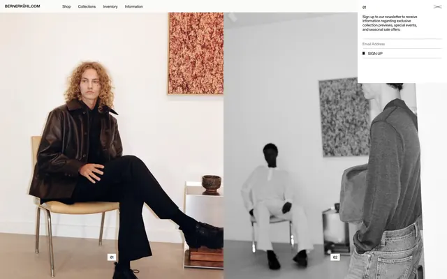
Preview image. Unlock full-res
monochrome editorial canvas
Color palette
Page and section backgrounds, pristine card surfaces — a clean, expansive foundation for content
Dark borders and separators for elevated surfaces and inverted UI. Do not promote it to the primary CTA color
Subtle borders for lists and inactive links, providing minimal separation without drawing attention
Neutral form states, badge text, and quiet UI feedback where color should stay understated. Do not promote it to the primary CTA color
Typography
- Weights
- 400
- Sizes
- 12px, 20px
- Line height
- 1.15, 1.25
- Fallback
- Source Serif Pro
Primary typeface for all text content, including navigation, body text, and headings. Its distinct serif character and uniform weight lend an air of classic editorial elegance and seriousness.
Spacing & shape
Components
Transparent background, Ink Black text, no borders or padding, relying on surrounding layout for definition. Used for navigation and secondary actions.
Canvas White background with Ink Black text, a thin 1px Ink Black border, and 8px vertical, 16px horizontal internal padding. Used for newsletter sign-ups and primary calls to action, providing a clear visual target.
Transparent background, Ink Black text. Defined by a 1px Stone Gray bottom border, visible only when active or focused. No internal padding is explicitly defined by the component data itself, relying on the font's natural line height for spacing.
Displays product images without explicit padding, borders, or background, letting the image content fill the space. Uses minimal bottom margin (64px) for vertical separation. The overall grid is a canvas for product photography.
Guidelines
- Prioritize Ink Black (#000000) for all textual content and critical UI borders.
- Maintain a pristine Canvas White (#ffffff) as the dominant background color for all primary surfaces.
- Use Gerstner Programm FSL at 400 weight for all typography, leveraging its consistent character.
- Apply 0px border-radius universally to maintain sharp, unrounded geometric forms.
- Separate major sections with a 64px vertical gap to create a spacious, deliberate rhythm.
- Utilize 1px thin borders in Ash Gray (#c8c8c7) or Ink Black (#000000) for subtle content division, rather than background differentiation.
- All interactive elements should be visually lightweight, either as text links or ghost buttons with minimal visual adornment.
- Avoid chromatic colors; maintain an exclusively achromatic palette unless explicitly defined for a specific, rare accent.
- Do not use shadows or elevation effects; surfaces should remain flat against the Canvas White background.
- Do not apply rounded corners to any UI elements; all corners must be sharp and angular (0px radius).
- Refrain from using varied font weights; all text should consistently use the 400 weight for Gerstner Programm FSL.
- Do not introduce complex background patterns or textures; surfaces should remain solid white.
- Avoid dense information blocks; use generous spacing and sparse content to convey exclusivity.
- Do not auto-generate hover/active states that introduce background fills or significant color changes; interaction should be subtle.
About this system
ShowHide
Berner Kühl employs a refined, almost austere visual system, echoing the minimalist aesthetic of high fashion. The design relies on a stark monochrome palette, using deep black typography and thin borders against a pristine white canvas. Absence of color, strong typographic presence with a custom serif font, and precise, measured spacing create an atmosphere of understated luxury and exclusivity, rather than an interactive, feature-rich interface.
The page employs a full-bleed, unconstrained layout for its primary content, allowing photography to extend edge-to-edge. The hero section establishes this with a large split layout of editorial photography. Content then follows a grid-based pattern, primarily with product images forming a highly structured, dense array, often with a 3-column layout. Vertical rhythm is established through consistent 64px section gaps. Navigation is a minimal top bar, with text links and a discrete utility icon. The overall impression is an expansive, gallery-like experience.
The site primarily uses photography, featuring a mix of styled portraiture for brand mood and clean e-commerce product shots. Photography is often full-bleed or large-format, often in black and white or desaturated tones, enhancing the monochrome aesthetic. Product images are typically isolated against a plain background, focusing solely on the garment itself without lifestyle context. Icons are minimal, with a very thin stroke weight, reinforcing the understated feel. Imagery serves both to convey atmosphere and to showcase products directly, dominating visual space.
Reminiscent of Acne Studios, COS, The Row, Theory.
# Berner Kühl — Style Reference
> monochrome editorial canvas

**Theme:** light

**Site:** https://bernerkuhl.com

Berner Kühl employs a refined, almost austere visual system, echoing the minimalist aesthetic of high fashion. The design relies on a stark monochrome palette, using deep black typography and thin borders against a pristine white canvas. Absence of color, strong typographic presence with a custom serif font, and precise, measured spacing create an atmosphere of understated luxury and exclusivity, rather than an interactive, feature-rich interface.

## Tokens — Colors

| Name | Value | Token | Role |
|------|------|------|------|
| Canvas White | `#ffffff` | `--color-canvas-white` | Page and section backgrounds, pristine card surfaces — a clean, expansive foundation for content |
| Ink Black | `#000000` | `--color-ink-black` | Dark borders and separators for elevated surfaces and inverted UI. Do not promote it to the primary CTA color |
| Ash Gray | `#c8c8c7` | `--color-ash-gray` | Subtle borders for lists and inactive links, providing minimal separation without drawing attention |
| Stone Gray | `#767676` | `--color-stone-gray` | Neutral form states, badge text, and quiet UI feedback where color should stay understated. Do not promote it to the primary CTA color |

## Tokens — Typography

### Gerstner Programm FSL
- **Substitute:** Source Serif Pro
- **Weights:** 400
- **Sizes:** 12px, 20px
- **Line height:** 1.15, 1.25
- **Role:** Primary typeface for all text content, including navigation, body text, and headings. Its distinct serif character and uniform weight lend an air of classic editorial elegance and seriousness.

## Tokens — Type Scale

| Role | Size | Line height | Letter spacing |
|------|------|------|------|
| caption | 12px | 1.15 | — |
| body | 20px | 1.25 | — |

## Tokens — Spacing

- **Section gap:** 64px
- **Card padding:** 16px
- **Element gap:** 8px

## Tokens — Radius

- **none:** 0px

## Layout

The page employs a full-bleed, unconstrained layout for its primary content, allowing photography to extend edge-to-edge. The hero section establishes this with a large split layout of editorial photography. Content then follows a grid-based pattern, primarily with product images forming a highly structured, dense array, often with a 3-column layout. Vertical rhythm is established through consistent 64px section gaps. Navigation is a minimal top bar, with text links and a discrete utility icon. The overall impression is an expansive, gallery-like experience.

## Imagery

The site primarily uses photography, featuring a mix of styled portraiture for brand mood and clean e-commerce product shots. Photography is often full-bleed or large-format, often in black and white or desaturated tones, enhancing the monochrome aesthetic. Product images are typically isolated against a plain background, focusing solely on the garment itself without lifestyle context. Icons are minimal, with a very thin stroke weight, reinforcing the understated feel. Imagery serves both to convey atmosphere and to showcase products directly, dominating visual space.

## Components

### Ghost Button
*Minimalist interactive element*

Transparent background, Ink Black text, no borders or padding, relying on surrounding layout for definition. Used for navigation and secondary actions.

### Primary Sign-Up Button
*Conversion action*

Canvas White background with Ink Black text, a thin 1px Ink Black border, and 8px vertical, 16px horizontal internal padding. Used for newsletter sign-ups and primary calls to action, providing a clear visual target.

### Text Input Field
*User data entry*

Transparent background, Ink Black text. Defined by a 1px Stone Gray bottom border, visible only when active or focused. No internal padding is explicitly defined by the component data itself, relying on the font's natural line height for spacing.

### Product Grid Item
*Product display*

Displays product images without explicit padding, borders, or background, letting the image content fill the space. Uses minimal bottom margin (64px) for vertical separation. The overall grid is a canvas for product photography.

## Guidelines

### Do

- Prioritize Ink Black (#000000) for all textual content and critical UI borders.
- Maintain a pristine Canvas White (#ffffff) as the dominant background color for all primary surfaces.
- Use Gerstner Programm FSL at 400 weight for all typography, leveraging its consistent character.
- Apply 0px border-radius universally to maintain sharp, unrounded geometric forms.
- Separate major sections with a 64px vertical gap to create a spacious, deliberate rhythm.
- Utilize 1px thin borders in Ash Gray (#c8c8c7) or Ink Black (#000000) for subtle content division, rather than background differentiation.
- All interactive elements should be visually lightweight, either as text links or ghost buttons with minimal visual adornment.

### Don't

- Avoid chromatic colors; maintain an exclusively achromatic palette unless explicitly defined for a specific, rare accent.
- Do not use shadows or elevation effects; surfaces should remain flat against the Canvas White background.
- Do not apply rounded corners to any UI elements; all corners must be sharp and angular (0px radius).
- Refrain from using varied font weights; all text should consistently use the 400 weight for Gerstner Programm FSL.
- Do not introduce complex background patterns or textures; surfaces should remain solid white.
- Avoid dense information blocks; use generous spacing and sparse content to convey exclusivity.
- Do not auto-generate hover/active states that introduce background fills or significant color changes; interaction should be subtle.

## Agent Prompt Guide

Quick Color Reference:
text: #000000
background: #ffffff
border: #000000
accent: no distinct accent color
primary action: no distinct CTA color

Example Component Prompts:
Create a primary navigation link: Gerstner Programm FSL, 400 weight, 12px, Ink Black (#000000), no underline, 0px transparent border.
Create a newsletter sign-up button: Canvas White (#ffffff) background, Ink Black (#000000) text, 1px Ink Black (#000000) border, 0px border-radius, 8px vertical padding, 16px horizontal padding.
Create a text input field: Transparent background, Ink Black (#000000) text, 1px Stone Gray (#767676) bottom border, no padding, 0px border-radius.
Create a product grid item: A large image contained within a column, no background, no borders, no padding. Product name text (Gerstner Programm FSL, 400 weight, 12px, Ink Black (#000000)) underneath, with 64px margin-bottom for vertical separation.
More like this









Keep what you find
A free account saves references to boards and can send you a weekly email of picks based on what you save.
To see every result, go Pro.