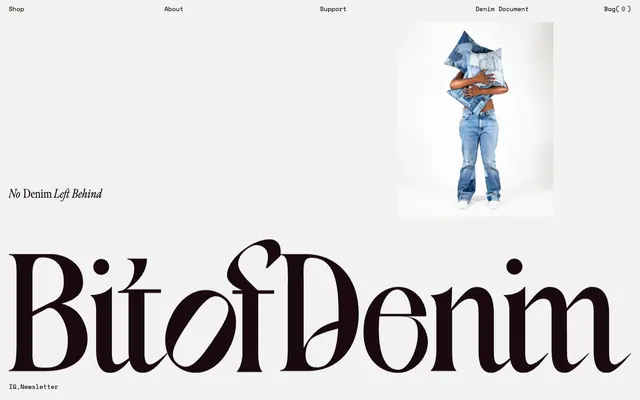
Preview image. Unlock full-res
Gallery Canvas, Monospace Serenity
Color palette
Page backgrounds, large empty spaces – a subtle off-white that feels warm
Primary text, headline text, badge text, borders. This near-black provides strong contrast
Dark borders and separators for elevated surfaces and inverted UI. Do not promote it to the primary CTA color
Muted UI text and faint button borders, offering a slightly softer alternative to pure black
Typography
- Weights
- 400, 700
- Sizes
- 14px
- Line height
- 1.29, 1.5
- Letter spacing
- normal
- Fallback
- monospace
Body text, navigation, and small UI elements. Its monospace nature brings a technical, precise, and understated feel to the UI.
- Weights
- 300
- Sizes
- 28px
- Line height
- 1.5
- Letter spacing
- normal
Headline display text. The ultra-light weight combined with its elaborate, high-contrast display serif forms a dramatic visual identity, giving an artistic, editorial feel. Weight 300 makes it whisper instead of shout – authority through restraint, not volume.
Spacing & shape
Components
Transparent background, Deepest Ebony (#000000) text (or Charcoal Grey #222222 for less prominent items), no padding, no border, 0px radius. Uses Space Mono, weight 400.
Transparent background, Midnight Ink (#1a0a0e) text, 0px border radius, with significant padding-bottom of 50px acting more as a vertical spacer than literal padding.
Midnight Ink (#1a0a0e) color, using meno-display-condensed font at weight 300, 28px size, normal line height and letter spacing.
Guidelines
- Prioritize Canvas Antique (#fcfaf6) for all page backgrounds to maintain a light, airy foundation.
- Use Midnight Ink (#1a0a0e) as the default for all primary text and display headlines.
- Employ Deepest Ebony (#000000) for interactive link text and button states to ensure high contrast and clear affordance.
- Utilize meno-display-condensed weight 300 for large, stylized headlines, leveraging its unique character for brand emphasis.
- Apply Space Mono at 14px for all navigation, body text, and explanatory UI elements, maintaining a consistent technical aesthetic.
- Give imagery ample surrounding space, using a minimum of 20px padding where applicable, and apply a 9px border-radius to images.
- Use 40px vertical spacing between major page sections and for generous component top/bottom padding.
- Do not introduce highly saturated colors unless for specific, deliberate accent roles not currently defined.
- Avoid heavy shadows or gradients; rely on contrast in color and typography for hierarchy and depth.
- Do not deviate from the specified font families; their distinct characteristics are critical to the brand identity.
- Do not add borders or backgrounds to navigation buttons; they should remain text-only with color changes for state.
- Avoid complex, multi-column layouts that introduce visual noise; prefer clean, open compositions.
- Do not use generic system fonts; Space Mono and meno-display-condensed are essential to the brand's typographic voice.
- Do not use small, indistinct headline sizes for meno-display-condensed; its impact relies on its dramatic larger scale.
About this system
ShowHide
Bitofdenim embraces a minimalist, sophisticated aesthetic, combining a stark, almost off-white canvas with deep, inky black typography. The visual hierarchy is established through a dramatic interplay of an oversized, highly stylized serif font for key branding against clean, monospace text for navigation and body. Imagery is given generous white space, creating a gallery-like feel where product visuals stand out with quiet confidence. The overall impression is one of artful restraint, allowing the unique typography and product imagery to dominate without visual clutter.
The page follows a classic max-width contained layout, likely centered, though specific max-width is not defined by tokens. The hero section presents a prominent image on the right, balanced by a significant, oversized brand headline on the left. Navigation is a minimalist top bar. Content is presented with comfortable vertical spacing (40px sections) and generous whitespace, creating an open, uncrowded feel. The text appears to be stacked centrally or left-aligned within content blocks, without complex grid structures for main content.
This site features product photography, specifically of styled models wearing or interacting with upcycled denim garments. The photography is clean, likely studio-shot with high-key lighting, focusing on the product itself rather than complex lifestyle scenarios. Images are contained within clear boundaries, often with visible but subtle borders (indicated by the 9px radius). The role of imagery is primarily product showcase, presented with generous surrounding whitespace to elevate their perceived value and artistic quality. Iconography appears to be minimal, likely using standard geometric shapes for UI actions (e.g., bag icon).
Reminiscent of Acne Studios, Totême, COS.
# Bitofdenim — Style Reference
> Gallery Canvas, Monospace Serenity

**Theme:** light

**Site:** https://www.bitofdenim.com

Bitofdenim embraces a minimalist, sophisticated aesthetic, combining a stark, almost off-white canvas with deep, inky black typography. The visual hierarchy is established through a dramatic interplay of an oversized, highly stylized serif font for key branding against clean, monospace text for navigation and body. Imagery is given generous white space, creating a gallery-like feel where product visuals stand out with quiet confidence. The overall impression is one of artful restraint, allowing the unique typography and product imagery to dominate without visual clutter.

## Tokens — Colors

| Name | Value | Token | Role |
|------|------|------|------|
| Canvas Antique | `#fcfaf6` | `--color-canvas-antique` | Page backgrounds, large empty spaces – a subtle off-white that feels warm |
| Midnight Ink | `#1a0a0e` | `--color-midnight-ink` | Primary text, headline text, badge text, borders. This near-black provides strong contrast |
| Deepest Ebony | `#000000` | `--color-deepest-ebony` | Dark borders and separators for elevated surfaces and inverted UI. Do not promote it to the primary CTA color |
| Charcoal Grey | `#222222` | `--color-charcoal-grey` | Muted UI text and faint button borders, offering a slightly softer alternative to pure black |

## Tokens — Typography

### Space Mono
- **Substitute:** monospace
- **Weights:** 400, 700
- **Sizes:** 14px
- **Line height:** 1.29, 1.5
- **Letter spacing:** normal
- **Role:** Body text, navigation, and small UI elements. Its monospace nature brings a technical, precise, and understated feel to the UI.

### meno-display-condensed
- **Weights:** 300
- **Sizes:** 28px
- **Line height:** 1.5
- **Letter spacing:** normal
- **Role:** Headline display text. The ultra-light weight combined with its elaborate, high-contrast display serif forms a dramatic visual identity, giving an artistic, editorial feel. Weight 300 makes it whisper instead of shout – authority through restraint, not volume.

## Tokens — Spacing

- **Section gap:** 40px
- **Card padding:** 20px
- **Element gap:** 20px

## Tokens — Radius

- **Images:** 9px

## Layout

The page follows a classic max-width contained layout, likely centered, though specific max-width is not defined by tokens. The hero section presents a prominent image on the right, balanced by a significant, oversized brand headline on the left. Navigation is a minimalist top bar. Content is presented with comfortable vertical spacing (40px sections) and generous whitespace, creating an open, uncrowded feel. The text appears to be stacked centrally or left-aligned within content blocks, without complex grid structures for main content.

## Imagery

This site features product photography, specifically of styled models wearing or interacting with upcycled denim garments. The photography is clean, likely studio-shot with high-key lighting, focusing on the product itself rather than complex lifestyle scenarios. Images are contained within clear boundaries, often with visible but subtle borders (indicated by the 9px radius). The role of imagery is primarily product showcase, presented with generous surrounding whitespace to elevate their perceived value and artistic quality. Iconography appears to be minimal, likely using standard geometric shapes for UI actions (e.g., bag icon).

## Components

### Text-Only Navigation Button
*Primary navigation and interactive labels.*

Transparent background, Deepest Ebony (#000000) text (or Charcoal Grey #222222 for less prominent items), no padding, no border, 0px radius. Uses Space Mono, weight 400.

### Text Badge
*Highlighting key phrases or calls to attention.*

Transparent background, Midnight Ink (#1a0a0e) text, 0px border radius, with significant padding-bottom of 50px acting more as a vertical spacer than literal padding.

### Brand Headline Text
*Dominant visual branding and section titles.*

Midnight Ink (#1a0a0e) color, using meno-display-condensed font at weight 300, 28px size, normal line height and letter spacing.

## Guidelines

### Do

- Prioritize Canvas Antique (#fcfaf6) for all page backgrounds to maintain a light, airy foundation.
- Use Midnight Ink (#1a0a0e) as the default for all primary text and display headlines.
- Employ Deepest Ebony (#000000) for interactive link text and button states to ensure high contrast and clear affordance.
- Utilize meno-display-condensed weight 300 for large, stylized headlines, leveraging its unique character for brand emphasis.
- Apply Space Mono at 14px for all navigation, body text, and explanatory UI elements, maintaining a consistent technical aesthetic.
- Give imagery ample surrounding space, using a minimum of 20px padding where applicable, and apply a 9px border-radius to images.
- Use 40px vertical spacing between major page sections and for generous component top/bottom padding.

### Don't

- Do not introduce highly saturated colors unless for specific, deliberate accent roles not currently defined.
- Avoid heavy shadows or gradients; rely on contrast in color and typography for hierarchy and depth.
- Do not deviate from the specified font families; their distinct characteristics are critical to the brand identity.
- Do not add borders or backgrounds to navigation buttons; they should remain text-only with color changes for state.
- Avoid complex, multi-column layouts that introduce visual noise; prefer clean, open compositions.
- Do not use generic system fonts; Space Mono and meno-display-condensed are essential to the brand's typographic voice.
- Do not use small, indistinct headline sizes for meno-display-condensed; its impact relies on its dramatic larger scale.

## Agent Prompt Guide

Quick Color Reference:
text: #1a0a0e
background: #fcfaf6
border: #1a0a0e
accent: no distinct accent color
primary action: no distinct CTA color

Example Component Prompts:

1. Create a primary navigation link: text 'Shop' (Space Mono, weight 400, 14px, #000000), no background, no border, 0px padding or radius.

2. Create a large brand headline: text 'BitofDenim' (meno-display-condensed, weight 300, 28px, #1a0a0e), with a background of Canvas Antique (#fcfaf6).

3. Create a descriptive text badge: text 'No Denim Left Behind' (meno-display-condensed, weight 300, 28px, #1a0a0e), transparent background, 50px bottom padding, situated on a Canvas Antique (#fcfaf6) background.
More like this









Keep what you find
A free account saves references to boards and can send you a weekly email of picks based on what you save.
To see every result, go Pro.