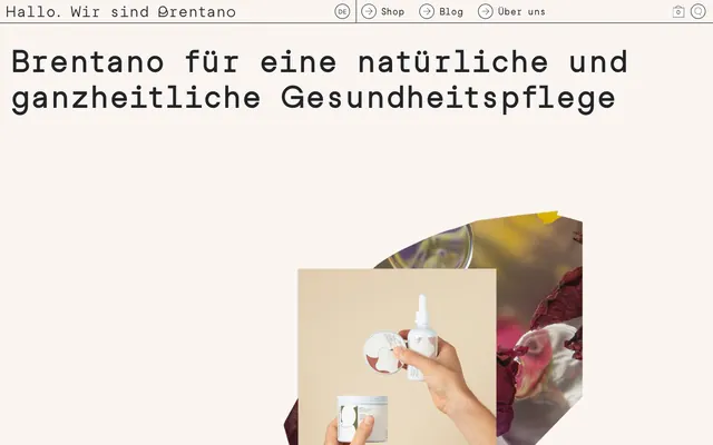
Preview image. Unlock full-res
Earthy botanical canvas
Color palette
Page backgrounds, card surfaces, button fills, input backgrounds
Primary text, link borders, button borders, navigation borders, input borders – providing crisp definition against light surfaces
Body text, heading text, list text, primary site borders – a slightly softer alternative to pure black for extensive text blocks and structural outlines
Typography
- Weights
- 400
- Sizes
- 12px, 15px, 18px, 25px, 30px, 60px
- Line height
- 1.2, 1.67, 2.08, 2.5
- Letter spacing
- normal
- Fallback
- Inter
Primary typeface for all body text, headings, links, and buttons. Its 'Writer Book' style denotes a commitment to legibility and a slightly editorial, handcrafted feel that distinguishes it from standard sans-serifs.
- Weights
- 700
- Sizes
- 12px, 15px, 18px, 25px, 30px, 60px
- Line height
- 1.2, 1.67, 2.08, 2.5
- Letter spacing
- normal
- Fallback
- Inter
Used for emphasized text and headings, maintaining the same clean aesthetic as the regular weight while adding clarity.
- Weights
- 400
- Sizes
- 15px, 30px
- Line height
- 1.2
- Letter spacing
- normal
- Fallback
- Inter
A lighter-touch variant of the primary typeface, used sparingly for specific body elements and input text to provide subtle visual differentiation.
- Weights
- 400
- Sizes
- 30px
- Line height
- 1.2
Studio Feixen Sans Writer Book Regular — detected in extracted data but not described by AI
Spacing & shape
Components
Ghost style with #ffffff background, #000000 border, and #000000 text. Features a 100% border radius for a circular shape, with no internal padding for a compact, icon-only appearance.
Outlined button with #ffffff background, #000000 border, and #000000 text. Has a 0px border radius, with 5px vertical and 10px horizontal padding. Font is Studio Feixen Sans Writer Book at appropriate size.
Text link with transparent background and #000000 text. No border radius or padding. Used for simple text-based navigation or inline actions.
Standard input field with #ffffff background, #000000 border, and #000000 text. Has a 0px border radius, with 5px padding on all sides. Uses Studio Feixen Sans Book for text.
A text link element, using Ink Black (#000000) for text, with a transparent background. Implied border on hover/active states suggested by surrounding elements or interaction.
Guidelines
- Prioritize Studio Feixen Sans Writer Book 400 for all body text and general interface elements, ensuring consistent legibility.
- Use Charcoal Text (#212529) for standard body text and structural borders to maintain a slightly softer contrast, reserving Ink Black (#000000) for high-impact text and outlines.
- Maintain a clear visual hierarchy with borders over shadows; use 1px solid Ink Black (#000000) borders for distinct elements like inputs and buttons.
- Implement a 10px element gap for most horizontal and vertical spacing between small interactive components, such as list items or buttons inside a container.
- Utilize 0px border radius for most container elements and buttons to maintain a sharp, clean aesthetic, with the exception of specific circular elements using 100% radius.
- Avoid introducing additional accent colors; stick to the neutral palette for all functional UI elements.
- Do not use drop shadows for elevation; rely exclusively on borders and background color changes to define element depth.
- Refrain from using overly decorative or image-heavy backgrounds; surfaces should remain Canvas White (#ffffff) to keep focus on content and products.
- Avoid excessive padding within elements; maintain a compact density with 5px or 10px padding for most components.
- Do not deviate from the custom font families; system fonts should not be used as a substitute.
About this system
ShowHide
My Brentano embraces a refined, organic aesthetic creating a calm, content-forward experience. Neutral, earthy tones combined with a strong, custom sans-serif typeface define its signature. The layout emphasizes clear structural organization with subtle borders and minimal use of color, allowing product imagery and text to take precedence. Components are lightweight and understated, integrating seamlessly into the canvas rather than standing out as distinct elements.
The page employs a contained, centered layout, allowing content to breathe within a defined maximum width. The hero section features a prominent, centered headline over a background that combines full-bleed abstract imagery with product photography. Content sections alternate between visually engaging abstract images and clear textual blocks, often structured in single or implied two-column arrangements. Vertical rhythm is established through consistent section gaps, creating a clean flow. Navigation is a minimal top bar, featuring text links and subtle iconic elements, maintaining a compact header area.
The imagery focuses on close-up product photography and abstract, organic macro shots of natural ingredients. Product shots are typically clean, isolated crops on neutral or slightly textured backgrounds, emphasizing the product itself with minimal lifestyle context. Abstract macro photography provides atmospheric backdrops, often with soft focus and muted, natural color palettes. Icons are minimalist, outlined, and monochrome, integrating seamlessly into the UI for functional cues rather than decorative accents. The overall density is balanced, allowing significant whitespace to frame both text and imagery.
Reminiscent of Aēsop, Byredo, Grown Alchemist, Tata Harper Skincare.
# My Brentano — Style Reference
> Earthy botanical canvas

**Theme:** light

**Site:** https://mybrentano.ch

My Brentano embraces a refined, organic aesthetic creating a calm, content-forward experience. Neutral, earthy tones combined with a strong, custom sans-serif typeface define its signature. The layout emphasizes clear structural organization with subtle borders and minimal use of color, allowing product imagery and text to take precedence. Components are lightweight and understated, integrating seamlessly into the canvas rather than standing out as distinct elements.

## Tokens — Colors

| Name | Value | Token | Role |
|------|------|------|------|
| Canvas White | `#ffffff` | `--color-canvas-white` | Page backgrounds, card surfaces, button fills, input backgrounds |
| Ink Black | `#000000` | `--color-ink-black` | Primary text, link borders, button borders, navigation borders, input borders – providing crisp definition against light surfaces |
| Charcoal Text | `#212529` | `--color-charcoal-text` | Body text, heading text, list text, primary site borders – a slightly softer alternative to pure black for extensive text blocks and structural outlines |

## Tokens — Typography

### Studio Feixen Sans Writer Book
- **Substitute:** Inter
- **Weights:** 400
- **Sizes:** 12px, 15px, 18px, 25px, 30px, 60px
- **Line height:** 1.2, 1.67, 2.08, 2.5
- **Letter spacing:** normal
- **Role:** Primary typeface for all body text, headings, links, and buttons. Its 'Writer Book' style denotes a commitment to legibility and a slightly editorial, handcrafted feel that distinguishes it from standard sans-serifs.

### Studio Feixen Sans Writer Book
- **Substitute:** Inter
- **Weights:** 700
- **Sizes:** 12px, 15px, 18px, 25px, 30px, 60px
- **Line height:** 1.2, 1.67, 2.08, 2.5
- **Letter spacing:** normal
- **Role:** Used for emphasized text and headings, maintaining the same clean aesthetic as the regular weight while adding clarity.

### Studio Feixen Sans Book
- **Substitute:** Inter
- **Weights:** 400
- **Sizes:** 15px, 30px
- **Line height:** 1.2
- **Letter spacing:** normal
- **Role:** A lighter-touch variant of the primary typeface, used sparingly for specific body elements and input text to provide subtle visual differentiation.

### Studio Feixen Sans Writer Book Regular
- **Weights:** 400
- **Sizes:** 30px
- **Line height:** 1.2
- **Role:** Studio Feixen Sans Writer Book Regular — detected in extracted data but not described by AI

## Tokens — Type Scale

Augmented Fourth (1.414) from 15px base.

| Role | Size | Line height | Letter spacing |
|------|------|------|------|
| caption | 12px | 1.67 | — |
| body | 15px | 1.67 | — |
| subheading | 18px | 1.67 | — |
| heading-sm | 25px | 1.2 | — |
| heading | 30px | 1.2 | — |
| display | 60px | 1.2 | — |

## Tokens — Spacing

- **Section gap:** 30px
- **Card padding:** 10px
- **Element gap:** 10px

## Tokens — Radius

- **Default:** 0px
- **circularElements:** 100%

## Layout

The page employs a contained, centered layout, allowing content to breathe within a defined maximum width. The hero section features a prominent, centered headline over a background that combines full-bleed abstract imagery with product photography. Content sections alternate between visually engaging abstract images and clear textual blocks, often structured in single or implied two-column arrangements. Vertical rhythm is established through consistent section gaps, creating a clean flow. Navigation is a minimal top bar, featuring text links and subtle iconic elements, maintaining a compact header area.

## Imagery

The imagery focuses on close-up product photography and abstract, organic macro shots of natural ingredients. Product shots are typically clean, isolated crops on neutral or slightly textured backgrounds, emphasizing the product itself with minimal lifestyle context. Abstract macro photography provides atmospheric backdrops, often with soft focus and muted, natural color palettes. Icons are minimalist, outlined, and monochrome, integrating seamlessly into the UI for functional cues rather than decorative accents. The overall density is balanced, allowing significant whitespace to frame both text and imagery.

## Components

### Circular Ghost Button
*Decorative or iconic buttons, cart badge.*

Ghost style with #ffffff background, #000000 border, and #000000 text. Features a 100% border radius for a circular shape, with no internal padding for a compact, icon-only appearance.

### Rectangular Outlined Button
*Primary action buttons for purchasing or navigation.*

Outlined button with #ffffff background, #000000 border, and #000000 text. Has a 0px border radius, with 5px vertical and 10px horizontal padding. Font is Studio Feixen Sans Writer Book at appropriate size.

### Ghost Navigation Link
*Subtle navigation elements.*

Text link with transparent background and #000000 text. No border radius or padding. Used for simple text-based navigation or inline actions.

### Basic Input
*Form fields for user entry.*

Standard input field with #ffffff background, #000000 border, and #000000 text. Has a 0px border radius, with 5px padding on all sides. Uses Studio Feixen Sans Book for text.

### Header Navigation Item
*Interactive clickable item in the main site navigation.*

A text link element, using Ink Black (#000000) for text, with a transparent background. Implied border on hover/active states suggested by surrounding elements or interaction.

## Guidelines

### Do

- Prioritize Studio Feixen Sans Writer Book 400 for all body text and general interface elements, ensuring consistent legibility.
- Use Charcoal Text (#212529) for standard body text and structural borders to maintain a slightly softer contrast, reserving Ink Black (#000000) for high-impact text and outlines.
- Maintain a clear visual hierarchy with borders over shadows; use 1px solid Ink Black (#000000) borders for distinct elements like inputs and buttons.
- Implement a 10px element gap for most horizontal and vertical spacing between small interactive components, such as list items or buttons inside a container.
- Utilize 0px border radius for most container elements and buttons to maintain a sharp, clean aesthetic, with the exception of specific circular elements using 100% radius.

### Don't

- Avoid introducing additional accent colors; stick to the neutral palette for all functional UI elements.
- Do not use drop shadows for elevation; rely exclusively on borders and background color changes to define element depth.
- Refrain from using overly decorative or image-heavy backgrounds; surfaces should remain Canvas White (#ffffff) to keep focus on content and products.
- Avoid excessive padding within elements; maintain a compact density with 5px or 10px padding for most components.
- Do not deviate from the custom font families; system fonts should not be used as a substitute.

## Agent Prompt Guide

Quick Color Reference:
text: #000000
background: #ffffff
border: #000000
accent: no distinct accent color
primary action: no distinct CTA color

Example Component Prompts:
1. Create a primary navigation item: text 'Shop' using Studio Feixen Sans Writer Book weight 400, color Ink Black (#000000), no background or border, with elementGap 10px from adjacent items.
2. Create an input field: 0px border-radius, 1px solid Ink Black (#000000) border, Canvas White (#ffffff) background, 5px padding on all sides, placeholder text in Charcoal Text (#212529) using Studio Feixen Sans Book 400.
3. Create a secondary button: Text 'View Details' using Studio Feixen Sans Writer Book weight 400, size 15px, color Ink Black (#000000), Canvas White (#ffffff) background, 1px solid Ink Black (#000000) border, 0px border radius, 5px vertical and 10px horizontal padding.
No distinct primary action color was observed; use the extracted neutral button treatments instead of inventing a filled CTA color.
More like this









Keep what you find
A free account saves references to boards and can send you a weekly email of picks based on what you save.
To see every result, go Pro.