Preview image. Unlock full-res
Color palette
Page backgrounds, surface base layer
Primary text, navigation links, icons, borders, and decorative elements. This single dark hue defines all foreground content against the white canvas
Typography
- Weights
- 400
- Sizes
- 12px, 16px, 30px
- Line height
- 1.2, 1.26, 1.4
- Letter spacing
- 0.083em at 12px, 0.007em at 16px, normal at 30px
- Fallback
- Inter
Primary brand typeface for all headings and UI elements. Its unique geometry contributes to the brand's distinctive, slightly technical yet approachable feel. The restrained weight maintains the system's lightweight visual character.
- Weights
- 400
- Sizes
- 16px
- Line height
- 1.2
- Fallback
- Times New Roman
Limited use for body text, providing a classic counterpoint to the more contemporary Cash Sans. Its use appears highly curated.
Spacing & shape
Components
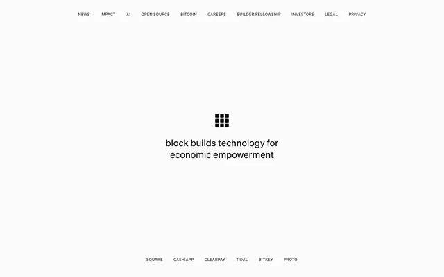
Uses Cash Sans, size 12px for primary nav and 16px for footer sub-nav, weight 400, color Absolute Black (#000000). Padding is 17px horizontal for top nav items. No visible borders or backgrounds.
Centered text using Cash Sans, size 30px, weight 400, color Absolute Black (#000000), line-height 1.4. This is a prominent focal point for key messages.
Guidelines
- Use Canvas White (#ffffff) for all primary backgrounds and surfaces.
- Apply Absolute Black (#000000) for all text, icons, and borders.
- Prioritize Cash Sans for all headings and UI text content.
- Center-align primary headlines and section content where appropriate to reinforce the focused aesthetic.
- Maintain generous vertical spacing between sections, following the 215-675px range.
- Ensure navigation links use 17px horizontal padding with no background or border.
- Avoid any border-radius; elements should have sharp, rectangular edges.
- Do not introduce any additional colors for UI elements; strictly adhere to the white and black palette.
- Avoid decorative gradients or shadows; the design relies on flatness and strong contrast.
- Do not use Times for prominent headings or UI elements; restrict its use to specific body text instances.
- Do not vary font weights; Cash Sans and Times should consistently use weight 400.
- Avoid dense, packed layouts; embrace generous negative space around elements.
- Do not use border-radius for any component; all corners should be 0px.
About this system
ShowHide
Block's design system embodies unadorned clarity: a stark white canvas serves as the backdrop for precise, centered typography. The visual language centers on minimal distraction, prioritizing content with a clean, almost ascetic aesthetic. Interaction is subtle, with elements distinguished primarily through typography and placement rather than color or elaborate surfacing.
The page maintains a full-bleed layout with a centered content approach rather than a fixed max-width container, especially for the main content areas. The hero features a large, centered headline accompanied by a simple icon, dominating the initial view. Sections are vertically distinct with significant spacing (215-675px), creating a calm rhythm. Content is primarily stacked and centered, with a clear hierarchy driven by font size and placement. Navigation is handled by a minimal top bar and a similar footer, both text-based and centered to the content axis.
This site uses no visible imagery on the main page. The visual system is purely typographic and layout-driven, relying on a content-first, minimalist approach that directs full attention to the text.
Reminiscent of Apple, Stripe, Linear, Substack.
# Block — Style Reference
> monochromatic minimalist canvas

**Theme:** light

**Site:** https://block.xyz

Block's design system embodies unadorned clarity: a stark white canvas serves as the backdrop for precise, centered typography. The visual language centers on minimal distraction, prioritizing content with a clean, almost ascetic aesthetic. Interaction is subtle, with elements distinguished primarily through typography and placement rather than color or elaborate surfacing.

## Tokens — Colors

| Name | Value | Token | Role |
|------|------|------|------|
| Canvas White | `#ffffff` | `--color-canvas-white` | Page backgrounds, surface base layer |
| Absolute Black | `#000000` | `--color-absolute-black` | Primary text, navigation links, icons, borders, and decorative elements. This single dark hue defines all foreground content against the white canvas |

## Tokens — Typography

### Cash Sans
- **Substitute:** Inter
- **Weights:** 400
- **Sizes:** 12px, 16px, 30px
- **Line height:** 1.2, 1.26, 1.4
- **Letter spacing:** 0.083em at 12px, 0.007em at 16px, normal at 30px
- **Role:** Primary brand typeface for all headings and UI elements. Its unique geometry contributes to the brand's distinctive, slightly technical yet approachable feel. The restrained weight maintains the system's lightweight visual character.

### Times
- **Substitute:** Times New Roman
- **Weights:** 400
- **Sizes:** 16px
- **Line height:** 1.2
- **Role:** Limited use for body text, providing a classic counterpoint to the more contemporary Cash Sans. Its use appears highly curated.

## Tokens — Type Scale

Golden Ratio (1.618) from 16px base.

| Role | Size | Line height | Letter spacing |
|------|------|------|------|
| caption | 12px | 1.26 | 0.996px |
| body | 16px | 1.2 | 0.112px |
| heading | 30px | 1.4 | — |

## Tokens — Spacing

- **Card padding:** 0px
- **Element gap:** 30-35px

## Tokens — Radius

- **none:** 0px

## Layout

The page maintains a full-bleed layout with a centered content approach rather than a fixed max-width container, especially for the main content areas. The hero features a large, centered headline accompanied by a simple icon, dominating the initial view. Sections are vertically distinct with significant spacing (215-675px), creating a calm rhythm. Content is primarily stacked and centered, with a clear hierarchy driven by font size and placement. Navigation is handled by a minimal top bar and a similar footer, both text-based and centered to the content axis.

## Imagery

This site uses no visible imagery on the main page. The visual system is purely typographic and layout-driven, relying on a content-first, minimalist approach that directs full attention to the text.

## Components

### Navigation Link
*Top and bottom navigation items.*

Uses Cash Sans, size 12px for primary nav and 16px for footer sub-nav, weight 400, color Absolute Black (#000000). Padding is 17px horizontal for top nav items. No visible borders or backgrounds.

### Centred Brand Headline
*Central page headline for brand messaging.*

Centered text using Cash Sans, size 30px, weight 400, color Absolute Black (#000000), line-height 1.4. This is a prominent focal point for key messages.

## Guidelines

### Do

- Use Canvas White (#ffffff) for all primary backgrounds and surfaces.
- Apply Absolute Black (#000000) for all text, icons, and borders.
- Prioritize Cash Sans for all headings and UI text content.
- Center-align primary headlines and section content where appropriate to reinforce the focused aesthetic.
- Maintain generous vertical spacing between sections, following the 215-675px range.
- Ensure navigation links use 17px horizontal padding with no background or border.
- Avoid any border-radius; elements should have sharp, rectangular edges.

### Don't

- Do not introduce any additional colors for UI elements; strictly adhere to the white and black palette.
- Avoid decorative gradients or shadows; the design relies on flatness and strong contrast.
- Do not use Times for prominent headings or UI elements; restrict its use to specific body text instances.
- Do not vary font weights; Cash Sans and Times should consistently use weight 400.
- Avoid dense, packed layouts; embrace generous negative space around elements.
- Do not use border-radius for any component; all corners should be 0px.

## Agent Prompt Guide

Quick Color Reference:
text: #000000
background: #ffffff
border: #000000
accent: no distinct accent color
primary action: no distinct CTA color

Example Component Prompts:
Create a top navigation bar: Canvas White background, links in Cash Sans 12px, weight 400, Absolute Black (#000000) color, with 17px horizontal padding on each link.
Create a central brand statement: 'block builds technology for economic empowerment' using Cash Sans 30px, weight 400, line-height 1.4, Absolute Black (#000000) color, centered on the page.
Create a footer navigation: Cash Sans 16px, weight 400, Absolute Black (#000000) color, centered, with 35px horizontal spacing between items.
More like this









Keep what you find
A free account saves references to boards and can send you a weekly email of picks based on what you save.
To see every result, go Pro.