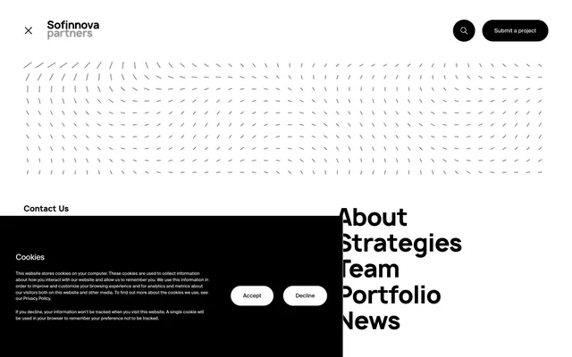
Preview image. Unlock full-res
Monochrome Grid Authority: a high-contrast, text-driven system conveying precision and gravitas through sharp lines and ample white space.
Color palette
Page backgrounds, navigation backgrounds, default surface color, inverse text for dark elements
Primary text, headings, outlines, filled button backgrounds, active navigation states, cookie banner background — the defining and dominant color
Typography
- Weights
- 400, 600, 700
- Sizes
- 10px, 11px, 13px, 14px, 20px, 59px, 188px
- Line height
- 1, 1.1, 1.2, 1.4, 1.45, 1.55
- Letter spacing
- -0.0400em, -0.0200em
- Fallback
- Inter
The sole typeface for all text elements. Its confident, modern sans-serif structure underpins the system's clarity. Varied letter-spacing introduces subtle rhythm for display and utility text.
Spacing & shape
Components
Filled with Midnight Ink (#000000) with Canvas White (#ffffff) text, utilizing generous horizontal padding (18px) and a highly rounded border-radius of 34.6354px. Font is SuisseIntl at varying sizes and weights depending on context.
Ghost button with no background or border, using Midnight Ink (#000000) for text. Padding and radius are 0px, presenting as pure text links. Font is SuisseIntl.
Solid Midnight Ink (#000000) background with Canvas White (#ffffff) text. Features two highly rounded buttons: 'Accept' (Canvas White fill, Midnight Ink text) and 'Decline' (Midnight Ink fill, Canvas White text).
A square icon container with a 49.4792px border-radius making it circular, featuring a 1px solid Midnight Ink (#000000) border and a Canvas White (#ffffff) background. The icon itself is Midnight Ink.
Guidelines
- Prioritize SuisseIntl typography as the primary driver of visual hierarchy and expression, using weights 400, 600, or 700.
- Use Midnight Ink (#000000) for all semantic text and primary interactive elements, contrasting it directly against Canvas White (#ffffff) backgrounds.
- Apply a border-radius of 34.6354px to all primary buttons and 49.4792px for circular icon buttons, defining the soft, yet precise corner treatment.
- Maintain generous spacing, using 'elementGap' (18px) for internal component spacing and 'sectionGap' (59px) for vertical separation between major content blocks.
- Design elements with a focus on high contrast, utilizing the #000000 and #ffffff palette for all UI components.
- Employ precise letter-spacing like -0.0400em or -0.0200em for display and specific body text to enhance legibility and visual tightness.
- Do not introduce new colors; restrict the palette strictly to Canvas White (#ffffff) and Midnight Ink (#000000) for all UI elements.
- Avoid using shadows or excessive elevation; rely on bold typography and high contrast for visual weight and hierarchy.
- Do not use generic border-radius values; always apply 34.6354px for rectangular buttons and 49.4792px for circular elements.
- Do not use highly saturated or chromatic colors for interactive states or accents; maintain the monochrome identity.
- Do not vary line-height arbitrarily; adhere to the specified line-heights (1.00, 1.10, 1.20, 1.40, 1.45, 1.55) from the typography scale.
About this system
ShowHide
Sofinnova Partners operates on a stark, high-contrast monochrome aesthetic where bold black elements punctuate an expansive white canvas. Typography is the primary visual driver, with large, confident headings and precise letter-spacing establishing a sense of authority and clarity. Minimal use of color ensures that interactive elements stand out instantly. Layouts are clean and highly structured, relying on generous spacing to create visual hierarchy rather than shadows or complex component treatments.
The site primarily uses abstract, subtle graphic patterns (like the dashed-line field in the hero) for decorative purposes rather than overt imagery. When present, imagery is minimal and functional, focusing on UI elements or simple icons. The overall density is text-dominant, with generous white space; visual elements serve to break up content or provide concise functional indicators.
Reminiscent of Stripe, Linear, Figma, Revolut.
# Partners for — Style Reference
> Monochrome Grid Authority: a high-contrast, text-driven system conveying precision and gravitas through sharp lines and ample white space.

**Theme:** light

**Site:** https://sofinnovapartners.com

Sofinnova Partners operates on a stark, high-contrast monochrome aesthetic where bold black elements punctuate an expansive white canvas. Typography is the primary visual driver, with large, confident headings and precise letter-spacing establishing a sense of authority and clarity. Minimal use of color ensures that interactive elements stand out instantly. Layouts are clean and highly structured, relying on generous spacing to create visual hierarchy rather than shadows or complex component treatments.

## Tokens — Colors

| Name | Value | Token | Role |
|------|------|------|------|
| Canvas White | `#ffffff` | `--color-canvas-white` | Page backgrounds, navigation backgrounds, default surface color, inverse text for dark elements |
| Midnight Ink | `#000000` | `--color-midnight-ink` | Primary text, headings, outlines, filled button backgrounds, active navigation states, cookie banner background — the defining and dominant color |

## Tokens — Typography

### SuisseIntl
- **Substitute:** Inter
- **Weights:** 400, 600, 700
- **Sizes:** 10px, 11px, 13px, 14px, 20px, 59px, 188px
- **Line height:** 1, 1.1, 1.2, 1.4, 1.45, 1.55
- **Letter spacing:** -0.0400em, -0.0200em
- **Role:** The sole typeface for all text elements. Its confident, modern sans-serif structure underpins the system's clarity. Varied letter-spacing introduces subtle rhythm for display and utility text.

## Tokens — Type Scale

| Role | Size | Line height | Letter spacing |
|------|------|------|------|
| caption | 10px | 1.45 | — |
| subheading | 20px | 1.4 | — |
| heading | 59px | 1.1 | -0.472px |
| display | 188px | 1 | -1.504px |

## Tokens — Spacing

- **Section gap:** 59px
- **Card padding:** 18px
- **Element gap:** 18px

## Tokens — Radius

- **Buttons:** 34.6354px
- **circularElements:** 49.4792px

## Imagery

The site primarily uses abstract, subtle graphic patterns (like the dashed-line field in the hero) for decorative purposes rather than overt imagery. When present, imagery is minimal and functional, focusing on UI elements or simple icons. The overall density is text-dominant, with generous white space; visual elements serve to break up content or provide concise functional indicators.

## Components

### Filled Action Button
*Primary calls to action and submission buttons.*

Filled with Midnight Ink (#000000) with Canvas White (#ffffff) text, utilizing generous horizontal padding (18px) and a highly rounded border-radius of 34.6354px. Font is SuisseIntl at varying sizes and weights depending on context.

### Text Link Button
*Navigation items and secondary actions.*

Ghost button with no background or border, using Midnight Ink (#000000) for text. Padding and radius are 0px, presenting as pure text links. Font is SuisseIntl.

### Cookie Consent Panel
*Persistent banner for user consent.*

Solid Midnight Ink (#000000) background with Canvas White (#ffffff) text. Features two highly rounded buttons: 'Accept' (Canvas White fill, Midnight Ink text) and 'Decline' (Midnight Ink fill, Canvas White text).

### Floating Action Icon
*Search or utility icons in the header.*

A square icon container with a 49.4792px border-radius making it circular, featuring a 1px solid Midnight Ink (#000000) border and a Canvas White (#ffffff) background. The icon itself is Midnight Ink.

## Guidelines

### Do

- Prioritize SuisseIntl typography as the primary driver of visual hierarchy and expression, using weights 400, 600, or 700.
- Use Midnight Ink (#000000) for all semantic text and primary interactive elements, contrasting it directly against Canvas White (#ffffff) backgrounds.
- Apply a border-radius of 34.6354px to all primary buttons and 49.4792px for circular icon buttons, defining the soft, yet precise corner treatment.
- Maintain generous spacing, using 'elementGap' (18px) for internal component spacing and 'sectionGap' (59px) for vertical separation between major content blocks.
- Design elements with a focus on high contrast, utilizing the #000000 and #ffffff palette for all UI components.
- Employ precise letter-spacing like -0.0400em or -0.0200em for display and specific body text to enhance legibility and visual tightness.

### Don't

- Do not introduce new colors; restrict the palette strictly to Canvas White (#ffffff) and Midnight Ink (#000000) for all UI elements.
- Avoid using shadows or excessive elevation; rely on bold typography and high contrast for visual weight and hierarchy.
- Do not use generic border-radius values; always apply 34.6354px for rectangular buttons and 49.4792px for circular elements.
- Do not use highly saturated or chromatic colors for interactive states or accents; maintain the monochrome identity.
- Do not vary line-height arbitrarily; adhere to the specified line-heights (1.00, 1.10, 1.20, 1.40, 1.45, 1.55) from the typography scale.

## Agent Prompt Guide

Quick Color Reference:
text: #000000
background: #ffffff
border: #000000
accent: no distinct accent color
primary action: #000000 (filled action)

Example Component Prompts:
1. Create a primary navigation bar: Canvas White (#ffffff) background. Left-aligned 'Sofinnova partners' (SuisseIntl, weight 600, 20px, #000000). Right-aligned 'Submit a project' button: Midnight Ink (#000000) background, Canvas White (#ffffff) text, 34.6354px border-radius, 17.8125px padding vertically and horizontally. Next to it, a circular search icon button: Canvas White (#ffffff) background, 1px Midnight Ink (#000000) border, 49.4792px border-radius, Midnight Ink (#000000) icon.
2. Design a cookie consent banner: Fixed at the bottom, full-width Midnight Ink (#000000) background. Body text in Canvas White (#ffffff) (SuisseIntl, weight 400, 14px, line-height 1.4). 'Accept' button: Canvas White (#ffffff) background, Midnight Ink (#000000) text, 34.6354px border-radius, 13.8542px vertical padding, 29.6875px horizontal padding. 'Decline' button: Midnight Ink (#000000) background, Canvas White (#ffffff) text, 34.6354px border-radius, 13.8542px vertical padding, 29.6875px horizontal padding.
3. Implement a page heading: 'About' (SuisseIntl, weight 700, 188px, #000000, line-height 1.0, letter-spacing -1.504px). Situated on a Canvas White (#ffffff) background, with a vertical spacing of 'sectionGap' (59px) above and below.
More like this









Keep what you find
A free account saves references to boards and can send you a weekly email of picks based on what you save.
To see every result, go Pro.