Preview image. Unlock full-res
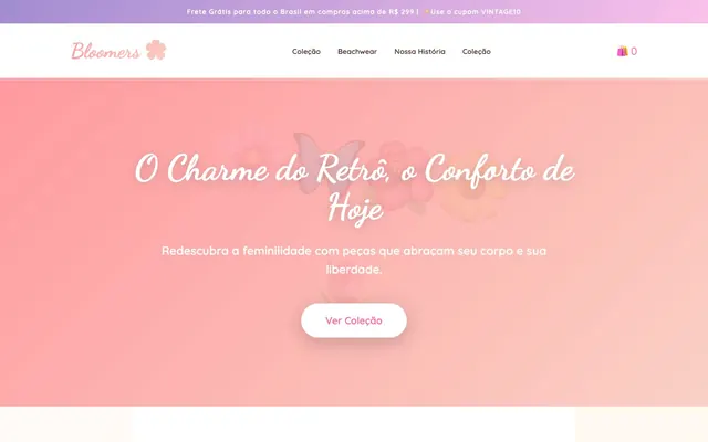
Vintage Blossom Dream: a soft, spacious world of pastel gradients, rounded forms, and flowing script where every element feels gently lifted.
Bloomers evokes a soft, whimsical retro charm through a palette dominated by pastels and warm pinks, accented by a deep, desaturated 'Bloomer Brown' for text. Typography blends a flowing script for headlines with a clean, rounded sans-serif for body text, creating a contrast of playful elegance and clear readability. Components feature heavily rounded corners and subtle, colored shadows that give elements a gentle, lifted appearance, avoiding harshness. The overall aesthetic is light, airy, and feminine, with a spacious layout that emphasizes visual breathing room. Always use 'Bloomer Brown' (#5d4037) for all primary text content to maintain a soft, natural readability. Apply 'Dancing Script' for all headlines and brand elements, using its 700 weight to reinforce the site's retro, elegant atmosphere. Ensure all interactive elements, such as buttons and badges, feature a 50px border-radius for a consistent, soft, and approachable pill-like aesthetic. Utilize linear gradients like 'Sunset Gradient' (linear-gradient(135deg, rgb(255, 154, 158) 0%, rgb(250, 208, 196) 99%, rgb(250, 208, 196) 100%)) as main section backgrounds to emphasize the site's pastel, whimsical identity. Incorporate subtle, 'Blush Pink' shadows (rgba(255, 107, 157, 0.15) 0px 10px 30px 0px) on 'Product Card' components to give them a gentle, lifted appearance without harsh contrasts. Maintain a spacious layout with a maximum content width of 1200px and generous vertical spacing, using '30px' as the default section gap and '20px' for element gaps. Use 'Rose Bloom' (#ff6b9d) sparingly as a functional accent for highlights, badges, and active states, ensuring it stands out against the muted pastel palette. Avoid harsh, high-contrast dark text or backgrounds; 'Bloomer Brown' is the darkest permissible text color. Do not introduce sharp corners or small border-radii; roundedness is key to the brand's soft aesthetic. Refrain from using strong, desaturated grays for backgrounds or text; the system relies on warmer neutrals like 'Bloomer Brown' and 'Whisper Gray'. Do not neglect the subtle shadow effects on components; they are critical for conveying the desired 'gentle lift' and dimensionality. Avoid excessive use of 'Rose Bloom' as a solid background color; its primary role is as an accent or border color to punctuate the design. Do not use generic system fonts for body text or navigation; 'Quicksand' maintains the rounded, friendly feel. Do not create dense, information-heavy sections; prioritize generous spacing and visual breathing room to align with the spacious aesthetic.