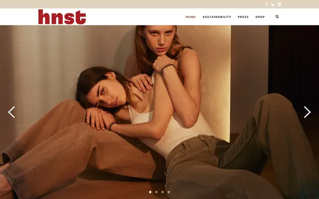
Preview image. Unlock full-res
Warm minimum, strong accent — natural fibers on a stark, bright loom.
Color palette
Brand accent for navigation hovers, headers, and decorative highlights. Its deep hue provides visual weight without being overly aggressive
Subtle accent for navigation hovers, a lighter variant of Crimson
Page backgrounds, critical surfaces, contrast for dark text
Subtle background surfaces, section dividers
Elevated surfaces, decorative backgrounds, badge bases
Primary text, button backgrounds, strong borders
Secondary text, muted links, subtle borders
Light gray text, subtle decorative elements, hairline borders
Typography
- Weights
- 500, 600, 700
- Sizes
- 11px, 13px, 16px, 20px, 62px
- Line height
- 1.15, 1.2, 1.25, 2.27
- Letter spacing
- -0.55px at 11px, -0.819px at 13px, -1.04px at 16px, -1.82px at 20px, -9.548px at 62px
- Fallback
- system-ui
Headings and prominent display text — the higher weights and deliberate letter spacing create a bold, modern voice.
- Weights
- 400, 600, 700
- Sizes
- 12px, 13px, 14px, 15px, 16px
- Line height
- 1.2, 1.67, 1.7, 1.79
- Letter spacing
- -0.2304px at 12px, -0.3003px at 13px, -0.3456px at 14px, -0.3744px at 15px, -0.416px at 16px
- Fallback
- system-ui
Body text, navigation, and detailed information — its wider stance and generous line-height ensure readability in smaller contexts.
Spacing & shape
Components
Solid Graphite background (#0e0e0e) with Canvas text (#ffffff). No border-radius for a stark, confident appearance. Padding is 0px top/bottom, 45px left/right. Font is Raleway at 16px, weight 400.
Transparent background with Canvas text (#ffffff). Used without padding or border-radius, acting as pure text label. Font is Raleway or Poppins, size varies based on context.
Desert Sand background (#eee5d9) with Canvas text (#ffffff). No padding or border-radius, similar to Image Overlay Badge for a clean, integrated look. Font is Raleway or Poppins, size varies.
Ash text (#868686), changing to Rose Blush (#ea9195) or Crimson (#892500) on hover. Underlined on hover with a thin border color. Font is Raleway or Poppins, 16px for primary items, varying for sub-items.
Guidelines
- Use Canvas (#ffffff) sparingly for core backgrounds, defaulting to Soft Mist (#f9f6f2) for primary content areas to maintain warmth.
- Apply Graphite (#0e0e0e) for all primary text and critical interactive elements like button backgrounds.
- Reserve Crimson (#892500) as a strong accent, specifically for interactive states in navigation, strong headlines, or decorative underlines.
- Maintain a zero border-radius for buttons and badges to reinforce the sharp, precise brand identity.
- Prioritize Raleway for body copy and general UI text, emphasizing its generous line height and neutral tracking for readability.
- Avoid using shadows for element elevation; rely on color contrast transitions between Canvas, Soft Mist, and Desert Sand instead.
- Do not introduce additional bright, saturated colors outside the defined Crimson and Rose Blush palette.
- Do not use generic system fonts; always adhere to Poppins for headings and Raleway for body text.
- Avoid tight letter-spacing for body text; Raleway's default open-ness is part of the brand's readability.
- Do not use subtle gradients; the system relies on solid colors and sharp contrasts for definition.
About this system
ShowHide
HNST features a clean, high-contrast aesthetic with a warm off-white canvas and stark black text. A single vivid red accent color draws attention to key brand elements and interactive states, cutting through the otherwise muted palette. Typography balances classic readability with a contemporary, open feel, maintaining a sense of refined utility. Components are minimal, relying on strong borders and generous internal spacing rather than shadows for definition.
This site prominently features lifestyle photography for its hero sections and product photography for showcasing items. Photography is natural, candid, and often high-key, using soft light and muted tones, focusing on human connection or authentic product details rather than stylized glamour. Product shots are typically tight crops, emphasizing texture and form. Imagery serves both decorative atmosphere in hero areas and explanatory content on product pages, occupying significant visual space in alternating text/image sections.
Reminiscent of Everlane, COS, Arket.
# HNST Studio — Style Reference
> Warm minimum, strong accent — natural fibers on a stark, bright loom.

**Theme:** light

**Site:** https://www.letsbehonest.eu

HNST features a clean, high-contrast aesthetic with a warm off-white canvas and stark black text. A single vivid red accent color draws attention to key brand elements and interactive states, cutting through the otherwise muted palette. Typography balances classic readability with a contemporary, open feel, maintaining a sense of refined utility. Components are minimal, relying on strong borders and generous internal spacing rather than shadows for definition.

## Tokens — Colors

| Name | Value | Token | Role |
|------|------|------|------|
| Crimson | `#892500` | `--color-crimson` | Brand accent for navigation hovers, headers, and decorative highlights. Its deep hue provides visual weight without being overly aggressive |
| Rose Blush | `#ea9195` | `--color-rose-blush` | Subtle accent for navigation hovers, a lighter variant of Crimson |
| Canvas | `#ffffff` | `--color-canvas` | Page backgrounds, critical surfaces, contrast for dark text |
| Soft Mist | `#f9f6f2` | `--color-soft-mist` | Subtle background surfaces, section dividers |
| Desert Sand | `#eee5d9` | `--color-desert-sand` | Elevated surfaces, decorative backgrounds, badge bases |
| Graphite | `#0e0e0e` | `--color-graphite` | Primary text, button backgrounds, strong borders |
| Ash | `#868686` | `--color-ash` | Secondary text, muted links, subtle borders |
| Silver | `#b7b7b7` | `--color-silver` | Light gray text, subtle decorative elements, hairline borders |

## Tokens — Typography

### Poppins
- **Substitute:** system-ui
- **Weights:** 500, 600, 700
- **Sizes:** 11px, 13px, 16px, 20px, 62px
- **Line height:** 1.15, 1.2, 1.25, 2.27
- **Letter spacing:** -0.55px at 11px, -0.819px at 13px, -1.04px at 16px, -1.82px at 20px, -9.548px at 62px
- **Role:** Headings and prominent display text — the higher weights and deliberate letter spacing create a bold, modern voice.

### Raleway
- **Substitute:** system-ui
- **Weights:** 400, 600, 700
- **Sizes:** 12px, 13px, 14px, 15px, 16px
- **Line height:** 1.2, 1.67, 1.7, 1.79
- **Letter spacing:** -0.2304px at 12px, -0.3003px at 13px, -0.3456px at 14px, -0.3744px at 15px, -0.416px at 16px
- **Role:** Body text, navigation, and detailed information — its wider stance and generous line-height ensure readability in smaller contexts.

## Tokens — Type Scale

| Role | Size | Line height | Letter spacing |
|------|------|------|------|
| caption | 11px | 1.25 | 0.55px |
| heading | 20px | 1.2 | 1.82px |
| display | 62px | 1.15 | 9.548px |

## Tokens — Spacing

- **Section gap:** 75px
- **Card padding:** 42px
- **Element gap:** 15px

## Tokens — Radius

- **Buttons:** 0px
- **Cards:** 10px
- **badges:** 0px

## Imagery

This site prominently features lifestyle photography for its hero sections and product photography for showcasing items. Photography is natural, candid, and often high-key, using soft light and muted tones, focusing on human connection or authentic product details rather than stylized glamour. Product shots are typically tight crops, emphasizing texture and form. Imagery serves both decorative atmosphere in hero areas and explanatory content on product pages, occupying significant visual space in alternating text/image sections.

## Components

### Primary Filled Button
*Call to action button*

Solid Graphite background (#0e0e0e) with Canvas text (#ffffff). No border-radius for a stark, confident appearance. Padding is 0px top/bottom, 45px left/right. Font is Raleway at 16px, weight 400.

### Image Overlay Badge
*Informational overlay on images*

Transparent background with Canvas text (#ffffff). Used without padding or border-radius, acting as pure text label. Font is Raleway or Poppins, size varies based on context.

### Product Category Badge
*Categorization tag for products*

Desert Sand background (#eee5d9) with Canvas text (#ffffff). No padding or border-radius, similar to Image Overlay Badge for a clean, integrated look. Font is Raleway or Poppins, size varies.

### Navigation Link
*Main navigation item*

Ash text (#868686), changing to Rose Blush (#ea9195) or Crimson (#892500) on hover. Underlined on hover with a thin border color. Font is Raleway or Poppins, 16px for primary items, varying for sub-items.

## Guidelines

### Do

- Use Canvas (#ffffff) sparingly for core backgrounds, defaulting to Soft Mist (#f9f6f2) for primary content areas to maintain warmth.
- Apply Graphite (#0e0e0e) for all primary text and critical interactive elements like button backgrounds.
- Reserve Crimson (#892500) as a strong accent, specifically for interactive states in navigation, strong headlines, or decorative underlines.
- Maintain a zero border-radius for buttons and badges to reinforce the sharp, precise brand identity.
- Prioritize Raleway for body copy and general UI text, emphasizing its generous line height and neutral tracking for readability.

### Don't

- Avoid using shadows for element elevation; rely on color contrast transitions between Canvas, Soft Mist, and Desert Sand instead.
- Do not introduce additional bright, saturated colors outside the defined Crimson and Rose Blush palette.
- Do not use generic system fonts; always adhere to Poppins for headings and Raleway for body text.
- Avoid tight letter-spacing for body text; Raleway's default open-ness is part of the brand's readability.
- Do not use subtle gradients; the system relies on solid colors and sharp contrasts for definition.

## Agent Prompt Guide

Quick Color Reference:
text: #0e0e0e
background: #f9f6f2
border: #868686
accent: #892500
primary action: #0e0e0e (filled action)

3-5 Example Component Prompts:
Create a product listing card: Desert Sand background (#eee5d9), 10px radius. Use Raleway 16px weight 400 for product name (#0e0e0e) and Raleway 14px weight 400 for price (#868686). Add a 'Buy now' button (#0e0e0e background, #ffffff text, 0px radius, 0px 45px padding).

Generate a hero section with a full-bleed background image. Overlay a Poppins 62px weight 700 headline in Canvas text (#ffffff) with letter spacing -9.548px. Beneath the headline, add a small info badge on a Desert Sand background (#eee5d9) with Canvas text (#ffffff).

Design a navigation bar: Canvas background (#ffffff), main links are Raleway 16px weight 400 in Ash (#868686). On hover, link color changes to Rose Blush (#ea9195) with a 1px Crimson (#892500) bottom border.

Create a feature section: Soft Mist background (#f9f6f2). Use a two-column layout with a large image on the left. On the right, a Poppins 20px weight 600 heading in Graphite (#0e0e0e) letter spacing -1.82px, followed by Raleway 15px weight 400 body text in Ash (#868686), with 15px element spacing.
More like this
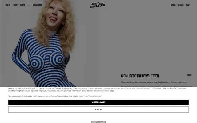









Keep what you find
A free account saves references to boards and can send you a weekly email of picks based on what you save.
To see every result, go Pro.