Preview image. Unlock full-res
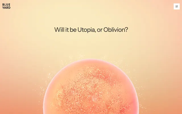
Soft-focus intellectual ether.
Color palette
Accent for themed content cards, signaling a specific category. Its warm, muted quality integrates rather than shouts
Accent for themed content cards, providing a cool, understated categorization
Accent for themed content cards, a vivid yet soft indicator for categorization
Accent for themed content cards, a cool, barely-there tint for specific categories
Accent for themed content cards, hinting at a category with a cool, subtle hue
Primary text, core iconography, subdued borders for cards and navigation elements. Its near-black depth offers contrast without harshness against softer backgrounds
Secondary text, subtle borders, and placeholder content. This deeper gray provides necessary hierarchy without overpowering the primary text
Background for primary content areas, cards, and interactive elements. Its purity serves as a foundation for other delicate hues
Subtle background for secondary sections and borders, offering a slight visual break from pure white surfaces
Typography
- Weights
- 400, 500
- Sizes
- 12px, 24px, 48px, 54px
- Line height
- 1, 1.2, 1.5
- Letter spacing
- -1.44, -1.62, -0.72, -0.36
- Fallback
- Inter
The sole typeface, used across all elements from headings to body text. Its clean, geometric sans-serif subtly counters the organic page gradients, providing a grounded clarity. The variable letter-spacing for larger sizes enhances its precise character.
Spacing & shape
Components
Minimal square button with an icon, `backgroundColor: #ffffff`, `color: #090b11`, and `border-radius: 0px`.
Transparent background, `#090b11` text color with `opacity: 0.8`. `border-radius: 0px`.
`background: transparent`, `border-radius: 0px`, no shadow. Used for subtle content grouping and layout.
`background: #ffffff`, `border-radius: 0px`, no shadow, `padding: 0px`.
`background: #ffcf9e`, text `color: #090b11`, `padding: 8px 12px`, `border-radius: 0px`.
`background: #e3a2ef`, text `color: #090b11`, `padding: 8px 12px`, `border-radius: 0px`.
Guidelines
- Maintain zero border-radius for all interface elements and content cards to reinforce the crisp, structured appearance.
- Utilize Instrument Sans exclusively across all text elements, varying size and weight as defined in the typography section, to uphold typographic consistency.
- Employ the muted accent colors (#ffcf9, #babfff, #e3a2ef, #bfe0f7, #8ceae4) only for thematic content categorization, such as card backgrounds, avoiding their use for primary active states or calls to action.
- Prioritize transparent or white backgrounds for card elements, with `12px` padding where applicable, to maintain a light, airy feel.
- Ensure all primary headings use Instrument Sans at `48px` or `54px` with negative letter-spacing (`-1.44px` or `-1.62px`) for a precise, refined look.
- Structure page sections with a `60px` vertical gap, opting for seamless transitions or subtle background shifts instead of heavy dividers.
- Apply `:last-child { margin-bottom: 0 }` to avoid excessive trailing space within content blocks and carousels, promoting a tidy finish.
- Do not introduce rounded corners; all elements must maintain `0px` border-radius.
- Avoid bold or highly saturated colors for calls to action or primary interactive states; maintain a neutral or ghost aesthetic for interactive elements.
- Refrain from using drop shadows or heavy elevation styles; surfaces should remain flat or rely on subtle background gradients for depth.
- Do not deviate from the Instrument Sans typeface or introduce additional font families.
- Do not use explicit borders on cards or primary content blocks unless it's a specific categorical indicator with a muted accent color.
- Avoid large, impactful hero images; prioritize abstract gradients or large typography in hero sections.
- Do not use letter-spacing: normal for headlines or display text; actively use negative letter-spacing for larger type sizes.
About this system
ShowHide
BlueYard employs a subdued, almost ethereal visual language, combining soft, desaturated background gradients with sharp, low-contrast text. This creates a contemplative distance, positioning content as abstract concepts rather than immediate tasks. The color palette is driven by nuanced, muted accents primarily used for content categorization, lending a subtle, academic feeling to information blocks. Typography is spare and precise, reinforcing an impression of rigor and thoughtfulness, rather than bold proclamations.
The page primarily uses a full-bleed layout, stretching content edges to the viewport, particularly for the hero and section backgrounds. Content within these full-bleed sections is centrally aligned, featuring a large, centered headline over an abstract visual. Sections have a consistent vertical rhythm established by `60px` gaps. Content arrangements often involve a centered stack of information, with implicit grids for feature or portfolio items. Navigation is a minimal top-right hamburger icon, suggesting content focus over complex site structure.
Imagery is minimal and abstract, dominated by sophisticated 3D renders of spherical, ethereal objects with subtle glittering textures set against soft, gradient backgrounds. Photography is absent. Icons are typically simple, monochromatic, and have a thin stroke weight. The primary role of visuals is decorative atmosphere and conceptual framing rather than direct explanation or product demonstration. The density is image-light, with visual elements serving as large, soft focal points rather than numerous small details.
Reminiscent of OpenAI, Stripe, Arc Browser, OtherSide.
# BlueYard Capital — Style Reference
> Soft-focus intellectual ether.

**Theme:** light

**Site:** https://www.blueyard.com

BlueYard employs a subdued, almost ethereal visual language, combining soft, desaturated background gradients with sharp, low-contrast text. This creates a contemplative distance, positioning content as abstract concepts rather than immediate tasks. The color palette is driven by nuanced, muted accents primarily used for content categorization, lending a subtle, academic feeling to information blocks. Typography is spare and precise, reinforcing an impression of rigor and thoughtfulness, rather than bold proclamations.

## Tokens — Colors

| Name | Value | Token | Role |
|------|------|------|------|
| Sunken Gold | `#ffcf9e` | `--color-sunken-gold` | Accent for themed content cards, signaling a specific category. Its warm, muted quality integrates rather than shouts |
| Cloud Indigo | `#babfff` | `--color-cloud-indigo` | Accent for themed content cards, providing a cool, understated categorization |
| Amethyst Haze | `#e3a2ef` | `--color-amethyst-haze` | Accent for themed content cards, a vivid yet soft indicator for categorization |
| Sky Veil | `#bfe0f7` | `--color-sky-veil` | Accent for themed content cards, a cool, barely-there tint for specific categories |
| Ocean Whisper | `#8ceae4` | `--color-ocean-whisper` | Accent for themed content cards, hinting at a category with a cool, subtle hue |
| Ink | `#090b11` | `--color-ink` | Primary text, core iconography, subdued borders for cards and navigation elements. Its near-black depth offers contrast without harshness against softer backgrounds |
| Graphite | `#3a3a3e` | `--color-graphite` | Secondary text, subtle borders, and placeholder content. This deeper gray provides necessary hierarchy without overpowering the primary text |
| Canvas White | `#ffffff` | `--color-canvas-white` | Background for primary content areas, cards, and interactive elements. Its purity serves as a foundation for other delicate hues |
| Pale Mist | `#b5b0b0` | `--color-pale-mist` | Subtle background for secondary sections and borders, offering a slight visual break from pure white surfaces |

## Tokens — Typography

### Instrument Sans
- **Substitute:** Inter
- **Weights:** 400, 500
- **Sizes:** 12px, 24px, 48px, 54px
- **Line height:** 1, 1.2, 1.5
- **Letter spacing:** -1.44, -1.62, -0.72, -0.36
- **Role:** The sole typeface, used across all elements from headings to body text. Its clean, geometric sans-serif subtly counters the organic page gradients, providing a grounded clarity. The variable letter-spacing for larger sizes enhances its precise character.

## Tokens — Type Scale

Golden Ratio (1.618) from 24px base.

| Role | Size | Line height | Letter spacing |
|------|------|------|------|
| caption | 12px | 1.5 | -0.36px |
| body | 24px | 1.5 | -0.72px |
| heading | 48px | 1.2 | -1.44px |
| display | 54px | 1 | -1.62px |

## Tokens — Spacing

- **Section gap:** 60px
- **Card padding:** 12px
- **Element gap:** 5px

## Tokens — Radius

- **Buttons:** 0px
- **Inputs:** 0px
- **Cards:** 0px
- **Images:** 0px
- **tags:** 0px

## Layout

The page primarily uses a full-bleed layout, stretching content edges to the viewport, particularly for the hero and section backgrounds. Content within these full-bleed sections is centrally aligned, featuring a large, centered headline over an abstract visual. Sections have a consistent vertical rhythm established by `60px` gaps. Content arrangements often involve a centered stack of information, with implicit grids for feature or portfolio items. Navigation is a minimal top-right hamburger icon, suggesting content focus over complex site structure.

## Imagery

Imagery is minimal and abstract, dominated by sophisticated 3D renders of spherical, ethereal objects with subtle glittering textures set against soft, gradient backgrounds. Photography is absent. Icons are typically simple, monochromatic, and have a thin stroke weight. The primary role of visuals is decorative atmosphere and conceptual framing rather than direct explanation or product demonstration. The density is image-light, with visual elements serving as large, soft focal points rather than numerous small details.

## Components

### Primary Navigation Button
*The main menu toggle.*

Minimal square button with an icon, `backgroundColor: #ffffff`, `color: #090b11`, and `border-radius: 0px`.

### Text Only Button (Ghost)
*Used for secondary actions or navigation links with minimal visual weight.*

Transparent background, `#090b11` text color with `opacity: 0.8`. `border-radius: 0px`.

### Content Card - Default
*A neutral container for various content blocks.*

`background: transparent`, `border-radius: 0px`, no shadow. Used for subtle content grouping and layout.

### Content Card - Canvas
*A base card for information presentation.*

`background: #ffffff`, `border-radius: 0px`, no shadow, `padding: 0px`.

### Category Tag - Sunken Gold
*Categorization tag for content blocks.*

`background: #ffcf9e`, text `color: #090b11`, `padding: 8px 12px`, `border-radius: 0px`.

### Category Tag - Amethyst Haze
*Categorization tag for content blocks.*

`background: #e3a2ef`, text `color: #090b11`, `padding: 8px 12px`, `border-radius: 0px`.

## Guidelines

### Do

- Maintain zero border-radius for all interface elements and content cards to reinforce the crisp, structured appearance.
- Utilize Instrument Sans exclusively across all text elements, varying size and weight as defined in the typography section, to uphold typographic consistency.
- Employ the muted accent colors (#ffcf9, #babfff, #e3a2ef, #bfe0f7, #8ceae4) only for thematic content categorization, such as card backgrounds, avoiding their use for primary active states or calls to action.
- Prioritize transparent or white backgrounds for card elements, with `12px` padding where applicable, to maintain a light, airy feel.
- Ensure all primary headings use Instrument Sans at `48px` or `54px` with negative letter-spacing (`-1.44px` or `-1.62px`) for a precise, refined look.
- Structure page sections with a `60px` vertical gap, opting for seamless transitions or subtle background shifts instead of heavy dividers.
- Apply `:last-child { margin-bottom: 0 }` to avoid excessive trailing space within content blocks and carousels, promoting a tidy finish.

### Don't

- Do not introduce rounded corners; all elements must maintain `0px` border-radius.
- Avoid bold or highly saturated colors for calls to action or primary interactive states; maintain a neutral or ghost aesthetic for interactive elements.
- Refrain from using drop shadows or heavy elevation styles; surfaces should remain flat or rely on subtle background gradients for depth.
- Do not deviate from the Instrument Sans typeface or introduce additional font families.
- Do not use explicit borders on cards or primary content blocks unless it's a specific categorical indicator with a muted accent color.
- Avoid large, impactful hero images; prioritize abstract gradients or large typography in hero sections.
- Do not use letter-spacing: normal for headlines or display text; actively use negative letter-spacing for larger type sizes.

## Agent Prompt Guide

Quick Color Reference: text: #090b11, background: #ffffff, border: #3a3a3e (for subdued elements), accent: #ffcf9e, primary action: no distinct CTA color

Example Component Prompts:
1. Create a Hero Section: Full-bleed soft gradient background from top-left #ffcf9e to bottom-right #babfff. Center a headline 'Will it be Utopia, or Oblivion?' using Instrument Sans, `size: 54px`, `weight: 500`, `color: #090b11`, `letter-spacing: -1.62px`.
2. Design a Category Card: `background: #e3a2ef`, `padding: 8px 12px`, `border-radius: 0px`. Inside, display a text label 'Biology & Chemistry' in Instrument Sans, `size: 12px`, `weight: 400`, `color: #090b11`.
3. Implement a Ghost Navigation Link: Text 'Back to home page' in Instrument Sans, `size: 24px`, `weight: 400`, `color: rgba(9, 11, 17, 0.8)`. No background or border, `border-radius: 0px`.
More like this









Keep what you find
A free account saves references to boards and can send you a weekly email of picks based on what you save.
To see every result, go Pro.