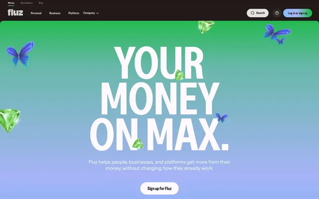
Preview image. Unlock full-res
Vivid gradient playground
Color palette
Primary action background, strong text, link borders, and decorative accents. This near-black red provides a bold, dominant presence
Primary hero background, creating a dynamic and expansive visual field. This gradient sets an energetic and inviting tone
A variant of the hero gradient, for vertical applications or specific sections requiring a similar chromatic blend
Rich, dark background for sections that need maximum contrast and depth
Background for feature cards, providing a soft, expansive feel
Dark borders and separators for elevated surfaces and inverted UI. Do not promote it to the primary CTA color
Main page background, content surfaces, button text, and base for overlays
Subtle secondary background for cards or section breaks, providing visual texture
Hover states, subtle borders, and background for ghost buttons
Dark borders and separators for elevated surfaces and inverted UI. Do not promote it to the primary CTA color
Deep background for certain sections, giving a rich, dark contrast
Muted body text and secondary information, maintaining hierarchy without stark contrast
Helper text and descriptive paragraphs, offering a gentler readability
Typography
- Weights
- 400, 700
- Sizes
- 16px, 17px, 20px
- Line height
- 1.4, 1.45, 1.5
- Fallback
- Inter
General body text, navigation elements, and card text. Provides a clean, readable contrast to the condensed headings.
- Weights
- 400, 700
- Sizes
- 16px, 24px
- Line height
- 1.17, 1.25, 1.5
- Letter spacing
- -0.030em, -0.025em, -0.020em, -0.019em, -0.005em
- Fallback
- Bebas Neue
Primary headings and display text, used at large sizes with tight letter spacing for maximum impact and a bold, declarative statement.
- Weights
- 400, 700
- Sizes
- 16px, 24px
- Line height
- 1.17, 1.25, 1.5
- Letter spacing
- -0.0160em
- Fallback
- Bebas Neue
Subheadings and section titles, supporting the condensed style with slightly looser tracking.
- Weights
- 400, 700
- Sizes
- 11px, 14px
- Line height
- 1.27, 1.29
- Fallback
- Public Sans
Metadata, captions, and smaller interface labels.
- Weights
- 400
- Sizes
- 13px
- Line height
- 1.2
- Fallback
- Arial
System default for utilitarian elements like legal text or form labels, ensuring accessibility.
- Weights
- 700
- Sizes
- 18px, 20px, 32px, 42px, 64px, 96px, 203px
- Line height
- 0.79, 0.91, 1, 1.15, 1.2, 1.33
- Letter spacing
- -0.025, -0.02, -0.019, -0.005
Greed Condensed SemiBold — detected in extracted data but not described by AI
- Weights
- 600, 700
- Sizes
- 15px, 54px
- Line height
- 0.92, 1.6
- Letter spacing
- -0.03
Greed SemiBold — detected in extracted data but not described by AI
- Weights
- 700
- Sizes
- 11px
- Line height
- 1.4
Area-Extrabold — detected in extracted data but not described by AI
Spacing & shape
Components
Filled with Money Max Black (#1a0000), white text (#ffffff), 200px border-radius, 16px vertical padding, 32px horizontal padding. This creates a distinct, pill-shaped button.
Transparent background (rgba(0,0,0,0)), text and 1px border in Forest Noir (#222624, implied from raw data #161616), 100px border-radius, 8px vertical padding, 18px horizontal padding. A subtle, rounded button for less prominent actions.
Background in Light Cloud (#ededec), text in Money Max Black (#1a0000), 100px border-radius, 8px vertical padding, 16px horizontal padding. Used for buttons that need less emphasis.
Transparent background (rgba(0,0,0,0)), 20px border-radius, generous 36px padding on top, right, and left, with 0px bottom padding. Focuses on content presentation without a contained background.
Transparent background (rgba(0,0,0,0)), 0px border-radius, no padding. Used for full-bleed imagery or dynamic content blocks where the image defines the card shape.
Background in Sky Blue (#98bbf4), 40px top and bottom border-radius with 0px side radius, 65px vertical padding, 40px horizontal padding. Creates a prominent, soft-edged container for hero content.
Guidelines
- Use Greed Condensed SemiBold 700 with letter spacing from -0.030em to -0.005em for all prominent headings to maintain high impact.
- Apply 200px border-radius to all primary action buttons for a consistent pill-shaped appearance.
- Utilize the Hero Gradient Green to Blue for primary hero sections, ensuring a dynamic and brand-aligned background.
- Structure major page sections with a 40px section gap for comfortable breathing room.
- Employ Money Max Black (#1a0000) for all primary text elements to ensure strong contrast and brand recognition.
- Use a Light Cloud (#ededec) background for ghost buttons and subtle interactive elements.
- Maintain a 1750px pageMaxWidth for horizontal content containment, creating a wide but controlled layout experience.
- Avoid sharp corners; ensure all containers, cards, and buttons use a minimum 20px radius unless specifically constrained by imagery.
- Do not use generic system fonts for display headings; always prioritize Greed Condensed SemiBold or its substitutes for brand consistency.
- Refrain from using overly high-contrast borders on cards; prefer soft or transparent backgrounds with subtle elevation for depth.
- Do not introduce new primary action colors; stick to Money Max Black (#1a0000) for filled buttons and Forest Noir (#11190c) for outlined buttons.
- Avoid dense packing of elements; maintain at least 5px for element gaps to preserve readability and visual comfort.
- Do not use subtle, muted colors for primary calls to action; these should always be bold and clear using Money Max Black.
- Do not alter the tight letter spacing of Greed Condensed SemiBold for headlines; it is integral to its visual impact.
About this system
ShowHide
Fluz employs a vibrant, energetic visual style, characterized by bold, condensed typography on gradients with floating illustrative elements. The UI balances strong, dark text against light or gradient backgrounds, emphasizing action and impact. Components are designed with soft, rounded edges and prioritize clear calls to action, maintaining a playful yet assertive tone.
Reminiscent of Revolut, Cash App, Chime.
# Fluz — Style Reference
> Vivid gradient playground

**Theme:** light

**Site:** https://fluz.app/us

Fluz employs a vibrant, energetic visual style, characterized by bold, condensed typography on gradients with floating illustrative elements. The UI balances strong, dark text against light or gradient backgrounds, emphasizing action and impact. Components are designed with soft, rounded edges and prioritize clear calls to action, maintaining a playful yet assertive tone.

## Tokens — Colors

| Name | Value | Token | Role |
|------|------|------|------|
| Money Max Black | `#1a0000` | `--color-money-max-black` | Primary action background, strong text, link borders, and decorative accents. This near-black red provides a bold, dominant presence |
| Hero Gradient Green to Blue | `#82befe` | `--color-hero-gradient-green-to-blue` | Primary hero background, creating a dynamic and expansive visual field. This gradient sets an energetic and inviting tone |
| Hero Gradient Vertical | `#7db4f4` | `--color-hero-gradient-vertical` | A variant of the hero gradient, for vertical applications or specific sections requiring a similar chromatic blend |
| Dark Gradient Background | `#262221` | `--color-dark-gradient-background` | Rich, dark background for sections that need maximum contrast and depth |
| Sky Blue | `#98bbf4` | `--color-sky-blue` | Background for feature cards, providing a soft, expansive feel |
| Forest Noir | `#11190c` | `--color-forest-noir` | Dark borders and separators for elevated surfaces and inverted UI. Do not promote it to the primary CTA color |
| Canvas White | `#ffffff` | `--color-canvas-white` | Main page background, content surfaces, button text, and base for overlays |
| Mist Gray | `#f2f2f2` | `--color-mist-gray` | Subtle secondary background for cards or section breaks, providing visual texture |
| Light Cloud | `#ededec` | `--color-light-cloud` | Hover states, subtle borders, and background for ghost buttons |
| Iron Slate | `#3a3a3a` | `--color-iron-slate` | Dark borders and separators for elevated surfaces and inverted UI. Do not promote it to the primary CTA color |
| Onyx Shadow | `#221919` | `--color-onyx-shadow` | Deep background for certain sections, giving a rich, dark contrast |
| Subtle Ash | `#514f4c` | `--color-subtle-ash` | Muted body text and secondary information, maintaining hierarchy without stark contrast |
| Pebble Gray | `#aeaea6` | `--color-pebble-gray` | Helper text and descriptive paragraphs, offering a gentler readability |

## Tokens — Typography

### Area Semibold
- **Substitute:** Inter
- **Weights:** 400, 700
- **Sizes:** 16px, 17px, 20px
- **Line height:** 1.4, 1.45, 1.5
- **Role:** General body text, navigation elements, and card text. Provides a clean, readable contrast to the condensed headings.

### Greed Condensed SemiBold
- **Substitute:** Bebas Neue
- **Weights:** 400, 700
- **Sizes:** 16px, 24px
- **Line height:** 1.17, 1.25, 1.5
- **Letter spacing:** -0.030em, -0.025em, -0.020em, -0.019em, -0.005em
- **Role:** Primary headings and display text, used at large sizes with tight letter spacing for maximum impact and a bold, declarative statement.

### Greed-CondensedSemiBold
- **Substitute:** Bebas Neue
- **Weights:** 400, 700
- **Sizes:** 16px, 24px
- **Line height:** 1.17, 1.25, 1.5
- **Letter spacing:** -0.0160em
- **Role:** Subheadings and section titles, supporting the condensed style with slightly looser tracking.

### Greed-SemiBold
- **Substitute:** Public Sans
- **Weights:** 400, 700
- **Sizes:** 11px, 14px
- **Line height:** 1.27, 1.29
- **Role:** Metadata, captions, and smaller interface labels.

### Arial
- **Substitute:** Arial
- **Weights:** 400
- **Sizes:** 13px
- **Line height:** 1.2
- **Role:** System default for utilitarian elements like legal text or form labels, ensuring accessibility.

### Greed Condensed SemiBold
- **Weights:** 700
- **Sizes:** 18px, 20px, 32px, 42px, 64px, 96px, 203px
- **Line height:** 0.79, 0.91, 1, 1.15, 1.2, 1.33
- **Letter spacing:** -0.025, -0.02, -0.019, -0.005
- **Role:** Greed Condensed SemiBold — detected in extracted data but not described by AI

### Greed SemiBold
- **Weights:** 600, 700
- **Sizes:** 15px, 54px
- **Line height:** 0.92, 1.6
- **Letter spacing:** -0.03
- **Role:** Greed SemiBold — detected in extracted data but not described by AI

### Area-Extrabold
- **Weights:** 700
- **Sizes:** 11px
- **Line height:** 1.4
- **Role:** Area-Extrabold — detected in extracted data but not described by AI

## Tokens — Type Scale

Augmented Fourth (1.414) from 16px base.

| Role | Size | Line height | Letter spacing |
|------|------|------|------|
| caption | 11px | 1.4 | — |
| body-sm | 14px | 1.29 | — |
| body | 16px | 1.4 | — |
| subheading | 24px | 1.25 | -0.016em |
| heading | 42px | 1.15 | -0.025em |
| heading-lg | 64px | 1 | -0.025em |
| display | 96px | 0.91 | -0.025em |

## Tokens — Spacing

- **Max width:** 1750px
- **Section gap:** 40px
- **Card padding:** 20px
- **Element gap:** 5px

## Tokens — Radius

- **Buttons:** 100px
- **Cards:** 20px
- **Images:** 20px

## Components

### Primary Action Button
*High-impact call to action*

Filled with Money Max Black (#1a0000), white text (#ffffff), 200px border-radius, 16px vertical padding, 32px horizontal padding. This creates a distinct, pill-shaped button.

### Outline Ghost Button
*Secondary or tertiary action*

Transparent background (rgba(0,0,0,0)), text and 1px border in Forest Noir (#222624, implied from raw data #161616), 100px border-radius, 8px vertical padding, 18px horizontal padding. A subtle, rounded button for less prominent actions.

### Light Muted Button
*Informational or inactive states*

Background in Light Cloud (#ededec), text in Money Max Black (#1a0000), 100px border-radius, 8px vertical padding, 16px horizontal padding. Used for buttons that need less emphasis.

### Floating Content Card
*Showcasing features or content blocks*

Transparent background (rgba(0,0,0,0)), 20px border-radius, generous 36px padding on top, right, and left, with 0px bottom padding. Focuses on content presentation without a contained background.

### Product Display Card
*Presenting product visuals*

Transparent background (rgba(0,0,0,0)), 0px border-radius, no padding. Used for full-bleed imagery or dynamic content blocks where the image defines the card shape.

### Hero Section Callout Card
*Primary informational sections requiring visual distinction*

Background in Sky Blue (#98bbf4), 40px top and bottom border-radius with 0px side radius, 65px vertical padding, 40px horizontal padding. Creates a prominent, soft-edged container for hero content.

## Guidelines

### Do

- Use Greed Condensed SemiBold 700 with letter spacing from -0.030em to -0.005em for all prominent headings to maintain high impact.
- Apply 200px border-radius to all primary action buttons for a consistent pill-shaped appearance.
- Utilize the Hero Gradient Green to Blue for primary hero sections, ensuring a dynamic and brand-aligned background.
- Structure major page sections with a 40px section gap for comfortable breathing room.
- Employ Money Max Black (#1a0000) for all primary text elements to ensure strong contrast and brand recognition.
- Use a Light Cloud (#ededec) background for ghost buttons and subtle interactive elements.
- Maintain a 1750px pageMaxWidth for horizontal content containment, creating a wide but controlled layout experience.

### Don't

- Avoid sharp corners; ensure all containers, cards, and buttons use a minimum 20px radius unless specifically constrained by imagery.
- Do not use generic system fonts for display headings; always prioritize Greed Condensed SemiBold or its substitutes for brand consistency.
- Refrain from using overly high-contrast borders on cards; prefer soft or transparent backgrounds with subtle elevation for depth.
- Do not introduce new primary action colors; stick to Money Max Black (#1a0000) for filled buttons and Forest Noir (#11190c) for outlined buttons.
- Avoid dense packing of elements; maintain at least 5px for element gaps to preserve readability and visual comfort.
- Do not use subtle, muted colors for primary calls to action; these should always be bold and clear using Money Max Black.
- Do not alter the tight letter spacing of Greed Condensed SemiBold for headlines; it is integral to its visual impact.

## Agent Prompt Guide

Quick Color Reference:
text: #1a0000
background: #ffffff
border: #ededec
accent: #98bbf4
primary action: #1a0000 (filled action)

Example Component Prompts:
1. Create a Primary Action Button: Money Max Black background (#1a0000), Canvas White text (#ffffff), 200px radius, 16px vertical padding, 32px horizontal padding.
2. Create a Product Display Card: transparent background, 0px radius, with an embedded full-bleed image and no padding.
3. Create a Hero Section Headline: 'YOUR MONEY ON MAX.' using Greed Condensed SemiBold 700 at 96px, letter-spacing -0.025em, Canvas White text (#ffffff), centered over the Hero Gradient Green to Blue background.
4. Create an Outline Ghost Button: transparent background (rgba(0,0,0,0)), Forest Noir text (#11190c, or #161616 if used for border), 100px radius, 8px vertical padding, 18px horizontal padding, with a 1px Forest Noir border.
More like this









Keep what you find
A free account saves references to boards and can send you a weekly email of picks based on what you save.
To see every result, go Pro.