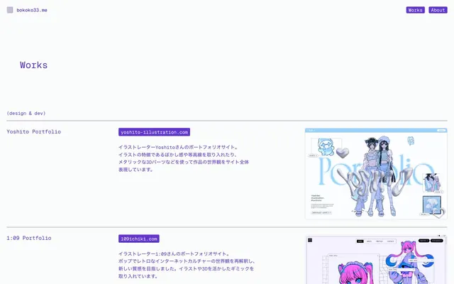
Preview image. Unlock full-res
Monospace grid on a violet canvas
Color palette
Primary text color for headings and body text, with a deep purple hue that retains legibility
Interactive link backgrounds and borders, providing a distinct active state contrast. Also used for the dominant canvas background in some sections
Page background, providing a subtle off-white base
Hairline borders and muted separators, creating a delicate visual division
Light text on dark surfaces, inverse labels, and high-contrast captions. Do not promote it to the primary CTA color
Typography
- Weights
- 400, 500
- Sizes
- 15px, 17px, 30px
- Line height
- 1.3, 1.5, 1.6
- Letter spacing
- normal
- Fallback
- Space Mono, Fira Code
The primary typeface for all content, including headings, body text, and navigation. Its monospace nature provides a consistent, technical aesthetic and uniform line rhythm.
Spacing & shape
Components
Text in Twilight Violet, Geist Mono regular, 3.16px border-radius, 6px horizontal padding. On hover/active, a Link Grape background with Frost White text, indicating selection.
Transparent background with no boxShadow detected. Uses 23.61px vertical padding and 0px horizontal padding, with a 1px solid Subtle Lavender border. Content is aligned to a grid line, not contained by internal padding.
Background is Link Grape with Frost White text, 3.16px border-radius and 6px horizontal padding. Font is Geist Mono regular.
Text in Twilight Violet, Geist Mono regular, no explicit background or border, minimal padding.
Guidelines
- Use Twilight Violet (#5a2fc3) for all primary body text and headings.
- Apply Geist Mono for all typographic elements, maintaining normal letter-spacing.
- Wrap interactive links with a Link Grape (#6135d0) background and Frost White (#ffffff) text to signify action.
- Reinforce interactive states and element boundaries using 1px borders of Subtle Lavender (#dad3f1).
- Maintain generous vertical spacing between sections, using a sectionGap of 142px.
- Apply a 3.16px border-radius consistently to all interactive elements like links and buttons.
- Use Canvas Fog (#fafcfc) as the general page background color.
- Avoid using any form of boxShadow or drop-shadow on elements; elevation is not part of this visual system.
- Do not introduce gradients; the system relies on solid color fills for all elements.
- Do not use highly saturated colors for decorative elements; restrict vibrant color primarily to interactive link backgrounds.
- Avoid heavy borders or solid fills for general cards; they should remain transparent with subtle borders.
- Do not vary letter-spacing for different type sizes; keep it at normal across the board.
- Do not use rounded corners beyond 5.27px; the system prefers subtle rounding or sharp edges.
About this system
ShowHide
The bokoko33.me system presents a sparse, structured portfolio space, utilizing a near-monochrome palette with a single vibrant violet to delineate interactive elements and accents. Typography is compact and precise, favoring a monospace font that lends a technical, direct feel. Components are extremely lightweight, largely relying on subtle borders and minimal padding rather than heavy fills or shadows. The overall impression is one of uncluttered professional directness, where visual focus is drawn by clear information hierarchy and discrete points of color.
The page exhibits a content-contained model, with a visual maximum width (though not explicitly constrained by a single `pageMaxWidth` value, content appears to align centrally). The hero section is minimal, acting as a clear title area. Content areas follow a consistent vertical rhythm with significant spacing between sections (142px), creating a breathable, sparse composition. Projects are presented in a two-column grid-like structure, with text descriptions to the left and project visuals to the right. There are no alternating background bands, maintaining a consistent Canvas Fog background throughout. Navigation is a simple top-right minimalist link list, repeated in a footer.
The site's imagery consists primarily of product screenshots or contained visual representations of websites/projects, showcased within a visual frame. Images appear flat and contained without overlapping elements or raw edges. There are no full-bleed photographs or illustrations; the focus is on displaying the work itself in a structured, almost technical manner. Icons, if present, are minimal and likely outlined to match the system's lightweight aesthetic. Imagery serves primarily as direct content showcase rather than decorative atmosphere.
Reminiscent of Fey, Blinkist, Linear, Savon.
# bokoko33.me — Style Reference
> Monospace grid on a violet canvas

**Theme:** light

**Site:** https://bokoko33.me

The bokoko33.me system presents a sparse, structured portfolio space, utilizing a near-monochrome palette with a single vibrant violet to delineate interactive elements and accents. Typography is compact and precise, favoring a monospace font that lends a technical, direct feel. Components are extremely lightweight, largely relying on subtle borders and minimal padding rather than heavy fills or shadows. The overall impression is one of uncluttered professional directness, where visual focus is drawn by clear information hierarchy and discrete points of color.

## Tokens — Colors

| Name | Value | Token | Role |
|------|------|------|------|
| Twilight Violet | `#5a2fc3` | `--color-twilight-violet` | Primary text color for headings and body text, with a deep purple hue that retains legibility |
| Link Grape | `#6135d0` | `--color-link-grape` | Interactive link backgrounds and borders, providing a distinct active state contrast. Also used for the dominant canvas background in some sections |
| Canvas Fog | `#fafcfc` | `--color-canvas-fog` | Page background, providing a subtle off-white base |
| Subtle Lavender | `#dad3f1` | `--color-subtle-lavender` | Hairline borders and muted separators, creating a delicate visual division |
| Frost White | `#ffffff` | `--color-frost-white` | Light text on dark surfaces, inverse labels, and high-contrast captions. Do not promote it to the primary CTA color |

## Tokens — Typography

### Geist Mono
- **Substitute:** Space Mono, Fira Code
- **Weights:** 400, 500
- **Sizes:** 15px, 17px, 30px
- **Line height:** 1.3, 1.5, 1.6
- **Letter spacing:** normal
- **Role:** The primary typeface for all content, including headings, body text, and navigation. Its monospace nature provides a consistent, technical aesthetic and uniform line rhythm.

## Tokens — Type Scale

Augmented Fourth (1.414) from 30px base.

| Role | Size | Line height | Letter spacing |
|------|------|------|------|
| caption | 15px | 1.5 | — |
| body-sm | 17px | 1.5 | — |
| body | 30px | 1.3 | — |

## Tokens — Spacing

- **Section gap:** 142px
- **Card padding:** 24px
- **Element gap:** 21px

## Tokens — Radius

- **Default:** 5.27px
- **interactive:** 3.16px

## Layout

The page exhibits a content-contained model, with a visual maximum width (though not explicitly constrained by a single `pageMaxWidth` value, content appears to align centrally). The hero section is minimal, acting as a clear title area. Content areas follow a consistent vertical rhythm with significant spacing between sections (142px), creating a breathable, sparse composition. Projects are presented in a two-column grid-like structure, with text descriptions to the left and project visuals to the right. There are no alternating background bands, maintaining a consistent Canvas Fog background throughout. Navigation is a simple top-right minimalist link list, repeated in a footer.

## Imagery

The site's imagery consists primarily of product screenshots or contained visual representations of websites/projects, showcased within a visual frame. Images appear flat and contained without overlapping elements or raw edges. There are no full-bleed photographs or illustrations; the focus is on displaying the work itself in a structured, almost technical manner. Icons, if present, are minimal and likely outlined to match the system's lightweight aesthetic. Imagery serves primarily as direct content showcase rather than decorative atmosphere.

## Components

### Header Navigation Link
*Interactive link in the primary navigation.*

Text in Twilight Violet, Geist Mono regular, 3.16px border-radius, 6px horizontal padding. On hover/active, a Link Grape background with Frost White text, indicating selection.

### Project Card Item
*Container for individual project entries.*

Transparent background with no boxShadow detected. Uses 23.61px vertical padding and 0px horizontal padding, with a 1px solid Subtle Lavender border. Content is aligned to a grid line, not contained by internal padding.

### Project URL Link
*External link to a project website.*

Background is Link Grape with Frost White text, 3.16px border-radius and 6px horizontal padding. Font is Geist Mono regular.

### Footer Navigation Link
*Interactive link in the footer navigation.*

Text in Twilight Violet, Geist Mono regular, no explicit background or border, minimal padding.

## Guidelines

### Do

- Use Twilight Violet (#5a2fc3) for all primary body text and headings.
- Apply Geist Mono for all typographic elements, maintaining normal letter-spacing.
- Wrap interactive links with a Link Grape (#6135d0) background and Frost White (#ffffff) text to signify action.
- Reinforce interactive states and element boundaries using 1px borders of Subtle Lavender (#dad3f1).
- Maintain generous vertical spacing between sections, using a sectionGap of 142px.
- Apply a 3.16px border-radius consistently to all interactive elements like links and buttons.
- Use Canvas Fog (#fafcfc) as the general page background color.

### Don't

- Avoid using any form of boxShadow or drop-shadow on elements; elevation is not part of this visual system.
- Do not introduce gradients; the system relies on solid color fills for all elements.
- Do not use highly saturated colors for decorative elements; restrict vibrant color primarily to interactive link backgrounds.
- Avoid heavy borders or solid fills for general cards; they should remain transparent with subtle borders.
- Do not vary letter-spacing for different type sizes; keep it at normal across the board.
- Do not use rounded corners beyond 5.27px; the system prefers subtle rounding or sharp edges.

## Agent Prompt Guide

Quick Color Reference:
text: #5a2fc3
background: #fafcfc
border: #dad3f1
accent: #6135d0
primary action: #6135d0 (outlined action border)

Example Component Prompts:
1. Create a primary heading: 'Works' in Geist Mono, 30px, lineHeight 1.3, #5a2fc3 (Twilight Violet).
2. Create an interactive project link: 'yoshito-illustration.com' in Geist Mono, 15px, lineHeight 1.6, background #6135d0 (Link Grape), text #ffffff (Frost White), border-radius 3.16px, 6px horizontal padding.
3. Create a project description paragraph: 'イラストレーターYoshitoさんのポートフォリオサイト。' in Geist Mono, 15px, lineHeight 1.6, #5a2fc3 (Twilight Violet).
More like this









Keep what you find
A free account saves references to boards and can send you a weekly email of picks based on what you save.
To see every result, go Pro.