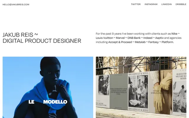
Preview image. Unlock full-res
Gallery Grid of Precision
Color palette
Accent color
Page background, primary surface for content areas
All text (headings, body, links, navigation), border elements, and functional UI strokes. Its starkness against Canvas White defines the visual impact
Subtle variation of Ink Black, used for text and borders
Secondary background surface, used for alternating content sections
Tertiary background surface, for distinguishing content blocks
Lightest gray surface or subtle divider
Typography
- Weights
- 300, 400
- Sizes
- 16px, 18px, 24px, 30px, 50px
- Line height
- 0.92, 1, 1.11, 1.25, 1.33
- Letter spacing
- 0.0330em, 0.0330em, 0.0330em, 0.0560em, 0.0560em
- Fallback
- system-ui
Primary typeface for all content. The varied weights and precise letter-spacing create a distinct typographic voice, balancing impact with refinement.
Spacing & shape
Components
Uses Degular, 'Ink Black' (#000000) at 18px with 1.25 line height and 0.59px letter spacing.
Uses Degular, 'Ink Black' (#000000) at 16px with 1.33 line height and 0.53px letter spacing. Links have a 5px right margin or 10px padding.
Uses Degular, 'Ink Black' (#000000) at 30px with 1.00 line height, 1.68px letter spacing. Followed by an 8px bottom margin.
Uses Degular, 'Ink Black' (#000000) at 18px with 1.25 line height, 0.59px letter spacing. Often appearing after a project title.
Uses Degular, 'Ink Black' (#000000) at 50px with 0.92 line height and 2.8px letter spacing.
Guidelines
- Prioritize 'Canvas White' (#f8f8f8) as the dominant background, ensuring ample negative space around all content.
- Use 'Ink Black' (#000000) for all text and UI outlines to maintain a stark, high-contrast appearance.
- Apply Degular font with precise letter-spacing values from the type scale to all text elements.
- Maintain a comfortable density with 80px section gaps and 20px padding for content blocks.
- Align link elements using 5px right margins or 10px internal padding for consistent spacing.
- Utilize 0px border-radius across all components to preserve the sharp, orthogonal aesthetic.
- Avoid gradients or soft shadows; the design relies on flat surfaces and crisp contrasts.
- Do not introduce colored primary action buttons; interactives are primarily defined by text and underlines using 'Ink Black'.
- Refrain from using rounded corners; all elements should adhere to the strict 0px radius.
- Do not deviate from the specified letter-spacing for each type size; it is a signature of the design's precision.
- Avoid decorative icons or complex SVG fills that introduce additional colors; stick to monochrome if necessary.
About this system
ShowHide
Jakub Reis employs a minimalist, high-contrast aesthetic, building a portfolio experience around crisp black text on a bright canvas. The typography is precise, with varied weights and letter-spacing creating a sophisticated rhythm. The layout prioritizes ample negative space, directing focus to individual project showcases and their accompanying metadata, creating a gallery-like atmosphere.
The page adheres to a mostly full-bleed layout, allowing images to extend edge-to-edge horizontally within their sections. Content is structured in clear, vertically stacked sections, featuring a prominent hero area with a large, centered headline and a multi-column grid of project previews below. The main content area uses a consistent vertical rhythm with 80px gaps between major sections. Project previews are arranged in a dynamic grid, often two columns, with each project thumbnail linking to more details. The header and footer are distinct, contained elements providing navigation and contact information. The overall density is spacious, emphasizing individual content blocks.
This site features a mix of high-quality, product-focused photography and more artistic, mood-setting visual content. Imagery is generally contained within rectangular frames, with no rounded corners or overlapping elements. Photography varies from crisp, well-lit product shots (e.g., watch in 'Le Modello') to more atmospheric, staged scenes with strong color casts and dramatic lighting (e.g., 'Midnight Studios' car scene). Illustrations, when present, appear as simple, bold color shapes (e.g., circles in 'Le Modello'). Icons are minimal, likely outlined and monochrome, serving a purely functional role in navigation. The role of imagery is primarily to showcase work, with some atmospheric content for visual interest. The site is image-heavy, using large blocks for project visuals.
Reminiscent of Stripe, Basic Agency, Figma, Linear.
# Jakub Reis — Style Reference
> Gallery Grid of Precision

**Theme:** light

**Site:** https://jakubreis.com

Jakub Reis employs a minimalist, high-contrast aesthetic, building a portfolio experience around crisp black text on a bright canvas. The typography is precise, with varied weights and letter-spacing creating a sophisticated rhythm. The layout prioritizes ample negative space, directing focus to individual project showcases and their accompanying metadata, creating a gallery-like atmosphere.

## Tokens — Colors

| Name | Value | Token | Role |
|------|------|------|------|
| Electric Violet | `#7848e8` | `--color-electric-violet` | Accent color |
| Canvas White | `#f8f8f8` | `--color-canvas-white` | Page background, primary surface for content areas |
| Ink Black | `#000000` | `--color-ink-black` | All text (headings, body, links, navigation), border elements, and functional UI strokes. Its starkness against Canvas White defines the visual impact |
| Ash Black | `#080808` | `--color-ash-black` | Subtle variation of Ink Black, used for text and borders |
| Sandstone Tan | `#f8e8d8` | `--color-sandstone-tan` | Secondary background surface, used for alternating content sections |
| Lavendar Gray | `#e8d8f8` | `--color-lavendar-gray` | Tertiary background surface, for distinguishing content blocks |
| Slate Gray | `#d8d8d8` | `--color-slate-gray` | Lightest gray surface or subtle divider |

## Tokens — Typography

### Degular
- **Substitute:** system-ui
- **Weights:** 300, 400
- **Sizes:** 16px, 18px, 24px, 30px, 50px
- **Line height:** 0.92, 1, 1.11, 1.25, 1.33
- **Letter spacing:** 0.0330em, 0.0330em, 0.0330em, 0.0560em, 0.0560em
- **Role:** Primary typeface for all content. The varied weights and precise letter-spacing create a distinct typographic voice, balancing impact with refinement.

## Tokens — Type Scale

Perfect Fourth (1.333) from 18px base.

| Role | Size | Line height | Letter spacing |
|------|------|------|------|
| caption | 16px | 1.33 | 0.53px |
| body | 18px | 1.25 | 0.59px |
| subheading | 24px | 1.11 | 0.79px |
| heading | 30px | 1 | 1.68px |
| display | 50px | 0.92 | 2.8px |

## Tokens — Spacing

- **Section gap:** 80px
- **Card padding:** 20px
- **Element gap:** 8px

## Tokens — Radius

- **Default:** 0px

## Layout

The page adheres to a mostly full-bleed layout, allowing images to extend edge-to-edge horizontally within their sections. Content is structured in clear, vertically stacked sections, featuring a prominent hero area with a large, centered headline and a multi-column grid of project previews below. The main content area uses a consistent vertical rhythm with 80px gaps between major sections. Project previews are arranged in a dynamic grid, often two columns, with each project thumbnail linking to more details. The header and footer are distinct, contained elements providing navigation and contact information. The overall density is spacious, emphasizing individual content blocks.

## Imagery

This site features a mix of high-quality, product-focused photography and more artistic, mood-setting visual content. Imagery is generally contained within rectangular frames, with no rounded corners or overlapping elements. Photography varies from crisp, well-lit product shots (e.g., watch in 'Le Modello') to more atmospheric, staged scenes with strong color casts and dramatic lighting (e.g., 'Midnight Studios' car scene). Illustrations, when present, appear as simple, bold color shapes (e.g., circles in 'Le Modello'). Icons are minimal, likely outlined and monochrome, serving a purely functional role in navigation. The role of imagery is primarily to showcase work, with some atmospheric content for visual interest. The site is image-heavy, using large blocks for project visuals.

## Components

### Primary Text
*Standard body copy and descriptive text.*

Uses Degular, 'Ink Black' (#000000) at 18px with 1.25 line height and 0.59px letter spacing.

### Navigation Link
*Global header and footer navigation items.*

Uses Degular, 'Ink Black' (#000000) at 16px with 1.33 line height and 0.53px letter spacing. Links have a 5px right margin or 10px padding.

### Project Title
*Main heading for individual project showcases.*

Uses Degular, 'Ink Black' (#000000) at 30px with 1.00 line height, 1.68px letter spacing. Followed by an 8px bottom margin.

### Project Metadata
*Secondary description under project titles.*

Uses Degular, 'Ink Black' (#000000) at 18px with 1.25 line height, 0.59px letter spacing. Often appearing after a project title.

### Hero Headline
*Prominent headline on the landing screen.*

Uses Degular, 'Ink Black' (#000000) at 50px with 0.92 line height and 2.8px letter spacing.

## Guidelines

### Do

- Prioritize 'Canvas White' (#f8f8f8) as the dominant background, ensuring ample negative space around all content.
- Use 'Ink Black' (#000000) for all text and UI outlines to maintain a stark, high-contrast appearance.
- Apply Degular font with precise letter-spacing values from the type scale to all text elements.
- Maintain a comfortable density with 80px section gaps and 20px padding for content blocks.
- Align link elements using 5px right margins or 10px internal padding for consistent spacing.
- Utilize 0px border-radius across all components to preserve the sharp, orthogonal aesthetic.

### Don't

- Avoid gradients or soft shadows; the design relies on flat surfaces and crisp contrasts.
- Do not introduce colored primary action buttons; interactives are primarily defined by text and underlines using 'Ink Black'.
- Refrain from using rounded corners; all elements should adhere to the strict 0px radius.
- Do not deviate from the specified letter-spacing for each type size; it is a signature of the design's precision.
- Avoid decorative icons or complex SVG fills that introduce additional colors; stick to monochrome if necessary.

## Agent Prompt Guide

Quick Color Reference:
text: #000000
background: #f8f8f8
border: #000000
accent: #7848e8
primary action: no distinct CTA color

3-5 Example Component Prompts:
1. Create a header with 'hello@jakubreis.com' on the left and 'Twitter', 'Instagram', 'LinkedIn', 'Dribbble' on the right, all in 'Ink Black' (#000000), Degular 16px, 1.33 line height, 0.53px letter spacing, with 5px margins between social links.
2. Design a project showcase block: a full-width image followed by 'Project Title' text using 'Ink Black' (#000000), Degular 30px, 1.00 line height, 1.68px letter spacing, with an 8px bottom margin, and 'Project Metadata' text below it in 'Ink Black' (#000000), Degular 18px, 1.25 line height, 0.59px letter spacing.
3. Implement a primary hero section with a 'Canvas White' (#f8f8f8) background, featuring a centered 'Hero Headline' in 'Ink Black' (#000000), Degular 50px, 0.92 line height, 2.8px letter spacing.
More like this









Keep what you find
A free account saves references to boards and can send you a weekly email of picks based on what you save.
To see every result, go Pro.