Preview image. Unlock full-res
organized workshop on creamy paper
Color palette
Informational labels, small badges, and specific icon accents. Used sparingly for minor highlights.
Primary action button borders, interactive link highlights – a warm, inviting accent for calls to engagement.
Supporting palette color with insufficient usage evidence for a stronger role. Extracted usage does not support a distinct primary control color.
Decorative background for featured sections, conveying richness and depth.
Subtler variation of the Burnished Bronze gradient, for secondary dark areas.
Light background for information cards, subtle highlights for text elements.
Links, focused states, and subtle borders indicating interactivity.
General text, deep accents, borders for structural elements.
Headlines, button backgrounds, darker text levels, and dividing lines for a strong presence.
Page background, primary canvas, card base surfaces.
Observed in other borderColor, body borderColor, nav borderColor. Extracted usage does not support a distinct primary control color.
Subtle background for differentiated sections, gentle dividing lines.
Muted body text, secondary icons, and less prominent borders.
Subtle borders and dividers, background for tertiary elements.
Icon strokes, default button borders, placeholder text, and supporting information.
Body text for less emphasized content, subtle decorative strokes.
Typography
- Weights
- 400, 500, 600, 700
- Sizes
- 10px, 11px, 12px, 14px, 16px, 17px, 19px, 20px, 24px, 32px, 40px, 60px
- Line height
- 1.1, 1.15, 1.2, 1.25, 1.45, 1.5, 1.7
- Letter spacing
- 0.0250em, 0.0500em, 0.1000em
- Fallback
- Inter
Primary brand typeface for all headings, body text, and UI elements. Its custom nature provides a unique, professional yet approachable character that system fonts lack.
- Weights
- 400, 500, 600
- Sizes
- 9px, 11px, 16px
- Line height
- 1.5
- Letter spacing
- normal
- Fallback
- SF Mono
Monospaced font for code snippets, API references, or data displays, ensuring alignment and distinctiveness from Matter.
Spacing & shape
Elevation
Components
Text uses Matter font, weight undisclosed (likely 400), color Dusk Grey (#7d7d7d). Default state has transparent background, 4px padding on all sides. When focused or hovered, it subtly changes color to Charcoal (#121212).
Background transparent, text color Faded Stone (#898989), border Dusk Grey (#7d7d7d), 4px radius, 4px padding. Used for less emphasized actions.
Background transparent, text Charcoal (#121212), border Butterscotch (#e8aa42), 9999px (pill-shaped) radius, 6px vertical and 12px horizontal padding. This is the main interactive element.
Charcoal (#121212) background, White (#ffffff) text, 8px radius, 6px vertical and 20px horizontal padding. Reserved for key confirmations or submissions.
Transparent background, text color Faded Stone (#898989), 0px radius, 2px padding. Visually light to not distract from main content.
White (#ffffff) background, 6px border radius, subtle blue-tinted shadow rgba(108, 188, 244, 0.5) 0px 0px 0px 1px. No internal padding specified, content manages its own spacing.
Alabaster (#fafaf5) background, 8px border radius, no shadow. Typically contains unpadded content for flexibility.
Transparent background, 0px border radius, no shadow. Content's background becomes the de-facto card background.
Transparent background, 12px radius, no shadow. Adapts to the gradient background of the section, often holding White (#ffffff) text.
Guidelines
- Use Alabaster (#fafaf5) for primary page backgrounds, creating a creamy white canvas.
- Apply Charcoal (#121212) for all main headings and prominent text to establish clear hierarchy.
- Accent interactive button borders and key links with Butterscotch (#e8aa42) to draw attention.
- Form pill-shaped buttons with a 9999px border radius for all primary calls to action.
- Utilize the `Matter` typeface with appropriate weights for all textual content, reserving `ui-monospace` for code displays only.
- Maintain a compact element spacing of 8px (elementGap) for items within components, like icons and text.
- Employ the Burnished Bronze Gradient for distinct dark sections to build contrast and visual interest.
- Avoid using raw black (#000000) for general body text; reserve it for structural borders or very high contrast needs.
- Do not introduce new primary action colors; Butterscotch (#e8aa42) outlines or Charcoal (#121212) fills are the established interactives.
- Refrain from adding arbitrary shadows; only use the specified light rgba(108, 188, 244, 0.5) 0px 0px 0px 1px for cards and the soft rgba(255, 255, 255, 0.03) 0px 0px 24px 0px for floating elements.
- Do not vary header or body font families outside of Matter and ui-monospace to maintain typographic consistency.
- Avoid deviating from the established border radii; adhere to 6px for general elements, 9999px for pills, and 12px for cards.
- Do not use gradients for backgrounds outside of the predefined Burnished Bronze and Warm Umber gradients.
- Introduce new chromatic colors; stick to the current palette to avoid visual noise and ensure brand recognition.
About this system
ShowHide
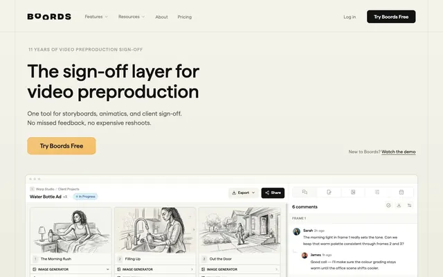
Boords presents a light and airy design that feels like an organized workshop, balancing clear information with subtle visual cues. The primary canvas of crisp Alabaster (#fafaf5) is contrasted by accents of playful Butterscotch (#e8aa42) and rich Charcoal (#121212) that anchor calls to action and create visual hierarchy. The consistent use of a custom "Matter" typeface provides a modern yet approachable voice, while distinct border radii like the 9999px pill shape for buttons introduce softness into an otherwise structured layout.
The page uses a maxWidth-contained layout for most content sections, centered on the screen. The hero section often breaks this, featuring a full-width background supporting a centered headline. Sections alternate between a creamy Alabaster (#fafaf5) background and darker gradient-filled bands, creating a rhythmic vertical flow. Content within sections is often arranged in symmetrical two or three-column grids for feature displays and text+image pairings, interspersed with full-width text blocks. The overall density is compact yet clear, with an 8px elementGap ensuring items are close but distinguishable. Navigation is a sticky top bar with branding, links, and primary actions.
The visual language relies heavily on clean product screenshots and finely-drawn, monochrome line illustrations with a hand-sketched feel. Product shots are typically contained within cards, showcasing the UI directly without heavy styling or context. Illustrations serve a decorative and explanatory role, often organic in their forms, contrasting with the structured UI. Icons are outlined, monochromatic, and appear with consistent stroke weights. Imagery is present but serves to support text content rather than dominate it, maintaining a text-dominant, information-rich layout.
Reminiscent of Framer, Webflow, Linear, Tally, Superhuman.
# boords.com — Style Reference
> organized workshop on creamy paper

**Theme:** light

**Site:** https://boords.com

Boords presents a light and airy design that feels like an organized workshop, balancing clear information with subtle visual cues. The primary canvas of crisp Alabaster (#fafaf5) is contrasted by accents of playful Butterscotch (#e8aa42) and rich Charcoal (#121212) that anchor calls to action and create visual hierarchy. The consistent use of a custom "Matter" typeface provides a modern yet approachable voice, while distinct border radii like the 9999px pill shape for buttons introduce softness into an otherwise structured layout.

## Tokens — Colors

| Name | Value | Token | Role |
|------|------|------|------|
| Peach | `#eb6c00` | `--color-peach` | Informational labels, small badges, and specific icon accents. Used sparingly for minor highlights. |
| Butterscotch | `#e8aa42` | `--color-butterscotch` | Primary action button borders, interactive link highlights – a warm, inviting accent for calls to engagement. |
| Honey Bronze | `#b77a10` | `--color-honey-bronze` | Supporting palette color with insufficient usage evidence for a stronger role. Extracted usage does not support a distinct primary control color. |
| Burnished Bronze Gradient | `#453d37` | `--color-burnished-bronze-gradient` | Decorative background for featured sections, conveying richness and depth. |
| Warm Umber Gradient | `#2d2824` | `--color-warm-umber-gradient` | Subtler variation of the Burnished Bronze gradient, for secondary dark areas. |
| Sky Mist | `#daeef8` | `--color-sky-mist` | Light background for information cards, subtle highlights for text elements. |
| Deep Ocean | `#214c70` | `--color-deep-ocean` | Links, focused states, and subtle borders indicating interactivity. |
| Carbon | `#000000` | `--color-carbon` | General text, deep accents, borders for structural elements. |
| Charcoal | `#121212` | `--color-charcoal` | Headlines, button backgrounds, darker text levels, and dividing lines for a strong presence. |
| Alabaster | `#fafaf5` | `--color-alabaster` | Page background, primary canvas, card base surfaces. |
| White | `#ffffff` | `--color-white` | Observed in other borderColor, body borderColor, nav borderColor. Extracted usage does not support a distinct primary control color. |
| Parchment | `#e9e9e7` | `--color-parchment` | Subtle background for differentiated sections, gentle dividing lines. |
| Slate | `#4d4d4d` | `--color-slate` | Muted body text, secondary icons, and less prominent borders. |
| Ash | `#cecdca` | `--color-ash` | Subtle borders and dividers, background for tertiary elements. |
| Dusk Grey | `#7d7d7d` | `--color-dusk-grey` | Icon strokes, default button borders, placeholder text, and supporting information. |
| Faded Stone | `#898989` | `--color-faded-stone` | Body text for less emphasized content, subtle decorative strokes. |

## Tokens — Typography

### Matter
- **Substitute:** Inter
- **Weights:** 400, 500, 600, 700
- **Sizes:** 10px, 11px, 12px, 14px, 16px, 17px, 19px, 20px, 24px, 32px, 40px, 60px
- **Line height:** 1.1, 1.15, 1.2, 1.25, 1.45, 1.5, 1.7
- **Letter spacing:** 0.0250em, 0.0500em, 0.1000em
- **Role:** Primary brand typeface for all headings, body text, and UI elements. Its custom nature provides a unique, professional yet approachable character that system fonts lack.

### ui-monospace
- **Substitute:** SF Mono
- **Weights:** 400, 500, 600
- **Sizes:** 9px, 11px, 16px
- **Line height:** 1.5
- **Letter spacing:** normal
- **Role:** Monospaced font for code snippets, API references, or data displays, ensuring alignment and distinctiveness from Matter.

## Tokens — Type Scale

Augmented Fourth (1.414) from 14px base.

| Role | Size | Line height | Letter spacing |
|------|------|------|------|
| caption | 10px | 1.5 | 0.25px |
| body | 14px | 1.7 | 0.35px |
| heading-sm | 19px | 1.25 | 0.475px |
| heading | 24px | 1.25 | 0.6px |
| heading-lg | 32px | 1.2 | 0.8px |
| display | 60px | 1.1 | 1.5px |

## Tokens — Spacing

- **Section gap:** 24px
- **Card padding:** 8px
- **Element gap:** 8px

## Tokens — Radius

- **Default:** 6px
- **Buttons:** 9999px
- **Cards:** 12px
- **input:** 6px
- **tags:** 9999px

## Tokens — Elevation

- **Feedback Card (White):** `rgba(108, 188, 244, 0.5) 0px 0px 0px 1px`
- **Hover/Focus States:** `rgba(255, 255, 255, 0.03) 0px 0px 24px 0px`
- **Subtle Elements:** `rgba(0, 0, 0, 0.1) 0px 2px 8px 0px`

## Layout

The page uses a maxWidth-contained layout for most content sections, centered on the screen. The hero section often breaks this, featuring a full-width background supporting a centered headline. Sections alternate between a creamy Alabaster (#fafaf5) background and darker gradient-filled bands, creating a rhythmic vertical flow. Content within sections is often arranged in symmetrical two or three-column grids for feature displays and text+image pairings, interspersed with full-width text blocks. The overall density is compact yet clear, with an 8px elementGap ensuring items are close but distinguishable. Navigation is a sticky top bar with branding, links, and primary actions.

## Imagery

The visual language relies heavily on clean product screenshots and finely-drawn, monochrome line illustrations with a hand-sketched feel. Product shots are typically contained within cards, showcasing the UI directly without heavy styling or context. Illustrations serve a decorative and explanatory role, often organic in their forms, contrasting with the structured UI. Icons are outlined, monochromatic, and appear with consistent stroke weights. Imagery is present but serves to support text content rather than dominate it, maintaining a text-dominant, information-rich layout.

## Components

### CTA Button Group

### Testimonial Cards

### API & Webhooks Dark Feature Cards

### Primary Navigation Link
*Clickable text in the main navigation.*

Text uses Matter font, weight undisclosed (likely 400), color Dusk Grey (#7d7d7d). Default state has transparent background, 4px padding on all sides. When focused or hovered, it subtly changes color to Charcoal (#121212).

### Ghost Outline Button
*Secondary action button, often grouped with a primary button.*

Background transparent, text color Faded Stone (#898989), border Dusk Grey (#7d7d7d), 4px radius, 4px padding. Used for less emphasized actions.

### Pill Outline Button (Accent)
*Primary call to action or crucial secondary action.*

Background transparent, text Charcoal (#121212), border Butterscotch (#e8aa42), 9999px (pill-shaped) radius, 6px vertical and 12px horizontal padding. This is the main interactive element.

### Filled Button (Charcoal)
*Prominent, high-contrast action button for critical paths.*

Charcoal (#121212) background, White (#ffffff) text, 8px radius, 6px vertical and 20px horizontal padding. Reserved for key confirmations or submissions.

### Plain Text Button
*Minimal interactive element, typically used for 'Log in' or simple navigation.*

Transparent background, text color Faded Stone (#898989), 0px radius, 2px padding. Visually light to not distract from main content.

### Feedback Card (White)
*Container for user comments or interactive content within a larger context.*

White (#ffffff) background, 6px border radius, subtle blue-tinted shadow rgba(108, 188, 244, 0.5) 0px 0px 0px 1px. No internal padding specified, content manages its own spacing.

### Information Card (Alabaster)
*General content display for lists or categorised information.*

Alabaster (#fafaf5) background, 8px border radius, no shadow. Typically contains unpadded content for flexibility.

### Transparent Card
*Visual grouping of elements without a distinct background, typically for lists or grids.*

Transparent background, 0px border radius, no shadow. Content's background becomes the de-facto card background.

### Dark Themed Section Card (API/Webhooks)
*Container for content within dark, gradient-infused sections.*

Transparent background, 12px radius, no shadow. Adapts to the gradient background of the section, often holding White (#ffffff) text.

## Guidelines

### Do

- Use Alabaster (#fafaf5) for primary page backgrounds, creating a creamy white canvas.
- Apply Charcoal (#121212) for all main headings and prominent text to establish clear hierarchy.
- Accent interactive button borders and key links with Butterscotch (#e8aa42) to draw attention.
- Form pill-shaped buttons with a 9999px border radius for all primary calls to action.
- Utilize the `Matter` typeface with appropriate weights for all textual content, reserving `ui-monospace` for code displays only.
- Maintain a compact element spacing of 8px (elementGap) for items within components, like icons and text.
- Employ the Burnished Bronze Gradient for distinct dark sections to build contrast and visual interest.

### Don't

- Avoid using raw black (#000000) for general body text; reserve it for structural borders or very high contrast needs.
- Do not introduce new primary action colors; Butterscotch (#e8aa42) outlines or Charcoal (#121212) fills are the established interactives.
- Refrain from adding arbitrary shadows; only use the specified light rgba(108, 188, 244, 0.5) 0px 0px 0px 1px for cards and the soft rgba(255, 255, 255, 0.03) 0px 0px 24px 0px for floating elements.
- Do not vary header or body font families outside of Matter and ui-monospace to maintain typographic consistency.
- Avoid deviating from the established border radii; adhere to 6px for general elements, 9999px for pills, and 12px for cards.
- Do not use gradients for backgrounds outside of the predefined Burnished Bronze and Warm Umber gradients.
- Introduce new chromatic colors; stick to the current palette to avoid visual noise and ensure brand recognition.

## Agent Prompt Guide

Quick Color Reference:
text: #121212
background: #fafaf5
border: #7d7d7d
accent: #e8aa42
primary action: #e8aa42 (outlined action border)

Example Component Prompts:
Create a standard information card: Alabaster (#fafaf5) background. Text: Matter weight 400 at 14px, color Slate (#4d4d4d). Element spacing 8px. Card radius 8px.
Create a primary 'Try Boords Free' button: Text 'Try Boords Free' in Matter weight 500 at 16px, Charcoal (#121212) color. Border Butterscotch (#e8aa42) 1px solid. Border radius 9999px. Padding 6px vertical, 12px horizontal.
Create a heading for a section: Matter weight 700 at 32px, color Charcoal (#121212), line-height 1.2, letter-spacing 0.8px.
Create a footer link: Matter weight 400 at 14px, Dusk Grey (#7d7d7d) color, no underline by default. On hover, underline appears and color changes to Charcoal (#121212).
More like this









Keep what you find
A free account saves references to boards and can send you a weekly email of picks based on what you save.
To see every result, go Pro.