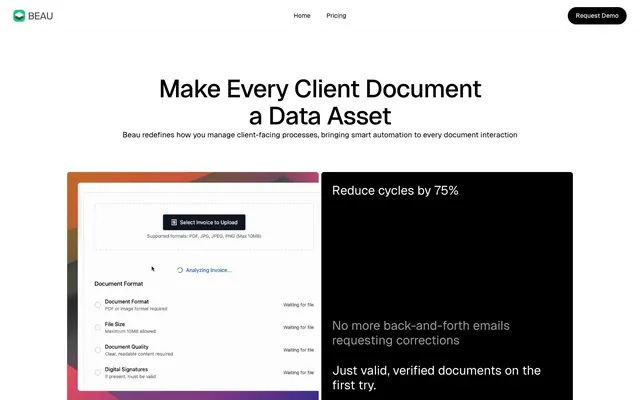
Preview image. Unlock full-res
monochrome precision, vibrant core
Color palette
Decorative background for energetic sections, feature highlights. Brings a dynamic and modern feel to the monochrome scheme
Page backgrounds, card surfaces, active states for text and icons. Provides a bright, expansive base for all content
Primary text, button backgrounds, strong borders, dark card surfaces. Establishes a bold and clear contrast against Canvas White
Secondary text, muted headings, subtle borders. Used for information that needs to recede slightly from primary content
Tertiary text, descriptive labels, less emphasized content. Creates a softer textual presence
Subtle background fill, badge backgrounds. Provides a soft, slightly-there surface
Typography
- Weights
- 400, 500
- Sizes
- 14px, 17px, 20px, 28px, 33px, 40px, 56px
- Line height
- 1.1, 1.15, 1.2, 1.3, 1.4
- Letter spacing
- -0.0200em at 56px, -0.0100em at 40px and below
- Fallback
- system-ui, sans-serif
The primary typeface for all text content, from headings to body text. Its clean, geometric forms, combined with specific letter-spacing and feature settings, contribute to the precise and modern feel. The slight negative letter-spacing for larger sizes enhances visual density without sacrificing legibility.
Spacing & shape
Components
Filled with Midnight Ink (#000000) with Canvas White (#ffffff) text. Features a highly rounded 200px border-radius, emphasizing its actionable nature. Padding is 0px vertical and 18px horizontal, with internal text dictating height.
Outlined in Canvas White (#ffffff) with matching text. Also features a 200px border-radius for consistency. No vertical padding, 18px horizontal padding.
Background is Canvas White (#ffffff), with a subtle shadow (rgba(0,0,0,0.06) 0px 2px 6px 0px). Corners are rounded at 6px. Inner padding of 24px on all sides.
Solid Midnight Ink (#000000) background, no shadow. Corners are rounded with a 6px radius. Inner padding of 24px on all sides.
Background is Silver Mist (rgba(0,0,0,0.3) which is effectively #b3b3b3 with lower opacity in a light context) with Canvas White (#ffffff) text. Features 6px border-radius. Padding is 12px vertical and 18px horizontal.
Guidelines
- Prioritize high-contrast pairing of Midnight Ink (#000000) and Canvas White (#ffffff) for primary content and actions.
- Use Geist at weight 400 for body text and 500 for headlines, ensuring the specified letter-spacing for optimal legibility.
- Apply a 200px border-radius to all buttons for a consistent, soft pill shape, and 6px to cards for subtle corner rounding.
- Use a base unit of 6px for all spacing decisions, translating to common elements gaps of 24px and section gaps of 72px.
- Introduce the Electric Gradient (linear-gradient(135deg, rgb(255, 131, 8), rgb(255, 80, 67) 50%, rgb(57, 43, 213))) sparingly as a background for impactful, energetic sections only.
- When using cards, default to Canvas White (#ffffff) with a soft shadow (rgba(0,0,0,0.06) 0px 2px 6px 0px) to indicate elevated content.
- Avoid using saturated colors other than Electric Gradient; maintain a strict monochrome palette for all other UI elements.
- Do not use heavy, complex shadows; only apply the subtle rgba(0,0,0,0.06) 0px 2px 6px 0px shadow for elevated cards.
- Do not vary border radii significantly; stick to 200px for buttons/pills and 6px for cards/containers.
- Do not use generic system fonts; always utilize Geist with its specific weights and font feature settings for brand consistency.
- Avoid excessive use of the Electric Gradient; it should act as a highlight, not a dominant background for all sections.
- Do not create complex multi-layered backgrounds; surfaces should primarily be Canvas White or Midnight Ink for clarity.
About this system
ShowHide
Beau employs a crisp, structured aesthetic with a high-contrast monochrome palette. The design emphasizes clear information hierarchy through distinct text sizing and weight, creating a feeling of efficient precision. Components are lightweight and purposeful, relying on shape and direct color contrast rather than heavy ornamentation or shadows. A striking multi-color gradient introduces vibrancy in specific sections, acting as an energetic backdrop for otherwise stark content.
The typical page layout is a max-width 1428px centered container, with full-width sections that internally constrain content. The hero section often features a centered headline over a white background. Sections establish rhythm through consistent 72px vertical spacing. Content is arranged in alternating patterns, such as text on one side and a product UI screenshot/illustration on the other. Feature sections utilize grids of cards, and prominent information is often presented in centered, stacked blocks for clarity.
Imagery primarily consists of product screenshots and abstract UI representations, often presented on dark backgrounds or within contained sections. These are treated with soft 6px rounded corners, matching the card aesthetic. There are no full-bleed photographs or lifestyle imagery. Icons appear to be outlined, monochrome (black or white, depending on background), with a medium stroke weight, serving an explanatory and decorative role at a medium density.
Reminiscent of Linear, Stripe, Vercel, Supabase.
# Beau — Style Reference
> monochrome precision, vibrant core

**Theme:** light

**Site:** https://beau.to

Beau employs a crisp, structured aesthetic with a high-contrast monochrome palette. The design emphasizes clear information hierarchy through distinct text sizing and weight, creating a feeling of efficient precision. Components are lightweight and purposeful, relying on shape and direct color contrast rather than heavy ornamentation or shadows. A striking multi-color gradient introduces vibrancy in specific sections, acting as an energetic backdrop for otherwise stark content.

## Tokens — Colors

| Name | Value | Token | Role |
|------|------|------|------|
| Electric Gradient | `#ff8308` | `--color-electric-gradient` | Decorative background for energetic sections, feature highlights. Brings a dynamic and modern feel to the monochrome scheme |
| Canvas White | `#ffffff` | `--color-canvas-white` | Page backgrounds, card surfaces, active states for text and icons. Provides a bright, expansive base for all content |
| Midnight Ink | `#000000` | `--color-midnight-ink` | Primary text, button backgrounds, strong borders, dark card surfaces. Establishes a bold and clear contrast against Canvas White |
| Subtle Gray | `#999999` | `--color-subtle-gray` | Secondary text, muted headings, subtle borders. Used for information that needs to recede slightly from primary content |
| Whisper Gray | `#666666` | `--color-whisper-gray` | Tertiary text, descriptive labels, less emphasized content. Creates a softer textual presence |
| Silver Mist | `#b3b3b3` | `--color-silver-mist` | Subtle background fill, badge backgrounds. Provides a soft, slightly-there surface |

## Tokens — Typography

### Geist
- **Substitute:** system-ui, sans-serif
- **Weights:** 400, 500
- **Sizes:** 14px, 17px, 20px, 28px, 33px, 40px, 56px
- **Line height:** 1.1, 1.15, 1.2, 1.3, 1.4
- **Letter spacing:** -0.0200em at 56px, -0.0100em at 40px and below
- **Role:** The primary typeface for all text content, from headings to body text. Its clean, geometric forms, combined with specific letter-spacing and feature settings, contribute to the precise and modern feel. The slight negative letter-spacing for larger sizes enhances visual density without sacrificing legibility.

## Tokens — Type Scale

Major Third (1.25) from 17px base.

| Role | Size | Line height | Letter spacing |
|------|------|------|------|
| caption | 14px | 1.4 | -0.14px |
| body | 17px | 1.4 | -0.17px |
| subheading | 20px | 1.3 | -0.2px |
| heading | 28px | 1.2 | -0.28px |
| heading-lg | 33px | 1.15 | -0.33px |
| display | 40px | 1.1 | -0.4px |
| display-lg | 56px | 1.1 | -1.12px |

## Tokens — Spacing

- **Max width:** 1428px
- **Section gap:** 72px
- **Card padding:** 24px
- **Element gap:** 24px

## Tokens — Radius

- **Buttons:** 200px
- **Cards:** 6px

## Layout

The typical page layout is a max-width 1428px centered container, with full-width sections that internally constrain content. The hero section often features a centered headline over a white background. Sections establish rhythm through consistent 72px vertical spacing. Content is arranged in alternating patterns, such as text on one side and a product UI screenshot/illustration on the other. Feature sections utilize grids of cards, and prominent information is often presented in centered, stacked blocks for clarity.

## Imagery

Imagery primarily consists of product screenshots and abstract UI representations, often presented on dark backgrounds or within contained sections. These are treated with soft 6px rounded corners, matching the card aesthetic. There are no full-bleed photographs or lifestyle imagery. Icons appear to be outlined, monochrome (black or white, depending on background), with a medium stroke weight, serving an explanatory and decorative role at a medium density.

## Components

### Primary Action Button
*Main call to action button.*

Filled with Midnight Ink (#000000) with Canvas White (#ffffff) text. Features a highly rounded 200px border-radius, emphasizing its actionable nature. Padding is 0px vertical and 18px horizontal, with internal text dictating height.

### Ghost Action Button
*Secondary action button, or for navigation.*

Outlined in Canvas White (#ffffff) with matching text. Also features a 200px border-radius for consistency. No vertical padding, 18px horizontal padding.

### White Card
*Content container for features or information.*

Background is Canvas White (#ffffff), with a subtle shadow (rgba(0,0,0,0.06) 0px 2px 6px 0px). Corners are rounded at 6px. Inner padding of 24px on all sides.

### Dark Card
*Container for content in dark mode sections.*

Solid Midnight Ink (#000000) background, no shadow. Corners are rounded with a 6px radius. Inner padding of 24px on all sides.

### Compact Tag Badge
*Informational tags or status indicators.*

Background is Silver Mist (rgba(0,0,0,0.3) which is effectively #b3b3b3 with lower opacity in a light context) with Canvas White (#ffffff) text. Features 6px border-radius. Padding is 12px vertical and 18px horizontal.

## Guidelines

### Do

- Prioritize high-contrast pairing of Midnight Ink (#000000) and Canvas White (#ffffff) for primary content and actions.
- Use Geist at weight 400 for body text and 500 for headlines, ensuring the specified letter-spacing for optimal legibility.
- Apply a 200px border-radius to all buttons for a consistent, soft pill shape, and 6px to cards for subtle corner rounding.
- Use a base unit of 6px for all spacing decisions, translating to common elements gaps of 24px and section gaps of 72px.
- Introduce the Electric Gradient (linear-gradient(135deg, rgb(255, 131, 8), rgb(255, 80, 67) 50%, rgb(57, 43, 213))) sparingly as a background for impactful, energetic sections only.
- When using cards, default to Canvas White (#ffffff) with a soft shadow (rgba(0,0,0,0.06) 0px 2px 6px 0px) to indicate elevated content.

### Don't

- Avoid using saturated colors other than Electric Gradient; maintain a strict monochrome palette for all other UI elements.
- Do not use heavy, complex shadows; only apply the subtle rgba(0,0,0,0.06) 0px 2px 6px 0px shadow for elevated cards.
- Do not vary border radii significantly; stick to 200px for buttons/pills and 6px for cards/containers.
- Do not use generic system fonts; always utilize Geist with its specific weights and font feature settings for brand consistency.
- Avoid excessive use of the Electric Gradient; it should act as a highlight, not a dominant background for all sections.
- Do not create complex multi-layered backgrounds; surfaces should primarily be Canvas White or Midnight Ink for clarity.

## Agent Prompt Guide

**Quick Color Reference**
text: #000000
background: #ffffff
border: #999999
accent: #ff8308
primary action: #000000 (filled action)

**3-5 Example Component Prompts**
1. Create a Primary Action Button: #000000 background, #ffffff text, 9999px radius, compact pill padding. Use this filled treatment for the main CTA.
2. Design a feature card: White Card component with padding 24px, containing a heading 'Reduce cycles by 75%' in Geist weight 500, size 28px, Midnight Ink (#000000), letter-spacing -0.28px. Below it, add body text 'No more back-and-forth emails requesting corrections' in Geist weight 400, size 17px, Whisper Gray (#666666).
4. Show a status badge: Use the Compact Tag Badge component with text 'Pending Review' in Canvas White (#ffffff), with Silver Mist background (rgba(0,0,0,0.3)), 12px vertical padding, 18px horizontal padding, 6px border-radius.
More like this









Keep what you find
A free account saves references to boards and can send you a weekly email of picks based on what you save.
To see every result, go Pro.