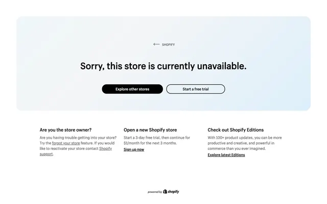
Preview image. Unlock full-res
Crisp monochrome canvas.
Color palette
Subtle background gradient base forming a diffused halo effect
Primary text, button backgrounds, interactive link color, primary iconography. Establishes strong contrast
Secondary text, subtle borders, inactive elements, supporting information. Provides visual hierarchy without harshness
Button text on dark backgrounds, outlined button strokes, primary surface color
Typography
- Weights
- 400, 700
- Sizes
- 14px, 16px, 20px, 40px
- Line height
- 1.2
- Letter spacing
- normal
- Fallback
- Inter
Primary brand typeface for headings, body text, buttons, and links. Its custom nature reinforces brand identity.
- Sizes
- 16px
- Line height
- 1.5
- Letter spacing
- normal
- Fallback
- Inter
Extended reading text and supporting content. Slightly increased line-height aids readability in longer blocks.
- Weights
- 400
- Sizes
- 16px
- Line height
- 1.2
- Letter spacing
- normal
- Fallback
- Times New Roman
Fallback and specialized legal/footer text, providing a classic, authoritative counterpoint to the sans-serif.
Spacing & shape
Components
Solid 'Midnight' background with 'Canvas White' text, 20px border-radius, and generous horizontal padding of 60px. Text uses Shopify Sans at 16px.
Transparent background with a 2px 'Canvas White' border and 'Midnight' text. 20px border-radius and 60px horizontal padding. Text uses Shopify Sans at 16px.
A container with a 25px border-radius, likely used for the main content block. Contains text and buttons.
Uses 'Midnight' text and is underlined by default. Inherits Shopify Sans font styles.
Guidelines
- Use 'Midnight' (#000000) for all primary text and button backgrounds to ensure high contrast.
- Apply 'Canvas White' (#ffffff) for text on dark backgrounds and as a 2px border for outlined components.
- Maintain a consistent border-radius of 20px for all buttons and interactive links, and 25px for primary content containers.
- Utilize Shopify Sans (or Inter as substitute) for headlines and body text to maintain brand voice.
- Structure page content within a max-width of 1296px for consistent presentation.
- Employ the 'Sky Wash' gradient as a subtle background element where diffused light is desired, not as a primary content surface.
- Avoid using multiple shades of gray for primary text; stick to 'Midnight' for focus and 'Storm Gray' for secondary details.
- Do not deviate from the specified border-radii of 20px for interactive elements and 25px for containers.
- Refrain from introducing additional accent colors; maintain the monochrome palette with subtle gradient backgrounds.
- Do not alter the letter-spacing for Shopify Sans; keep it at 'normal' unless otherwise specified in token definitions.
- Avoid applying solid background colors to large sections when the subtle 'Sky Wash' gradient is intended to provide a soft aesthetic.
- Do not use Times for primary headlines or UI elements; reserve it for specific legal or footer content.
About this system
ShowHide
Boutique8888 features a clean, high-contrast aesthetic with a distinct focus on clarity and directness. The visual system leverages a light canvas over a subtle background gradient, grounding prominent dark typography and dark-filled or light-outlined components. Interaction elements are clearly delineated through strong black and white contrast and rounded shapes, creating a focused and accessible user experience.
The page adheres to a max-width of 1296px, centered on the screen, creating a contained and structured feel. The hero content is a prominent, centrally aligned text block with two call-to-action buttons. Below this, content is arranged in a three-column grid, with left-aligned subordinate text blocks. Vertical spacing is consistent but not excessively dense. The footer is minimal, centered at the bottom. The overall pattern is a clear hierarchy of information presented in distinct, well-separated blocks.
The site uses minimal imagery, focusing on UI elements. The Shopify logo is crisp and monochrome. Icons are simple, outlined, and monochromatic, like the 'back' arrow. When present, imagery (like the Shopify logo at the bottom) appears self-contained, using strict brand colors and avoiding complex photographic elements. The primary visual weight is carried by typography and strong component shapes.
Reminiscent of Stripe, Linear, Vercel, Apple (services).
# Boutique8888 — Style Reference
> Crisp monochrome canvas.

**Theme:** light

**Site:** https://boutique8888.com

Boutique8888 features a clean, high-contrast aesthetic with a distinct focus on clarity and directness. The visual system leverages a light canvas over a subtle background gradient, grounding prominent dark typography and dark-filled or light-outlined components. Interaction elements are clearly delineated through strong black and white contrast and rounded shapes, creating a focused and accessible user experience.

## Tokens — Colors

| Name | Value | Token | Role |
|------|------|------|------|
| Sky Wash | `#c1e9ff` | `--color-sky-wash` | Subtle background gradient base forming a diffused halo effect |
| Midnight | `#000000` | `--color-midnight` | Primary text, button backgrounds, interactive link color, primary iconography. Establishes strong contrast |
| Storm Gray | `#5b5b5b` | `--color-storm-gray` | Secondary text, subtle borders, inactive elements, supporting information. Provides visual hierarchy without harshness |
| Canvas White | `#ffffff` | `--color-canvas-white` | Button text on dark backgrounds, outlined button strokes, primary surface color |

## Tokens — Typography

### Shopify Sans
- **Substitute:** Inter
- **Weights:** 400, 700
- **Sizes:** 14px, 16px, 20px, 40px
- **Line height:** 1.2
- **Letter spacing:** normal
- **Role:** Primary brand typeface for headings, body text, buttons, and links. Its custom nature reinforces brand identity.

### Shopify Sans
- **Substitute:** Inter
- **Sizes:** 16px
- **Line height:** 1.5
- **Letter spacing:** normal
- **Role:** Extended reading text and supporting content. Slightly increased line-height aids readability in longer blocks.

### Times
- **Substitute:** Times New Roman
- **Weights:** 400
- **Sizes:** 16px
- **Line height:** 1.2
- **Letter spacing:** normal
- **Role:** Fallback and specialized legal/footer text, providing a classic, authoritative counterpoint to the sans-serif.

## Tokens — Type Scale

Augmented Fourth (1.414) from 16px base.

| Role | Size | Line height | Letter spacing |
|------|------|------|------|
| body-sm | 14px | 1.2 | — |
| body | 16px | 1.2 | — |
| heading | 20px | 1.2 | — |
| display | 40px | 1.2 | — |

## Tokens — Spacing

- **Max width:** 1296px
- **Section gap:** 27px
- **Card padding:** 20px
- **Element gap:** 10px

## Tokens — Radius

- **Buttons:** 20px
- **containers:** 25px
- **links:** 20px

## Layout

The page adheres to a max-width of 1296px, centered on the screen, creating a contained and structured feel. The hero content is a prominent, centrally aligned text block with two call-to-action buttons. Below this, content is arranged in a three-column grid, with left-aligned subordinate text blocks. Vertical spacing is consistent but not excessively dense. The footer is minimal, centered at the bottom. The overall pattern is a clear hierarchy of information presented in distinct, well-separated blocks.

## Imagery

The site uses minimal imagery, focusing on UI elements. The Shopify logo is crisp and monochrome. Icons are simple, outlined, and monochromatic, like the 'back' arrow. When present, imagery (like the Shopify logo at the bottom) appears self-contained, using strict brand colors and avoiding complex photographic elements. The primary visual weight is carried by typography and strong component shapes.

## Components

### Primary Filled Button
*Call to action*

Solid 'Midnight' background with 'Canvas White' text, 20px border-radius, and generous horizontal padding of 60px. Text uses Shopify Sans at 16px.

### Outlined Button
*Secondary action*

Transparent background with a 2px 'Canvas White' border and 'Midnight' text. 20px border-radius and 60px horizontal padding. Text uses Shopify Sans at 16px.

### Subtle Callout Card
*Informational container*

A container with a 25px border-radius, likely used for the main content block. Contains text and buttons.

### Text Link
*Inline navigation or reference*

Uses 'Midnight' text and is underlined by default. Inherits Shopify Sans font styles.

## Guidelines

### Do

- Use 'Midnight' (#000000) for all primary text and button backgrounds to ensure high contrast.
- Apply 'Canvas White' (#ffffff) for text on dark backgrounds and as a 2px border for outlined components.
- Maintain a consistent border-radius of 20px for all buttons and interactive links, and 25px for primary content containers.
- Utilize Shopify Sans (or Inter as substitute) for headlines and body text to maintain brand voice.
- Structure page content within a max-width of 1296px for consistent presentation.
- Employ the 'Sky Wash' gradient as a subtle background element where diffused light is desired, not as a primary content surface.

### Don't

- Avoid using multiple shades of gray for primary text; stick to 'Midnight' for focus and 'Storm Gray' for secondary details.
- Do not deviate from the specified border-radii of 20px for interactive elements and 25px for containers.
- Refrain from introducing additional accent colors; maintain the monochrome palette with subtle gradient backgrounds.
- Do not alter the letter-spacing for Shopify Sans; keep it at 'normal' unless otherwise specified in token definitions.
- Avoid applying solid background colors to large sections when the subtle 'Sky Wash' gradient is intended to provide a soft aesthetic.
- Do not use Times for primary headlines or UI elements; reserve it for specific legal or footer content.

## Agent Prompt Guide

Quick Color Reference:
text: #000000
background: #f4f5f6
border: #ffffff
accent: #c1e9ff
primary action: no distinct CTA color

Example Component Prompts:
No distinct primary action color was observed; use the extracted neutral button treatments instead of inventing a filled CTA color.
Create an outlined secondary button with the text 'Sign up free': 2px #ffffff border, transparent background, #000000 text, 20px radius, 60px horizontal padding, Shopify Sans 16px.
Create a content card: #ffffff background, 25px border-radius, with Shopify Sans 40px 'Sorry, this is unavailable.' heading (#000000), followed by two buttons (primary and outlined) with 10px spacing vertically.
Create a footer link 'About Us': #000000 text, Shopify Sans 14px, with the logo beside it.
More like this









Keep what you find
A free account saves references to boards and can send you a weekly email of picks based on what you save.
To see every result, go Pro.